

Some houses whisper. A colorful house waves from the end of the street — siding in a brave shade, a door that smiles, window boxes spilling over with blooms.
These 75 ideas start at the kerb and work inwards, from full painted exteriors to the smallest joyful detail, so you can take one idea or the full technicolour tour.
1. At a Glance: Joy, Planned Properly
Colour works best when it is planned rather than splashed on. Choose one hero shade, one supporting colour and one small accent before you open a tin, then repeat each at least three times across the facade so the scheme feels deliberate. Our guide to front yard landscaping for kerb appeal shows how planting frames the paintwork. The table below sums up the approach.
| Element | Quick take |
| Hero shade | One main colour for siding or the largest surface |
| Supporting colour | A calmer partner for fences, sheds and secondary walls |
| Accent | A bright hit for the door, shutters and small details |
| Trim | Crisp white, or a deeper tone of the hero shade |
| Restraint | One quiet neutral zone so the eye can rest |
| Testing | Big swatches, watched in morning and evening light |
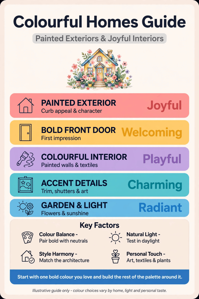
Infographic: a visual summary of hero shades, supporting colours and accents for a joyful painted exterior.
2. Painted Exteriors That Stop Traffic
The largest surface sets the mood for everything else, so choose the wall colour first and let doors and trim follow. Browse contemporary home design ideas if you want the architecture itself to share the spotlight with the paint.
- Drench the facade in teal. A deep teal over every wall turns an ordinary box into a landmark; keep the roof and path quiet so the colour stays rich rather than loud and shouty.
- Butter yellow on a cottage front. Soft yellow flatters stone, brick and white picket fences, and it glows on grey days when paler paints fall flat and look washed out.
- Forest green painted brick. Painting tired brick in a woodland green hides patchy mortar, suits leafy streets and makes white-painted windows look freshly tailored.
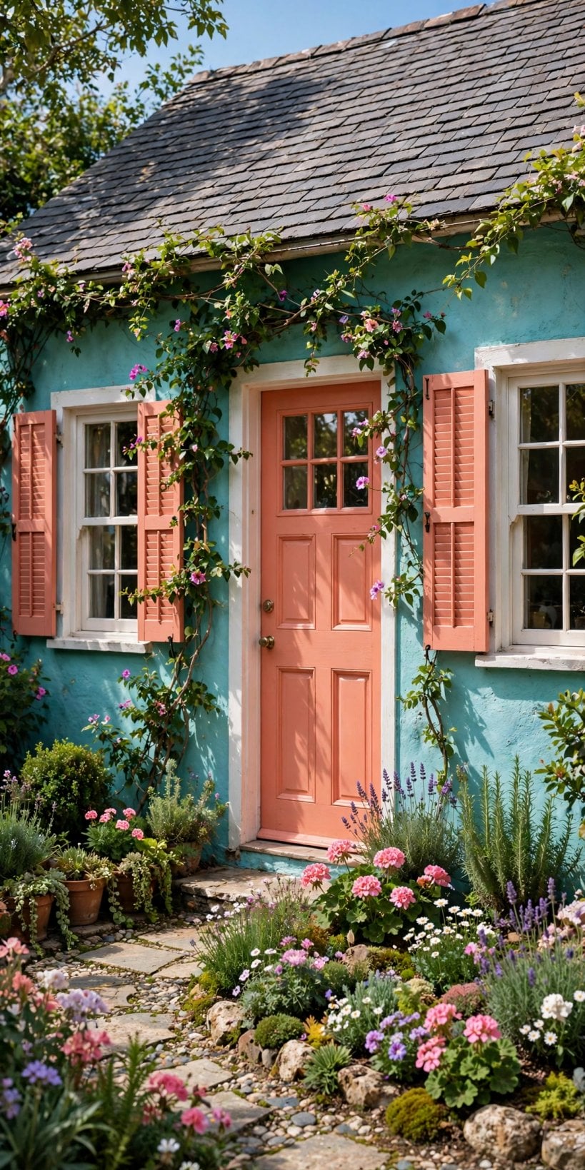
- Coral for a seaside mood. A warm coral reads happy without shouting; pair it with white trim, natural rope and driftwood tones for a relaxed coastal feel.
- Two-tone with a darker base. A deeper shade on the ground floor grounds the house and hides splash marks, while a lighter tone above keeps the front feeling tall.
- Apricot limewash softness. Limewash-style finishes in apricot or peach soften modern render and old stucco alike, giving walls a chalky, sun-warmed depth.
- Paint the gable differently. Treat the gable triangle as its own panel in a deeper or lighter tone of the main shade to add architecture to plain fronts.
- Tailored navy formality. Navy siding with bright white trim and a glossy door looks smart on almost any house shape and hides city dust gracefully.
- One white wall to rest the eye. Leaving a side wall or an upper storey white gives bold colour a breathing space and makes the whole scheme feel considered.
3. Front Doors That Smile Back
A door is the smallest big decision on the house: one tin, one afternoon, and the whole front changes its expression. It is also the traditional first step for anyone nervous about painting walls.
- Gloss red with brass. A classic combination that suits brick, painted siding and stone; the gloss finish makes the colour feel jewel-like in low winter sun.
- Sunshine yellow on grey. Yellow doors lift grey and charcoal facades instantly, and they make finding your keys on a dark evening strangely cheerful.
- Teal with a seasonal wreath. Teal sits happily between blue and green, and a simple wreath swapped through the year keeps the entrance feeling freshly dressed.
- Blush pink, softly grown-up. A muted, dusty pink reads elegant rather than sweet, especially with black hardware and a pot of green on either side.
- Paint the frame with the door. Colouring the frame and sidelights the same shade makes a standard door look wider, grander and far more deliberate.
- A quieter tint inside. Paint the inner face of the door a softer version of the exterior shade so the hall feels connected without shouting.
- A painted number plaque. A bold house number on a painted wooden or metal plaque repeats the door colour and helps visitors find you happily.
- Match the door to the shrubs. Repeating a flowering shrub’s colour on the door makes planting and paintwork feel like one designed idea in spring.
- Tangerine for mid-century shapes. Flat-fronted mid-century homes carry citrus shades beautifully; keep the hardware simple and let the colour do all the talking.
4. Trim, Shutters and Happy Contrasts
Trim is the tailoring of a house: it outlines every window, corner and roof edge, so changing its colour redraws the whole front without touching the walls at all.
- Crisp white framing. White window frames and corner boards outline bold siding like a mount around a picture, sharpening every edge of the facade.
- Trim one shade deeper. Using a deeper tone of the wall colour for trim gives a soft, tonal scheme that feels calm, layered and quietly expensive.
- Shutters in the accent colour. Shutters are the classic home for your accent; painting them to match the door ties the whole front together.
- Surprise window frames. Frames painted in a colour found nowhere else — a flash of red or cobalt — add wit to an otherwise quiet facade.
- Painted fascia boards. A coloured fascia line under the roof edge draws a neat underline beneath the roof and echoes the trim below.
- Corner boards picked out. On board-clad homes, painted corner boards give the front a crisp, almost storybook structure that suits cottages especially well.
- Two-tone shutters. Paint shutter frames one shade and the inner panels another for a tailored detail that rewards anyone who looks twice.
- Garage doors in trim colour. A garage door painted in the trim colour recedes quietly, letting the front door keep the starring role it deserves.
- Repeat it on the small things. A mailbox, a lantern and a house number in the accent colour make the scheme feel finished from the street.
5. Porches and Verandas in Full Colour
A porch is a room the street can see, so it deserves the same colour confidence as the facade. If you are planning the structure itself, these tiny house plans with screened porches show how much living fits into a few square metres.
- A pale blue ceiling. The traditional soft blue porch ceiling makes the space feel airy and open, as if the sky had been invited in.
- A painted porch floor. A deep green, brick red or even checkerboard porch floor hides footprints gracefully and makes plain furniture look deliberate.
- Rocking chairs in the accent. Two chairs painted to match the door turn the porch into an invitation rather than a mere passageway.
- A colourful porch swing. A swing painted in the supporting colour becomes the porch’s centrepiece and, predictably, its most fought-over seat.
- Cushions and an outdoor rug. Weatherproof cushions and a patterned outdoor rug in your three colours pull the whole scheme onto the porch.
- Planters lining the steps. Matching pots in graduated sizes marching up the steps repeat the accent colour and soften the architecture.
- Painted lanterns and bunting. A string of painted lanterns or simple fabric bunting brings festival colour that can change with the seasons.
- A screen door that matches. Painting a screen door the same shade as the front door keeps the colour story going all through summer.
- A two-tone balustrade. Rails in white with spindles in the accent colour is a small weekend job with a surprisingly tailored result.
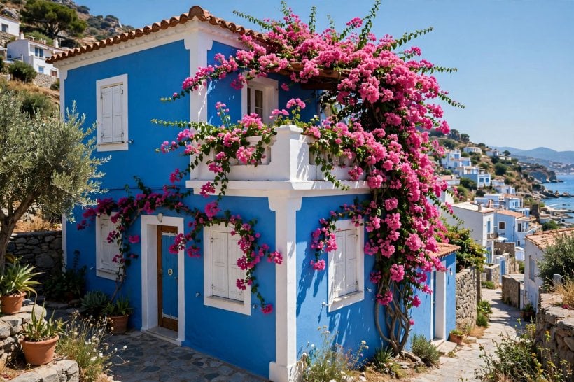
6. Garden Colour: Boxes, Planters and Paths
Colour should not stop at the walls. Pots, boxes, benches and even the path can repeat the palette, and these tiny house landscaping ideas prove that small plots can carry generous planting and colour.
- Window boxes matching the shutters. Boxes painted to match the shutters or the door make flowers look curated rather than accidental.
- A gradient of pots. Line the path with pots painted in shades that deepen step by step towards the door for a gentle rainbow.
- A painted garden bench. One bench in the accent colour gives the front garden a focal point and a pleasant place to enjoy it.
- Flower beds in colour blocks. Planting in bold single-colour drifts rather than mixtures echoes the confidence of the painted facade behind them.
- Painted raised beds. Timber raised beds painted in the supporting colour tidy a front garden and tie even vegetables to the scheme.
- Birdhouses in bright shades. A cluster of small painted birdhouses on a fence brings colour at eye level through every season of the year.
- Painted stepping stones. Flat stones painted in your palette make a playful path that children will always choose over the plain route.
- A trellis in the accent colour. Painting a trellis or obelisk makes climbing plants look designed from the very day they are planted.
- One bold bulb season. A spring border planted in a single confident hue — every tulip the same colour — is simple and unforgettable.
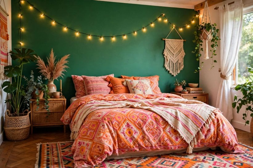
7. Small Homes, Brave Colour
Small homes wear colour brilliantly because there is less wall to argue about, and every shade counts double. Think of the decks above the roofline in these tiny house floor plans with rooftop decks, and even tiny two-storey shed houses, which carry full painted schemes with confidence.
- One bold shade, everywhere. On a tiny facade, a single saturated colour looks deliberate and generous, where several timid shades would only look patchy.
- Dark walls, white trim. The classic small-home trick: a deep colour makes the walls feel rich while white trim draws the architecture crisply.
- Door and boxes only. If the walls must stay neutral, a painted door plus two window boxes deliver most of the joy for very little paint.
- Colour-blocked cladding. Two large panels of cladding in different tones give a plain small home instant modern architecture and presence.
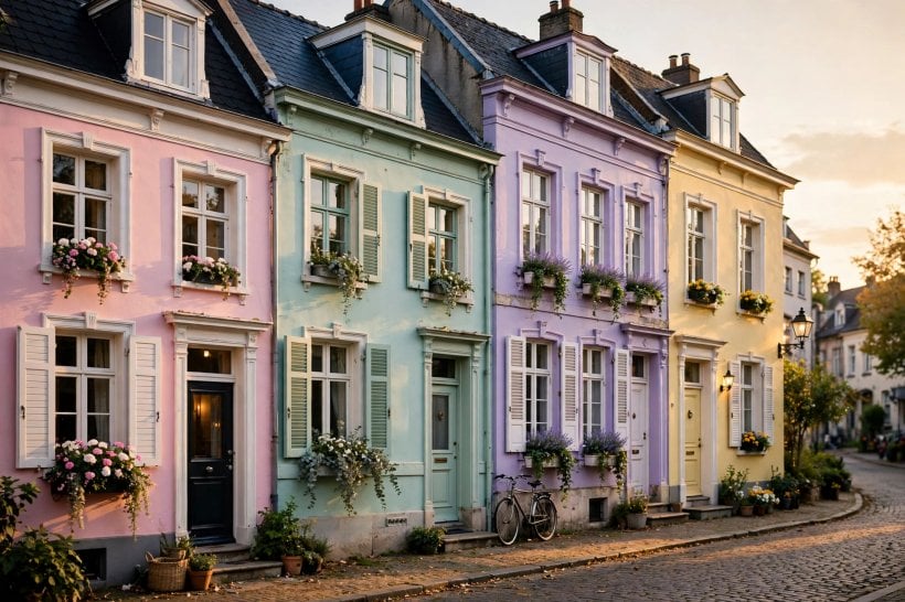
- Join the street’s pastel row. If the neighbours lean pastel, choosing a slightly deeper pastel keeps the harmony while still standing out kindly.
- A painted foundation band. Colouring the base band or skirting grounds a small home visually and hides the muddy splash zone elegantly.
- Bright furniture up top. Rooftop and balcony furniture in the accent colour carries the scheme all the way up to the skyline.
- Paint the shed to match. A garden shed or studio painted in the house colours turns plain storage into part of the composition.
- A saturated little porch. Concentrating your strongest colour in a tiny porch gives the whole home a jewel-like, welcoming entrance.
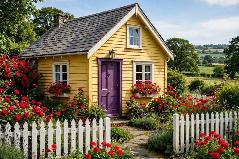
8. Fences, Gates and Rooflines
The supporting cast matters more than it gets credit for. Fences, gates and rooflines frame every view of the house, and a little paint on each makes the main colours look intentional.
- A gate in the accent colour. The garden gate is where visitors first touch the house; painting it to match the door sets happy expectations.
- A soft-coloured picket fence. Sage, powder blue or warm cream pickets feel friendlier than stark white and flatter colourful planting behind them.
- Fence panels in the supporting tone. Painting boundary fences in the supporting colour makes the garden feel larger and the house more composed.
- A painted mailbox post. A two-minute job that repeats the accent colour at the street and makes the daily post feel personal.
- Coloured bargeboards. Painted bargeboards and finials pick out the roofline beautifully and reward houses with pretty, visible gables.
- A painted chimney. Rendering and painting a tired chimney in the wall colour tidies the silhouette of the whole roof at once.
- Boxes on upper windows too. Repeating window boxes upstairs doubles the flower display and balances a colourful ground floor perfectly.
- A painted storage box. Bike stores and bench boxes painted in the trim colour stop practical objects spoiling the colour story.
- The rule-of-three trio. Gate, door and shutters in one shared colour is the simplest complete scheme a street ever admired.
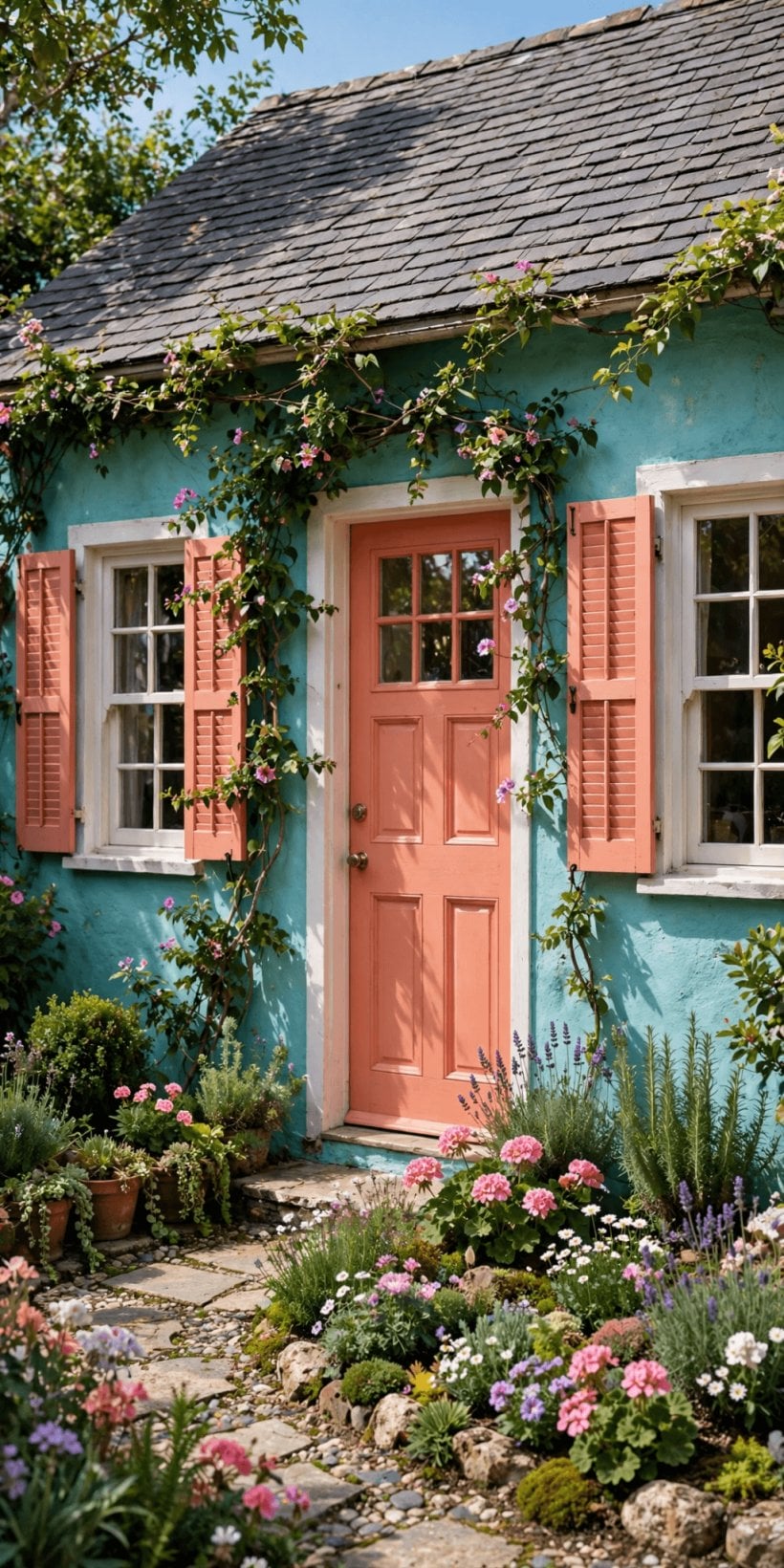
9. Bringing the Joy Indoors
The happiest schemes do not stop at the front door. Repeating one exterior colour inside — on a door, a bookcase or a single small room — makes the whole home feel like one idea.
- A hall in the accent colour. Painting the entrance hall in the door’s colour makes arriving home feel like one continuous, cheerful welcome.
- Painted interior doors. Interior doors in a joyful shade turn plain corridors into designed moments, especially in white-walled homes.
- A painted staircase. Risers or a runner in your palette carry colour upstairs and hide daily scuffs far better than white paint.
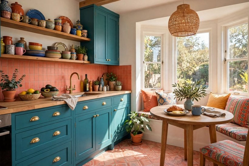
- Kitchen cabinets in one brave colour. A single run of coloured cabinets looks bespoke and photographs beautifully against plain tiles and worktops.
- Painted bookcase backs. The inside back panel of a bookcase painted in the accent colour makes shelves look styled with no effort.
- Colour in the smallest room. A bold cloakroom is the traditional place to experiment with strong colour before committing anywhere larger.
- Cushions that echo the porch. Indoor cushions repeating the porch colours tie the inside and outside of the house into one scheme.
- One painted ceiling. A small room with a coloured ceiling feels like a jewel box and asks absolutely nothing of the walls.
- Art that repeats the facade. Choosing prints and textiles that echo the exterior shades makes the whole home feel quietly authored.
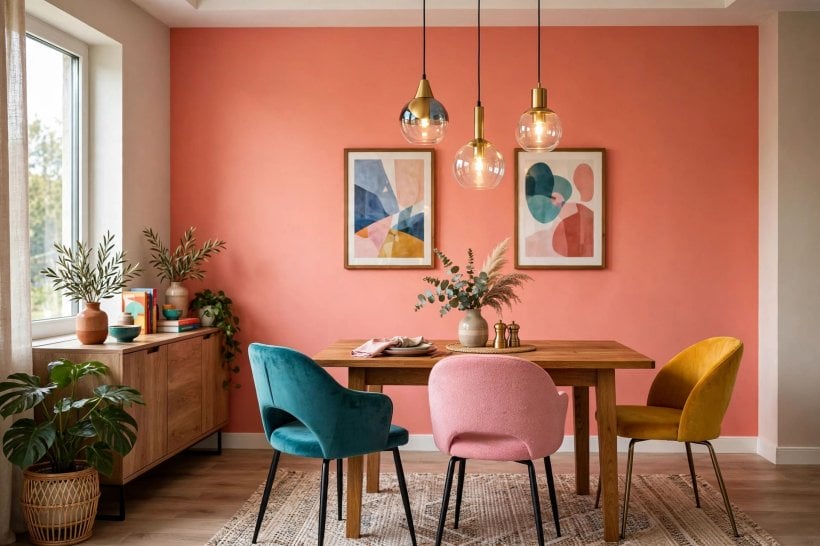
10. Finishing Touches and Colour Confidence
Before you commit to gallons of paint, these final checks separate a scheme that sings from one that merely shouts, and they cost nothing but a little patience.
- Test three shades, big. Paint boards at least a metre square and move them around the facade; tiny sample chips lie about depth and light.
- Repeat every colour three times. A colour used once looks like a mistake; used three times across door, planting and details, it looks like design.
- Live with it for a week. Prop the painted board by the front door for seven days of arrivals before ordering paint for the whole house.
Final Considerations
A joyful exterior is not about using every colour you love; it is about choosing a few and repeating them with confidence. Start with the door if you are nervous, or the whole facade if you are not — either way, test big, watch the light at different hours, and let the house make you smile when you turn into the street. Colour fades in memory long before it fades on the wall, so dare to be a little braver than feels safe.

0 Comments