

A crimson feature wall can make a living room feel warm, intimate and full of character — if you get the shade and styling right. These 75 ideas for red walls cover living rooms of every size, from deep oxblood accents to soft terracotta washes, plus the restful colour pairings that keep bold walls calm. Browse it like a mood board before you buy a single paint sample.
1. At a Glance: Planning Bold Walls
Before the ideas, a quick orientation: working with red walls rewards planning — shade, light and proportion decide whether the room feels cosy or overwhelming. The table below distils the essentials, and our guide to interior paint colours that make small rooms feel big goes deeper on choosing shades for compact spaces.
| Topic | Quick take |
| Best rooms | Living rooms with good daylight; north-facing rooms suit warmer brick and terracotta tones |
| Finishes | Matt or eggshell for large walls; satin for trim and woodwork |
| Restful pairings | Warm white, soft beige, natural oak, muted sage |
| Small rooms | One accent wall; keep ceiling and trim light |
| Testing | Paint large swatches; view them morning and evening |
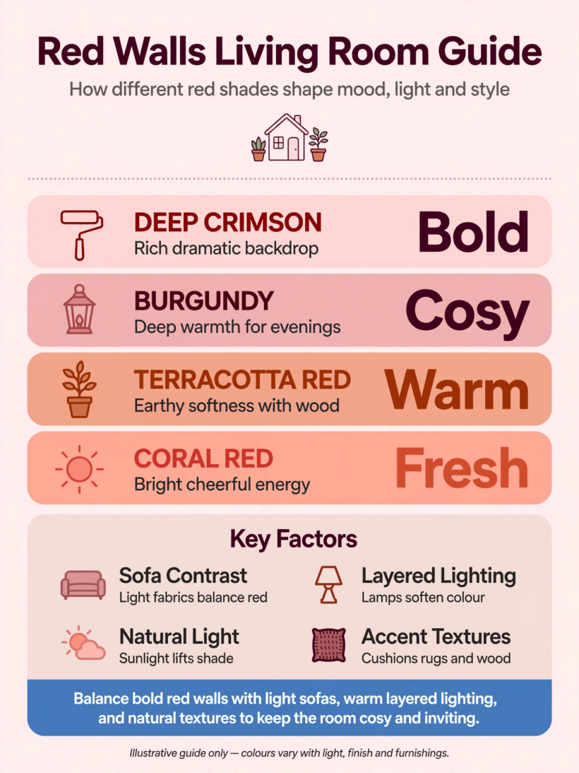
Infographic: a visual summary of shades, finishes and pairings for bold painted walls in living rooms.
2. Crimson Statements for the Living Room
Deep crimson brings instant atmosphere. These ideas show how to use full-strength reds with confidence, whether you drench the room or concentrate the colour in one powerful gesture. For broader living room interior design planning, start with layout before committing to colour.
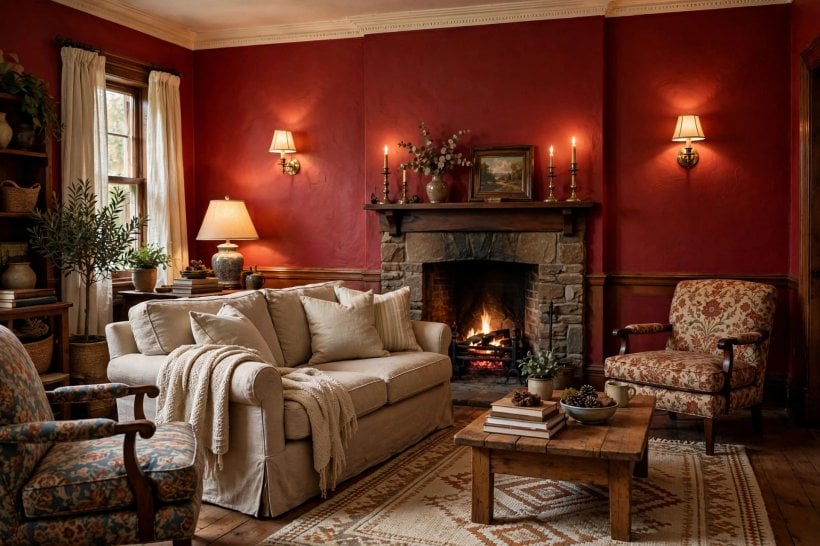
- Drench all four walls in crimson. Colour-drenching wraps the room in one deep tone, making walls, trim and ceiling feel continuous; keep the finish matt so the colour reads soft rather than glossy.
- Paint one feature wall behind the sofa. A single crimson wall gives the seating area a clear focal point while the remaining walls stay pale, which keeps the scheme balanced and easy to change later.
- Highlight the chimney breast in oxblood. Painting just the chimney breast draws the eye to the fireplace and adds architecture to flat rooms; the deep tone makes mantel styling look richer.
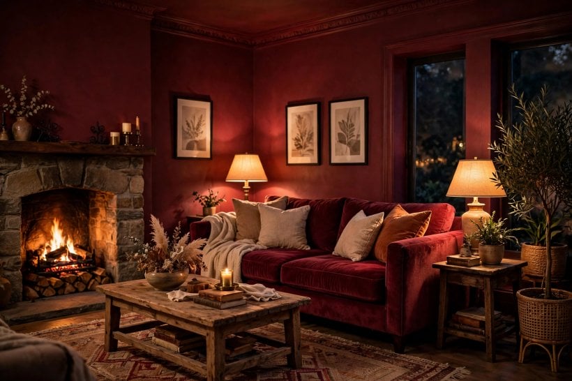
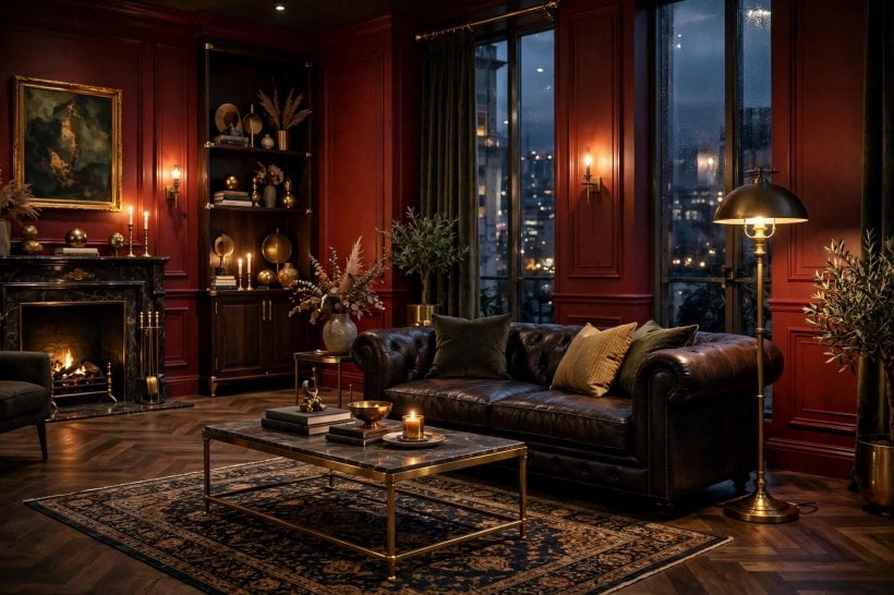
- Choose burgundy for evening rooms. Darker reds come alive under lamplight, so a burgundy wall suits rooms used mostly after dark, where it glows instead of shouting.
- Add picture-frame moulding in crimson. Painted moulding panels give a plain wall a tailored, panelled look for the cost of timber strips and paint, adding shadow lines that shift through the day.
- Paint the alcoves, not the chimney. Reversing the usual approach — colour in the recesses, pale on the breast — creates depth and makes shelving and books stand out beautifully.
- Try lacquered panels for drama. High-gloss red panels on one wall reflect light like still water; use them in rooms with good daylight and keep surrounding finishes quiet.
- Use crimson in double-height spaces. Tall walls can take strong colour; a crimson upper wall with a pale lower zone keeps the volume feeling airy rather than cavernous.
- Carve out a burgundy reading corner. Paint the two walls of a corner nook in deep red, add a chair and a warm lamp, and an awkward corner becomes the room’s favourite seat.
3. Brick, Terracotta and Earthy Reds
Earthy reds are the easy-wearing side of the family: warm, natural and forgiving. Brick, terracotta and clay tones bring the energy of red down to a comfortable, liveable level that suits relaxed, texture-rich rooms.
- Wash walls in brick-red limewash. Limewash gives red a soft, cloudy movement that flat paint cannot match; it suits relaxed rooms and hides minor wall imperfections gracefully.
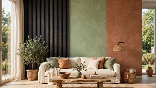
- Choose terracotta plaster tones. A sunbaked terracotta wash brings warmth without the intensity of true red, pairing naturally with rattan, jute and pale timber floors.
- Go for faded adobe red. Muted, dusty reds feel collected and calm; they work well in rooms with lots of natural texture like wool, clay and unfinished wood.
- Pair rust-red with raw textures. Rust tones sit comfortably beside linen, stone and weathered wood, giving an earthy scheme that feels grounded rather than decorated.
- Use paprika as a spicy accent. A vivid paprika wall energises a neutral room; limit it to one wall and repeat the tone in small decor pieces for cohesion.
- Paint a clay-red half wall. A dado-height band of clay red with warm white above lowers the visual ceiling line slightly and makes large rooms feel more intimate.
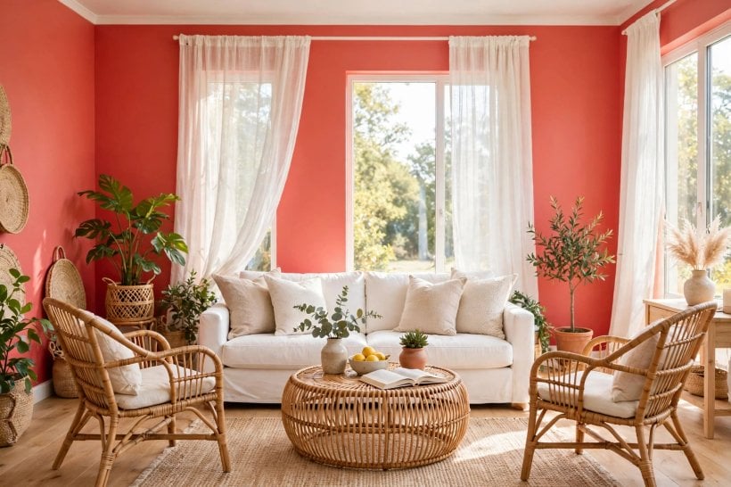
- Layer terracotta with rattan. Rattan chairs and pendants against a terracotta wall create a warm, holiday-like corner; add one deep green plant for contrast.
- Face the garden with sunbaked red. In garden-facing rooms, warm reds echo brick and terracotta outdoors, blurring the boundary between inside and out.
- Pick muted brick for low-commitment depth. A dusty brick tone adds richness without dominating, making it a safe first step for anyone nervous about strong colour.
4. Accent Walls That Anchor the Room
An accent wall concentrates red where it works hardest — behind the sofa, around the fireplace, or framing a view. These placements give you the drama of red with the flexibility of mostly neutral walls.
- Anchor the media wall in red. A deep red wall behind the television reduces the black-screen effect, helping the TV blend into the room when switched off.
- Frame the fireplace wall. Painting the full fireplace wall in brick red turns the hearth into the room’s natural gathering point, even in summer.
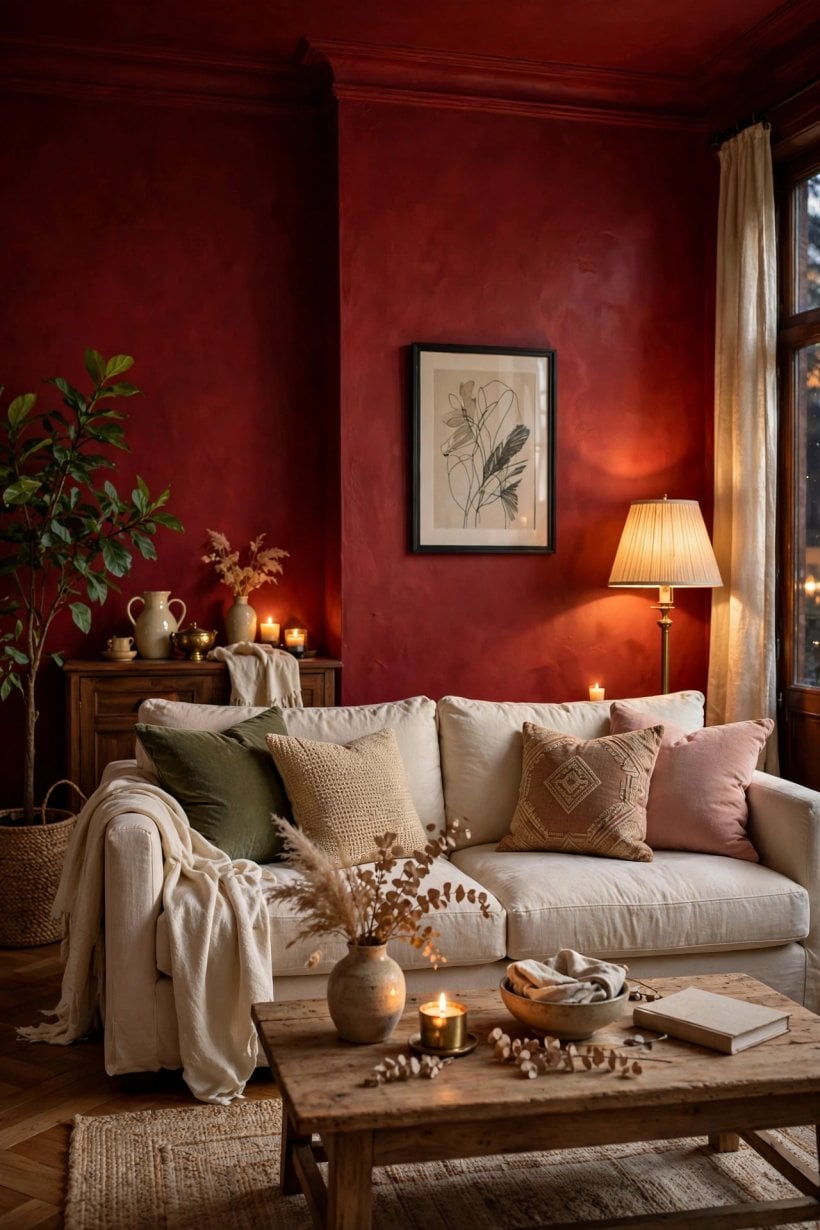
- Set the sofa against scarlet. A scarlet backdrop makes pale upholstery pop; keep cushions in cream, oat and one dark accent for a composed look.
- Paint the window wall red. Colour around a window frames the view like artwork; choose a mid-tone red so daylight keeps it lively rather than dark.
- Wrap two adjoining walls. Taking red around a corner creates a cocooning zone for dining or reading, while the rest of the room stays light and open.
- Back floating shelves with crimson. A red recess or panel behind open shelving makes ceramics, books and glass glow; it is a small area with big impact.
- Hang a gallery on oxblood. Deep crimson walls make brass frames and pale mounts sing; plan the layout on the floor first to avoid extra holes.
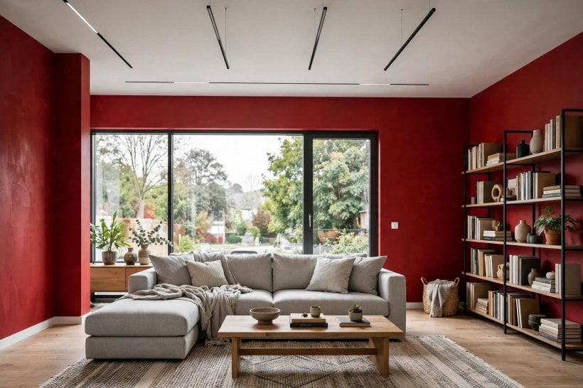
- Line the bookcase wall in red. Painting the wall behind bookcases in a deep tone adds depth to the shelves and makes book spines look curated.
- Stop the colour at three-quarter height. Ending a red accent below the ceiling with a crisp line feels modern and keeps the upper wall light, which suits lower ceilings.
5. Restful Colour Pairings
Red feels restful when its partners do the calming. Warm whites, soft beiges, natural timber and muted greens all take the edge off strong walls. If you love bold colour generally, our colourful tiny house interiors roundup and these blue and white interiors show how contrast can still feel serene.
- Pair red with warm white. Warm white trim, ceiling and woodwork keep crimson walls feeling fresh; avoid brilliant white, which can make red look harsh.
- Soften with soft beige and linen. Beige upholstery and linen curtains calm strong walls, creating a restful layered look that still has personality.
- Ground with natural oak. Pale oak floors and furniture bring an organic calm to crimson walls; the wood’s honey tones bridge red and neutral beautifully.
- Cool it with muted sage. Sage green sits near red on the warm side of the wheel, and in muted form it makes a soothing, garden-like partner.
- Rest with soft grey. A gentle warm grey on adjoining walls lets a red accent breathe; keep the grey warm so the scheme stays cosy.
- Add cream and brass. Cream walls with brass lighting and one crimson accent deliver classic warmth; the metal adds a quiet gleam after dark.
- Try dusty pink alongside. Dusty pink shares red’s warmth in a whisper-quiet form, making it a gentle companion for one stronger red wall.
- Earth it with olive. Olive green furniture or curtains against brick-red paint feel natural and restful, like a late-summer landscape.
- Go classic with navy. Navy and oxblood is a timeless, club-like pairing; use navy in textiles so the walls stay the star.
6. Texture, Finish and Depth
Finish changes everything: the same red reads velvety in matt, dramatic in gloss and artisanal in limewash. These ideas explore surfaces that give crimson walls depth and character. For structural options, see these lightweight interior wall finishes that work well under paint.
- Choose matt for large walls. Flat matt paint absorbs light and makes red feel velvety; reserve silk or satin for trim where you want definition.
- Try a limewash effect. Limewash in red shows soft tonal clouds that add artisanal character; two coats over a primer usually give the best depth.
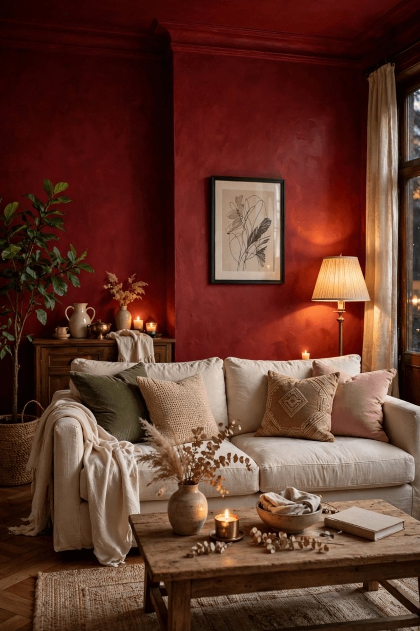
- Consider polished plaster in oxblood. A waxed plaster finish gives deep red a subtle sheen and movement, turning one wall into a crafted feature.
- Hang red grasscloth. Natural grasscloth in brick tones adds fine texture that catches light differently through the day; order extra for pattern matching.
- Paint tongue-and-groove red. Vertical timber boards painted in deep red add shadow lines and a cottage-meets-modern feel; they suit hallways and snugs too.
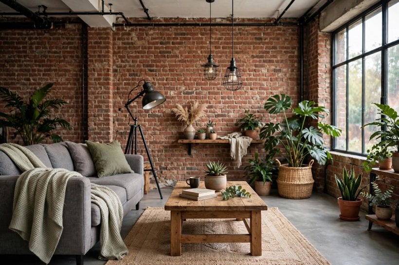
- Expose or fake brick in red. Real brick brings instant texture, while brick slips or wallpaper give a similar warmth; seal real brick to tame dust.
- Upholster panels in crimson. Fabric-covered wall panels soften acoustics and add luxury; they work well behind a sofa or as a headboard-style feature.
- Layer limewash over plaster. On textured plaster, limewash settles into the undulations and emphasises the hand-made surface; test a board first.
- Try a suede-effect paint. Specialty suede-effect paints give red a soft, brushed look that feels cosy in low light; apply with the recommended technique.
7. Making Red Work in Small Living Rooms
Small rooms can absolutely take red — the trick is concentration. One strong wall, smart placement and light-reflecting tricks keep compact spaces feeling open. Browse more small living room ideas and tiny house living room ideas for layout inspiration to pair with these colour moves.
- Follow the one-wall rule. In compact living rooms, limit strong red to a single wall; the restraint keeps the room feeling open while still delivering drama.
- Paint a studio alcove red. A red recess or sleeping nook in a studio flat zones the space without walls, giving the bed area its own identity.
- Put red behind a mirror. A mirror on a crimson wall bounces warm colour and light around a small room, doubling the impact without extra paint.
- Embrace deep red in a snug. Small, low-lit rooms suit dark reds; leaning into the cosiness with oxblood walls and warm lamps beats fighting it with white.
- Use a red half-wall with white above. A chair-rail-height band of red adds colour at seating level while the white upper wall keeps things airy.
- Paint the shortest wall. Colour on the shortest wall of a narrow room visually widens the space; it is a classic decorator trick that really works.
- Warm a north-facing room with red. North light is cool and flat, and warm reds counteract it beautifully; choose brick or terracotta over blue-reds.
- Echo the wall on the door. Painting an interior door the same red as the accent wall creates a considered, designer look for very little effort.
- Combine red with built-in storage. A red wall of built-in cupboards hides clutter in colour; paint the units and wall the same tone for seamlessness.
8. Furniture and Decor Against Red
What you put in front of the wall matters as much as the paint. Cream upholstery, pale timber, warm metals and green plants all shine against red — while the wrong undertones can clash. These farmhouse living room ideas show similar warm-wall styling with rustic furniture.
- Float a cream boucle sofa against crimson. Nubby cream upholstery glows against deep red; keep the sofa slightly off the wall so the colour frames it.
- Pair tan leather with brick red. Cognac leather armchairs and brick walls are a natural match, ageing together into a warm, lived-in look.
- Choose natural oak furniture. Pale timber sideboards and coffee tables calm crimson walls; their simple lines stop the scheme feeling heavy.
- Add black metal frames. Slim black metal in lighting and furniture edges gives crimson walls a crisp, modern outline without adding visual weight.
- Bring in brass and warm metals. Brass lamps and trays pick up red’s warmth and add a soft gleam; a little goes a long way.
- Use green plants as contrast. Deep green foliage against crimson is a classic complementary pairing; large-leaf plants make the strongest statement.
- Layer rugs in natural fibres. Jute and wool rugs in oat and beige soften the floor zone and stop crimson walls from feeling stark underfoot.
- Hang linen curtains. Washed linen in warm white filters daylight softly against crimson walls; full-length drops add gentle vertical lines.
- Choose art that sings on red. Pale abstracts, botanical prints and brass frames stand out on deep walls; give each piece breathing room.
9. Lighting for Crimson Walls
Red is a chameleon under different light: warm bulbs make it glow, cool bulbs flatten it. Plan your lighting with the paint in mind, and a red living room will look good from morning coffee to late evening.
- Light crimson walls warmly. Warm-white bulbs flatter red paint, while cool daylight bulbs can make it look flat; check the bulb’s tone before committing.
- Add picture lights. A brass picture light over art on a red wall creates a gallery glow and highlights the paint’s depth after dark.
- Pool light with floor lamps. Arc or tripod floor lamps cast warm pools that make crimson walls feel intimate; position them to wash, not spotlight.
- Use candles and low light. Crimson walls were made for candlelight; a cluster of candles on the mantel turns an ordinary evening into an occasion.
- Read the daylight first. South-facing rooms keep red lively all day, while north-facing rooms need warmer reds; observe your light before choosing.
- Fit dimmer switches. Dimmers let a red living room shift from bright family space to moody evening retreat at the touch of a slider.
- Wash the wall, don’t spot it. Soft wall-washing light flatters textured red finishes; harsh downlights can create unflattering hot spots.
- Avoid cool fluorescents. Cool, blue-toned light fights with warm red paint; if you must use it, keep it out of the living room.
- Plan lighting in layers. Combine ambient, task and accent light so the red wall looks good at every hour; no single source should do all the work.
10. Finishing Touches
Before you commit, these final checks save expensive mistakes. Sampling properly and coordinating ceiling, trim and sheen is what separates a professional-looking result from a weekend regret.
- Test with large swatches. Paint A3-size boards and move them around the room for a few days; small chips lie about how red behaves at scale.
- Decide the ceiling and trim. Warm white ceilings and trim keep crimson walls crisp; a fully drenched red ceiling suits only confident, well-lit rooms.
- Live with a sample first. Prop a painted board against the wall for a week and view it morning and night before committing to gallons.
Final Considerations
Red rewards the brave but forgives the prepared. Start with one wall, test big swatches, pair with warm neutrals and natural textures, and light it warmly. Whether you choose oxblood drama or a soft terracotta wash, the ideas above give you a complete palette to work from — pick the three that speak to you and build outward. Your living room will thank you.


0 Comments