

The long, low profile and split levels of these homes are full of potential; they just need a clearer entry, fresher materials and a stronger colour story. This guide walks the facade piece by piece, with layouts, colours, costs and practical details.
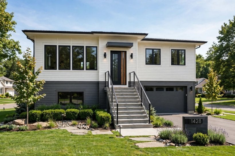
1. Read the House First: Levels, Roofline and the At-a-Glance Plan
Every successful raised ranch remodel begins with reading the house honestly from the street. Stand across the road and note what your eye does: most of these homes present a long upper wall of windows, a plainer lower level that often houses the garage, and an entry that can feel tucked away between the two. The remodel works when it balances those levels, gives the front door a clear moment, and stops the garage from telling the whole story.
List the fixed points before dreaming about finishes: roof condition, driveway slope, window sizes, and any brick or stone you might keep. Keeping one sound original material and renewing everything around it usually looks better, and costs less, than stripping the facade bare. Photograph the front in flat midday light and again at dusk, because both views reveal different weaknesses. The planning mindset in new home exterior design ideas applies just as well to a remodel: decide the hierarchy of the facade first, then let every purchase serve it.
| At a Glance | What to Decide | Practical Note |
|---|---|---|
| Best first step | Street-view audit of both levels and the entry | Photograph the facade at midday and at dusk |
| Layout focus | Entry presence, level balance and garage share | Reduce the garage’s visual weight first |
| Colour direction | One body colour, one trim, one accent | Three colours is plenty for a long facade |
| Main cost drivers | Siding area, windows, entry work and roof changes | Surface area makes small unit prices grow quickly |
| Quick wins | Front door, lighting, numbers and planting | The cheapest changes sit exactly where visitors look |
| Good fit for | Sound homes whose bones outlast their finishes | Prioritise roof and drainage before cosmetics |
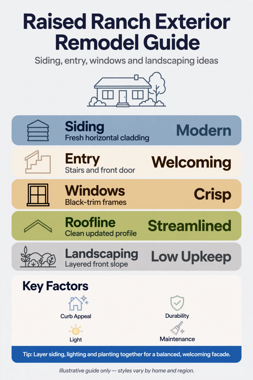
At a glance: the facade decisions, cost drivers and quick wins for a modern exterior transformation.
2. A Welcoming Entry: Stairs, Porch and Front Door
The entry is where these homes most often underwhelm: a plain door reached by an exposed stair, floating between levels with nothing to announce it. Give it architecture. A modest porch roof or a flat canopy on slim brackets shelters visitors and casts a shadow line that reads as design, while a widened landing stops the arrival feeling like a fire escape. Repeat the porch material at the garage or the lower level to tie the composition together.
Then make the door itself the accent. A bold painted colour, a glazed panel that borrows light for the hall, and hardware in one consistent finish lift the whole facade for a fraction of the siding budget. Widen the steps if the plot allows, add a handrail that looks intentional rather than clinical, and flank the door with planting at two heights. These are the same first-impression principles used in home designing ideas indoors, simply moved outside: one clear focal point, layered light and nothing competing for attention.
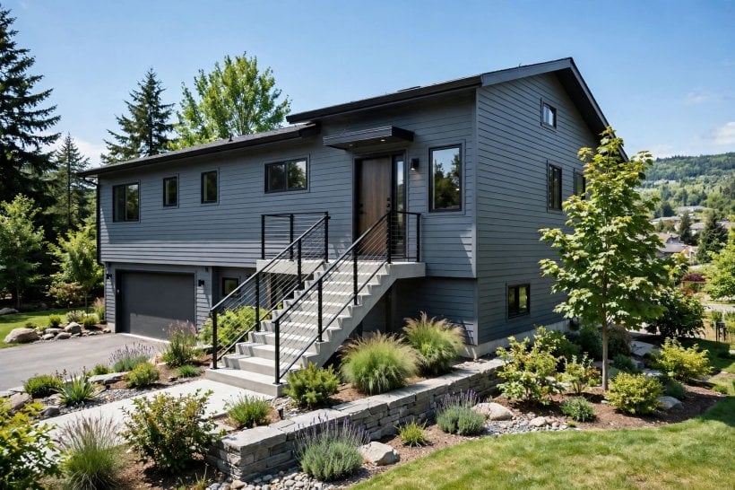
3. Siding Combinations That Modernise the Long Facade
A single siding run from end to end is what dates these homes fastest, so break the length deliberately. Mixing two materials, horizontal boards above with vertical panelling, stone or brick below, gives each level its own character and shortens the facade visually. Keep the change of material on a natural break such as the floor line between levels, and let the heavier-looking material sit at the bottom where the eye expects weight.
Colour contrast does similar work when budgets will not stretch to two materials: a deeper tone on the lower level grounds the house, while a lighter upper level lifts it. Fibre-cement and engineered timber both take modern profiles and paint well, and either can sit happily beside original brick that has been cleaned or limewashed. Whichever combination you choose, order samples large enough to judge outside in real light, and check how the joints and trims will be finished, because crisp detailing is what separates a designed mix from a patchwork.
4. Garage Doors and Driveway Details That Lift the Whole Front
On many of these homes the garage occupies a third of the street view, yet it is usually the last thing anyone upgrades. A flush or simply panelled door in the facade’s trim colour calms that whole section instantly, while a row of narrow windows along the door’s top brings in daylight and breaks up the slab. Match the door’s finish to the front door for a quiet conversation across the facade, or to the siding if you want the garage to disappear.
The driveway deserves the same attention. Pressure-washing, re-edging and repairing cracks costs little next to replacement and makes new work look newer. Where a full resurface is planned, a border course or a change of tone at the threshold adds the tailored feel modern schemes rely on. Soften the hard landscape with a planting strip between drive and lawn, keep bins and storage screened behind a simple slatted panel, and the approach to the house starts to feel like part of the design rather than the parking that precedes it.
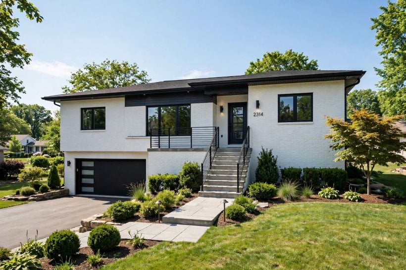
5. Windows: Bigger Openings, Dark Frames and Better Balance
Windows set the rhythm of the upper level, and tired units in thin white frames can make even fresh siding look old. Replacements with slimmer, darker frames read instantly more modern and throw the glass into calm, even bands across the facade. Where a room is being remodelled inside at the same time, widening one key window or joining two into a single larger opening changes both the interior light and the exterior balance in one move, subject to proper structural advice.
Consistency matters more than drama. Keep frame colour and style the same across the front, align new openings to the existing rhythm where you can, and resist mixing grille patterns between neighbouring windows. The light lessons from small living room interior design ideas hold true here: fewer, larger areas of glass usually feel calmer than many small divided panes. Finish with simple, deep sills and tidy trims, and consider a subtle tint or shading on any west-facing glass that overheats a room in summer.
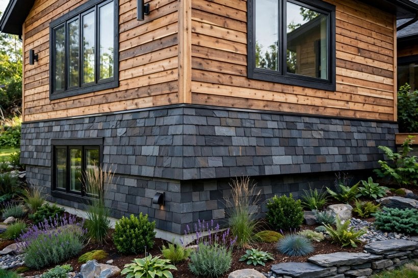
6. Colour Palettes for Brick, Siding and Stone
Modern palettes for this style lean on contrast with restraint: a warm white or soft greige body, charcoal or black trim, and one natural material, cedar, stone or the original brick, left to bring the warmth. Painting tired brick can unify a facade that mixes additions from different decades, though it is worth testing a limewash or stain first if the brick itself is sound, since those finishes keep some texture and are kinder to older masonry.
Cooler schemes borrow from the palettes in beachy interior design ideas: weathered blues, sea-glass greens and sandy neutrals suit homes near water or in leafy streets where a crisp white would glare. Whatever the family, hold the count at three main colours and repeat the accent at the door, the mailbox and the planters so it feels chosen. Always paint a large test patch including a corner and a trim edge, then live with it through a full day of changing light before committing the whole house.
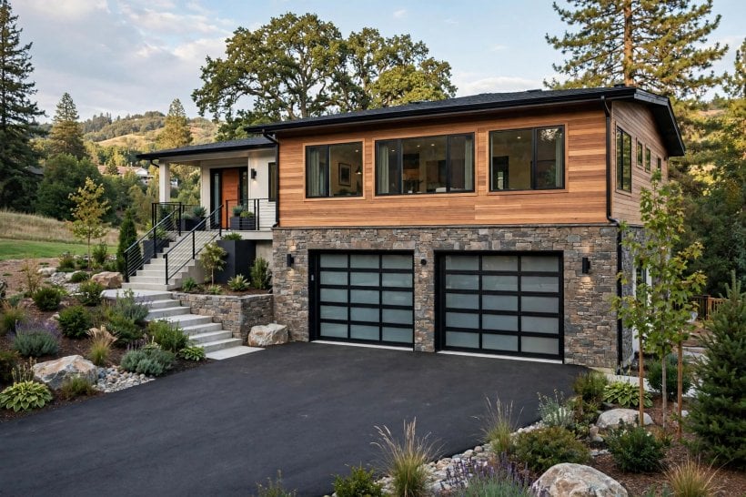
7. Roofline Tweaks, Gables and Eaves That Add Presence
The roof of this style is usually a simple, low-pitched plane, which is exactly why small changes register so strongly. A new gable over the entry or the main living space breaks the long horizontal line and tells visitors where the front door lives. Deeper eaves with a clean fascia and soffit add shadow and shelter, and swapping tired shingles for a crisper profile in a darker tone modernises the whole silhouette in one contract.
Roof work is the least forgiving place to improvise, so bring in a roofer or designer early and let structure lead the styling. Dormers can add light and headroom to upper rooms but change drainage and flashing everywhere they touch. If the budget is tight, keep the roof shape and spend on the visible edges instead: gutters, fascias and a tidy ridge line are what the street actually reads. And never let a cosmetic remodel jump ahead of a roof that leaks; new siding under a failing roof is money spent twice.
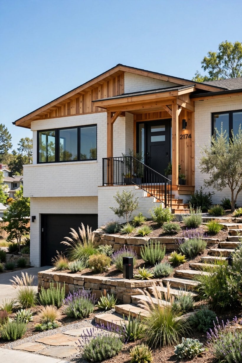
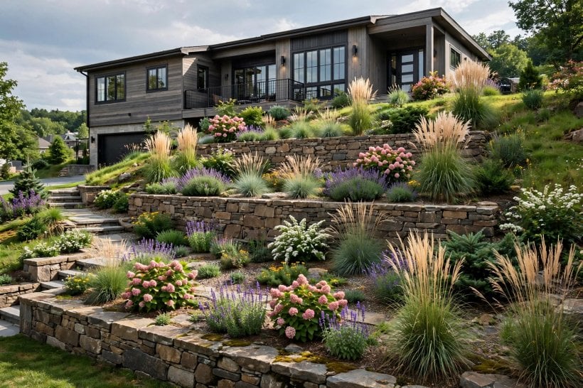
8. Landscaping the Slope: Terraces, Steps and Planting
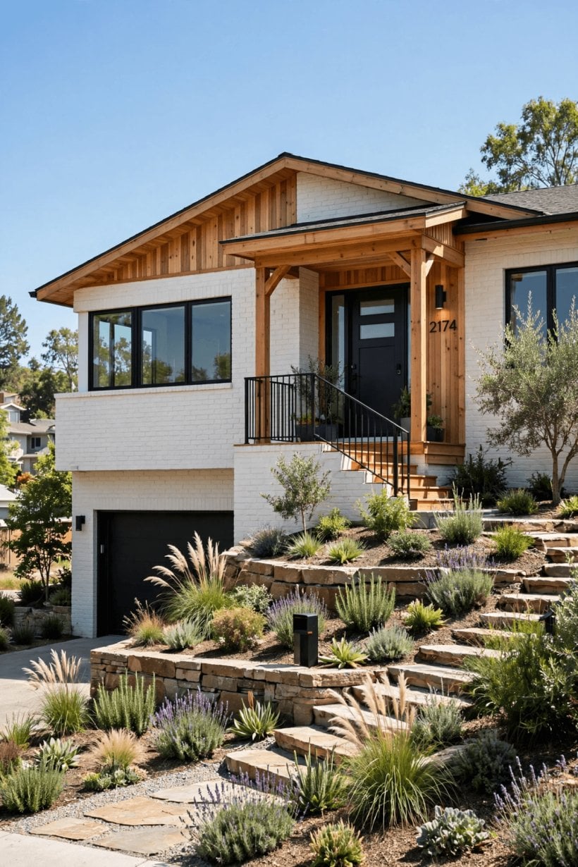
These homes often sit above their street, which makes the front garden a slope that must be designed rather than merely mown. Low retaining terraces turn that slope into usable, plantable levels and give the house a plinth to sit on. Wide, shallow steps aligned with the front door, edged in the same material as the terraces, make the climb feel generous instead of apologetic, and a resting landing halfway suits longer climbs.
Plant for structure first: evergreen shapes that hold the design in winter, then grasses and perennials for movement through the seasons, in the calm spirit of zen interior design ideas translated outdoors. Keep planting lower than the upper windows so the facade keeps its clean lines, and repeat a few plants in drifts rather than dotting singles along the wall. Mulch deeply, light the steps for safety, and the sloped front garden becomes the setting the architecture always wanted.
9. Outdoor Lighting and House Numbers for a Finished Look
Lighting is the cheapest layer of architecture there is. A pair of fittings flanking the front door, a soft wash up the new gable and gentle step lights turn the remodelled facade into an evening picture and make arrivals safer. Choose one finish and one warm colour temperature across every fitting, and put the scheme on a timer or dusk sensor so the house looks cared for even when you are away.
House numbers and the mailbox are the facade’s jewellery: small, visible and disproportionately telling. Crisp modern numerals, sized to be read from the road and lit by the entry light, signal that the remodel was finished properly rather than abandoned at ninety percent. Add a matching mailbox and door furniture in the same finish and the effect multiplies. These details photograph beautifully too, which matters if the remodel is partly about kerb appeal for a future sale.
10. The Lower Level: Making the Ground Floor Feel Like Part of the Home
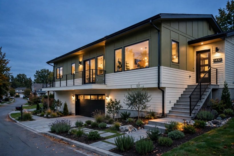
The lower level is this style’s secret asset: a whole floor that can hold a family room, guest suite, studio or gym, yet from the street it often reads as an afterthought of small windows and the garage. An exterior remodel should dignify it. Enlarging lower windows where structure allows, painting the level in the grounding colour and adding a proper path and planting to any lower entrance all announce that this floor is lived in, not stored in.
Inside, connect the levels visually so the house feels like one home: repeat the upper floor’s flooring tone on the stairs, carry the same trim colour through, and borrow the layered approach of modern living room interior design ideas for the lower sitting area, with lamps and rugs warming the cooler light. Attend to moisture and ventilation before finishes, since ground-level rooms punish shortcuts. Done well, the lower level stops being the basement and becomes the reason this house out-performs newer ones twice its price bracket.
Final Considerations
A raised ranch rewards the remodeler who works with its geometry instead of disguising it: clarify the entry, balance the two levels, quieten the garage and let a disciplined palette do the modernising. Sequence the spending so structure, roof and drainage come before finishes, and let the quick wins, door colour, lighting, numbers and planting, land last, when they can polish rather than distract. Photograph each stage from the street; the camera is brutally honest about what still jars.
Finally, keep the neighbours and the street in mind. The best remodels of this style look inevitable, as though the house had always meant to look this way, and they lift the whole road with them. Choose materials that will weather gracefully, keep the planting maintained so the architecture stays visible, and your long, low house will read as what it truly is: a practical, light-filled home with a second life well begun.

0 Comments