
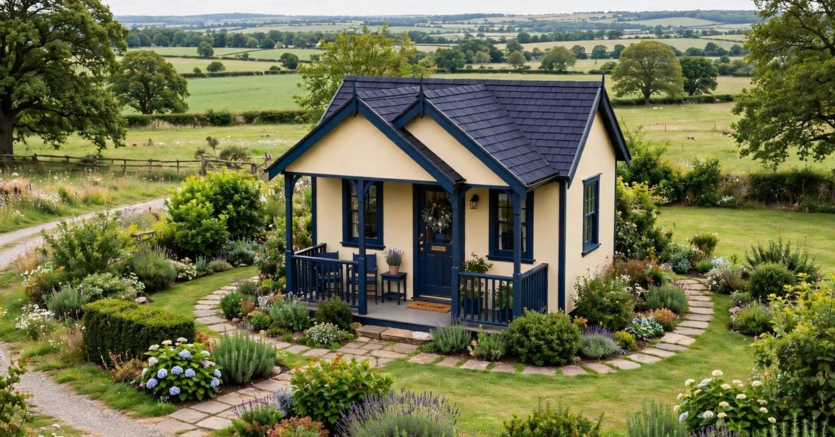
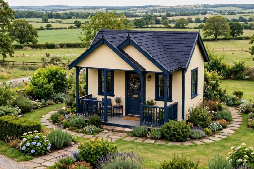
A two-tone exterior is one of the quietest ways to make a house look considered. Instead of a single colour stretched across every wall, two colours share the work: one carries the bulk of the building, and the other picks out the details that give the house its shape. Done well, the result feels calm rather than busy, and the house gains depth without gaining decoration. The eye reads the main walls first, then follows the second colour along the trim, the porch, or the lower storey, and the whole facade settles into a pleasing order.
That balance is what this guide is about. It looks at how to choose a pairing, where to place each colour, and which combinations tend to feel settled rather than restless. It stays in general terms throughout, because every house brings its own roof, its own masonry, and its own setting, and the right pairing for one home may not suit the next. Among the many collections of tiny house exterior ideas, the two-tone approach stands out for small homes in particular, since it can make a compact facade feel layered rather than flat. Readers looking for two tone house color ideas will find the principles here apply just as well to a cottage as to a larger family home, provided the pairing respects the building it dresses.
The sections below take the subject step by step, from the basic idea through contrast, warmth, trim, roofs, doors, and proportion, and on to the light and setting that can change how any pairing looks. Nothing here asks the reader to take on structural work, and anything that touches the structure of a building, its wiring, or its weatherproofing belongs with qualified professionals. Colour choice is the enjoyable part of the project; the building work behind it deserves proper advice, and the guide says so wherever that line appears.
1. What a Two-Tone Scheme Actually Is
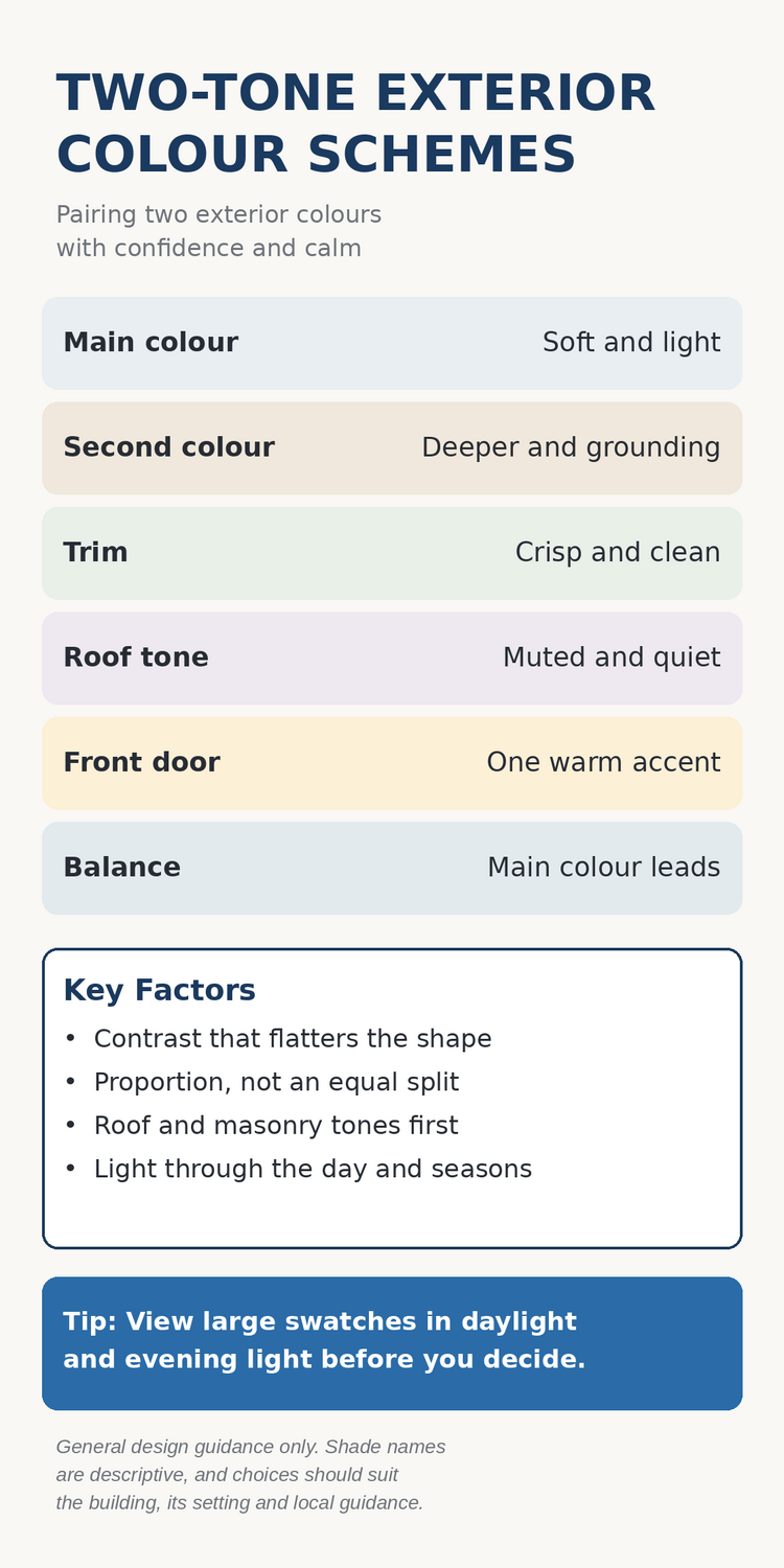
At its simplest, a two-tone scheme uses two colours on the outside of a house, with a clear difference in how much of each is seen. The main colour covers most of the walls, while the second colour appears in smaller, deliberate places: the trim around windows and doors, the boards of a porch, the gable, or the lower part of the walls. The two colours are partners, not rivals, and the scheme works when their roles are obvious at a glance. If the eye cannot tell which colour leads, the facade can feel indecisive, however pretty each shade may be on its own.
It helps to think of the scheme as a conversation between a background and a voice. The background colour sets the mood of the house. A soft white or warm cream background feels open and gentle, while a deeper grey or sage background feels grounded and sheltered. The second colour then speaks more quietly, drawing attention to the shape of the house rather than shouting over it. A crisp white trim on sage walls, for example, traces the windows and corners so the structure reads clearly from the street, while a dark trim on pale walls gives the same house a firmer, more defined outline.
Two tones are not the same as many tones. Adding a third or fourth colour can still work in the hands of a careful designer, but the charm of the two-tone approach lies in its restraint. With only two colours to manage, the relationship between them stays legible, and the house avoids the patchwork feeling that comes from too many competing shades. The guide that follows therefore treats the door as an accent within the second colour family, or as a single warm note, rather than as a licence to introduce a whole new palette. Restraint, in exterior colour, is often what reads as confidence.
2. Let One Colour Lead and the Other Support
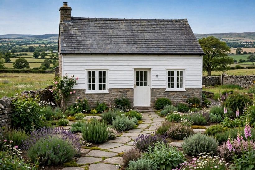
Every successful two-tone scheme has a leader. The main colour should dominate the walls, so that the house reads as one colour first and two colours second. When the split creeps toward equal halves, the facade can feel divided, as though two different houses were joined at the middle. A generous main colour, with the second colour confined to trim, gables, or a single storey, keeps the building whole while still giving it rhythm and interest.
Proportion also shapes how formal or relaxed a house feels. A pale main colour with a narrow band of deep trim feels light and welcoming, and suits cottages and village houses well. A deeper main colour with pale trim feels more composed and architectural, and can suit larger homes with strong rooflines. Neither approach is better in itself; the question is which mood suits the building and its neighbours. A house that sits among pale cottages will usually feel more at home in a pale-led scheme, while a house with bold masonry may welcome a deeper leading colour that answers its weight.
It is worth deciding the leading colour before falling in love with any single shade. Collect the colours that appeal, then ask which one could happily cover most of the house through every season, in bright sun and in grey winter light alike. The supporting colour can afford to be bolder, because it appears in smaller doses, but the leader must be liveable at scale. This is also the moment to look at the fixed elements of the house, such as stone, brick, and roofing, since those tones will share the facade whether they are chosen or not, and the leading colour should sit comfortably beside them.
3. Pairing by Contrast: Soft, Medium and Deep
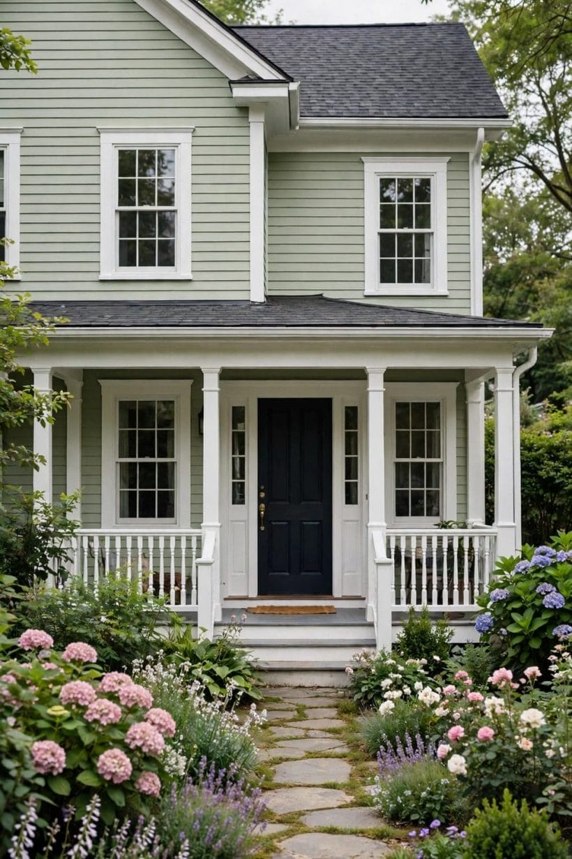
Contrast is the engine of a two-tone scheme, and it can be tuned like volume. A soft contrast pairs colours that sit close together in lightness, such as warm cream with soft white, or pale sage with gentle grey. The effect is subtle and serene, and it suits houses where the architecture itself provides the interest, or where the setting is already busy with planting and landscape. Soft contrast rarely startles, but it can also fade into vagueness if the two colours are too alike, so the difference should still be visible from the pavement.
A medium contrast pairs a light colour with a clearly deeper partner, such as soft white with dusty blue, or warm cream with sage green. This is the most forgiving range for most homes, because the second colour is distinct enough to define the trim and gables without dominating the facade. Medium contrast gives a house presence from the street while keeping it friendly, and it photographs well in varied light. Many of the most admired two-tone houses live in this middle range, where the pairing feels intentional but never forced.
A deep contrast pairs a pale colour with a very dark partner, such as soft white with charcoal, or cream with deep navy. The result is dramatic and crisp, and it can make the shape of a house read beautifully against sky and garden. Deep contrast also demands care, because dark trim in large amounts can feel heavy, and dark walls can make a small house feel smaller. Used as trim, gables, or a lower storey, however, a deep tone anchors the building and gives pale walls a handsome frame. The safest deep-contrast schemes keep the dark colour disciplined, appearing where the architecture asks for emphasis and nowhere else.
4. Warm and Cool Pairings That Feel Settled
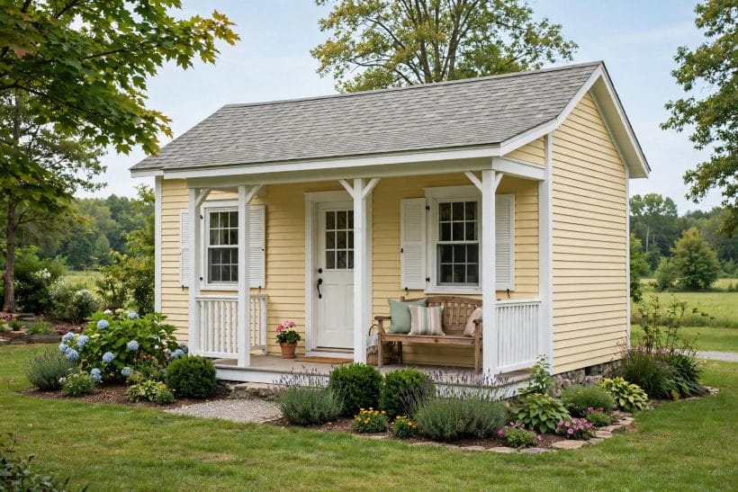
Colour temperature matters as much as lightness. Warm colours, such as cream, butter yellow, warm taupe, and soft terracotta, feel welcoming and sunlit, and they flatter gardens, timber, and brick. Cool colours, such as sage green, dusty blue, soft grey, and deep navy, feel calm and composed, and they sit beautifully against green planting and grey stone. A pairing that mixes warm and cool tones can be lovely, but it needs a bridge: a shared softness, a similar depth, or a neutral trim that lets both sides belong to the same house.
Warm-led schemes often suit cottages and traditional homes. Cream walls with warm stone or terracotta accents feel rooted and generous, while butter yellow with white trim feels cheerful without becoming loud. These schemes glow in morning and evening light, and they pair naturally with wooden porches and planted gardens. The risk with warm pairings is excess heat, where too many warm tones make the facade feel heavy in summer sun, so a cool or neutral note in the trim or roof can restore balance.
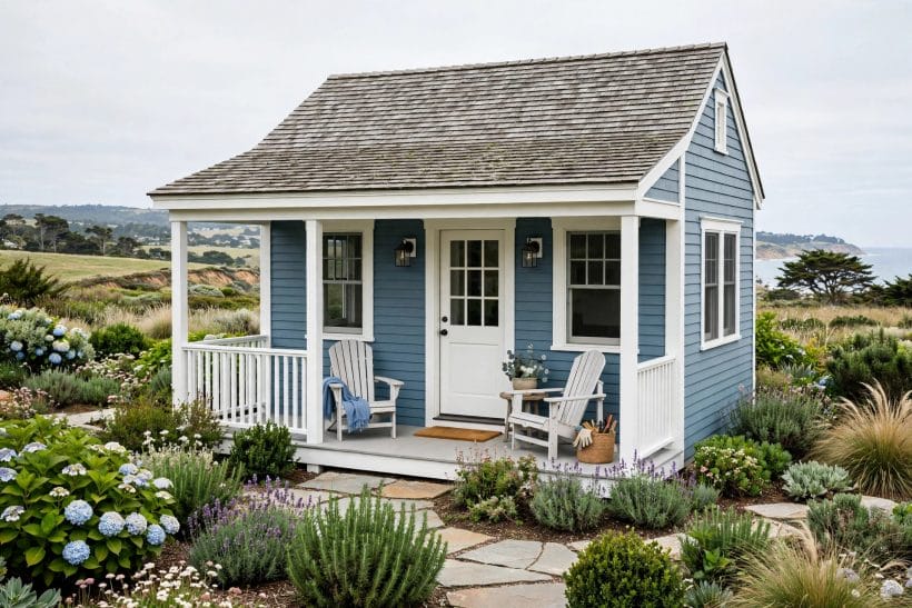
Cool-led schemes often suit coastal, modern, and woodland settings. Dusty blue with white trim feels fresh and airy, sage green with cream trim feels quiet and natural, and soft grey with charcoal trim feels tailored and calm. These pairings stay composed in bright light and hold their character in overcast weather, which makes them dependable choices in changeable climates. The risk here is chill, where a very cool pairing can feel distant, so a warm wooden door, warm planting, or warm-toned masonry nearby can soften the impression without adding another wall colour.
5. Using Trim to Sharpen the Whole House
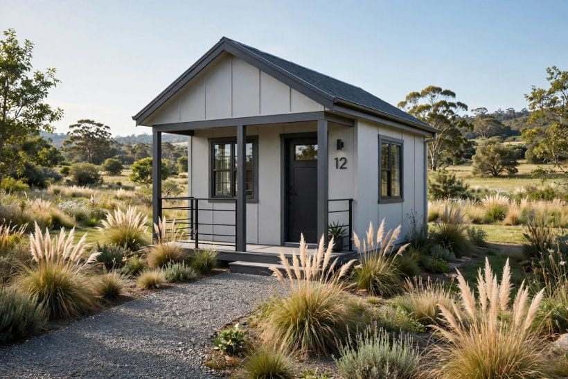
Trim is where a two-tone scheme earns its keep. Window frames, corner boards, porch posts, and eaves are the lines of the house, and colouring them in the second tone is like drawing the building with a steady hand. White trim on a coloured wall is the classic choice, and it works because it is clean, bright, and honest: it says where the openings are and lets the wall colour breathe. Dark trim on a pale wall does the opposite job with equal grace, giving the house a tailored outline that reads well from a distance.
The width and consistency of the trim matter. Trim that is generous and continuous around every window feels deliberate, while trim that appears on some windows and not others can feel accidental. It is usually wiser to treat all openings alike, so the second colour forms a rhythm across the facade rather than a series of surprises. The same logic applies to the porch: posts, rails, and beams in the trim colour tie the entrance to the rest of the house, while a porch painted in an unrelated shade can detach the entrance from the building it serves.
Trim also offers a gentle way to test a bolder pairing. Because trim covers a modest area, a deeper or more vivid second colour feels less risky there than across a whole wall, and it can be the place where a scheme gains its character. A sage house with cream trim feels soft, while the same house with charcoal trim feels crisp, and the wall colour has not changed at all. When in doubt, let the trim be the bolder voice and the walls the calmer one, since that balance flatters most houses and is forgiving in varied light.
6. Roofs, Stone and Brick as the Second Tone
Not every second tone needs to come from a paint tin. Many houses already carry a second tone in their roof, their stone, or their brick, and a thoughtful scheme works with those materials rather than competing against them. A warm grey stone lower storey beside white upper walls, for example, is a two-tone scheme in itself, and it needs only a quiet trim colour to complete it. Similarly, red brick beside cream walls gives a house a natural two-tone character that has lasted for generations, because the materials themselves supply the contrast.
The roof deserves the first look, since it crowns the whole building and its tone will sit beside the wall colours in every view. A brown roof asks for wall colours that sit comfortably with warm earth tones, and readers weighing that particular combination may enjoy the survey of exterior house colours with a brown roof for a fuller look at the warm side of the palette. A grey roof, by contrast, welcomes cooler wall colours, while a dark roof can anchor a pale scheme and give it definition. The wall colours should never fight the roof; they should answer it, either by echoing its warmth or by offering a calm counterpoint that still feels related.
Stone and brick also set limits that protect a scheme from going astray. A house with warm brick will usually feel more settled with warm or neutral wall colours, while a house with cool grey stone welcomes cooler companions. When the masonry is strong in character, the painted colours can afford to be quieter, letting the natural material do much of the talking. Conversely, a house with plain rendered walls has more freedom, since the painted pairing carries the whole facade and can be bolder. In both cases, the lesson is the same: begin with what cannot change, and choose the changeable colours to suit it.
7. Doors and Porches as the Accent Moment
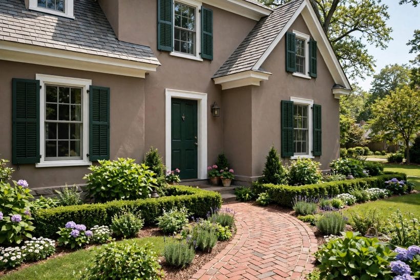
The front door is the natural accent of a two-tone scheme, and it is the one place where a slightly stronger note feels welcome. A deep navy door on cream walls, a dark green door on taupe walls, or a warm red door on sage walls each give visitors a clear destination, and the eye is grateful for the guidance. The door colour should still belong to the scheme, either by matching the trim family or by offering a warm counterpart that the rest of the facade can support, rather than introducing a stranger that appears nowhere else.
Porches deserve the same care, because they are the threshold between garden and home. A porch painted in the trim colour ties the entrance to the house, while porch details in the main wall colour keep the structure from feeling detached. Collections of farmhouse porch ideas show how often the most welcoming porches use this simple discipline, with seating, planting, and lighting doing the decorating while the colours stay quiet. Shutters, where a house has them, follow the same rule: they read best in the trim or door colour, forming a frame around the windows rather than a separate statement.
It is tempting to make the door the star of the show, but restraint serves the entrance better. A door that is too loud can pull attention away from the house as a whole, while a door that is simply deeper or warmer than its surroundings feels like a confident welcome. Planting beside the door, a clear path, and a porch light placed by a professional where wiring is involved all help the entrance feel cared for, and none of them require a new colour. The accent moment works precisely because it is a moment, not a competing scheme.
8. Small Houses, Cottages and Larger Homes
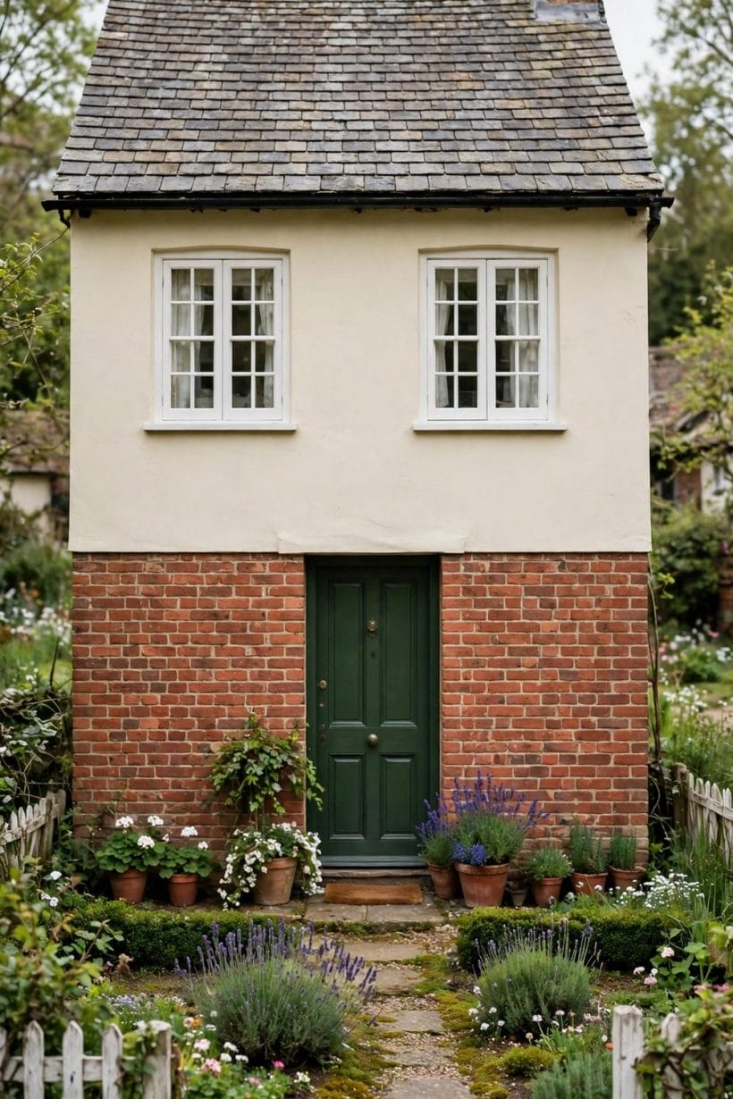
House size changes how a two-tone scheme behaves. On a small house or cottage, the pairing is seen all at once, so soft and medium contrasts usually feel most comfortable, and the trim should be neat rather than heavy. A pale main colour helps a small home feel open, while a second colour on the trim and porch gives it definition without weighing it down. The many examples of blue exterior homes and green exterior homes show how well gentle colour families suit compact facades, where the garden and the house are read together as one picture.
Larger homes can carry deeper contrasts and broader bands of second colour, because the facade has room to absorb them. A lower storey in a deeper tone, a gabled section in a contrasting shade, or a wing painted as a quiet companion to the main block can all give a large house structure and rhythm. The danger for larger homes is not boldness but drift, where different sections slowly acquire different treatments until the house feels assembled rather than designed. Holding the whole building to the same two colours, with the same trim discipline throughout, keeps even a generous facade feeling like one home.
Cottages with mixed materials sit between these cases, and they often need the least paint of all. Where stone, brick, or timber already provides the second tone, the painted colours can stay simple, perhaps a single wall colour with a crisp trim. The charm of simple country houses often lies in exactly this economy, where the materials lead and the paint follows. Whatever the size of the home, the test remains the same: stand back, look at the whole facade, and ask whether the two colours feel like partners in one design, or like neighbours who happen to share a wall.
9. Light, Season and Setting: Testing Before You Commit
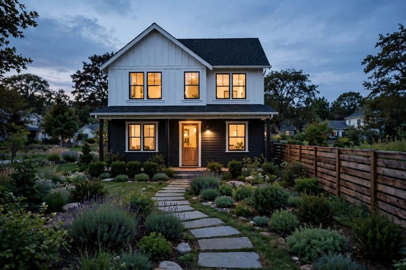
Exterior colour is never seen in isolation. The same pairing looks different in morning sun, in midday glare, in evening shade, and under a grey winter sky, and a scheme that glows in summer may feel flat in February. Setting matters just as much: a house among trees will borrow green reflections, a coastal house will meet bright reflected light, and a house on a pale street will sit beside neighbours whose colours form part of the view. Testing a pairing in varied light and across seasons, where possible, is therefore the most valuable step in the whole process, and it costs nothing but patience.
Large swatches viewed outdoors, held against the wall and seen from the pavement, tell the truth far better than small chips viewed indoors. Colours tend to read lighter outside than expected, and a shade that looks gentle on a small sample can feel much stronger across a whole wall. It helps to view the main colour and the second colour together, beside the roof and any stone or brick, rather than judging each shade alone. A pairing should be checked in daylight and in evening light, and against the planting that will surround it, since green foliage warms and cools the colours beside it in turn.
Neighbourhood character is the final setting to respect. A scheme does not need to copy its neighbours, and a street of varied houses can be delightful, but a pairing that ignores the prevailing mood of the road can feel restless even when its colours are beautiful in themselves. A quiet street of pale cottages welcomes a quiet scheme, while a street of varied Victorian homes may welcome a bolder one. Local guidance, where it applies, and the advice of experienced professionals should be sought before any work begins, particularly where a building is listed, protected, or subject to neighbourhood rules. Colour is personal, but a facade is also part of a shared view.
10. Mistakes That Make a Scheme Feel Unsettled
Most two-tone schemes fail for a handful of familiar reasons, and knowing them in advance makes them easy to avoid. The first is the equal split, where neither colour leads and the house feels divided rather than dressed. The second is the drifting third colour, where a door, a shutter, or a porch quietly introduces a shade that belongs to no other part of the house, until the facade holds three or four unrelated notes. The third is the ignored roof, where wall colours are chosen without reference to the roof above them, so the top of the house and the walls seem to belong to different buildings.
Other mistakes are subtler. One is choosing colours only from small samples viewed indoors, which flatters shades that will read very differently at full scale outdoors. Another is forgetting the seasons, so a scheme chosen in high summer feels cold or harsh in winter light. A further mistake is treating every elevation alike without considering aspect: a north-facing wall receives cooler, softer light than a sunlit front, and the same pairing can feel different on each side of the house. None of these mistakes reflects poor taste; they reflect decisions made too quickly, before the house, its light, and its setting have been properly considered.
The remedy for all of them is the same discipline this guide has followed throughout: one leading colour, one supporting colour, a trim that behaves consistently, a roof and masonry that are answered rather than ignored, and a door that accents rather than competes. Where the building work itself is concerned, from preparing surfaces to any structural, electrical, or weatherproofing questions, qualified professionals should be consulted, and their advice should shape the plan before colours are finalised. A scheme chosen slowly, tested in real light, and executed with proper help is far more likely to feel settled for years, rather than merely striking for a season.
Final Considerations
A two-tone exterior succeeds when it looks inevitable, as though the house could hardly have been coloured any other way. That feeling rarely comes from an exotic shade or a daring combination; it comes from a leading colour that suits the building, a supporting colour that defines its shape, and a consistent trim that ties the whole facade together. Warm or cool, soft or deep in contrast, the best schemes share the same quiet virtues: proportion, consistency, respect for roof and masonry, and a door that welcomes without competing.
For readers gathering two tone house color ideas, the practical path is therefore a calm one. Begin with the fixed tones of roof, stone, and brick, choose a leading colour that can live happily at scale, add a supporting colour that earns its place on trim, gables, or a lower storey, and test the pairing outdoors in varied light before committing. Among the broader surveys of brown exterior homes, the lesson is the same: the most enduring facades are rarely the loudest, and a house dressed in two well-chosen colours, with its structure and services left to qualified professionals, will reward its owners every time they come home.


0 Comments