

Purple is the wall colour people apologise for in advance — too bold, too girlish, too much. Then the light comes through a lilac wall at breakfast, or a plum wall closes around a lamplit bed like a curtain, and the apology is withdrawn.
These seventy-five bedroom ideas collect purple walls at every depth — lilac, lavender, mauve, plum and aubergine — with the bedding, furniture, flooring and lighting that let the colour carry a room built for rest.
1. Purple-Walled Bedrooms at a Glance
Scope first, because the bedroom colour lanes are each owned. This post is purple’s: the walls carry the colour, from the palest lilac wash to near-black aubergine. Its siblings keep their own walls — yellow bedroom ideas owns the sunny end, bedroom with black walls ideas the darkest neutral, and brown bedroom ideas the earthy register — while the pillar, bedroom ideas, holds the whole room. Style-specific rooms such as French country bedroom ideas are linked where purple crosses into their territory. Here, everything begins with the purple wall and what it does to light, sleep and mood.
One rule governs the whole colour family: purple is two colours wearing one name. Blue-leaning purples cool a room down and read calm, distant, morning-like; red-leaning purples warm it and read close, rich, evening-like. Every choice below — depth, bedding, metal, light — follows from deciding which purple you mean.
Purple also has the widest range of any wall colour, and the sections of this post are arranged along it deliberately: the pale washes of sections 2 and 3, the greyed middle register of section 4, the saturated depths of sections 5 and 7, the near-black of section 8, and the whispered grey-violet of section 9. Read in order, they are one colour at nine volumes. The practical consequence is that a purple bedroom is almost never a mistake of colour, only of calibration — the same hue that feels ethereal as lilac in a bright room turns brooding as plum in a dark one, and both are available in a single paint family by moving along the range. Choose the volume for the room’s light and hours, and the hue will behave.
Finish matters more with purple than with most colours, because the family’s depths exaggerate sheen: a satin finish on a plum wall shows every roller mark as a stripe of light, while flat matte swallows imperfections and lets the colour read as pure atmosphere. Pale purples are more forgiving but still look their best matte in daylight rooms. The trim decision travels with the finish — crisp white woodwork frames purple like a mount in a picture frame, while colour-drenched trim and ceiling (taken furthest in section 8’s evening rooms) dissolve the room’s edges entirely. Neither is a default; both are chosen per section below.
| Purple family | Character |
|---|---|
| Lilac and lavender | Pale, blue-leaning, daylight-friendly — the gentle entry |
| Mauve and dusty purple | Greyed and muted — the grown-up, goes-with-everything register |
| Plum | Red-leaning and rich — the lamplit, enveloping depth |
| Aubergine | Purple at the edge of black — drama kept for evenings |
| Accent or all-over | One wall for commitment-shy rooms; four walls for the full embrace |

2. Pale Lilac and Lavender All Over
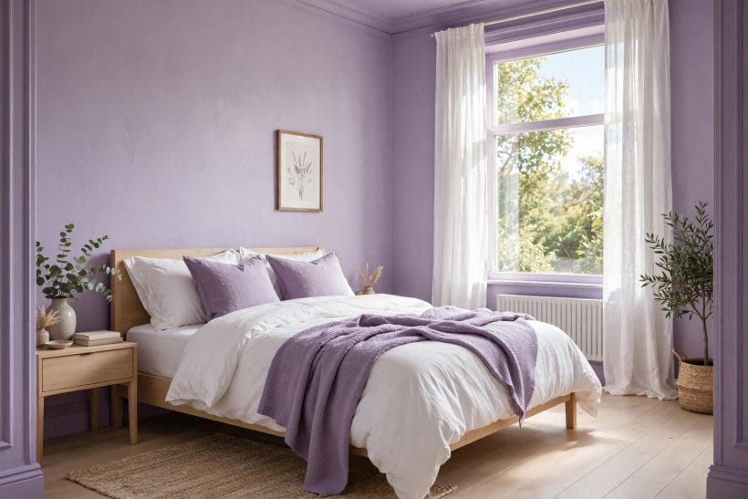
Gallery-1’s room is the gentle case for purple: lilac on every wall, white bedding, a lavender throw doing the colour’s deeper work. Pale purples behave like coloured neutrals — present in every glance, demanding in none — and they hold daylight beautifully, shifting from grey at dawn to rose by evening.
1. Lilac on four walls
Commit the pale colour to every wall and the room becomes a tinted atmosphere rather than a decorated box. At this depth, purple stops being an accent and starts being the light itself.
2. White bedding, always
Against lilac walls, plain white bedding is the classic balance: crisp, calm, and it keeps the purple from sweetening into nursery territory. The wall provides the colour; the bed provides the rest.
3. The deeper throw
One textile two shades deeper than the wall — a lavender throw, a violet cushion — gives pale walls their anchor. Without it, an all-pale room can float away; with it, the scheme has a floor.
4. Pale oak and light woods
Blond timber against lilac keeps the room in daylight register. Dark furniture would pull the same walls toward evening; pale wood is how lilac stays a morning colour.
5. Lavender in the north-facing room
Cool northern light greys most colours, but blue-leaning lavender is already at home in it. The walls read serene rather than cold — choose purple precisely where blue-grey paint would feel bleak.
6. Silver-grey partners
Soft greys in curtains, rugs and upholstery sit inside lilac’s family and extend it. The pairing is tone-on-tone: quiet, layered, and almost impossible to get wrong.
7. A single green plant
Green is purple’s complement, and one plant against lilac walls vibrates pleasantly — the oldest colour trick in the book, and the cheapest way to make pale purple look intentional.
8. Lilac for the guest room
Guests read pale purple as cared-for: softer than white, calmer than colour. A lilac guest room with white bedding and one deep throw is hospitality in paint form.
9. Matte, always matte
Pale purple in a flat matte finish reads as plaster and atmosphere; in sheen it reads as bathroom tile. The paler the colour, the more the finish decides its character.
3. Lilac with Natural Texture: Rattan, Linen and Cane

The pin pairs lilac walls with a rattan headboard and unbleached linen — purple domesticated by texture. Natural materials keep a sweet colour honest: cane, jute, raw cotton and pale timber supply the earth that purple, left alone, can lack.
10. The rattan headboard
Woven cane against lilac is the pairing of the moment for a reason: the grid of the weave breaks the wall’s flat colour, and the honey tone warms purple’s cool lean.
11. Linen in oatmeal and flax
Unbleached linen bedding brings purple down to earth. The slub and wrinkle of real linen read as texture at the exact distance the wall reads as colour — each flatters the other.
12. Jute and sisal underfoot
A natural-fibre rug grounds a lilac room the way soil grounds a flower bed. Purple above, straw below: the scheme is a garden translated indoors.
13. Raw timber furniture
Unstained, unoiled-looking wood — bedside tables, a simple bench — keeps pale purple from feeling precious. The rougher the timber, the more grown-up the purple.
14. Baskets as storage
Woven baskets for blankets and clutter continue the texture story into storage. In a lilac room, plastic boxes shout; baskets murmur.
15. Dried grasses in a vase
Pampas, dried lavender or bunny tails on the dresser echo the wall colour in plant form. Dried stems ask for no water and give the room its softest silhouette.
16. A cane pendant shade
Hang the texture overhead: a woven pendant throws patterned light across lilac walls at night, and the walls return the compliment by tinting the shadows violet.
17. The boho register
Layer the textures — rattan, linen, jute, a patterned throw — and lilac becomes the calm background of a bohemian room rather than its statement. Purple as peacekeeper.
4. Muted Mauve and Dusty Purple: The Grown-Up Register

Gallery-2’s mauve wall, cane headboard and worn wooden dresser show purple’s most versatile register: greyed, dusty, halfway to neutral. Mauve forgives — it sits with old furniture, warm metals and imperfect light, and it never once looks like a child’s room.
18. Mauve as a neutral
Treat dusty purple the way you would treat greige: as the background everything else stands on. It carries pattern, timber and metal without steering any of them.
19. Mauve with aged brass
Unlacquered brass and mauve share a tarnished warmth. Lamps, handles and frames in aged metal look inherited against dusty purple, and inherited is mauve’s favourite mood.
20. The worn wooden dresser
Furniture with a past — a scratched dresser, a chair with faded upholstery — looks deliberate against mauve walls. The colour dignifies wear instead of exposing it.
21. Dusty purple in period rooms
Older houses with cornices, picture rails and deep skirting take dusty purple naturally; it is a heritage-adjacent colour that flatters old plaster and tall ceilings.
22. Mauve and cream, not white
Swap stark white bedding for cream and ivory in a mauve room. The softer whites sit inside the colour’s warmth instead of arguing with it from outside.
23. Patterned cushions in the same dust
Florals and checks in dusty rose, faded violet and sage let a mauve room carry pattern without noise — every print pulled from the wall’s own muted family.
24. The reading chair corner
Mauve is a thinking colour; give it a chair, a lamp and a small table in the corner. Dusty purple rewards the room’s quietest function with its calmest wall.
25. Mauve for the principal bedroom
Where lilac can feel young, mauve feels settled — the register couples land on when the bedroom needs to be both romantic and serious. It is purple with its sleeves rolled down.
5. Deep Plum, Done Densely

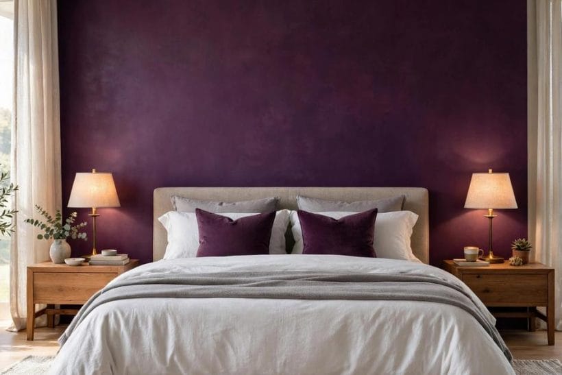
Gallery-3 moves in close on the plum wall itself — the colour as texture, lamplight pooling on it, grey linen at its foot. Deep plum is not an accent; it is an atmosphere decision, and it succeeds when the room commits: soft textiles, warm light, nothing apologetic.
26. The single plum wall behind the bed
The classic deployment: one deep wall as the bed’s backdrop, the other walls pale. The bed gains a proscenium, the room keeps its daylight, and the commitment stays reversible.
27. Plum on every wall
Four plum walls make a cocoon that small bedrooms wear surprisingly well — the colour advances, the corners vanish, and the room feels held rather than shrunk. North-facing rooms warm up dramatically.
28. Grey linen against plum
Cool grey bedding against warm plum is the depth pairing: each makes the other look richer. It is the combination in gallery-3, and the easiest deep-purple scheme to live with.
29. Brass lamps, low and warm
Deep purple eats light; feed it warm pools at bedside height. Brass lamps do double duty — their metal is plum’s oldest friend and their glow is its evening makeup.
30. Plum with black accents
Black frames, a black lamp base, one black cushion — small doses of true black sharpen plum and stop it sliding toward brown. The wall stays purple because the black takes the darkness role.
31. The velvet headboard
A velvet headboard in the wall’s own family deepens the bed wall into a single plush surface. Different shade, same hue: the tonal layering is what makes deep rooms feel designed.
32. Plum in the small bedroom
Small rooms are told to stay pale; plum disagrees, and wins. A small plum bedroom with good lamps feels like a jewel box — size stops being the room’s defining fact.
33. Keep the ceiling pale
With plum walls, a white or barely tinted ceiling keeps the room’s height and its morning. The exception (section 8) is for rooms that want to be caves on purpose.
6. Soft Purple with Pattern, Print and a Desk

Gallery-4’s room works for a living: lilac walls, floral bedding, a desk under the window. Soft purple is the pattern-friendly end of the family — it hosts florals, stripes and checks without fighting them, and it flatters the bedroom that must also be an office.
34. Floral bedding on lilac
A floral duvet whose print borrows the wall colour is the cottage scheme perfected: the wall is the garden’s sky, the bed is the flower bed. Keep the print’s background pale.
35. Stripes to lengthen
Striped bedding or a striped throw pulls a lilac room’s proportions — vertical energy from horizontal furniture. Stripes are the pattern purple wears to work.
36. The desk against purple
A wooden desk against a soft purple wall is the work-from-bedroom corner at its calmest; purple’s blue lean reads as concentration in daylight. Face the window, keep the wall behind the screen.
37. Botanical prints on the wall
Framed botanical or lavender prints on lilac walls continue the garden logic quietly. Matching the art’s subject to the colour’s plant namesakes is a wink, not a theme.
38. Checks and gingham
Small checks in cushions or a throw give soft purple a country rhythm. Gingham against lilac is springtime made permanent — best kept to two pieces, not the whole room.
39. Pattern on pattern, one family
Floral bed, striped cushion, checked throw — the rule that lets them coexist is one colour family (the wall’s) and one pale ground shared by all three prints.
40. A patterned rug under soft walls
When walls are plain lilac, the floor can carry the pattern: a faded traditional rug in rose and violet pulls the whole room together and hides a multitude of floor sins.
41. Children’s rooms that grow
Soft lilac with changeable prints suits a child’s room that must last: swap the bedding’s pattern as tastes change, keep the wall. Purple at this depth serves age six and sixteen alike.
7. Glamorous Plum: Velvet, Brass and Blush

Gallery-5 is purple at full ceremony: plum walls, a buttoned velvet headboard in the same hue, blush cushions, brass lamps burning at both sides. This is the hotel register — purple as luxury — and it runs on three materials: velvet, brass and silk-soft light.
42. The tufted headboard in the wall’s hue
Upholstery matched to the wall turns the bed into architecture. The tufting gives the single colour a landscape of shadow and highlight to play across.
43. Blush as the release valve
Pink-leaning cushions and throws lighten plum without leaving its family — blush is plum’s own highlight colour. Two blush pieces are enough; three is a theme.
44. Brass everywhere it can gleam
Lamps, frames, handles, a tray: repeat brass until it becomes the room’s jewellery. Against plum, brass reads as candlelight made permanent.
45. Mirrors to multiply the lamps
A mirror above the dresser doubles every flame and lamp in a plum room. Deep colours are light-hungry; mirrors are how they feed without more fittings.
46. The chaise or slipper chair
A small upholstered chair in a paler violet gives the glamorous bedroom its boudoir note — a place for robes, books and sitting that is not the bed.
47. Dark floors under plum
Deep-stained floorboards ground the ceremony: plum walls, dark floor, pale bed — the room stands on shadow and sleeps on light. Rugs in pale wool complete the sandwich.
48. Crystal and glass accents
A glass lamp base, a crystal decanter on the dresser, mirrored trays — hard sparkle against soft velvet is the glamour equation. One or two pieces; the velvet does the rest.
49. Scent and ritual
The glamorous register finishes in ritual: a candle, a carafe, folded throws. Plum rooms ask to be entered slowly — dress the surfaces for the evening, not the photograph.
8. Aubergine After Dark

The pin shows aubergine in its natural hour: night outside the tall window, lamps lit, the walls gone nearly black and the bed — grey, blush, lamplight — glowing in the middle of the dark. Aubergine is purple’s evening-only register, chosen by rooms that are mostly used after sunset.
50. Walls at the edge of black
Aubergine gives a dark room colour instead of mere darkness: in daylight it declares purple; at night it performs as black with a memory of wine. For more on the dark-wall decision itself, the black-walls sibling linked in section 1 is the companion read.
51. Layered lamplight or nothing
An aubergine room lit by one ceiling light is a cave with a bulb. Two bedside lamps, a third light at the dresser, all warm — the layers are the lighting design.
52. Grey bedding in the dark
Charcoal and slate bedding inside aubergine walls makes a monochrome of the night; a single blush throw is the room’s one warm word. Restraint is the luxury here.
53. The velvet curtain wall
Floor-to-ceiling curtains in aubergine’s family behind or beside the bed extend the walls in cloth. When drawn, the room’s fourth wall becomes fabric and the dark is total.
54. Gold-framed art as windows
In a room this dark, art is illumination: pale prints in gold frames read as small lit windows on the walls. Hang two, not a gallery — darkness needs its emptiness.
55. A pale rug as the room’s moon
One light rug beside the bed gives the eye its landing place and the feet their morning kindness. In aubergine rooms, the rug does the ceiling’s usual job of relief.
56. The dressing-room mood
Aubergine flatters clothes, jewellery and mirrors — the bedroom-dressing room hybrid wears it best. Keep a proper mirror light; the walls will not help you judge colours.
57. Small windows, no problem
Rooms with little daylight are told to compensate with pale paint. Aubergine takes the other path: accept the dark, furnish it richly, and let lamps do what windows couldn’t.
58. The weekend room
A guest room or principal suite used mostly at night can carry aubergine that a dawn-facing family bedroom might tire of. Match the colour’s depth to the hours the room is actually lived in.
59. Test at night, not in the shop
Deep purples are judged by lamplight or not at all. Paint the sample board, live with it after dark for two evenings — aubergine’s true colour only appears when the lamps are on. (The paint-colour mechanics are covered generally in tiny house interior paint colours.)
9. Grey-Lavender: The Quiet End of Purple

Gallery-6’s room — lavender-grey walls, a low platform bed, white bedding, nothing else competing — is purple whispered. Grey-lavender is for the purple-curious and the calm-committed: a colour that reads as grey in flat light and violet in kind light, never once raising its voice.
60. The colour that changes its mind
Grey-lavender’s shiftiness is its charm: grey at noon, violet at dusk. Rooms that bore easily should choose colours that move, and this one moves daily.
61. Low furniture, low colour
A platform bed and low bedside tables match the colour’s humility. The whole room stays near the floor and near silence — a rest machine with no sharp edges.
62. White bedding, grey throw
The two neutrals of the family dress the bed: white for freshness, grey for depth, and the wall quietly between them in both hue and value.
63. The minimalist’s purple
For rooms of few objects, grey-lavender supplies the interest that minimalism usually borrows from texture. The wall itself is the decoration; everything else can be plain.
64. Scandi violet
Pale timber, white textiles, one grey-violet wall scheme — the Scandinavian version of purple, all restraint and daylight. It pairs with the style’s usual suspects without a single change of furniture.
65. Grey-lavender for renters
The quietest purple is the easiest to paint back and the least likely to be argued with. Renters wanting colour without commitment should start at this end of the family.
66. Works with every metal
Chrome, brass, black, nickel — grey-lavender’s neutrality accepts them all, which makes it the purple for rooms whose fittings are already fixed and not up for negotiation.
67. The meditation-room bedroom
Bedrooms that double as yoga or meditation space want exactly this: a wall that recedes, a colour that breathes slowly, nothing that performs. Grey-lavender is the background of backgrounds.
10. Choosing, Testing and Living With Purple
The last word belongs to process, because purple punishes the hasty more than most colours: it darkens as it dries, shifts with the light’s temperature, and photographs dishonestly. Work through these checks and the colour you choose is the colour you keep.
Two continuities decide whether a finished purple room feels designed or merely painted. The first is flooring: pale timber lightens every register of purple and suits the daylight sections, while dark floors deepen the room toward the evening registers — changing the floor’s tone moves the same wall a full section along this post’s range. The second is the window treatment: curtains in the wall’s own family extend the colour and soften its edges, curtains in a pale neutral cut the colour off at the window and frame it like a picture. Decide both before the paint is bought, because walls are chosen in a day and lived with alongside floors and curtains for years.
68. Decide blue-lean or red-lean first
Before depth, decide direction. Blue-leaning purples (lilac, lavender, violet) cool and calm; red-leaning (plum, mauve, aubergine) warm and enclose. The lean matters more than the shade name.
69. Sample on the wall, large
Paint the sample big — a full square of wall, not a swatch — and live with it through a full day of light changes. Purple’s shift between morning and lamplight is the largest in the paint box.
70. Judge by the room’s real hours
A bedroom used at dawn and dusk should be chosen at dawn and dusk. The midday colour of a bedroom wall is nearly irrelevant; test when the room is actually occupied.
71. Match depth to room size honestly
Pale purples open small rooms; deep purples cocoon them. Both are legitimate in small spaces — the question is whether the room should feel larger or more held, and that is taste, not error.
72. Keep textiles paler than the wall
The reliable scheme at any depth: walls deepest, bedding paler, accents deepest in small doses. Reverse it — dark bedding on dark walls — only in the evening rooms of section 8.
73. Mind the undertones of whites
Blue-whites sharpen lilac; creamy whites warm plum. The wrong white beside purple looks dirty rather than fresh, so test the trim and bedding whites against the wall, not in isolation.
74. One purple room per home is a statement; two is a theme
Purple’s memorability is its power — a single purple bedroom becomes the house’s signature. A second purple room should change register (lilac after plum) or the signature becomes a slogan.
75. When in doubt, go one shade deeper
Paint dries lighter on a big wall than the heart expects, and pale colours disappoint more often than deep ones surprise. If the choice stands between two purples, take the deeper — the room will thank you at lamplight.
Final Considerations
Choose the lean first (blue for calm, red for warmth), the depth second (pale for daylight rooms, deep for evening ones), and test on the wall through a full day before committing. Dress the bed paler than the walls, warm the light for anything deeper than lilac, and let one texture — rattan, velvet, linen — do the talking. Purple asks for decisiveness and repays it: no other wall colour makes a bedroom feel so deliberately chosen.



0 Comments