

Choosing between a 1/8 inch and a 1/16 inch grout line sounds like a tiny detail, yet it changes how a whole wall of subway tile looks and how forgiving the job feels.
This guide explains the grout line size for 3×6 subway tile in plain questions and answers, so you can match the line to your tiles, your layout and your experience.
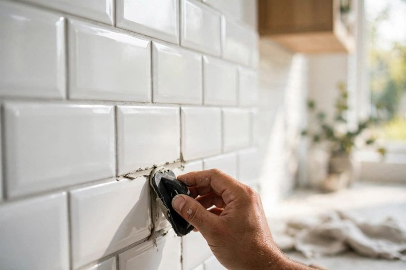
1. What Is the Real Difference Between 1/8 and 1/16 Inch?
| Question | Answer |
|---|---|
| Which line is narrower? | 1/16 inch is half the width of 1/8 inch, so tiles sit visibly closer together. |
| What look does 1/16 inch give? | A tighter, more seamless and contemporary look, where the tile surface dominates. |
| What look does 1/8 inch give? | A clearer grid and a more traditional subway feel, where the pattern reads strongly. |
| Which is easier for a first tiling job? | For most people, 1/8 inch, because it leaves more room to absorb small variations. |
| Which suits uneven or handmade-look tiles? | Generally 1/8 inch, because wavy edges need extra room so they do not clash or pinch. |
| What matters more than the number itself? | The tile edge, the flatness of the wall and consistency — a steady line beats a tight, wobbly one. |
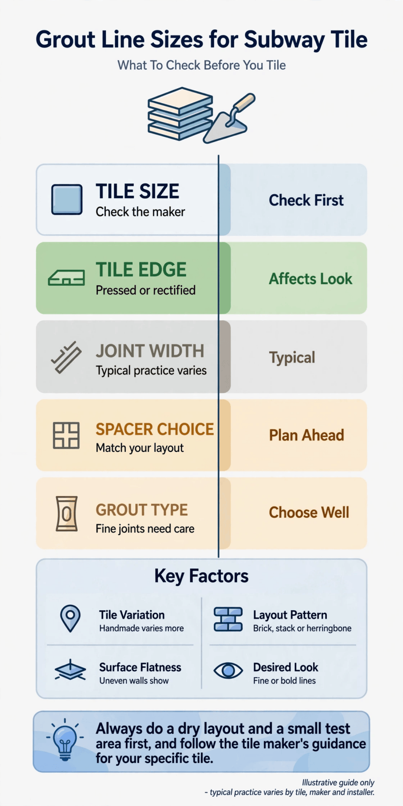
At a glance: how the two grout line widths compare for look, tolerance and tile choice.
Stand back from a finished wall and the difference is easier to feel than to measure. With a 1/16 inch line, the tiles merge into a calmer, more continuous surface and the eye reads colour and sheen first. With a 1/8 inch line, the grid itself becomes part of the design: each brick shape is outlined more clearly, which suits the classic subway look many people picture in kitchens and bathrooms.
Neither size is better in the abstract. The narrower line asks more of the tiles and the wall beneath them, because there is less grout width to hide small differences. The wider line is more forgiving and often more practical, even though it can look slightly more rustic. The rest of this guide works through the questions that actually decide it: tile edges, size variation, pattern, contrast, tolerance and testing.
2. Start With the Tile Edge: Rectified or Soft?

The single biggest factor is the edge of the tile itself. Tiles with crisp, precisely finished edges — often described as rectified — are made to sit close together evenly, so a narrow line can stay consistent from tile to tile. Tiles with softer, cushioned or slightly rounded edges behave differently: the visible face is smaller than the body, so even a tight spacer setting produces a wider-looking groove once the edges fall away.
Look at a row of your tiles dry, on a flat surface, before deciding. Push them together and watch whether the faces meet evenly or rock and vary. If the edges are pillow-like, a 1/16 inch setting can look pinched in places and uneven overall, while 1/8 inch gives the soft profile room to read as intentional. When you are planning the room as a whole, the tiling chapters in bathroom interior design ideas for tiny houses are a useful reminder to choose finishes as a set, not one product at a time.
3. How Size Variation Changes the Answer
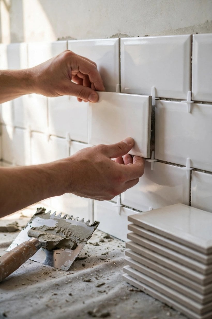
No batch of tiles is perfectly identical, but some vary more than others, and variation is the quiet enemy of narrow grout lines. If one tile is a fraction longer than the next, a wide line can absorb that difference gradually, spread across the row. A narrow line cannot: the mismatch shows quickly as a line that wanders, narrows or suddenly steps, and in a running bond pattern the vertical joints begin to drift out of their expected rhythm.
Measure several tiles from different boxes before you commit. Lay out a small grid using your intended spacer and look honestly at whether the joints stay even. Handmade-look tiles, with deliberately wavy faces and irregular edges, almost always belong with the wider option, because their charm depends on a little breathing room. Choosing the grout line size for 3×6 subway tile is really choosing how much variation your design can absorb, and it is far better to discover your batch’s character on a tabletop than halfway up a wall.
4. What Each Line Does to the Pattern
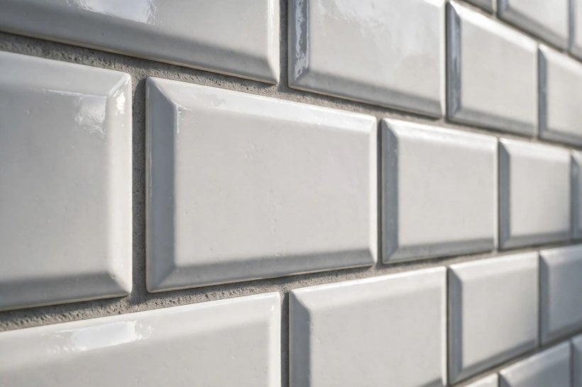
Subway tile is rarely laid in a plain stack; running bond, herringbone, vertical stacks and basket-style layouts all interact with grout width differently. In running bond, a wider line emphasises the brickwork rhythm and can feel traditional or farmhouse in character, while a narrow line modernises the same pattern and lets a coloured tile carry the wall. In herringbone, the many short joints become a strong visual texture, so the line width changes the busyness of the whole surface.
Think about corners and cuts too. Patterns that rely on precise diagonal meeting points are less forgiving at narrow widths, because every cut edge joins the pattern at a visible angle. If you love a complex layout but your tiles are slightly irregular, the wider line is usually the calmer choice. The layout-first approach in tiny house kitchen design applies neatly here: settle the pattern, then choose the line that lets that pattern look deliberate from across the room, not just correct up close.
5. Grout Colour Can Matter as Much as Width
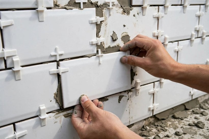
Two walls with identical line widths can look completely different depending on grout colour. A contrasting grout — dark lines on white tile, for example — draws the full grid, so a 1/8 inch line looks bold and graphic while even a 1/16 line still reads as a fine, deliberate mesh. A closely matched grout softens everything: a wider line can nearly disappear into the tile colour, giving a calmer surface than the width alone would suggest.
Use this when you are torn between the two sizes. If you want a quiet, continuous look but your tiles need the forgiveness of 1/8 inch, a colour-matched grout gets you much of the effect without forcing a narrow joint. If you want crisp definition with easy-going installation, pair 1/8 inch with a gentle contrast. Judge samples in your own room’s light, morning and evening, because grout colour shifts noticeably between daylight and warm artificial light, and it generally dries lighter than it looks when mixed and freshly applied. Splashbacks in compact kitchens, like those in kitchen designs for tiny houses and small spaces, often suit a matched grout, because the tiled area sits close to eye level and a quiet grid keeps small rooms calm.
6. Walls Are Rarely Flat: Tolerance Explained Simply
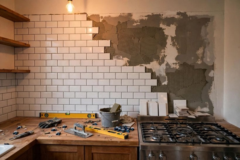
Tolerance is the amount of imperfection a joint can hide, and it is where narrow lines catch people out. Walls bow, corners drift and adhesive beds vary slightly, so tiles rarely sit in a perfect plane. A wider grout line lets you make tiny, gradual adjustments tile by tile, steering a row back to level without any single joint looking wrong. A narrow line demands the wall — and your setting out — be accurate from the first row, because each correction has nowhere to go.
Check your wall with the longest straight edge you have and fix real humps or hollows before tiling rather than hoping grout will hide them; it will not hide a wavy wall at either width. Beginners often enjoy the narrower look in photographs, then find the wider line far less stressful in practice. There is no shame in that trade: a consistent 1/8 inch wall looks more professional than a wandering 1/16 inch one, every time.
7. Spacers, Wedges and Keeping Lines Consistent
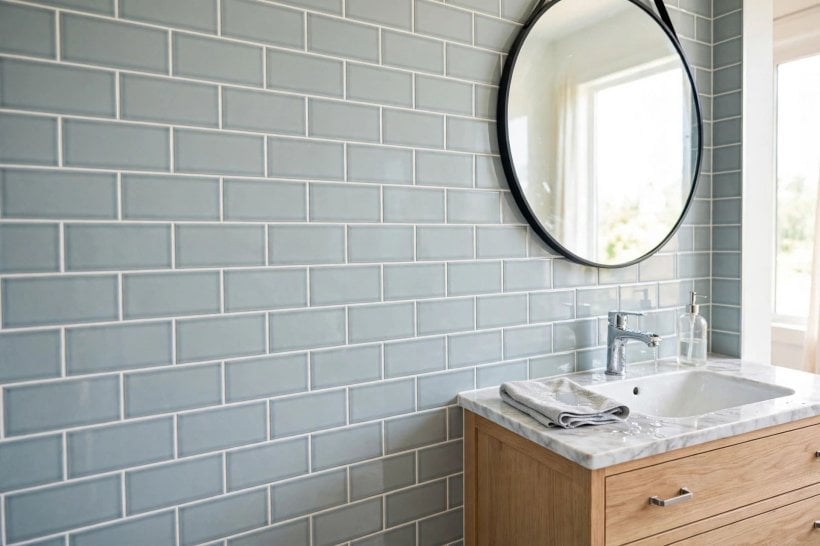
Whichever width you choose, consistency comes from your spacing system, not eyesight alone. Cross or T-shaped spacers sized to your chosen joint make setting out repeatable, while small wedges are handy for fine adjustments on rows that want to drift. Some tilers prefer leave-in levelling aids on larger areas; others remove spacers as they go. Follow the guidance supplied with the products you are using, and keep the approach the same across the whole wall so the texture stays even.
Work in manageable sections, check every few rows with a level and a straight look along the joints, and clean stray adhesive from the joints as you go rather than digging it out later. In small rooms like those in tiny house and small-space interior design, the eye is close to the work, which makes small inconsistencies easier to spot — another reason steady spacing beats an ambitious width. Consistent joints also make the grouting stage itself faster and neater, because every line takes grout in the same way.
8. Grout Choice for Narrower Joints
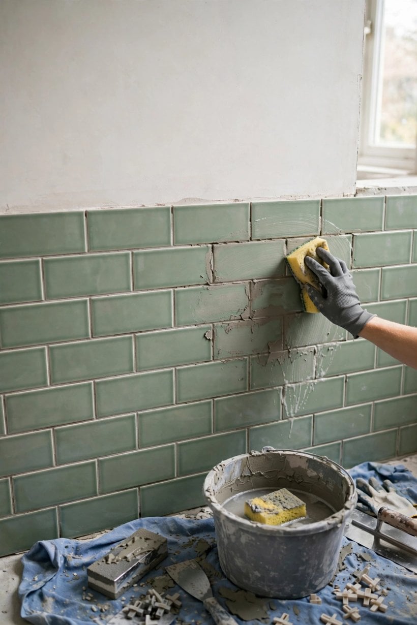
Grout products differ, and joint width is one of the things their makers design for. As a general principle, finer grouts are made to flow into and fill narrow joints fully, while coarser, sanded mixes are intended for wider joints where extra body is helpful. Putting a coarse mix into a very narrow joint can leave it weak and patchy, because the material cannot pack in properly; a very fine mix in a wide joint may shrink or crack as it cures.
Treat the product’s own stated joint range as the authority for your job — packaging and manufacturer guidance exist precisely because there is no single rule that fits every grout, tile and setting. Read it before you buy, match the grout to your chosen width, and mix and apply it as directed rather than improvising consistency at the bucket. If you are tiling a shower or a splash zone, also confirm the product suits wet areas and follow its curing guidance before the wall gets used. Good grout in the right joint disappears into the job; the wrong pairing shows for years.
9. Walls, Splashbacks, Floors and Movement

Most 3×6 subway tiling happens on walls and splashbacks, where either width can work when the tiles and setting out suit it. Floors are a different conversation: they take foot traffic, furniture loads and more temperature and movement stress, and grout joints play a part in how a tiled floor handles all of that. If you are considering small-format tiles underfoot, take product-specific advice for that exact use rather than copying a wall decision, and expect the recommended joint to be driven by the floor products involved.
Movement matters everywhere. Buildings shift subtly, timber moves with the seasons and heated areas expand and contract, which is why perimeter joints and internal corners are normally finished with a flexible sealant rather than hard grout — a detail worth confirming with your installer or product guidance. Planning those soft joints into the design from the start keeps them looking intentional. For whole-room context, ideas for bathrooms in tiny houses show how tiling decisions sit alongside the rest of a small, hard-working room.
10. Decide With a Dry-Laid Sample, Not a Photograph
The most reliable step in this whole guide costs nothing: build a small sample. Lay a patch of your actual tiles on a board or a cleared table, using spacers at 1/16 inch on one half and 1/8 inch on the other, then prop it where the tiling will go and live with it for a day. You will see how your tiles’ edges behave, how your light treats the grid, and which side your eye prefers from normal viewing distance rather than arm’s length.
If you can, press a little grout — or even a removable filler in a similar tone — into a few joints on each half, because unfilled joints always look darker and deeper than finished ones. Take a photo from the doorway too; the camera is brutally honest about wandering lines. This small rehearsal settles arguments that measurements cannot, and it converts an abstract choice into something you have already seen succeed. Tilers do versions of this on real jobs for a reason: five minutes of sampling protects days of finished work. The sample-first habit is the same one that runs through how to build your own tiny house: test small, learn cheaply, then commit with confidence.
Final Considerations
So, 1/8 or 1/16? Choose 1/16 inch when your tiles have crisp, consistent edges, your walls are genuinely flat, and you want a tight, modern surface — and choose 1/8 inch when tiles are soft-edged or handmade in character, when the wall or your experience argues for tolerance, or when you want the classic subway grid to show. Let grout colour refine the effect, match the grout product to the joint width its maker intends, and always let the manufacturer’s guidance for your specific tiles and grout have the final word over any general guide, including this one.
Above all, value consistency over tightness. A calm, even line at the slightly wider size will look right for the life of the room, while a narrow line that pinches and wanders will draw your eye daily. Dry-lay a sample, set out carefully, keep your spacing system steady, and the size you choose will look like the obvious one all along.


0 Comments