

Plum is the colour people admire in other houses and hesitate over in their own — too rich to be safe, too beautiful to drop. That hesitation is unnecessary. Plum is not a difficult colour; it is a decisive one. Treated as what it is — a deep purple warmed with red — and given the right partners, it flatters more rooms, woods and metals than colours half as bold.
This guide works with plum as a colour only: its undertones, its behaviour in daylight and lamplight, and the pairings that make it read soft, rich, calm, warm or bold. No named paints, no codes, no figures — just the colour and how to live with it.
1. Plum at a Glance
Scope first. This post owns one colour: plum. The neighbouring reading lives elsewhere on the site: Pure White vs Extra White for the two classic whites plum so often sits beside, enduring paint colours for the timeless families, and the wider cluster of colour guides below. Here, everything is plum — where it sits between purple and red, what it does to a room, and what to put next to it.
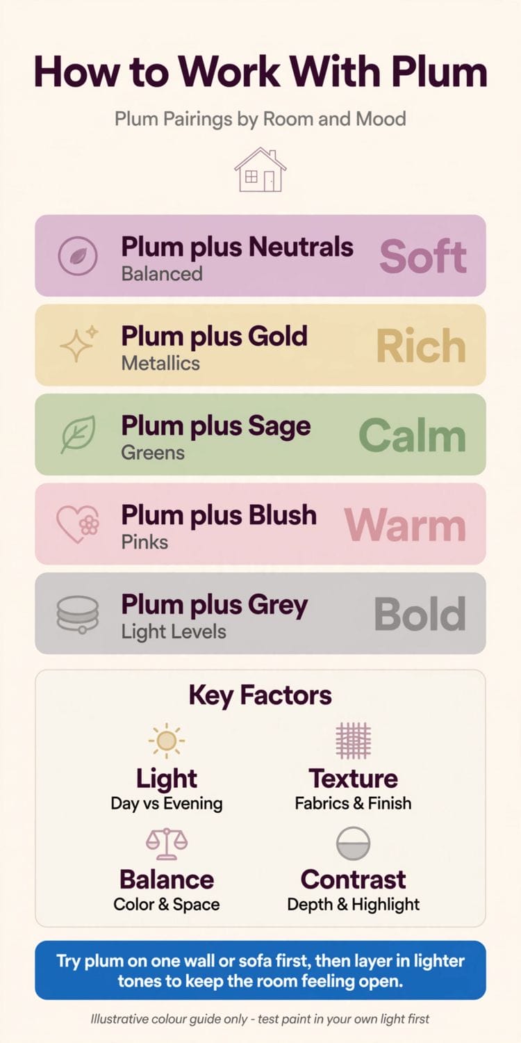
The five pairings in the table are the whole guide in miniature. Each takes the same plum and produces a different room, which is the first lesson the colour teaches: plum is a chameleon, and its partners decide its mood.
| Pairing | Character | What it means |
|---|---|---|
| Plum + Neutrals | Soft | Balanced — cream and stone let plum glow quietly |
| Plum + Gold | Rich | Metallics turn plum evening-dark and luxurious |
| Plum + Sage | Calm | Muted greens settle plum into garden softness |
| Plum + Blush | Warm | Pinks draw out plum’s red side and its warmth |
| Plum + Grey | Bold | Cool greys sharpen plum; light levels decide the drama |
2. What Plum Is: A Colour Between Purple and Red
1. The fruit is the definition
Plum takes its name and its character from the fruit: a purple skin with red warmth beneath it and a bloom of softness over both. Any plum paint, fabric or paper you meet is some balance of those three — blue-purple depth, red warmth, and a muting softness that keeps it grown-up rather than bright.
2. Warm plums and cool plums
Slide the balance toward red and plum reads warm — mulberry, wine, the colour of a hearth-side chair. Slide it toward blue and it cools — damson, dusk, a colour for calm north-facing rooms. Neither is more “plum” than the other; the choice is about the room’s light and the mood you want.
3. Why plum feels luxurious
Deep colours absorb light instead of returning it, and the eye reads that softness as richness — the same reason velvet looks expensive. Plum’s red undertone keeps the depth warm rather than funereal, which is why it flatters skin, lamplight and candlelight, and why dining rooms and bedrooms have loved it for centuries.
Plum also arrives with a history. It is the colour of Victorian dining rooms and Arts-and-Crafts libraries, of aubergine velvet and damask, of fruit bowls painted by the Dutch masters — a colour that has signified ripeness, richness and evening for as long as interiors have been recorded. That lineage is useful rather than merely decorative: a colour with four centuries of domestic service behind it does not date the way a fashion colour does, and a room built on plum inherits the whole tradition at no extra cost.
3. Plum in Daylight and Lamplight
4. North light cools it
In a north-facing room the daylight is already blue-grey, and it pulls plum toward its cool side. Warm plums hold up best here; a cool plum in north light can turn austere. Test the exact wall, at the exact hours you use the room, before committing.
5. South light feeds it
Warm southern sun brings plum’s red forward and can make a full room of it feel genuinely enveloping. In bright rooms plum rarely reads as dark as the sample suggests — space and daylight open it up. The fear of the colour is mostly a fear of the colour card.
6. Evening changes everything
Under lamplight plum deepens toward wine and becomes the most sociable colour in the house. This is why plum earns its keep in rooms used after dark — dining rooms, sitting rooms, bedrooms — and why a colour tested only at noon has not really been tested.
4. Plum With Neutrals and Woods
7. Cream: the softening partner
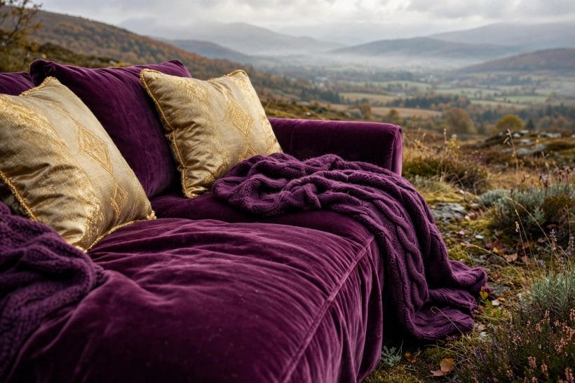
Cream beside plum is the classic soft scheme — the neutral’s warmth matches plum’s own, and the contrast is gentle rather than graphic. It is the pairing for a first plum room: one plum wall or sofa, everything else cream, and the room feels composed rather than daring. The in-between neutrals get their own treatment in the site’s guide to greige undertones.
8. Taupe and stone: the quiet frame
Where cream feels too bright, taupe and stone neutrals frame plum at a lower volume — the scheme of libraries, studies and calm bedrooms. Taupe in particular shares plum’s greyed softness, so the two sit together without either shouting.
9. Wood tones that agree with plum
Warm woods — oak, walnut, cherry — agree with plum because they share its red-gold heart; pale woods lift it and keep a plum room feeling daylight-friendly. The woods to handle carefully are the orange-toned ones, which can fight plum’s purple. As always, samples side by side in the room’s own light settle the question.
5. Plum With Metals and Fellow Colours
10. Gold and brass: the rich pairing
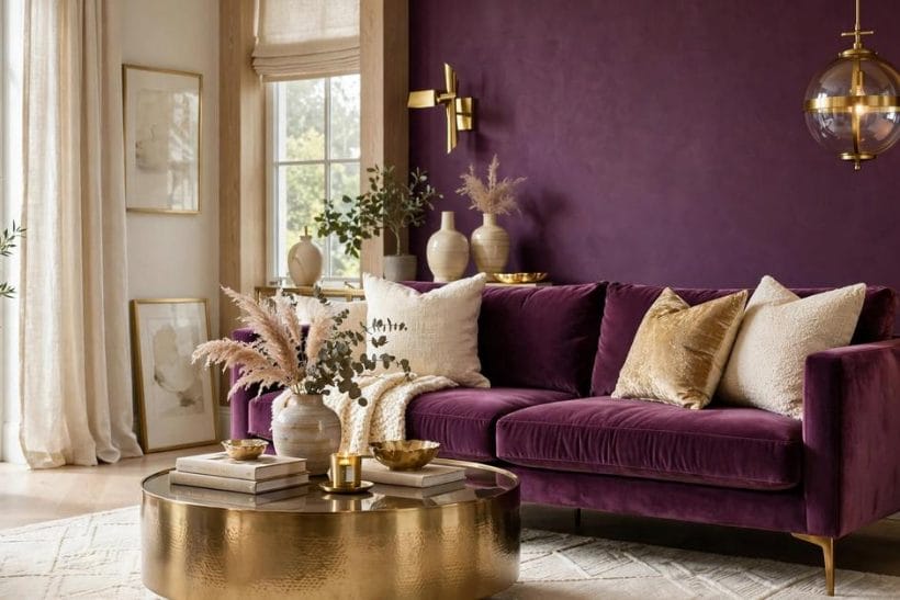
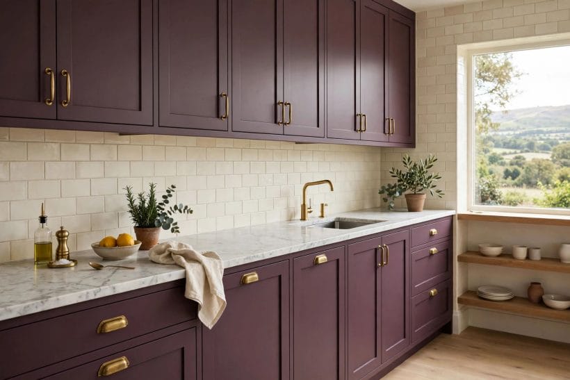
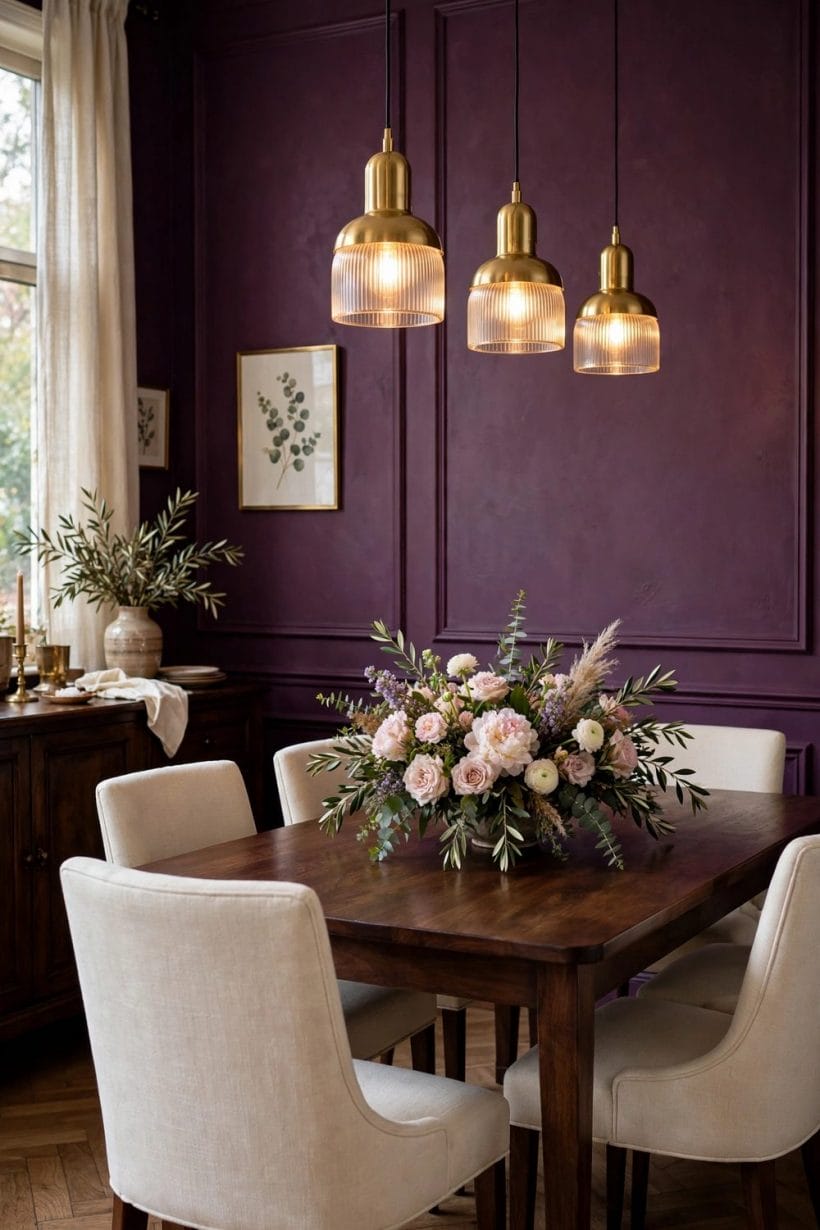
Warm metals are plum’s oldest partners — picture frames, candlesticks, the brass rail of a bar cart. Gold draws out plum’s warmth and makes the whole scheme read evening-rich, which is why the pairing anchors formal dining rooms and why it is the feature photograph’s scheme, plum on plum with brass between.
11. Sage and soft greens: the calm pairing
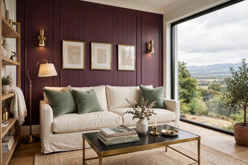
Green sits opposite plum’s red-purple on the colour wheel, and in their muted forms the two settle each other beautifully — sage walls with a plum chair, or plum walls with green velvet and plants. It is the garden’s own pairing: think of the fruit hanging among its leaves.
12. Blush and pink: the warm pairing
Pink is plum with more light in it, so the two form a natural family — blush cushions on a plum sofa, a pink-toned rug under a plum wall. The scheme is warm and romantic without turning sweet, provided the pinks stay dusty rather than sugary. Charcoal, covered in the site’s charcoal colour guide, is the anchor that keeps this family grounded.
6. Plum in the Living Room
13. The one-wall introduction
The infographic’s advice is the right first step: try plum on one wall — usually the fireplace or sofa wall — and live with it through a full cycle of light. One wall gives the room its depth while the remaining walls keep the daylight bouncing.
14. The plum sofa
A plum sofa is a commitment with an escape route: it anchors a neutral room completely, and it can move house with you. In velvet it is the full luxurious statement; in a matte woven fabric it reads quieter and more modern. Either way, cushions in cream, blush or sage complete it.
15. The full plum room
All four walls in plum is the connoisseur’s version — a room that feels like the inside of a jewel box, made liveable by pale flooring, a light ceiling and warm lighting. It suits rooms with a single purpose and generous windows: the snug, the study, the dining room that only ever sees lamplight.
Two supporting players complete the living-room scheme. Curtains in a soft neutral — cream linen, warm white — keep the windows bright against a plum wall or sofa, while a rug in one of the pairing tones (sage-flecked, blush-washed, charcoal-deep) ties the furniture group to the floor. And bare wood, as the palette section promised, is plum’s quiet fourth partner: a pale oak floor cools a plum room pleasantly, a dark walnut floor makes it glow like a cabinet. Choose the floor’s temperature and you have, in effect, chosen the room’s plum.
7. Plum in Bedrooms and Dining Rooms
16. Plum bedrooms: depth without darkness
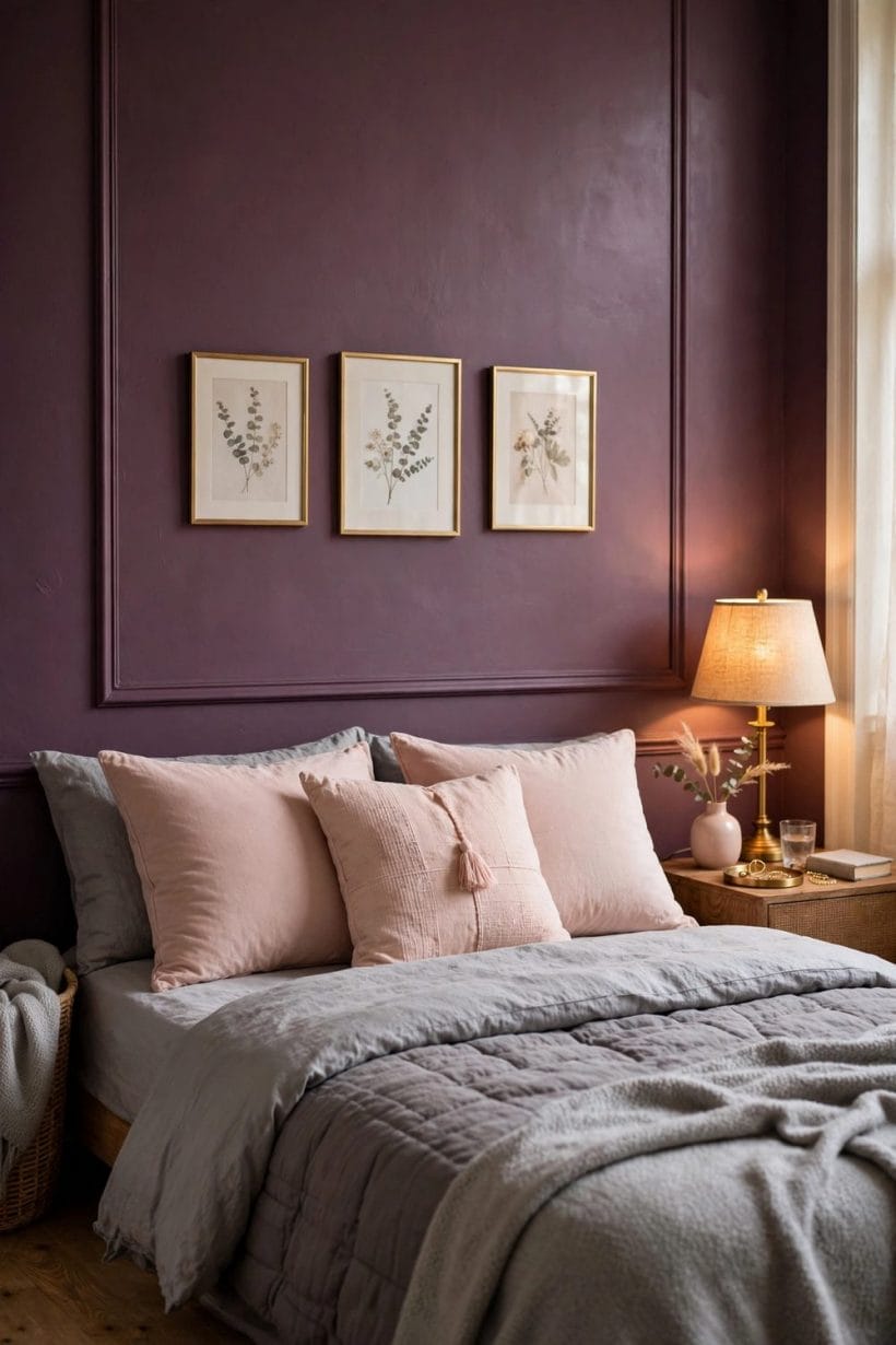
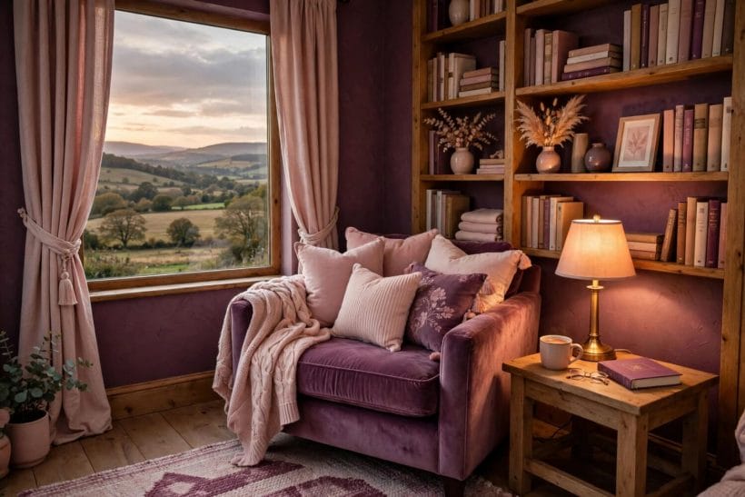
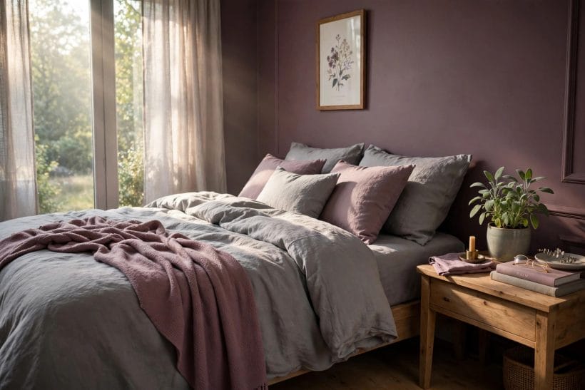
Plum behind a bed makes the headboard wall disappear into dusk, and pale bedding — cream, blush, washed linen — floats against it. The room feels cocooning rather than dark provided the window wall stays light and the lamps are warm.
17. Plum by textile, not by paint
In a rented or north-facing bedroom, plum bedding, a plum throw and one plum cushion deliver the mood with none of the commitment. Textiles also show plum’s texture-dependence at its best: the same colour reads richer in velvet, softer in linen, crisper in cotton.
18. Plum dining rooms: built for lamplight
The dining room is plum’s ancestral home. It flatters food, faces and candlelight impartially, and it pairs with the room’s existing furniture — dark wood, brass, cream linen — without asking any of it to change. If any room in your house gets the full plum treatment first, make it this one.
8. Plum in Small Doses
19. Kitchens: cabinets and islands
A plum island or a run of plum lower cabinets gives a kitchen a tailored, almost bespoke feel, especially with brass handles and pale stone worktops. Keep the walls and upper cabinets light — plum below the worktop line anchors a kitchen without closing it in.
20. Bathrooms: the jewel-box trick
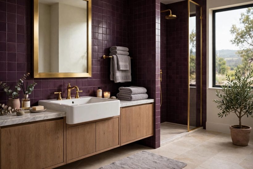
Small bathrooms and cloakrooms are where strong colours earn disproportionate praise: the door closes, the mirror lamps come on, and plum turns a utilitarian box into a jewel box. It is the lowest-risk full-plum room in any house.
21. Hallways and doors: plum in passing
A hallway in a paler plum, or a front door and boot-room joinery in deep plum, gives the colour a daily presence without a whole room’s commitment. Doors are a particularly honest test — paint one, live with it a month, and you will know your true feelings about the colour.
9. Paint, Fabric and Paper: Ways to Bring Plum In
22. Paint: sheen changes the colour
The same plum reads deeper in a flat matt finish and livelier in eggshell or satin, because sheen returns light to the eye. For walls, the softer sheens flatter plum’s depth; for woodwork and doors, a gentle sheen gives the colour its tailored edge. Test the actual finish, not just the colour.
23. Fabric: where plum lives richest
Velvet is plum’s signature fabric — its pile catches light at different angles, so one cushion holds three tones of the colour. But plum also works in slubby linen for summer softness and in wool for winter weight. Choosing the fabric is choosing which plum you get.
24. Wallpaper and pattern
A plum-ground wallpaper — floral, damask or a quiet geometric — delivers the colour with built-in company: its pattern carries the creams, greens or golds that a plain wall would need cushions to supply. In small rooms especially, pattern makes plum feel intentional rather than intense. Small-space colour thinking of this kind runs through the site’s tiny house interior paint colours as well.
10. Testing, Balancing and Living With Plum
25. Test like you mean it
Paint the largest sample you can — a board you can move around the room beats a swatch on the wall. Live with it through a bright morning and a lamplit evening, and hold your actual fabrics, woods and metals against it. Plum changes more between lights than almost any colour, and every one of its moods should please you.
26. Balance is the whole craft
The Key Factors on the infographic reduce to one word: balance. Plum needs light somewhere — a pale floor, a cream ceiling, a window kept undressed — and it needs texture everywhere, because flat plum on flat surfaces is the only version of this colour that ever looks heavy. Give it both, and it never does.
27. If you tire of it
The honest reassurance: plum is a superb base colour to change around. Swap the cushions from blush to sage and the room changes season; paint one wall back to cream and the room changes mood. A colour this connective rarely needs removing — it needs re-partnering. The same is true of its material cousin indoors, explored in interior brick: paint it or leave it.
Final Considerations
Plum is not a brave colour; it is a generous one. It deepens rooms used in the evening, warms rooms starved of sun, flatters wood, brass, food and faces, and asks in return only that you test it properly and keep light and texture in the scheme. Start with a wall, a sofa or a door — and let the fruit do the rest.
A last word on confidence. Every strong colour looks alarming on the first morning and inevitable by the end of the first month; plum, with its warmth and its four centuries of service, settles faster than most. Decorators return to it precisely because it behaves — deep without gloom, rich without glare, dramatic without noise. If a colour in your house should feel like the inside of a ripe fruit at dusk, it is this one, and it is ready when you are.

0 Comments