
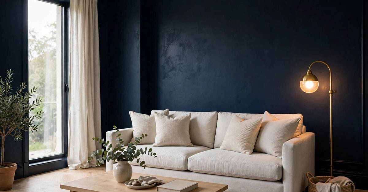
Every few years a dark colour is crowned as the new black, and the current claimant is the deepest blue there is. Midnight blue — the colour of the sky just before true dark — has quietly moved from front doors and kitchen cabinets onto whole walls, and the question in this post’s title deserves a careful answer rather than a coronation.
So this article stays with one colour only and examines it properly: what midnight blue actually is, how it behaves in daylight and lamplight, what it pairs with, which rooms flatter it, and where it fights back. No codes, no named shades presented as fact — the colour in general terms, and the title’s question answered as considerations at the end.
1. The Colour at a Glance
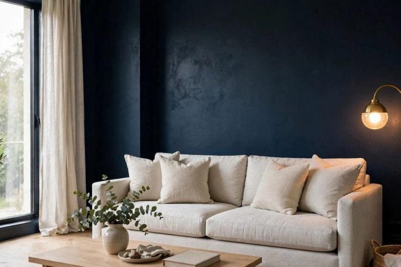
The summary first. Midnight blue sits at the very deep end of blue — in dull light it can pass for black, and in good light its blueness is unmistakable. Colour companionship of every kind is explored across the site, from the cheerful end in yellow and green rooms to whole walls of blue in the bedroom with blue walls collection — and this post keeps its eyes on the darkest rung of the ladder.
| Aspect | Behaviour | In a word |
|---|---|---|
| The Colour | Deep blue that reads near-black | Midnight |
| Daylight | Blue wakes as light rises | Shifting |
| Evening | Lamplight turns it inky | Cosy |
| Pairings | Brass, white and pale timber | Balanced |
| Room by Room | Boldest in small, calm rooms | Focused |

Four factors govern everything that follows: light, because this colour is two colours depending on the hour; undertone, because deep blues lean green or violet and the lean decides their partners; finish, because matt and satin return light differently; and contrast, because midnight blue is never seen alone — it is always seen against whatever stands in front of it.
A word on method before the sections begin: everything claimed for this colour below is a claim about behaviour — how it responds to light, company and room size — and behaviour can be tested with a sample board and a day’s patience. Where the colour’s reputation outruns its behaviour, section 9 says so plainly.
2. One Colour, Honestly Described
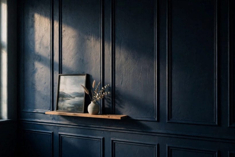
Run a hand along the wall in this photograph — a panelled stretch of midnight blue with daylight raking across it — and the colour’s double nature shows at once: shadowed areas fall almost to black, while the lit ridges are plainly, richly blue. That duality is not a flaw in the colour; it is the colour.
Deeper Than Navy, Softer Than Black
Midnight blue is best understood as black with the chill taken out. Where true black flattens a room and drinks its light, the blue in this colour keeps a breath of atmosphere — walls recede rather than loom, and the room feels enclosed rather than extinguished. It is the depth of navy carried one step further toward night.
The Undertone Decides
Deep blues lean one of two ways: toward green, which makes them moodier and more peacock-like, or toward violet, which makes them cooler and more regal. Neither lean is better, but they keep different company — the green-leaning blues sit happily beside the plum family’s territory, much as the plum colour guide describes for its own deep shade, while violet-leaning blues prefer crisper, greyer partners of the kind mapped in the light grey colour guide. Hold samples against both a green and a violet object and the lean announces itself.
Why It Is Not Just a Trend Word
Colours earn ‘new black’ talk when they do black’s jobs — grounding, framing, flattering everything placed against them — with more life in them. Whether midnight blue does those jobs in a given room depends on the sections below, not on the label. The honest description is a starting point; the behaviour is the verdict.
3. Evening: Lamplight Turns It Inky
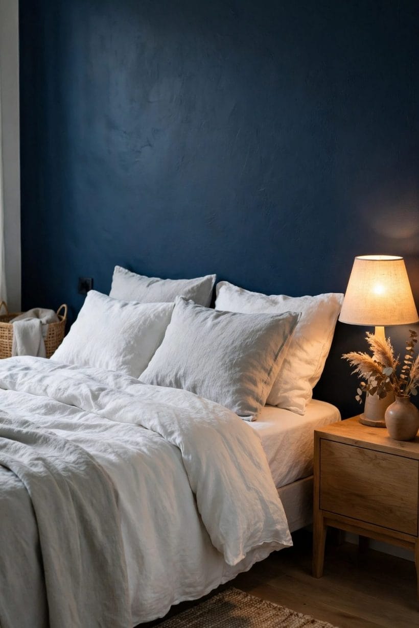
This portrait photograph — a bedroom wall at full depth, white linen against it, a bedside lamp pooling warm light — is midnight blue in its favourite hour. As daylight leaves, the colour stops performing blueness and becomes atmosphere.
The Cosiness Is Real
Under warm lamplight the colour darkens toward ink and the room contracts pleasantly around its lit centre. This is the effect people mean when they call dark rooms cosy: the walls stop competing for attention, faces and fabrics take the light, and the room feels held. Small rooms gain most, because their walls are close enough for the embrace to register.
Light It Warmly
The partnership has one condition: the light itself should be warm. Cool, blue-white bulbs push the colour toward a chill it cannot recover from, while warm light deepens it flatteringly. Think in pools rather than floods — table lamps, picture lights, a lit alcove — and let the wall be the darkness between them. Whole-house colour thinking of this kind, room by room and hour by hour, is the thread running through the tiny house colour palette guide as well: palette is behaviour, not just selection.
4. Pairings: Brass, White and Pale Timber
Midnight blue is rarely the only colour in a room — it is the ground against which others stand. The living room in this photograph keeps the blue on the sofa rather than the walls, and the pairing rules work identically in reverse.
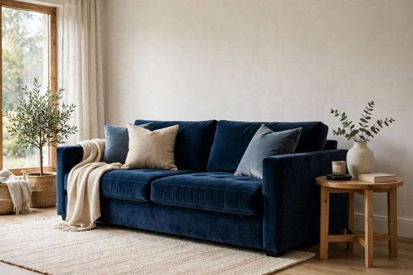
Pale Partners Give It Air
White, cream and pale grey are the colour’s breathing space. Against pale walls a midnight sofa reads as a deliberate, tailored statement; against midnight walls, pale furniture performs the same rescue from the other side. The ratio matters more than the items: roughly a third deep colour to two-thirds pale keeps most rooms balanced.
Warm Metals and Timber
Brass is the classic companion — its warmth answers the colour’s coolness point for point — and pale timber does similar work more quietly. Chrome and cold steel can sit with the violet-leaning blues but fight the green-leaning ones. When in doubt, put the metal object against the sample board in daylight before committing to either.
What to Keep Away
Competing deep colours are the main risk: a room of midnight blue, burgundy and forest green can turn muddy, each depth dulling the others. One deep colour per room, with the rest of the scheme pale or mid-toned, keeps the blue’s authority intact.
5. Bedrooms: Where It Rests Best
If midnight blue has a home room, it is the bedroom — shown here from the other side of the pairing, deep blue bedding against pale walls in morning light. Bedrooms are used at the day’s two soft ends, exactly the hours when this colour is at its best.
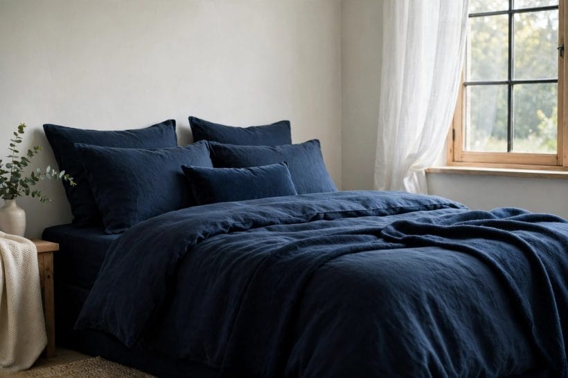
Walls or Textiles, Not Both at Full Strength
Choose the commitment level. Blue walls with pale bedding give the full cocoon; pale walls with blue bedding give the colour’s depth with an easy exit. Both work. Blue walls and blue bedding together can succeed in a large, bright room, but in a small one the layers merge into a single undifferentiated dark.
The Headboard Wall Compromise
The single wall behind the bed is the colour’s most forgiven placement: it is the wall you face least while awake, it frames the bed like a picture, and it leaves three pale walls to keep the room’s daylight. A household testing the colour’s courage could do worse than start exactly here.
6. Kitchens and Cabinetry
The kitchen in this photograph — midnight cabinets, pale worktop, brass handles — is the colour’s second natural habitat. Cabinetry flatters deep blue because a kitchen is already a room of pale counters, lit task areas and reflective surfaces.
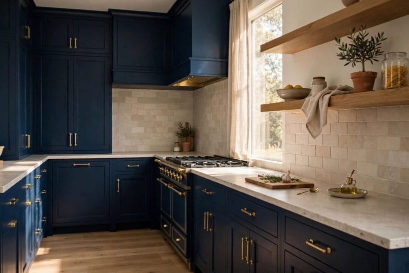
Why Cabinets Suit It
Cabinet fronts are broken by handles, shadows and gaps, so a deep colour on them never forms the unbroken field a wall does — the depth reads as richness rather than darkness. Lower cabinets in midnight with pale uppers or open shelves is the gentlest version; full-height runs demand a bright room and a confident hand.
Worktops and Splashbacks Stay Pale
The rule from section 4 holds with extra force under task lighting: keep the horizontal surfaces pale and reflective, and the blue will look deeper by contrast while the kitchen stays practical to cook in. Stone-look and plain pale finishes do the work; patterned surfaces compete.
7. Small Rooms and Bathrooms
Conventional advice says small rooms must be pale. Midnight blue’s counter-argument stands in this photograph: a small bathroom in deep blue tile with white fittings, where the colour turns a poky room into a jewel box.
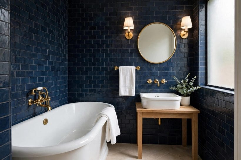
The Jewel-Box Effect
A small room cannot pretend to be large for long, so the dark-colour strategy stops pretending: it makes the room deliberately dramatic instead. Bathrooms, cloakrooms, studies and hallways — rooms visited briefly and used singly — carry boldness that a living room must sustain all day. Brief exposure forgives depth.
White Fittings Are the Frame
In bathrooms the pairing rule is supplied by the room itself: white sanitaryware is the pale partner, and brass or chrome fittings choose the temperature. Gloss and satin tiles return enough light to keep the colour luminous; full matt in a windowless room is the one version to test very carefully first.
8. One Wall, One Piece: The Cautious Route
The hallway in this portrait photograph — midnight wall, round brass mirror, slim console — shows the colour used the way most households actually adopt it: decisively, in one place, where it greets you and is then left behind.
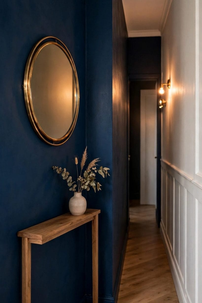
Furniture as the Test Bed
A single piece — sofa, cabinet, bed frame — in midnight blue against an existing pale scheme costs a fraction of a repaint and can be lived with honestly for a season. The deep-sofa arrangement has its own long history, as the discussion around a brown couch with grey walls shows for the neighbouring combination: one grounded piece anchors a room, whatever its depth of colour.
Hallways Forgive Everything
Passage spaces are the boldest rooms’ training ground: nobody sits in a hall for an evening, so depth there is pure theatre. A midnight hallway with pale doors opening off it makes every adjoining room feel brighter by contrast — the colour working as a foil for the whole home.
9. When It Fights Back
Honesty section. Midnight blue has failure modes, and a household should meet them before the paint is bought rather than after the second coat.
It Shows Dust and Marks
Deep colours display pale evidence: dust on a midnight shelf, a scuffed skirting, a fingerprint beside a light switch all announce themselves as they never would on cream. Busy households and households with small children should expect deep-coloured walls in traffic areas to ask for more wiping, and to forgive less.
North Light Can Turn It Cold
In a room whose only light is cool and indirect, the colour’s blue can curdle toward a chill, steely dark — the near-black without the warmth. Such rooms are not forbidden the colour, but they need the warmest version of it, the warmest lighting, and a large sample lived with for days before any decision.
It Cannot Be Ignored
Black’s great social skill is invisibility: it goes with everything and asks for no attention. Midnight blue, for all its depth, remains a colour — it will argue with clashing curtains and upstage a busy pattern. Households wanting a neutral that never speaks should paint the neutral; this colour is a presence, and that is both its point and its price.
10. So, Is It the New Black?
The study corner in this photograph is a good place to deliver the verdict — midnight walls, a timber desk, one warm lamp: the colour at work rather than on display.
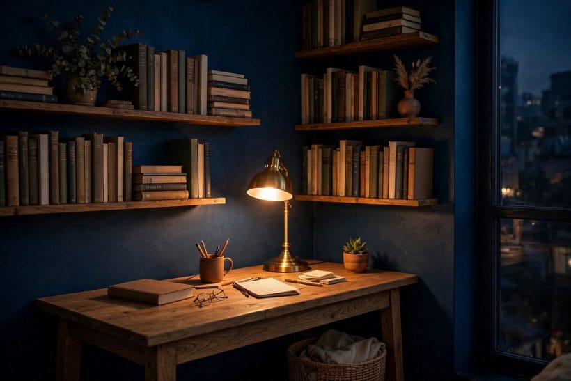
Where the Answer Is Yes
In small rooms used at the day’s ends, in bedrooms, bathrooms and hallways, beside brass and pale timber, under warm lamplight — in all these conditions midnight blue does black’s grounding work with more atmosphere than black can offer, and the crown fits. Households decorating those rooms will find it the most useful deep colour they own.
Where the Answer Is Not Quite
As a universal neutral, it fails black’s defining test: it has a hue, an undertone and opinions. Whole large living rooms in cool light, households with dusty traffic and no appetite for wiping marks, schemes built on many competing colours — these are better served by black, charcoal or a gentler navy. The title’s question, answered honestly, is ‘in the right rooms, gladly; as a universal replacement, no.’
The Test That Settles It
Paint is cheap to test and expensive to regret, so borrow the method the infographic’s tip gives: one wall or one piece, lived with through a full day of light — and, this section would add, one evening of lamplight. The colour will make its own case. For the wider craft of choosing interior paint that behaves across rooms, the tiny house interior paint colours guide is the natural next read.
Final Considerations
Midnight blue is not the new black so much as the more interesting alternative to it: deeper company, warmer at night, bluer at noon, and honest about being a colour. Give it small rooms, warm light and pale partners, and it will repay the trust daily. That is not a trend verdict — it is a description of behaviour, and behaviour, unlike fashion, can be tested in your own home in a single weekend.


0 Comments