

White tile alone can look unfinished — a blank grid waiting for a decision. Add grey grout and the same tile suddenly has rhythm, shadow and intent: the pattern you actually see is drawn by the grout.
This guide treats grey grout in white tile as a design tool: contrast levels, joint widths, tile shapes, room-by-room ideas and styling that keeps the look crisp.
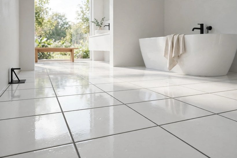
1. White Tile With Grey Grout at a Glance
Grey grout turns white tile from a surface into a pattern. The grey line defines every tile edge, so shape, layout and joint width become the design — and the mid-tone line is far more forgiving of daily life than white grout, which shows every mark, or black grout, which can shout. It is a design decision first and a practical one second.
| The design effect? | Visible grid and shadow lines — tile shape and pattern become the room’s graphic structure. |
| Contrast range? | Pale silver-grey for a soft outline, mid-grey for the classic grid, charcoal-grey for a bold graphic. |
| Where it works? | Floors and walls in bathrooms, kitchens, hallways and utility spaces — anywhere white tile is used. |
| Practical bonus? | Grey hides everyday marks and slight colour drift far better than white grout lines do. |
| Key choice? | Joint width — wider joints make the grey a stronger design feature; fine joints keep it subtle. |
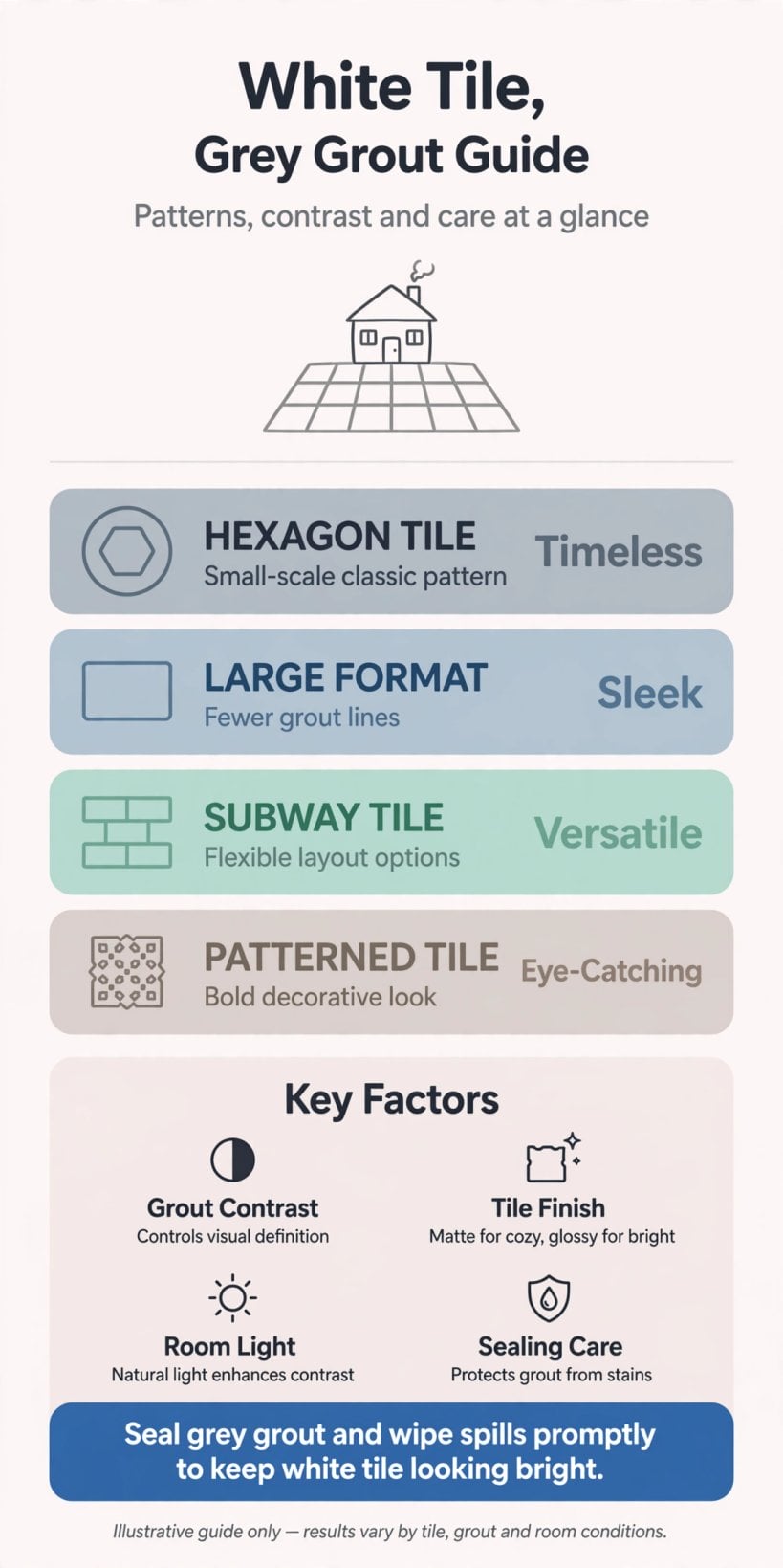
At a glance: pick the grey’s depth and the joint width first — together they set how graphic the room feels.
2. Choosing the Grey: Depth and Temperature
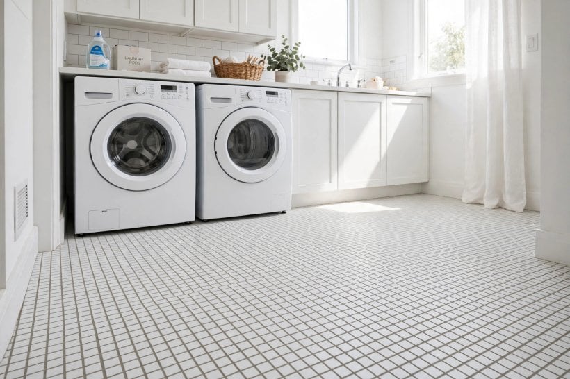
Grey is not one colour. Pale greys whisper the grid, mid-greys draw it clearly, and deep greys make it the room’s main event. Temperature matters just as much: warm greys lean taupe and suit cream-leaning tiles and timber; cool greys lean blue and suit crisp whites, chrome and stone. Sample the grout dried, beside the actual tile, in the room’s own light — wet grout always reads darker than the finished line.
1. Pale Silver-Grey for a Soft Outline
The gentle option: the grid is present but quiet, suiting calm, spa-like rooms and large calm floors.
2. Mid-Grey for the Classic Grid
The balanced default — clear definition, forgiving in use, and the shade most people picture for this look.
3. Charcoal-Grey for a Graphic Punch
Near-black lines turn white tile into a bold graphic; powerful on small areas, demanding on whole rooms.
4. Match the Grey to the Room’s Metals and Stone
Echo the grout in a worktop vein, a tap finish or a floor border and the scheme reads designed, not accidental.
3. Joint Width as a Design Lever
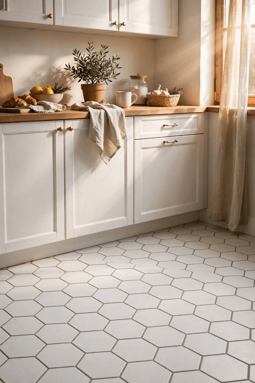
Width is the volume control on the whole design. Fine joints of a millimetre or two give a refined, tailored grid; standard joints give the familiar tiled look; wide joints — on floors, with larger tile — make the grey a bold band that competes with the tile itself. Keep the width consistent with the tile’s edge quality: crisp rectified tiles carry fine joints beautifully, while handmade-look tiles need a little more width to absorb their variation.
5. Fine Joints for a Tailored Finish
Slim grey lines on large white tiles read almost like panelled stone — modern, calm and expensive-looking.
6. Standard Joints for the Honest Tiled Look
The familiar grid that suits family bathrooms and kitchens — defined, practical and easy to keep even.
7. Wide Joints as a Deliberate Feature
On floors, a generous grey band gives grip to the eye and a crafted, almost terrazzo rhythm to plain white tile.
8. Keep One Width Across a Whole Room
Mixed widths look like mistakes; where floor meets wall tile, align the module so the grids agree.
4. Tile Shapes and Layout Patterns
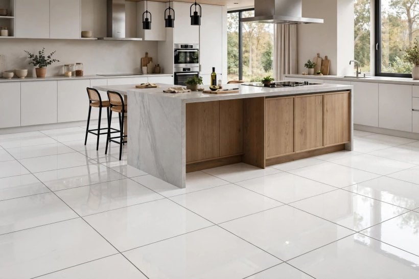
Because the grout draws the pattern, shape and layout do the designing. Straight grids read calm and architectural; diagonals and herringbones add movement; hexagons and mosaics multiply the linework into texture. Choose the pattern for the room’s size and energy — busy patterns shrink and enliven small spaces, while calm grids let large rooms breathe. The layouts pair naturally with the compact planning in our tiny house bathroom layouts, where pattern is often the only decoration the room has room for.
9. Stacked Grid for Modern Calm
Aligned joints both ways give a clean architectural grid — the grey line as draughtsmanship.
10. Brick Bond for the Classic Look
Offset rows soften the grid and suit traditional rooms; grey grout keeps the pattern legible without fuss.
11. Herringbone for Movement
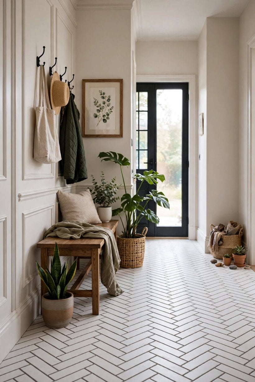
Zigzag lines lead the eye along a hallway or across a bathroom floor — grey grout makes every angle count.
12. Hexagons for Texture
White hex tiles in grey become a woven surface — a floor that is pattern and finish in one.
13. Large-Format Tiles for Fewer, Stronger Lines
Big white tiles with mid-grey joints give a bold, spaced grid that suits contemporary rooms and quick cleaning.
14. Mosaics Where Grip and Detail Matter
Small tiles multiply grout lines — in wet zones the texture is beautiful and the extra lines are practical underfoot.
5. Bathroom Floors and Walls
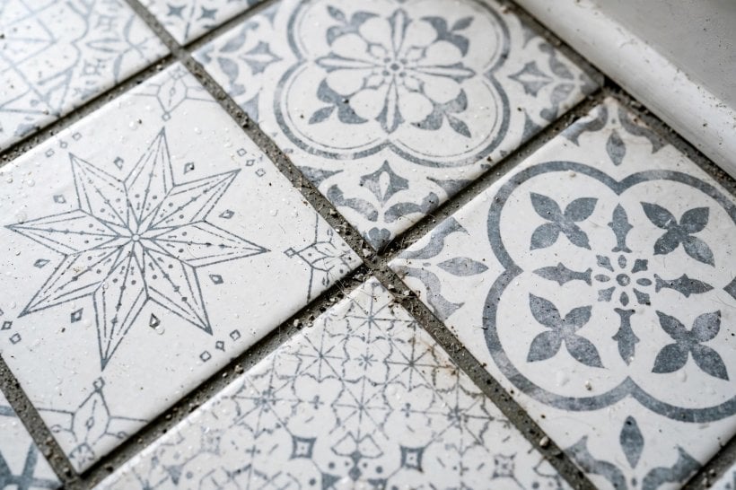
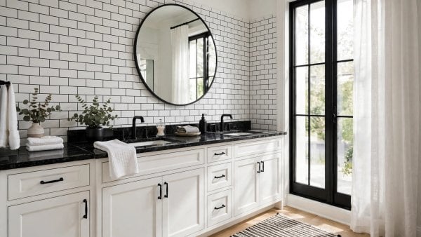
Bathrooms are this combination’s home ground. A white floor tile with gray grout gives the brightness small bathrooms need with a pattern that stops the room feeling clinical, and on walls the same pairing carries showers and splashbacks with graphic clarity. Keep the floor’s grey a touch deeper than the wall’s if you use both — floors take the visual weight and the wear. The pairing is a staple across our tiny house bathroom designs precisely because it survives family use gracefully.
15. Continue the Floor Grid Up the Shower Wall
One uninterrupted pattern from floor to shower wall makes a small bathroom read as a single designed volume.
16. Use the Boldest Contrast in the Smallest Room
Cloakrooms and ensuites can take charcoal-grey lines that would overwhelm a big bathroom — small rooms love a strong grid.
17. Frame a Plain Wall With a Border Tile
A border of smaller white tiles — or the same tile turned diagonal — outlined in grey finishes a half-tiled wall crisply.
18. Let Fixtures Stay White on White
White sanitaryware against white tile disappears politely, leaving the grey grid and one metal finish to carry the design.
6. Kitchens, Hallways and Utility Spaces
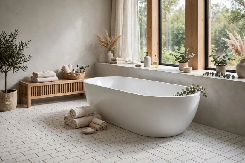
Beyond the bathroom, the pairing works anywhere brightness and wipe-clean surfaces matter. Kitchen splashbacks in white tile gain definition that stops them vanishing behind cabinetry; hallway floors get a pattern that hides the traffic line; utility rooms become cheerful instead of apologetic. In open-plan spaces, carrying the same tile-and-grout combination through two zones is a quiet way to unify them, as seen in the flowing schemes among these tiny house interior design ideas.
19. Kitchen Splashback With a Defined Grid
Grey lines stop a white splashback disappearing, and echo stainless and stone tones in the work zone.
20. Hallway Floors That Hide the Traffic Line
Mid-grey joints disguise the daily wear path that white grout would advertise within a month.
21. Utility Rooms With Pattern Instead of Apology
A herringbone or hex floor in white and grey makes the hardest-working room feel designed, not leftover.
7. Pairing With Fixtures, Metals and Colour
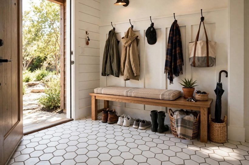
White and grey is a deliberate neutral stage — what you put on it sets the room’s character. Chrome sharpens it, brass warms it, matte black doubles the graphic, and timber or colour in textiles stops it feeling cold. Keep the supporting cast small: the grid is already a pattern, so the room needs editing more than additions, in the spirit of modern tiny house interior design.
22. Chrome for a Crisp, Cool Scheme
Bright chrome against white and grey is clean and classic — the hotel-bathroom register.
23. Brushed Nickel or Steel for Softness
Softer metals sit closer to the grey’s own tone and give a quieter, more tonal room.
24. Brass to Warm the Grid
One warm metal — taps, a mirror frame, light fittings — keeps the cool palette from feeling chilly.
25. Timber and Textiles as the Colour
A timber stool, woven basket and coloured towels supply warmth and change seasonally, while the tile stays timeless — the same balancing act used across our bathroom interior design ideas for tiny houses.
8. Keeping Grey Grout Looking Grey
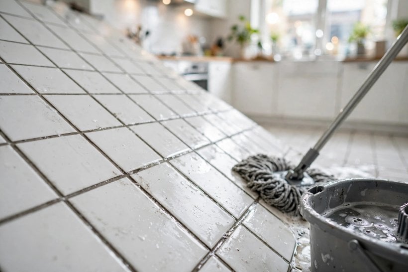
Design includes how the room ages. Grey grout’s great advantage is honesty: it neither shows every mark like white nor fades unevenly like strong colours can. Keep it that way with unglamorous habits — ventilation that dries the room, prompt rinsing of strong dyes and coloured cleaners, and a soft brush rather than harsh chemicals when the lines need refreshing. Sealing grout in wet zones, where the tiler recommends it, slows water-borne staining and keeps the grey even from wall to floor.
26. Ventilate So Lines Dry Evenly
Dry grout keeps its colour; perpetually damp grout darkens in patches and invites mildew at the edges.
27. Rinse Coloured Products Promptly
Hair dye, fake tan and bright bath products can tint light-grey lines — a quick rinse is the whole defence.
28. Refresh With a Brush, Not Bleach Blasts
Gentle, regular cleaning preserves the grey; aggressive chemicals can lighten lines unevenly and spoil the grid.
9. Common Design Mistakes
The failures of this pairing are design failures, not material ones. A grey chosen from a wet sample that dries two shades lighter than expected. A charcoal grid specified for a whole bathroom that then fights every fixture in it. Three tile patterns in one small room, each outlined in grey, multiplying into visual noise. And the subtlest: a cool blue-grey grout against warm cream tile, where the two temperatures argue quietly forever. Every one is prevented by the same discipline — dried samples, in the room, beside the actual tile and fixtures, before committing.
29. Do Not Let the Grid Fight the Fixtures
If the pattern is bold, keep basins, taps and accessories simple — one graphic element per room is the design.
30. Do Not Mix Greys Between Floor and Wall by Accident
Two greys that nearly match look like an error; either match them properly or separate them by a clear shade step. The editing discipline behind these choices is the same one that organises the compact rooms in our small space interior design ideas — every element deliberate, nothing nearly-right.
10. Costs and Choosing Your Installer
Grey grout costs no more than white — the pigment is in the same standard ranges — so the design upgrade here is effectively free; the money is in the tile, the layout’s labour and the quality of the setting-out. Patterned layouts cost more in cutting and time than straight grids, and fine joints on large tiles demand flatter preparation and a more careful tiler. Spend on the setting-out: a grid is only beautiful if it lands symmetrically on the room — centred on the doorway, balanced at the edges, with no sliver cuts shouting from the corners.
Choose a tiler by their grids, not their promises: ask to see a finished bathroom or floor where grout lines carry the design — the standard visible in well-finished rooms like those in our interior design bathroom ideas for tiny houses — and check that lines run true and joints are even. Agree the exact grout shade by name, from a dried sample, and have it recorded before work starts. The finished room should look inevitable — as if white tile and grey grout were always meant to meet in exactly this pattern, in exactly this room.
Final Considerations
White tile with gray grout works because it converts a plain surface into a designed pattern for the price of a pigment. The decisions that matter are the grey’s depth and temperature, the joint width, and a layout set out symmetrically — everything else is styling. Choose them from dried samples in the room’s own light, and the grid will look deliberate for as long as the tile lasts.
It is also the forgiving choice: brighter than dark tile, calmer than black grout, kinder to daily life than white grout. For bathrooms, kitchens and hallways that must look crisp without demanding perfection, grey grout in white tile is close to a permanent answer. Stand back and judge the floor from the doorway, not from above: grout reads as pattern at room distance, and the combination that looks calm and even from where you actually enter the room is the one that will keep looking right long after the tiling day is forgotten.

0 Comments