
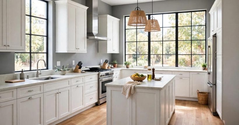
Grey walls and white cabinets are the calmest pairing a kitchen can wear: the grey quiets the room, the white lifts it, and neither one shouts. It is a combination that survives fashion cycles because it is not really a fashion statement at all — it is a balance of light and shade, worked out at the scale of a whole room. The grey holds the background steady while the white cabinets catch the daylight and hand it back, and the result reads clean without reading cold, bright without reading stark.
What makes the pairing work is not luck but a handful of decisions taken in the right order: the temperature of the grey, the style of the white fronts, the counter that sits between them, the metal that repeats through the room, and the light that ties the whole thing together at every hour of the day. Get those five right and almost any kitchen — large or small, traditional or flat-fronted — settles into the same easy calm. The sections below work through each decision in turn, with layouts, counters, metals, light, upkeep and costs, all in general terms.
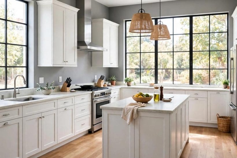
1. Grey Walls, White Cabinets at a Glance
Five things decide whether this pairing sings: the walls themselves, the cabinets, the counter between them, the metals that mediate, and the light the room can borrow. The table below is the post in miniature.
| Element | What matters | In a word |
|---|---|---|
| The Walls | Soft grey, warm or cool | Calm |
| The Cabinets | White fronts, one style | Bright |
| The Counter | Pale stone bridges the two | Bridge |
| The Metals | One finish, repeated | Cohesion |
| The Light | Daylight plus warm lamps | Balance |
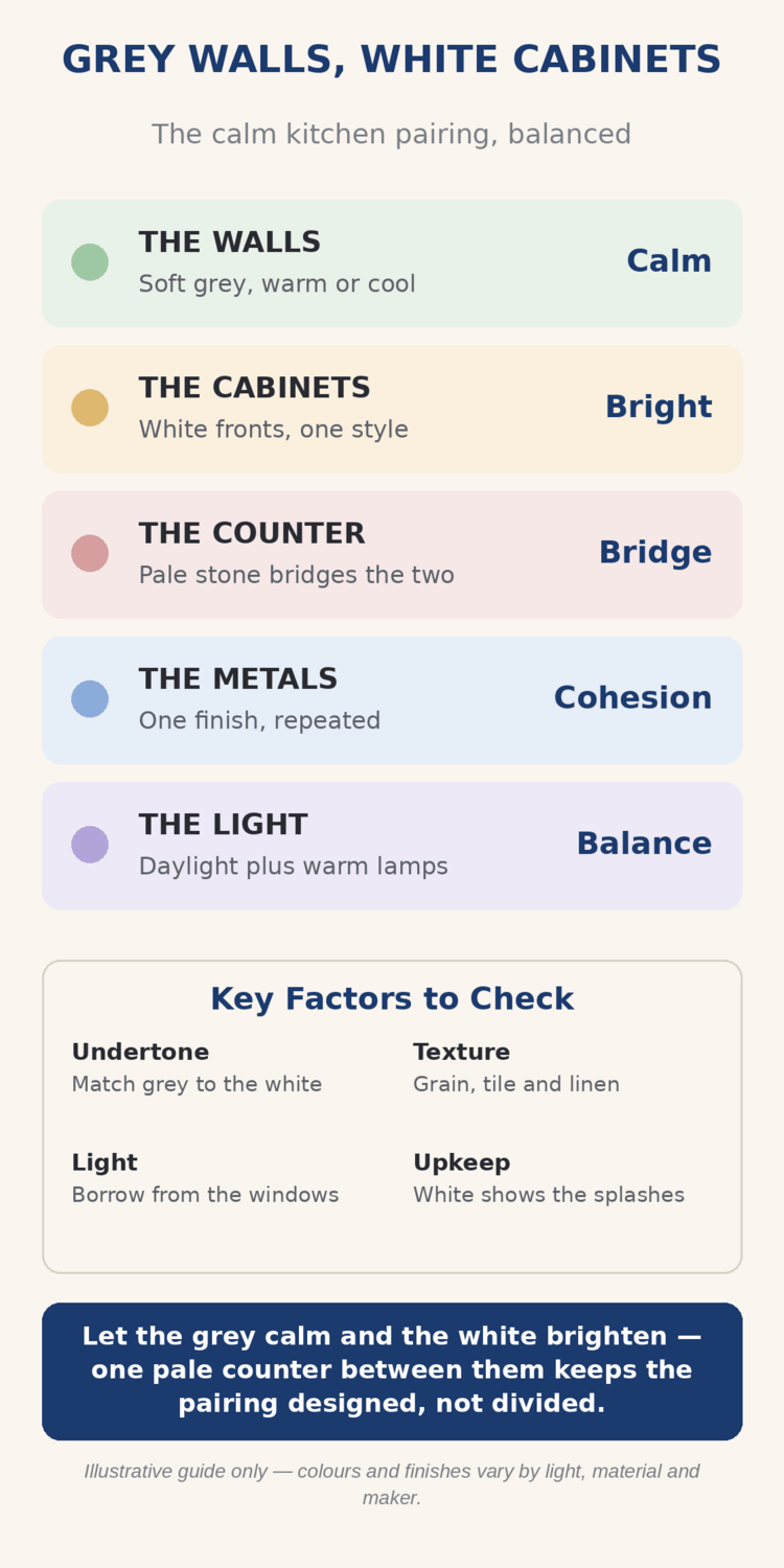
Four factors run under every idea: undertone, because the grey must be matched to the white rather than chosen in isolation; texture, because grain, tile and linen stop a pale room from feeling flat; light, borrowed from the windows wherever the plan allows; and upkeep, because white shows the splashes and the pairing should be chosen with open eyes about that.
Keep one pale surface besides the cabinets — a counter, a splashback or a runner — so the grey and the white read as a designed pairing rather than two unrelated choices that happen to share a room. That single habit, repeated through the ideas below, is the difference between kitchens that feel composed and kitchens that feel merely pale.
2. Layouts That Carry the Pairing
Start with the plan, because grey walls and white cabinets behave differently in every layout. The pairing is forgiving — it suits galleys, L-shapes, islands and open plans alike — but each layout asks the grey and the white to do a slightly different job. The small-room plans in tiny kitchen ideas show the same bones at a tighter scale.
1. The Island Kitchen, Grey at the Edges
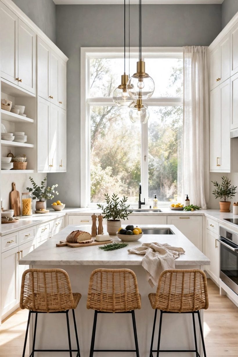
In an island kitchen the grey walls become the room’s frame and the white island becomes its centre: the walls recede, the island advances, and the eye travels between them without snagging. Keep the island’s fronts the same white as the wall cabinets so the room reads as one decision, and let the stools and the pendant lights supply the texture.
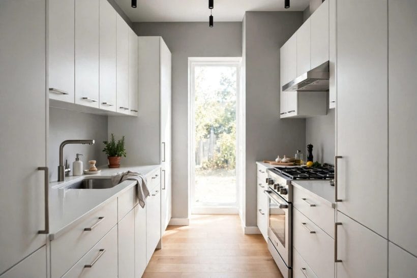
2. Galley Runs in Grey and White
In a galley, grey walls on both sides with white cabinets running between them create a calm corridor of a kitchen, and the perspective does much of the styling. The look succeeds when the far end holds light — a window, a glazed door, a pale splashback — so the corridor leads somewhere bright rather than closing in.
3. L-Shaped Runs with a Grey Return
An L of white cabinets against grey walls benefits from one wall that goes a shade deeper or a shade paler than the rest: a single accent wall of grey, or a tiled splashback carried high at the short end. The corner where the two runs meet is where the pairing gathers, so give it the room’s best light and its tidiest fronts.
4. Open-Plan Kitchens Zoned by Colour
In open plans, grey walls can mark the kitchen’s territory inside a larger pale room, the white cabinets holding the zone’s brightness. The trick is a clean threshold — a straight wall edge or a change of floor the eye can follow — so the zoning reads deliberate rather than accidental.
Every layout above obeys one proportional rule: the larger the wall area on show, the softer the grey should be. A wide open-plan wall of mid grey demands bright white cabinets, pale counters and generous light together, while a small galley can carry a deeper grey with the counter alone as mediator. Walk the plan at eye level, not on paper — the pairing is experienced standing up, and the layout that looks balanced in a drawing can feel washed out or heavy in the room itself.
3. Reading the Grey: Warm, Cool and In Between
Grey is not one colour but a family, and the family’s temperature decides everything else. A warm grey leans towards taupe and brown; a cool grey leans towards blue and slate; a mid grey sits between them and takes its character from whatever stands next to it. The same white cabinets will look creamy against a cool grey and crisp against a warm one, so the grey must be chosen against the actual fronts, in the room’s own light, not against a swatch in a shop. The warm-cool balancing act in brown couch against grey walls shows the same temperature question answered for a living room.
5. Warm Grey for North-Facing Rooms
Rooms that get little direct sun usually suit a warm grey: the brown undertone compensates for the cool daylight and keeps the white cabinets from turning icy. In these rooms the pairing feels welcoming rather than clinical, especially with timber floors and warm metals.
6. Cool Grey for Bright, Sun-Facing Rooms
Rooms flooded with sun can carry a cool grey without turning cold, because the sunlight warms it through the day. Here the white cabinets stay brilliantly white, and the pairing reads fresh and architectural — the version of this kitchen most often photographed.
7. Mid Grey as the Safe Middle
A mid grey, neither warm nor cool, is the most forgiving choice when the room’s light changes through the day or the fronts have not yet been chosen. It shifts a little with the light — warmer at lamp-light, cooler at noon — and that shift is a feature, not a fault, as long as it is expected.
8. One Grey, Not a Gradient
Resist the temptation to use three or four greys across walls, tiles and textiles. One wall grey, carried consistently, with texture doing the varying — tile, linen, timber, stone — gives a calmer room than a gradient of near-identical greys that only ever look like a matching error. Let the materials vary; keep the grey steady.
Before committing, live with large samples: a painted board leant against the existing cabinets for a week tells you more than any small swatch, because your room’s light — not the shop’s — decides how warm or cool the grey really is. Check the board at breakfast and at lamp-light; a grey that pleases at noon can turn flat by evening, and the pairing has to please you at both hours.
4. The Cabinets Themselves
White is not one decision but four — style, surface, temperature and the top row. The same fronts appear in other rooms for other reasons, and the timber alternative in kitchens with oak cabinets shows how different a kitchen feels when the cabinets, rather than the walls, carry the warmth. Here the white must carry the brightness, so its details matter.
9. Shaker White, the Safe Classic
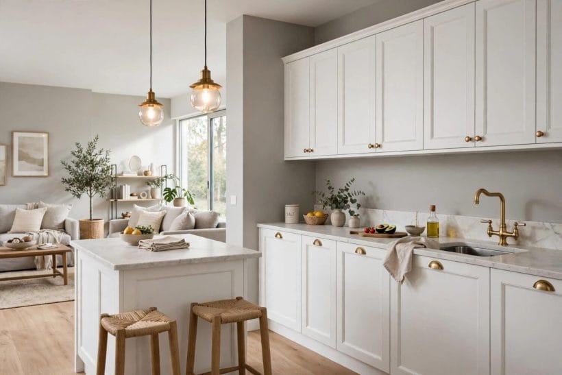
The shaker frame gives white a shadow line of its own, which keeps large runs from reading flat against the grey. It is the most forgiving front for this pairing and the one that ages slowest through fashion cycles, because the frame adds craft without adding colour.
10. Flat-Front White for a Quieter Room
Slab fronts remove the shadow play and let the grey do all the tonal work: the contrast becomes graphic, almost gallery-like. It asks for perfect alignment and good handles — there is nothing else to look at, so everything must be right, and the grey must be chosen with extra care.
11. Warm White over Cool White
Against warm grey walls, a warm white — creamy, slightly ivory — keeps the room cohesive where a blue-white can turn the cabinets icy. Against cool grey, the cool white earns its crispness back. Match the white’s temperature to the grey’s undertone, and check both together in daylight and lamplight before ordering.
12. Glass Uppers to Lighten the Top
Glazed upper doors break the white into reflection and depth, lightening the top half of the room so the grey walls stay the only quiet note. Keep the contents calm and pale; glass uppers above a grey wall reward tidy shelves and punish clutter, so they suit owners who enjoy keeping things in order.
One more cabinet decision hides in the finish: matte, satin or gloss. Matte fronts soften the white and suit the calm of grey walls best; satin adds a gentle wipeability for busy kitchens; gloss bounces the most light but shows every mark. In most grey-walled kitchens the matte or satin front wins — it lets the grey stay the room’s calm voice while the white stays its bright one.
5. Counters and Backsplashes: The Bridge
Between the grey and the white stands the counter — the pairing’s chief mediator. A pale counter echoes the cabinets’ brightness at worktop height and gives the eye a resting step before the grey wall above it, while a darker counter creates a layered gradient that needs pale walls to hold the top. The tile and splashback choices in white cabinets with a tile backsplash show the same bridge built in tile rather than stone.
13. Pale Stone Counters as the Classic Bridge
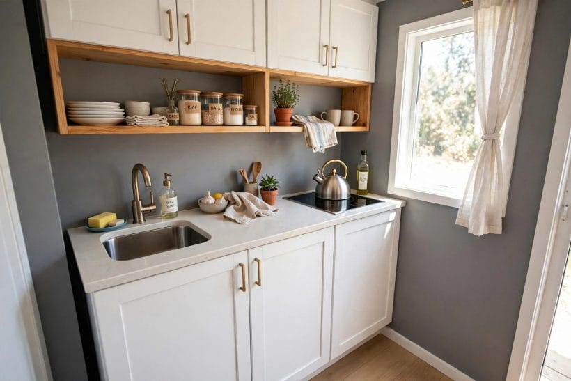
A pale stone or stone-look counter is the classic bridge: it echoes the cabinets at worktop height and softens the step up to the grey wall. Soft veining adds movement without adding a third colour, and the paler the stone, the calmer the whole wall reads.
14. White Tile Backsplash, Grout as the Line
White tiles above a pale counter double the brightness where the work happens. The grout becomes the design: pale grout disappears into calm, while a mid-tone grout draws a fine grid that mediates between the white cabinets and the grey wall behind them.
15. A Timber Counter to Warm the Middle
A timber worktop is the warm mediator: paler than a dark floor, warmer than the cabinets, it shakes hands with both the grey and the white. It asks for oiling and honesty about water marks, and repays both with the room’s friendliest surface — a good choice where the grey runs cool.
16. Full-Height Splashbacks for Small Rooms
One more mediation decision hides in the splashback: how high it climbs. A counter-height splashback keeps the bright band thin and the pairing crisp; a full-height tiled or panelled splashback widens the pale field and calms the whole wall. In small kitchens the taller splashback usually wins — it stretches the white upward to meet the cabinets and leaves the grey as a single calm note above.
Whatever the counter, keep the palette to three notes at most: grey, white and one mediator, whether that mediator is stone, timber or tile. A fourth colour — a loud kettle, a patterned blind, a coloured appliance — can still work, but it should arrive as an accent chosen on purpose, not as a fifth or sixth note that nobody planned.
6. Metals, Handles and Taps
Metals are the pairing’s jewellery, and the rule is the same as for any jewellery: one finish, repeated, beats three finishes competing. Brass warms a cool grey; brushed nickel keeps a warm grey honest; matte black draws a quiet line between the white and the grey that suits flat-front cabinets especially well. Whichever finish is chosen, it should appear on handles, tap and lighting together, so the room reads as one decision.
17. Cup Handles for a Traditional Feel
Cup handles give shaker white cabinets a traditional, kitchen-garden feel that sits kindly against a soft grey wall. They are comfortable to grip and forgiving of the odd splash, and their shape echoes the curve of a tap or a pendant.
18. Slim Bars for a Modern Line
Slim bar handles suit flat-front white cabinets: a single horizontal line repeated across the run, quiet and architectural. Keep the lengths consistent — mixed lengths on drawers and doors are the detail that makes a modern kitchen look assembled from leftovers.
19. Knobs Where Bars Would Crowd
On small doors, narrow uppers and the ends of runs, knobs beat bars: they take less visual space and cost the eye less attention. A kitchen that mixes bars on drawers with knobs on doors, in the same finish, reads as designed rather than improvised.
20. The Tap as the Room’s Signature
The tap is the one metal object used many times a day, so it earns the best finish in the room. Choose it in the same finish as the handles, at a height that clears the tallest pot, and let it be the single brightest metal note against the grey and white around it.
One caution: metals age differently in a kitchen’s steam and splashes, so the finish that looks perfect in the showroom should be checked for how it is cleaned and how it wears. A finish that needs special care will either be cared for or resented, and resentment is a poor basis for a room lived in daily.
7. Walls and Light
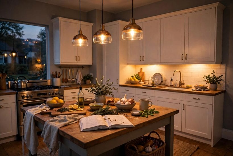
Light is what makes grey walls and white cabinets either glow or go flat, and the room gets two kinds of light to manage: the daylight that arrives through windows and the lamplight that takes over in the evening. Daylight decides how the grey reads — warm at sunset, cool at noon — while lamplight decides how the white reads, because a cold lamp can turn warm white cabinets grey and a warm lamp can turn cool grey walls brown. The two lights must be planned together, not one after the other.
21. Windows First, Always
No lamp replaces a window. If the plan allows a choice, put the sink or the main worktop where the daylight falls, so the white cabinets catch the sun and the grey walls sit in its softer reflected light. A kitchen planned around its window is a kitchen that looks good for free, every day.
22. Layered Lamplight for Evenings
Evenings need layers: pendant lights over an island or table, under-cabinet lights over the worktops, and one soft general light for the room. The under-cabinet layer matters most against grey walls, because it washes the white fronts and the counter while leaving the grey to recede gently behind them.
23. Warm Lamps, Checked Against the Grey
Choose lamp warmth against the actual grey, not in isolation: a warm lamp flatters a warm grey and softens a cool one, while a cold lamp sharpens a cool grey and chills a warm one. Test the lamps with a painted board and a cabinet door together, at night, before the electrician finishes — changing a lamp afterwards is easy, but living with the wrong one is a daily irritation.
24. Mirrors and Gloss as Borrowed Light
Where daylight is short, borrow light instead of adding lamps: a glazed cabinet door, a pale glossy splashback, a mirror on the wall opposite the window. Each one hands a little daylight back to the grey walls, and together they can lift a dim kitchen by more than any single new fitting.
The test of the lighting plan is simple: stand in the kitchen at midday, at dusk and at night, and ask whether the grey still reads grey and the white still reads white. If either one has drifted — grey turned greenish under a lamp, white turned yellow under another — the lamps, not the paint, are usually the culprit, and they are the cheaper thing to change.
8. Small Kitchens and Tiny Homes
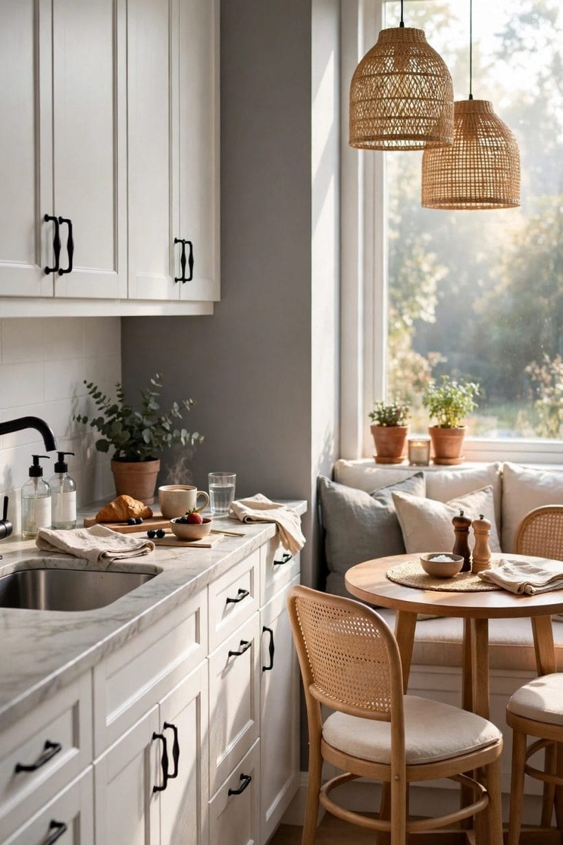
Small kitchens are where this pairing earns its keep. Grey walls stop a tiny room from feeling like a white box, and white cabinets stop it from feeling like a grey one; together they give a compact kitchen depth without darkness and brightness without glare. The trick in a small room is restraint: one grey, one white, one metal, one counter — and then texture, through timber, linen and plants, doing the work that colour does in a larger room. The broader room plans in kitchen ideas show how the same restraint scales up.
25. Paler Grey for the Smallest Rooms
In the smallest kitchens, take the grey a step paler than you first intended: pale grey walls with white cabinets read as one continuous light surface with a gentle shadow, and the room feels larger for it. The deeper greys can return as accents — a blind, a runner, a painted stool — without closing the walls in.
26. Handleless or Knobbed Fronts to Save Space
Protruding handles catch hips and aprons in a tight kitchen. Handleless fronts, or small knobs kept flush, save the few inches that matter in a galley, and they keep the white runs looking like clean panels against the grey rather than a row of hardware.
27. Open Shelving in Small Doses
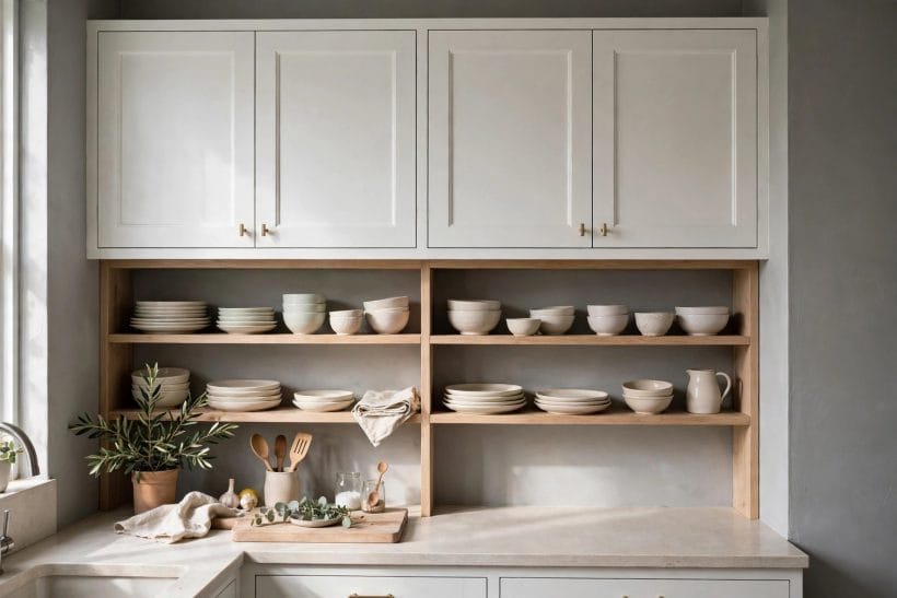
One or two runs of open shelving against a grey wall break up a wall of white cabinets and give a small kitchen somewhere to show its prettiest crockery. Keep it to a single stretch — a whole kitchen of open shelves is a whole kitchen of dusting — and keep the contents pale so the shelves read as part of the white, not against it.
28. One Bright Note, Then Stop
Small rooms tempt their owners to add colour everywhere at once. Resist it: one bright note — a plant, a kettle, a runner — against grey and white is a feature, while five bright notes are clutter. In a tiny kitchen, the pairing itself is the decoration, and it needs very little help.
Storage deserves a final word in small kitchens: the pairing looks its best when the worktops are clear, and worktops stay clear when everything has a home inside the cabinets. Before choosing fronts, count what must live in the kitchen and make sure the cabinets, drawers and shelves genuinely hold it — a calm colour scheme cannot rescue a kitchen whose contents live on the counter.
9. Costs in General Terms
Costs for this pairing vary widely, and they vary for reasons that have little to do with colour: the construction of the cabinets, the material of the counter, the scope of any wall preparation, the metal finishes, and whether the work is a repaint, a refit or a full remodel. The honest way to think about cost is as a set of drivers, not a single figure — the same grey walls and white cabinets can be achieved at very different levels of spend depending on which drivers are chosen. The quote-comparison guidance in cabinet pricing explained sets out how to compare those drivers like for like.
Start with the cabinets, because they are usually the largest driver: stock, semi-custom and custom construction sit at different levels, and the finish, the drawer hardware and the door style each move the total. Next comes the counter, where stone, timber and stone-look materials each carry their own level, and the splashback, where tile choice and height matter more than most owners expect. Wall preparation is the quiet driver people forget — a grey wall only looks calm when it is smooth and even, and making an old wall smooth can be a real part of the work.
Metals and lighting are smaller drivers individually, but they add up across a whole kitchen: handles on every door and drawer, a tap, pendants and under-cabinet lights together form a meaningful part of the total, and choosing one finish throughout usually costs less than mixing several. Labour is the final driver, and it varies with the scope: repainting existing cabinets and walls is one kind of job, replacing fronts is another, and a full refit with new cabinets, counters and electrics is another again. Get the scope written down before comparing any two quotes, because two quotes for different scopes are not two prices for the same kitchen.
The practical approach is to fix the pairing first and the level second: decide that the room will be grey walls and white cabinets, then choose the construction, counter and finishes at the level the budget allows, keeping the palette unchanged. A modest version of this pairing, well lit and well kept, looks better than an expensive version whose grey and white were never matched — the pairing is the design, and the design does not depend on the level of spend.
10. Pairings and Palettes to Copy
Once the grey and the white are settled, the rest of the room is a matter of choosing companions that do not argue with them. Timber floors warm the pairing; pale stone counters bridge it; linen and cotton soften it; plants give it life; and a single metal finish holds it together. The reversed contrast in white cabinets with dark floors shows the same white cabinets working against depth rather than calm, and the comparison is useful: where that kitchen leans dramatic, this one leans restful, and the choice between them is a choice of mood.
29. Grey, White and Timber
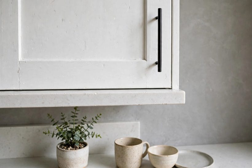
The most forgiving palette of all: grey walls, white cabinets, timber floors and a timber board or stool. The timber supplies the warmth that neither grey nor white can, and the room reads natural rather than decorated.
30. Grey, White and Stone
For a cooler, more architectural room, let stone lead: pale stone counters, a stone or stone-look splashback, and grey walls a touch cooler to match. The white cabinets stay the brightest note, and the room reads calm and precise.
31. Grey, White and Linen
Textiles are the pairing’s softener: linen curtains, cotton tea towels, a woven runner. They break the hard surfaces without adding colour, and they are the cheapest way to change the room’s mood with the seasons.
32. Grey, White and Green
Plants are the pairing’s one living accent, and they suit it perfectly: green against grey and white reads fresh without competing, and a plant on a counter or a sill finishes the room in a way no object can. Even a single pot changes the kitchen from a display to a room.
Whichever palette is chosen, keep the companions few and the grey and white dominant. The pairing works because it is restrained; every additional colour, pattern or material should have to earn its place, and most of them, on honest inspection, will not.
Final Considerations
Grey walls and white cabinets endure because they ask so little of their owners and give so much back: a room that is calm in the morning, bright at noon and gentle in the evening, without ever demanding attention. The decisions that protect that calm are small and unglamorous — matching the grey’s temperature to the white, keeping one pale counter between them, repeating one metal, layering the light, and accepting the honest upkeep that white fronts require. None of them is difficult on its own; together they are the whole design.
Before starting, take the two samples that matter most — a large grey board and a white cabinet door — and live with them in the room for a week, in daylight and lamplight, against the counter and the floor that will actually be there. If the pair still pleases after a week of ordinary days, it will please for years. That is the real test of this pairing, and it is also its real promise: a kitchen that does not date, because it was never trying to be fashionable in the first place.


0 Comments