

Black and white is the bathroom’s oldest colour scheme and its most graphic: two colours, no hiding place, and a century of tile patterns that prove the pairing never exhausts itself. In tile — on floors, walls and shower glass’s other side — the scheme becomes architecture: pattern you walk on, geometry you shower inside.
These seventy-five black and white tile bathroom ideas collect the scheme in its tile forms — checkerboard floors, metro layouts, hexagons, marble, printed patterns and grout used as a drawing tool — with the layout, pairing and care judgements that keep two colours looking sharp rather than stark.
1. Black and White Tile at a Glance
Scope first, because this bathroom family is crowded and the splits are strict. This post owns black and white TILE: the colour scheme carried by ceramic, porcelain and stone on floors, walls and wet zones. The scheme across the whole room — vanities, fixtures, paint and tile together — belongs to black and white bathroom ideas; tile as a bathroom material generally is surveyed in ceramic tile bathroom; the floor as its own subject is in bathroom flooring ideas; and the counters that meet the tile are chosen in bathroom countertops. Every bathroom post in this series reports to the bathroom ideas pillar; here, everything is the tile and its two colours.
One discipline runs through every section: in a two-colour scheme, pattern does the decorating. The tile’s format, layout and grout are the design decisions; the colours are merely the ink. Choose the pattern for the room’s size and nerve, the grout for the pattern’s emphasis, and the fixtures to stand quietly inside the drawing.
| Pattern family | Character |
|---|---|
| Checkerboard | The classic floor — bold, rhythmic, unmistakably graphic |
| Metro layouts | Brick-bond and herringbone — the scheme in its tailored register |
| Small formats | Hexagons, penny rounds, basketweave — pattern at jewel scale |
| Marble and stone | Veining does the drawing — the scheme at its most luxurious |
| Printed pattern | Encaustic-look geometry — maximal pattern, minimal palette |

2. Checkerboard and Chequered Floors

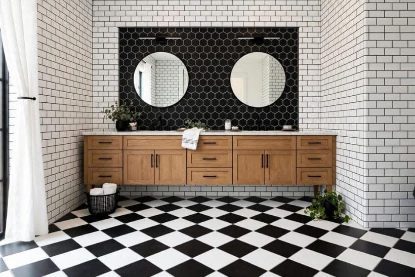
Gallery-1’s floor is the scheme’s founding image: black and white squares in strict alternation, the bathroom built above them like a game in progress. The checkerboard is the boldest floor the two colours make, and the most forgiving of a plain room above it.
1. The classic square checkerboard
Equal black and white squares, laid straight: the floor that has served barbershops, bistros and bathrooms for a century. Its confidence is its charm — everything above it can be simple, because the floor has already made the room’s statement.
2. The diamond-laid checkerboard
Turn the same squares forty-five degrees and the floor gains movement and a period elegance, at the price of more cuts at the edges. Diamond laying suits long rooms, where its diagonal borrows width from the walls.
3. Small-scale checkerboard
The pattern shrunk — small squares, finer rhythm — reads as texture from the doorway and pattern at the feet. It is the checkerboard for small bathrooms, where the full-scale version would shout.
4. Large-scale checkerboard
Oversized squares in a big bathroom slow the pattern to a stately pulse. The fewer the squares, the more each one reads as a slab of colour — the floor becomes minimalist art with grout lines.
5. Checkerboard with a border
A border of plain black or white tile frames the chequered field like a rug — the traditional treatment, and the one that lets the pattern stop short of fixtures and walls with intent rather than interruption.
6. The worn-marble checkerboard
In marble, the checkerboard softens: the white squares vein, the black squares glow, and the strict geometry relaxes into luxury. It is the same floor wearing evening dress — section 5’s material in this section’s pattern.
7. Checkerboard climbing one step
Carrying the floor pattern up a plinth, a step or the bath’s apron ties the room’s levels together. One climb is a composition; more becomes a theme park — the discipline is stopping.
8. Checkerboard with white walls
Above a chequered floor, plain white tile or paint keeps the room’s nerve: the floor performs, the walls applaud. It is the classic distribution and the safest: one pattern per room, worn by the floor.
9. Checkerboard with black walls
The bolder distribution — black on the walls, chequer at the feet — encloses the room in the scheme entirely. It suits bathrooms with strong light and owners with strong convictions, and it is unforgettable in both.
3. Metro and Brick-Bond Layouts

The pin’s wall — elongated tiles in running bond, grout drawn dark — is the scheme’s tailored register: the metro tile, laid like brickwork, in black, in white, or in the conversation between them.
10. White metro, dark grout
The defining modern treatment: white elongated tiles whose grid is drawn by charcoal grout. The pattern is the grout’s, not the tile’s — section 7’s tool at its most eloquent.
11. Black metro, pale grout
The inversion: black tiles gridded in pale lines, glossy as liquorice. It is the scheme’s most dramatic wall and its most demanding — every splash shows, and section 10’s care is its price of admission.
12. Herringbone in two colours
Metro tiles laid in herringbone — all white with dark grout, all black, or the two colours alternating through the weave — give the wall a textile’s richness in ceramic. The pattern carries small walls and splashbacks especially well.
13. Vertical metro
Turned upright, the metro tile draws the eye up and lends low bathrooms height. In white it is quietly modern; in black, a tailored shadow. The bond’s discipline survives the turn intact.
14. Stacked metro
Laid in a straight grid rather than brick bond, metro tile becomes minimalist — the scheme’s contemporary register, where the grout grid is a graph paper the fixtures are plotted on.
15. Mixed black and white fields
Walls zoned by colour — black below the rail line, white above, or the reverse — compose the room in two fields of metro with a drawn boundary. The rail line is where the scheme shows its tailoring.
16. Metro in the shower only
Confining the scheme’s tile to the shower — white metro inside the glass, calm paint outside — concentrates the pattern where the water is. It is the renter-friendly, budget-honest version of the whole post.
17. The bevelled metro
Bevel-edged metro tiles catch light on every edge, and in black they gleam like cut stone. The bevel is the format’s one ornament, and in a two-colour scheme ornament is rationed — this one earns its place.
4. Small Formats: Hexagons, Pennies and Weaves
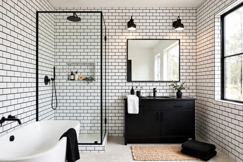
Gallery-2’s room runs on the brick-format unit — the scale this section leaves behind. Small formats shrink the tile until the pattern is woven rather than drawn: tiles at jewel scale, and the bathroom a textile underfoot.
18. Hexagon flowers
Black hexagons dotted through white ones make the Victorian floor flower — a pattern older than the bathroom itself, revived in every generation since. Its charm is arithmetic: a handful of black tiles in a white field, blooming at intervals.
19. All-white hexagons, dark grout
The quiet version: one colour of tile, the pattern drawn by grout alone. From the door it reads as texture; at the feet, as lace. It is the small format for owners who want pattern at a whisper.
20. All-black hexagons
Black hexagons with pale grout make a floor of dark honeycomb — dramatic, grounding, and kind to the white fixtures it sets off. The grout colour is the whole decision; pale draws the comb, dark dissolves it.
21. Penny rounds
Penny tiles — tiny circles in sheets — soften the scheme’s geometry into bubbles and dots. Underfoot they are the friendliest of the small formats, and in black and white they read as the floor’s polka dot.
22. Basketweave
The woven pattern — pale rectangles interlaced with dark squares — is the small format’s most architectural: a floor that looks constructed rather than printed. In marble it is a classic of grand bathrooms; in ceramic, its democratic heir.
23. Pinwheel and windmill patterns
Squares and rectangles turning around a point compose the pinwheel family — motion in a floor that otherwise holds still. Reserved for the floor or a feature panel, it is pattern with a pulse.
24. Small formats on the wall
Hexagons and pennies climb walls as splashbacks and shower backs, where their texture catches light the big formats cannot. One wall of small format against plain large tile elsewhere is the balanced distribution.
25. The sheeted border
Small-format borders — a band of black hexagons edging a white field — draw the room’s plan in miniature at its edges. The border is the small format used as punctuation, and it suits every other family in this post.
26. Mixing two small formats
Hexagons on the floor, pennies in the shower niche: two small scales can share a room when their colours match exactly and their zones are clear. The scheme unifies what the formats vary.
5. Marble and Stone-Look Black and White

Gallery-3’s shower — small black hexagons carried wall to wall — stands at this family’s threshold: one colour creating pattern by shape alone. The stone and printed looks go further, letting geology or the printing press draw what the two colours then perform.
27. White marble, honestly veined
The classic: white marble whose grey veins are the room’s only pattern. Everything else — fixtures, grout, towels — stands back. Its checks are the stone’s sealing and the owner’s temperament, both covered in section 10.
28. Black marble as the accent
Black stone used sparingly — a floor border, a niche back, a vanity’s splashback — against white marble walls composes the scheme at jewel-box scale. The black’s own white veins keep it in the family.
29. Marble checkerboard
Section 2’s pattern in section 5’s material: the checkerboard in two marbles is the grand hotel floor, softened by veining into luxury. It is the scheme’s most expensive sentence and its most quoted.
30. Book-matched marble walls
Slabs mirrored so their veins compose a figure — the shower wall as a Rorschach in stone. Two colours become one artwork; the rest of the room must be quiet enough to hang it.
31. Stone-look porcelain
Porcelain printed with marble’s face gives the look with a fraction of the care — the democratic marble, honest about its nature and kind to busy households. At a glance it composes identically; the difference is lived, not seen.
32. Honed against polished
Finish is the stone family’s sheen decision: polished gleams and shows water; honed sits matte and forgives. Floors lean honed for grip and mercy; walls may shine. The two colours read a full shade apart between the finishes.
33. Marble mosaics
Stone cut small — hexagons, chevrons, basketweave in real marble — joins section 4’s patterns to this section’s material. The chevron in two marbles is the contemporary favourite: geometry and geology in one band.
34. The black stone floor
A floor of black stone or stone-look tile under white walls grounds the room like a shadow. It heats the scheme’s nerve to its highest — and section 10’s dust-and-limescale honesty applies in full.
35. Stone thresholds and saddles
The marble threshold at the door — the saddle the foot crosses — is the stone family’s smallest member and its traditional signature. A black saddle into a white room, or the reverse, frames the entry like a title page.
6. Printed Pattern: Encaustic-Look and Graphic Tiles
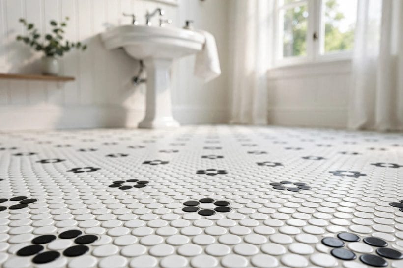
Gallery-4’s floor, photographed low across white penny tiles flowered in black, is scale made visible: thousands of small units and their joints composing one textile. Grout is this scheme’s third colour — the one that decides whether two colours read as pattern or as plain.
36. The encaustic-look star
Star and medallion prints in black and white compose floors of woven-looking complexity from four plain colours’ worth of ink — in fact from two. It is the Victorian hall floor’s pattern book, opened in the bathroom.
37. Geometric repeats
Cubes, diamonds and optical geometries print the scheme as pure pattern — the floor as a drawing. In small bathrooms one printed floor against white walls is the complete design; nothing else need apply.
38. The printed feature wall
Printed tiles on one wall — behind the vanity, inside the shower — with plain tile elsewhere gives the pattern a frame and the room a focal point. The wall becomes the bathroom’s artwork, washable division.
39. Pattern scale against room scale
The printed family’s one law: pattern scale follows room scale. Large prints in small rooms crowd; small prints in large rooms fidget. The sample board test — a square of tiles laid on the floor before committing — is this family’s test patch.
40. Mixing print with plain black and white
A printed floor with plain black wall tiles, or printed walls with a plain white floor: the mix works when one surface performs and the others accompany. Two printed surfaces in two colours is the room arguing with itself.
41. The patchwork arrangement
Several prints from one family, laid in a deliberate patchwork, compose the bohemian register of the scheme — pattern as plenty. It demands the strictest palette discipline: black, white, and nothing else, ever.
42. Printed tiles in the niche and splashback
At small scale — a shower niche, the vanity’s splashback — a printed tile is a jewel setting. It is also the renter-scale and budget-scale way into this family: a single box of tiles, a whole scheme.
43. Cement-look against true cement
True encaustic cement tiles and their porcelain lookalikes differ in care more than in face: the true tiles are sealed, thirsty and alive with variation; the prints are serene and uniform. Choose by the household’s appetite for patina.
44. The monochrome mural
Some printed sets compose a single large image across many tiles — a landscape or a geometry at wall scale. In black and white it reads as an engraving the room is built inside: the scheme’s most artistic sentence.
7. Grout: The Third Colour

Gallery-5 keeps to the room’s dry end — a patterned feature wall performing behind twin vanities — because immersion is a decision, taken surface by surface. This section takes the scheme into the water.
45. Dark grout on white tile
The modern signature (idea 10’s engine): charcoal joints draw the grid, forgive the eye’s hunt for dirt in the lines themselves, and make white tile read as design rather than as default.
46. Pale grout on black tile
On black tile, pale grout draws the same grid in negative — the liquorice wall of idea 11. The check is maintenance: pale grout is the scheme’s most honest surface, showing everything, and it belongs where it will be cared for.
47. Matched grout: the seamless field
Grout matched to the tile — white on white, black on black — dissolves the grid and lets the surface read as one material. It is the minimalist distribution: the scheme stated by zones, not by lines.
48. Mid-grey: the diplomat
Between the two colours sits grey grout, the scheme’s peacemaker: it softens white tile without the graphic punch of black, and grounds black tile without pale grout’s upkeep. Most real bathrooms in this scheme are grouted in grey diplomacy.
49. Grout width as a design line
Wide joints make tile read rustic and hand-made; hairline joints make it read machined and modern. In a two-colour scheme the joint is a drawn line, and its weight is chosen like a pen’s.
50. Sealing and the grout’s own care
Grout is the scheme’s porous citizen: sealed where its maker directs, refreshed when it dulls, and chosen in a formulation suited to wet zones. Section 10’s care begins here, in the lines.
51. Grout as the pattern’s switch
The same hexagons, the same pennies, two utterly different floors — one grouted to match, one to contrast. When a scheme feels wrong, the grout is the cheapest variable to change, and often the guilty one.
52. Contrasting grout on patterned tile
On printed and marble tiles, grout takes the supporting role: matched or grey, never competing. The pattern has already spent the room’s contrast budget; the joints should whisper.
53. The grout sample strip
Grout colours dry lighter than they mix and read differently against black and white neighbours. A sample strip — a few tiles boarded and grouted in the candidate colours — is the grout’s test patch, and it has saved more schemes than any other board in this post.
8. Walls, Showers and Wet Zones

The second pin is all tile — a patterned wall doing every decorative job in its room — which raises this section’s question: when tile speaks this loudly, what should the fixtures, fittings and ceramics say? The scheme’s supporting cast is cast here.
54. The fully tiled shower
Inside the glass, one tile treatment end to end — white metro, black hexagons, marble — makes the shower a room of its own. The scheme’s wettest zone is also its most-seen; it earns the best tile in the house.
55. The black shower
Black tile in the shower, white outside it: the cave and the gallery. It is dramatic, cocooning, and — with pale grout — the most maintenance-honest room in this post. Owners choose it with section 10 open.
56. The white shower, dark floor
White walls over a black or chequered shower floor grounds the wet zone and hides a multitude of water marks in the pattern. It is the practical distribution, and the one hotels choose.
57. Half-height tiling and the rail line
Tile to a rail line, paint above: the traditional bathroom’s distribution, and the scheme’s friendliest to future change. Black below and white above grounds; white below and a dark colour above dramatises — the paint is where the scheme can change its mind.
58. The niche in the opposite colour
A shower niche lined in the opposite colour to its wall — black niche in white tile — is the wet zone’s jewel box: small, deliberate, and the first thing the eye finds. One niche, one contrast; the discipline is singularity.
59. Bench, shelf and the tiled extras
Tiled benches and shelves inside the shower carry the scheme into the furniture. In marble they read as architecture; in the wall’s own tile, as continuity. Either beats a plastic caddy in a room this composed.
60. Slip and finish underfoot
Wet floors ask for grip, stated generally: matte and small-format tiles — whose many grout lines are themselves a texture — are the shower floor’s traditional answers. The mosaic floor is not a style choice only; it is the safe one, in both senses kept general here.
61. The bath panel and apron in tile
Tiling the bath’s panel in the room’s scheme — checkerboard echoing the floor, marble matching the walls — integrates the bath into the composition. It is the difference between a tiled room with a bath in it and a tiled bathroom. (The tubs themselves, by configuration, are designed in alcove bathtub ideas and its walk-in and corner siblings; this post dresses whichever one the room has chosen.)
9. Fixtures and Finishes Against the Tile

Gallery-6 composes several eras in one room — brick-bond black walls, a white mosaic floor, a plain white suite before a round mirror. The scheme’s history is short enough to hold in one bathroom; this section walks it.
62. The white suite, always
Sanitaryware in white is the scheme’s constant: bath, basin and pan disappear into the colour family and let the tile speak. Coloured suites belong to other schemes and other decades.
63. Black taps and fittings
Matte black brassware is the contemporary default against black and white tile — it repeats the black, sharpens the white, and turns every fitting into punctuation. Its care is section 10’s: water spots show on black as surely as on tile.
64. Chrome: the traditional metal
Chrome is the scheme’s period fitting — the metal the original checkerboard bathrooms wore. It lightens black tile, cools white tile, and suits the traditional families of sections 2 and 4 best.
65. Brass and gold warmth
Warm metal against the two colours adds the scheme’s only warmth — a jewel note in marble rooms and printed-pattern rooms especially. One warm metal, used consistently, is the rule; two is a crowd.
66. The vanity in black or white
A black vanity against white tile, or a white vanity against black — the furniture joins the scheme by opposition. Timber vanities warm it from outside the palette, as the farmhouse door warmed the white house in this batch’s exterior post.
67. Mirrors and glass
Frameless mirrors and clear glass keep the scheme unobstructed; a black-framed mirror repeats the grout’s drawn line at face height. The shower screen’s edge, black or chrome, should agree with the fittings’ verdict.
68. Towels, plants and the soft layer
The scheme’s soft furnishings stay in the family — white towels, black towels, a stripe of the two — with green planting as the single permitted guest colour. A plant against black and white tile is the room’s pulse; everything else wears the uniform.
10. Keeping the Scheme Sharp: Care in General Terms
The last attribute is the one two colours are famous for: they show everything. White tile shows the splash, black tile shows the limescale, pale grout shows the year. The scheme is kept the way it was chosen — deliberately, and in general terms.
69. The wipe-down habit
Black tile and black fittings stay sharp by being dried — a soft cloth after the shower, a minute’s work that prevents the mineral film water leaves as it evaporates. The habit, not any product, is the black tile owner’s real secret.
70. Limescale, stated generally
In hard-water districts the white deposits gather on the dark surfaces first. General care — regular gentle cleaning suited to the tile’s material, per the maker’s guidance, and water softening where the household chooses it — keeps the scheme ahead of its water.
71. Stone’s sealing rhythm
Real marble and stone in this scheme are sealed on the rhythm their supplier states, and cleaned with the neutral care stone demands. The porcelain lookalikes of idea 31 exist precisely for households who decline this rhythm — an honest choice, made in advance.
72. Grout refreshing
When grout dulls past cleaning, it is refreshed or renewed rather than endured — the scheme’s lines are its drawing, and a faded drawing fades the room. The grout sample strip of idea 53 governs the refresh as it governed the birth.
73. Chips, cracks and the spare tile
Keep a box of spares from every tile used, stored with the house’s records. A chipped black tile among a hundred is a full stop in the scheme’s sentence; the spare box is how the sentence gets repaired in the same words.
74. Repainting the painted zones
Where the scheme uses paint — above the rail line, on the ceiling — the repaint rhythm is the room’s refresh: white ceilings dull, dark walls mark. The tile endures; the paint is the scheme’s renewable surface.
75. The honest verdict
Black and white tile is the scheme for households who enjoy precision: it rewards the wipe-down, the sealed stone and the kept spare, and it shows neglect faster than any palette in this series. Chosen with that knowledge, it stays the sharpest room in the house for decades — the checkerboard in section 2 has been proving it for a century.
Final Considerations
Choose the pattern for the room’s scale, the grout for the pattern’s voice, the fixtures to punctuate rather than compete, and the care rhythm before the tile, not after it. Seventy-five ideas, two colours, one discipline: in a black and white bathroom the tile is the decoration, the architecture and the argument, all in a grid of grout lines. No scheme in the bathroom family rewards deliberation more — or forgives its absence less.



0 Comments