

Some colour pairings need persuading. Yellow and green do not. Put a butter-yellow cushion on a sage sofa, or a pot of green leaves beside a mustard wall, and the room settles at once — as if the two had always been waiting to meet in that particular corner.
This guide works through the pairing properly: the shades that suit each other, the proportions that keep it calm, and the rooms where it earns its keep most happily.
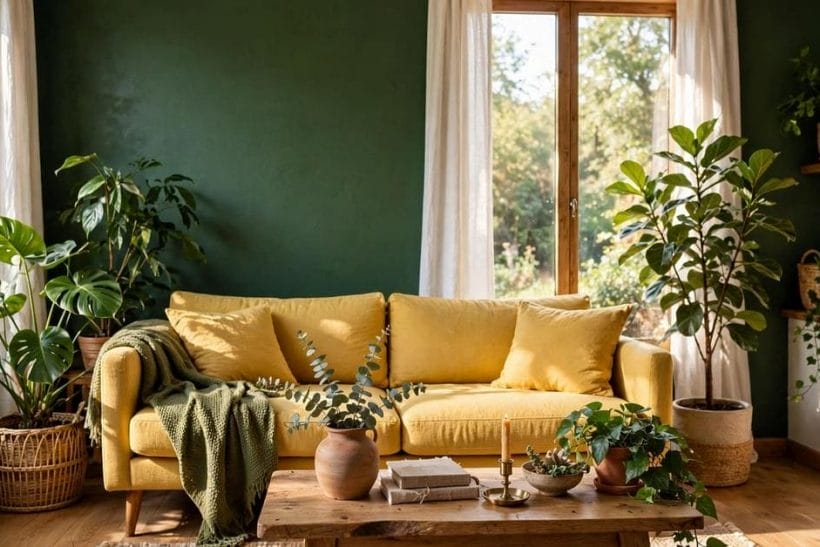
1. Yellow and Green at a Glance
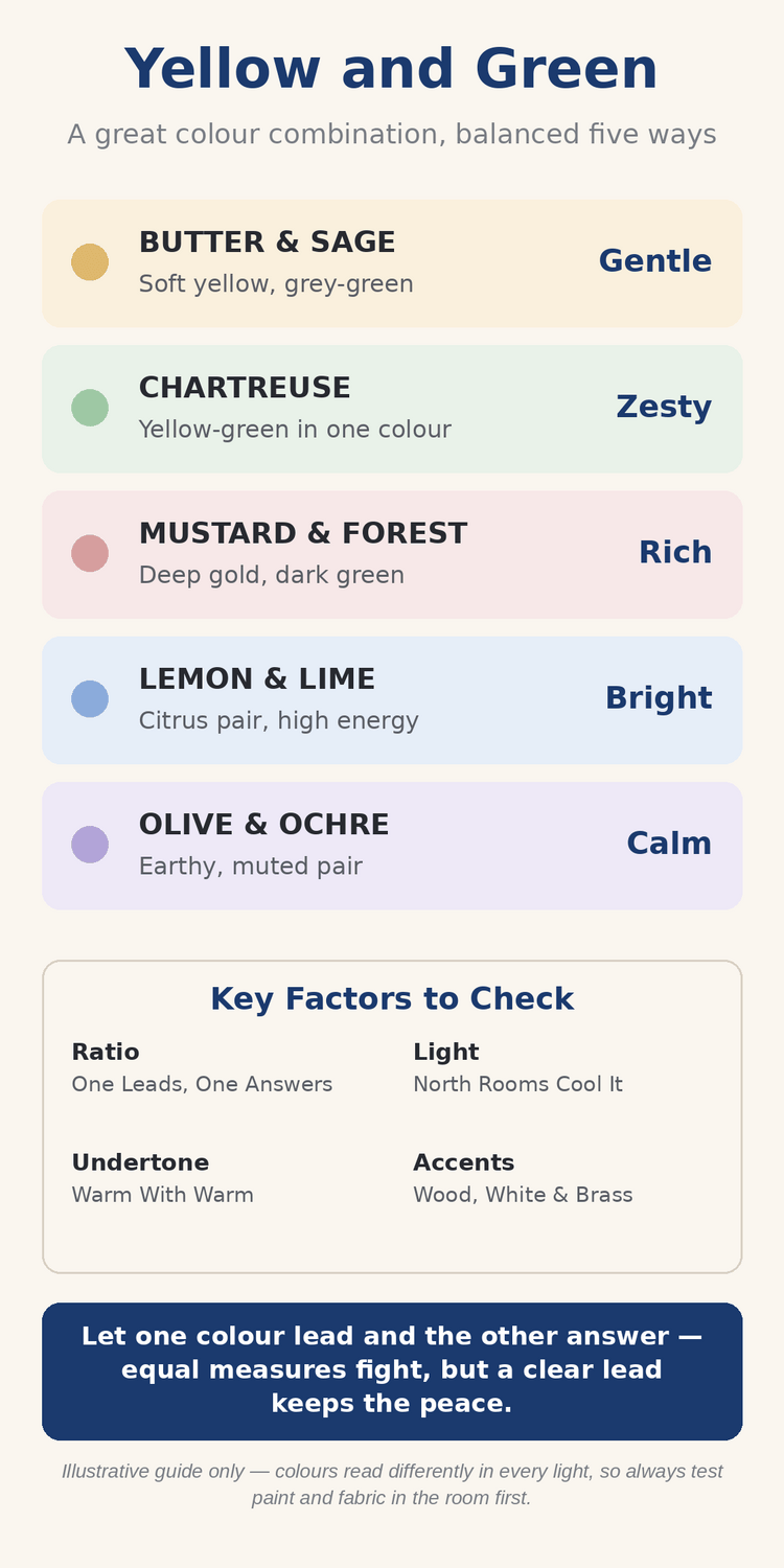
Scope first. Colour pairings are a family of guides on this site, and this post owns the yellow-green pairing specifically — yellow with green, across rooms, in general terms. Other pairings, and single-colour guides, are handled elsewhere; here the whole subject is how these two colours behave together, from the softest butter and sage to the deepest mustard and forest, and how to balance them in a real home.
The orientation is simple: this is nature’s own pairing — sunlight and leaf. Almost every landscape you have ever loved is built from it, which is why it rarely jars indoors. Yellow brings the warmth and the light; green brings the calm and the depth. Together they can be gentle or bold, but they almost never feel accidental.
| Pairing | Balance | What it means |
|---|---|---|
| Butter and Sage | Soft with soft | The gentle pairing for bedrooms and quiet rooms |
| Chartreuse | One colour, both parents | Yellow-green in a single shade, zesty and modern |
| Mustard and Forest | Deep with deep | The rich pairing for dining rooms and studies |
| Lemon and Lime | Bright with bright | High-energy citrus for kitchens and play spaces |
| Olive and Ochre | Muted with muted | Earthy, settled tones for halls and living rooms |
2. Why Yellow and Green Belong Together
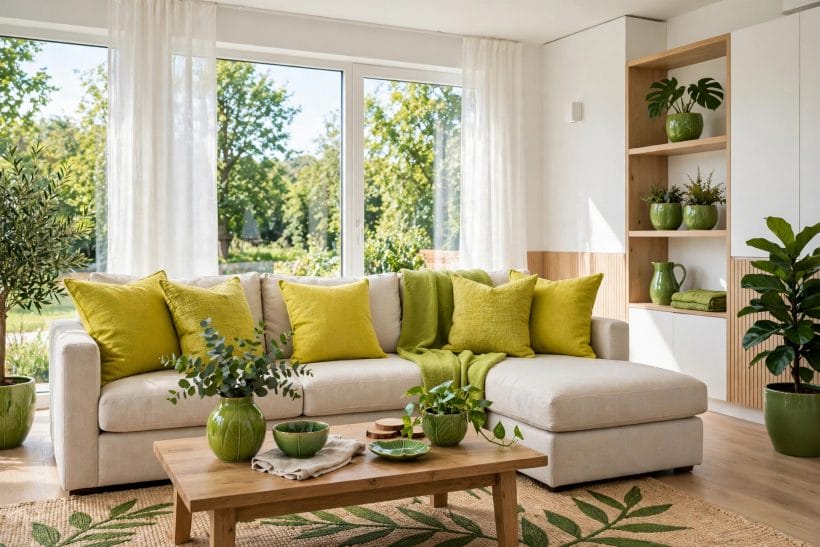
Most successful pairings have a logic you can point to, and this one has the oldest logic of all: it is the colour scheme of the outdoors. Understanding why it works makes every later choice — shade, ratio, room — much easier to judge.
The nature logic behind the pairing
Leaves are green and sunlight is golden, and the eye has read that combination every day of its life. A room in yellow and green borrows that familiarity, so it feels resolved before you have consciously judged a single shade. No other warm-and-cool pairing arrives with quite this much goodwill already built in. Daffodils against hedges, lemons hanging among leaves, late light across a green field — the references are all pleasant ones, and a room dressed in these colours quietly borrows every one of them.
Warm and cool in one pairing
Yellow is the warmest colour in most rooms and green sits near the cool middle, so the pairing balances itself. A green room that feels slightly cold warms up with yellow fabric; a yellow room that feels slightly frantic calms down with green leaves, paint or upholstery beside it.
The in-between colour that bridges them
Between yellow and green sits a whole family of yellow-greens that belong to both parents at once. The chartreuse colour guide explores the brightest of them in depth. Used on cushions, glass or a single chair, these in-between shades stitch the two main colours together so the scheme reads as one idea, not two competing ones.
3. The Ratio Question: Which Colour Leads
Shade matters, but proportion matters more. Yellow and green in equal, competing measures fight for attention; give one colour the lead and the other the answering role, and the same shades suddenly look deliberate. These are the three arrangements that work.
Green leads, yellow answers
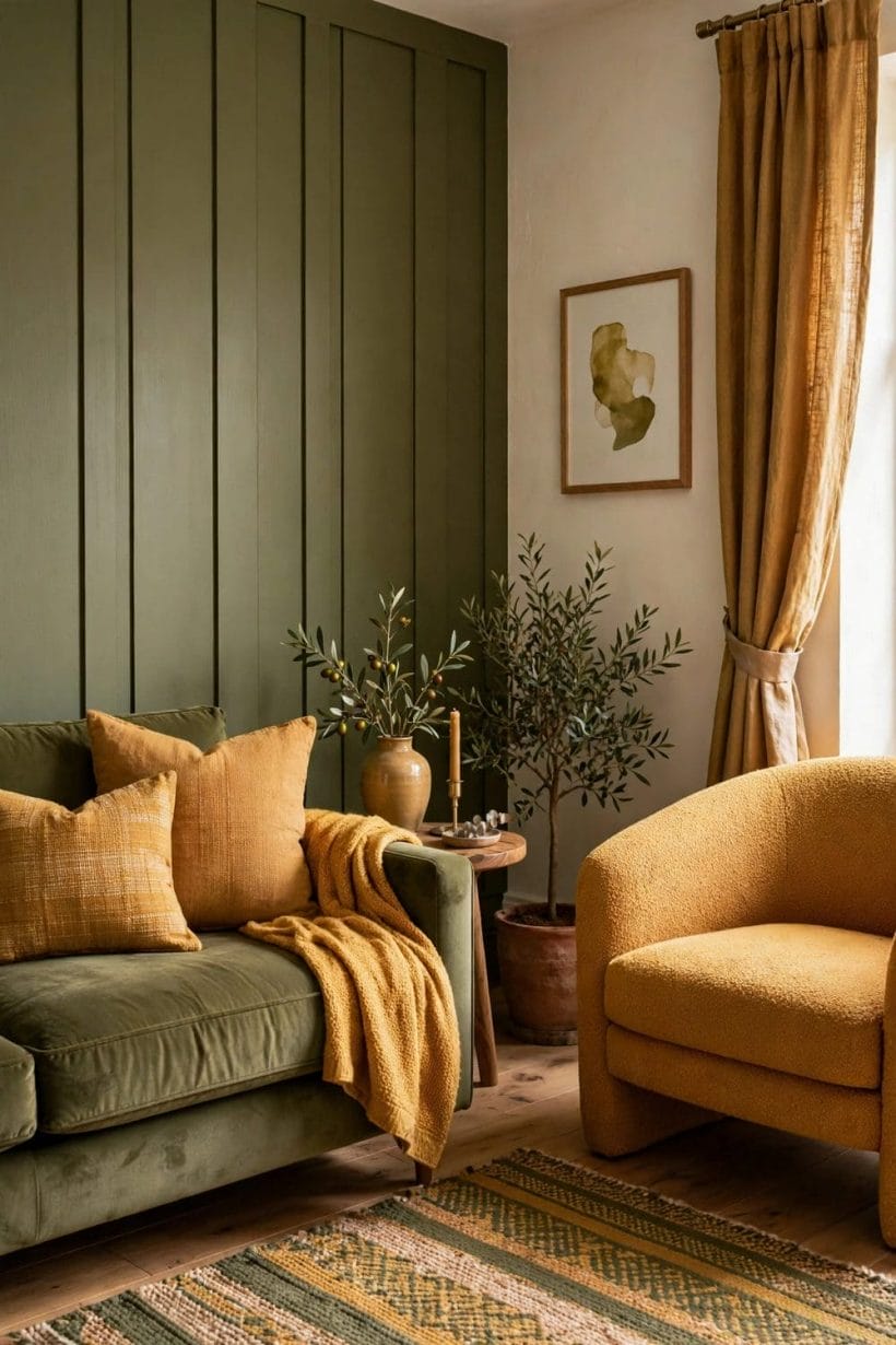
The calmest arrangement: green on the large surfaces — walls, sofa, curtains — and yellow in the accents that catch the light, such as cushions, lampshades, artwork and flowers. It suits living rooms and bedrooms, because green recedes quietly while the yellow notes supply all the cheer the room needs.
Yellow leads, green grounds it
The sunnier arrangement: yellow on walls or big upholstery, grounded by green in plants, rugs, chairs and woodwork. It brings real energy to kitchens and halls, but the green must be present in solid pieces, not just a houseplant or two, or the yellow floats without an anchor.
The neutral third that referees
Cream, white, warm wood and natural linen stop the two colours from shouting over each other. Let the neutral carry the floor, the ceiling and the largest textiles, and yellow and green can both be stronger without the room tiring you. Most settled schemes are, quietly, three-colour schemes. The neutral also gives the eye somewhere to rest between the two stronger notes, which is why a cream sofa or a pale rug often does more for a yellow-green room than another coloured piece would.
4. Soft Pairings: Butter, Sage and Cream
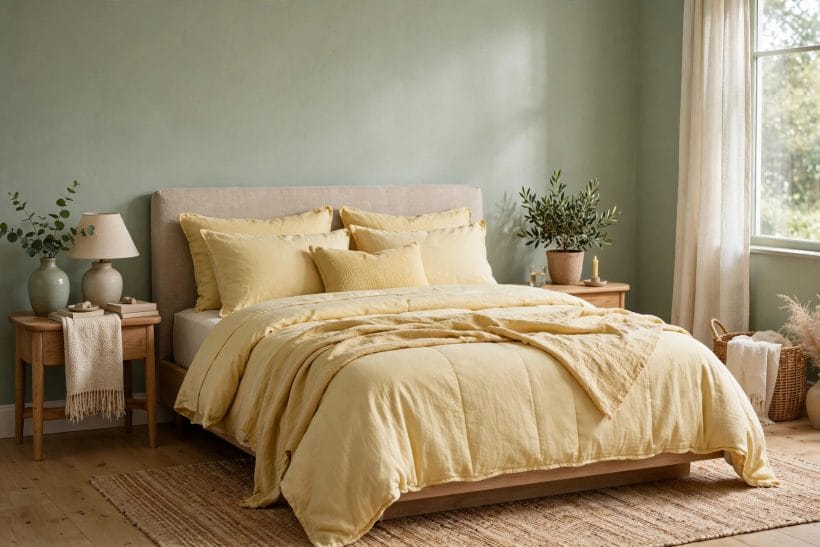
At the gentle end of the family, both colours are softened — yellow towards butter and cream, green towards sage and pale leaf. This is the version for quiet rooms, nervous decorators and homes that want colour without any sense of performance.
Butter yellow without the brightness
Butter is yellow with the volume turned down: creamy, warm and kind to skin and lamplight. On bedding, curtains or a painted cupboard it gives a room a sunny temper without a single bright note, and it pairs naturally with pale timber and white cotton.
Sage green as the quiet partner
Sage is green greyed into good manners. It behaves almost like a neutral on walls, yet beside butter yellow its green character wakes up pleasantly. The two together make bedrooms that feel fresh in the morning and settled at night, which is exactly what a bedroom is for.
Cream as the softener between them
Where butter and sage meet, cream stops any edge. Cream woodwork, bedding and rugs blur the join between wall and accent, so the room reads as layers of one soft idea. Keep textures varied — linen, wool, painted wood — so gentle never slides into bland. A soft scheme lives on touch and shadow rather than contrast, so a knitted throw, a matte wall and a glossy ceramic vase in the same pale family will read as richness, not sameness, once the light moves across them during the day.
5. Bold Pairings: Chartreuse, Citrus and Leaf
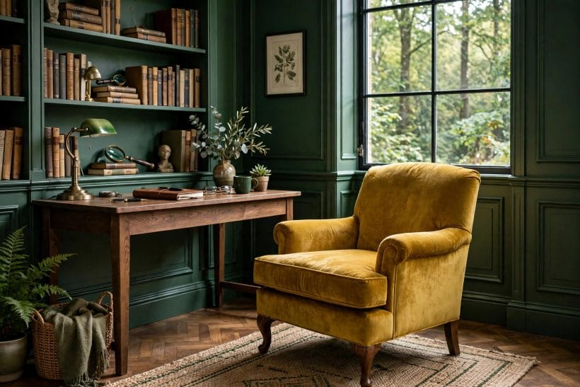
At the lively end, both colours speak up: yellow towards lemon and chartreuse, green towards lime and clear leaf. This version suits smaller doses, braver rooms and households that like their colour with the sun still in it.
Chartreuse as the headline shade
Chartreuse is yellow-green at full voltage, and a little carries a long way — a chair, a door, a run of cushions. Surround it with clear leaf green and plenty of white, and it looks modern and deliberate; surround it with more brights and it quickly becomes noise.
Lemon and lime in honest citrus
Lemon yellow with lime green is the kitchen pairing above all others: clean, appetising and awake. Keep surfaces simple and let the colour live in tiles, stools, blinds and crockery, so the scheme can change with a single shelf of objects rather than a repaint.
Leaf green to hold the energy
Bright yellows need a green with enough body to hold them, and clear leaf green is that anchor. The deeper earth-led sibling of this pairing is explored in the brown and green colour combinations guide. In bold schemes, repeat the leaf green in at least three places so the eye reads rhythm, not accident. A plant on a shelf, a green glass vase and a patterned cushion are enough; the repetition tells anyone entering that the brightness was chosen on purpose, and confidence is what separates a bold room from a merely loud one.
6. Deep Pairings: Mustard, Olive and Forest
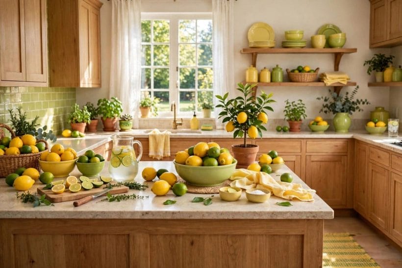
Deepen both colours and the pairing changes character completely: yellow towards mustard and ochre, green towards olive and forest. The result is rich, evening-friendly and unexpectedly formal — the version for dining, reading and lingering.
Mustard as the grown-up yellow
Mustard keeps yellow’s warmth and loses its shrillness. In velvet, wool or painted cabinetry it flatters candlelight and firelight, and beside deep green it takes on a slightly antique richness that suits older houses and inherited furniture particularly well.
Olive as the settled green
Olive is green mixed with earth, and it settles a room the way few colours can. On hall walls, kitchen units or a study bookcase it holds mustard and ochre accents calmly, asking only for warm metals and natural wood to complete it.
Forest green for full depth
Forest green on all four walls makes the richest background in this whole family. Paired with mustard upholstery and warm lighting, it turns dining rooms and studies into rooms that hold people late into the evening. Test it large first; depth this strong should be chosen, never drifted into. Painted well and lit warmly, these deep rooms feel protective rather than dark, especially in winter, and they flatter books, leather, brass and candlelight in a way paler schemes simply cannot match.
7. Yellow and Green in the Living Room
The living room is where this pairing is asked to do the most — welcome guests, calm evenings and look good at every hour. The yellow living room ideas collection shows the sunny half of the scheme at work; the arrangements below add the green that completes it.
Sofa and wall: the main decision
Choose which of the big two carries which colour. A yellow sofa against green walls is cheerful and grounded; green upholstery against soft yellow walls is sunnier and lighter. Either works, but deciding this one pairing first makes every later purchase — rug, curtains, cushions — straightforward. If the room faces north, lean towards the sunnier arrangement and let yellow do the warming; if it faces south and already glows at midday, let green take the walls and cool the whole scheme into balance.
Plants as the living version of the scheme
Houseplants are green that moves, shadows and grows, and against yellow fabric or walls they complete the pairing without a tin of paint. Group them at different heights near the yellow pieces, so the two colours keep meeting as the eye travels round the room.
Wood, white and warm metals as support
Timber floors, white ceilings and brass or aged-gold details keep a yellow-green living room feeling furnished rather than themed. If the scheme ever feels too sweet, add dark wood or black in small pieces; contrast is what makes gentle colour look grown-up.
8. Bedrooms, Kitchens and Bathrooms
Beyond the living room, each room asks the pairing a slightly different question. Bedrooms want it softened, kitchens want it sharpened, and bathrooms want it fresh — and the same two colours can answer all three.
Bedrooms: the soft end of the family
Keep bedrooms at the butter-and-sage end: pale yellow bedding, sage walls or curtains, cream in between. The yellow bedroom ideas guide gathers the sunny versions. Morning light does half the decorating here, and nothing in the room should be brighter than the person waking up in it.
Kitchens: citrus with green cabinetry or tiles
Kitchens can take the boldest version happily. Green units or tiles with yellow stools, blinds and small appliances feel clean and appetising, while the soft version — sage units, butter walls — suits country kitchens. Worksurfaces in white or wood keep the colour honest.
Bathrooms: fresh, leafy and light
In bathrooms, pair pale yellow with leafy green in towels, plants and painted cabinets, against white sanitaryware and tiles. The effect is garden-fresh rather than clinical, and it survives steamy mirrors and hard light better than most soft schemes do.
9. Outside: Front Doors, Gardens and Green Houses
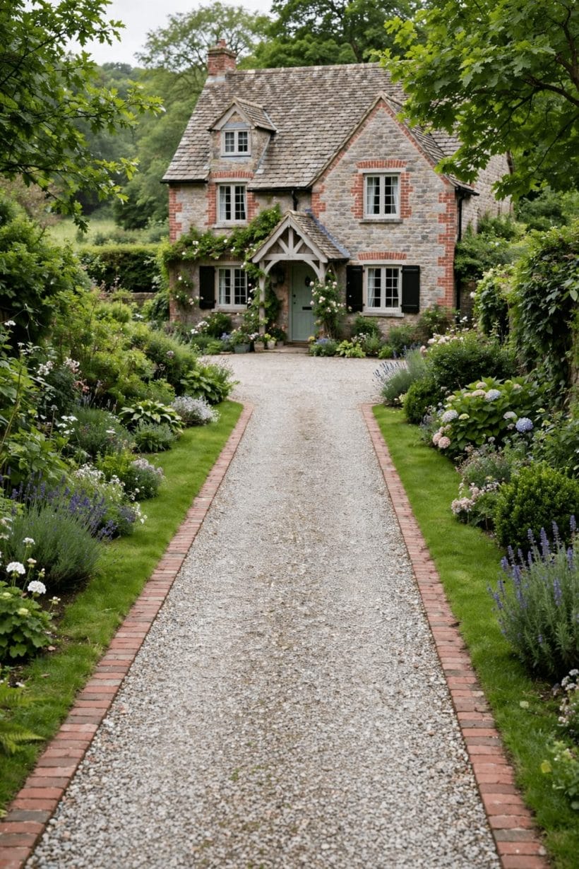
The pairing began outdoors, so it is no surprise that it works beautifully on the house itself. The green exterior home ideas collection covers the green half in full; a yellow door or yellow planting completes the picture.
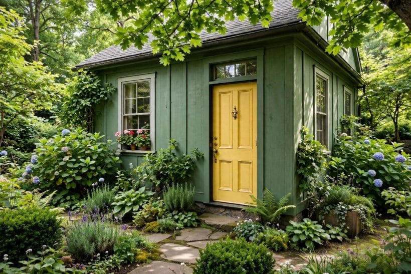
A yellow door on a green house
Few front doors make people smile like a yellow one, and against green-painted render, timber or brickwork softened by planting, it reads as pure welcome. Keep the shade towards mustard or ochre outdoors — bright lemon can glare in full sun — and repeat it in a pot or a bench.
Gardens already own this pairing
Yellow flowers against green foliage is the garden’s default setting, so any scheme near the house only has to join in. Yellow seating, pots or a painted shed echo the planting, while green doors and fences disappear pleasantly into it. Let the garden lead and the paintwork follow. Even a small front garden or a pair of window boxes can carry the pairing outside, and a house that echoes its own planting always looks more settled in the street than one painted in colours that stop abruptly at the front wall.
10. Testing the Pairing in Your Own Light
Every pairing in this guide is a starting point, not a promise, because light rewrites colour in every house. The testing habits below are the difference between a scheme chosen well and a scheme merely hoped for.
Test shades together, never alone
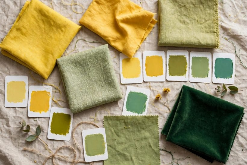
Yellow and green change each other: a sage that looked grey alone can look fresh beside butter, and a mustard can turn muddy beside the wrong forest. Paint test boards of both colours, lean them together in the room, and judge the pair — as the enduring paint colours guide also advises for shades meant to last.
Check morning, noon and lamplight
Morning light cools green and softens yellow; evening lamplight warms both and deepens mustard and forest considerably. Live with the test boards through a full day, and weight your judgement towards the hours the room is actually used, not the hour the shop was open.
Start with fabric before paint
The cheapest honest test is textile: a yellow throw, green cushions, a plant moved into place. Live with the pairing in fabric for a week before any wall is painted. Fabric can move from room to room, be folded away in an afternoon, and be judged at breakfast and by lamplight alike — a week of that honest testing is worth more than any number of small sample cards held up in a shop. The broader families these shades come from are mapped in the timeless paint colour families guide, which helps place a tested shade in its wider family.
Final Considerations
Yellow and green succeed because they were never strangers. Whether you choose them soft in butter and sage, bold in citrus and leaf, or deep in mustard and forest, let one colour lead, let a neutral referee, and test the pair together in your own light. Do that, and the pairing will look as settled in your rooms as it does in every garden and sunlit field that taught it to us.
Start small if you are unsure — cushions, a door, a single chair — and let the room argue for more. Pairings this natural rarely need forcing; they only need permission.

0 Comments