

A good shower layout does quiet work every morning: it stretches a small room, calms a busy one and makes cleaning simpler. The right shower tile patterns can do all three, before colour or fixtures even enter the conversation.
Start with the pattern, match it to the size of the enclosure, then choose finish and grout. These 75 ideas break down into ten practical groups.
1. Shower Tile Patterns At a Glance
| Layout | Best For | Grout Note | Fitting Feel |
|---|---|---|---|
| Straight stack | Modern, calm rooms | Matching grout keeps the grid quiet | Simple, precise setting out |
| Running bond | Classic family showers | Mid-tone grout hides everyday marks | Familiar and forgiving |
| Herringbone | Feature walls and floors | Contrast grout shows every zigzag | More cuts, more planning |
| Chevron | Long, narrow enclosures | Matching grout softens the point | Pre-cut pieces help accuracy |
| Vertical stack | Low ceilings | Slim joints emphasise height | Needs level first row |
| Hexagon mosaic | Small floors and niches | More joints can mean more grip | Sheet-mounted, quicker to lay |
| Large-format | Spacious, spa-style rooms | Fewest joints, easiest wipe-down | Needs flat walls and careful handling |
| Basketweave | Traditional and cottage styles | Two-tone pieces do the talking | Mosaic sheets simplify spacing |
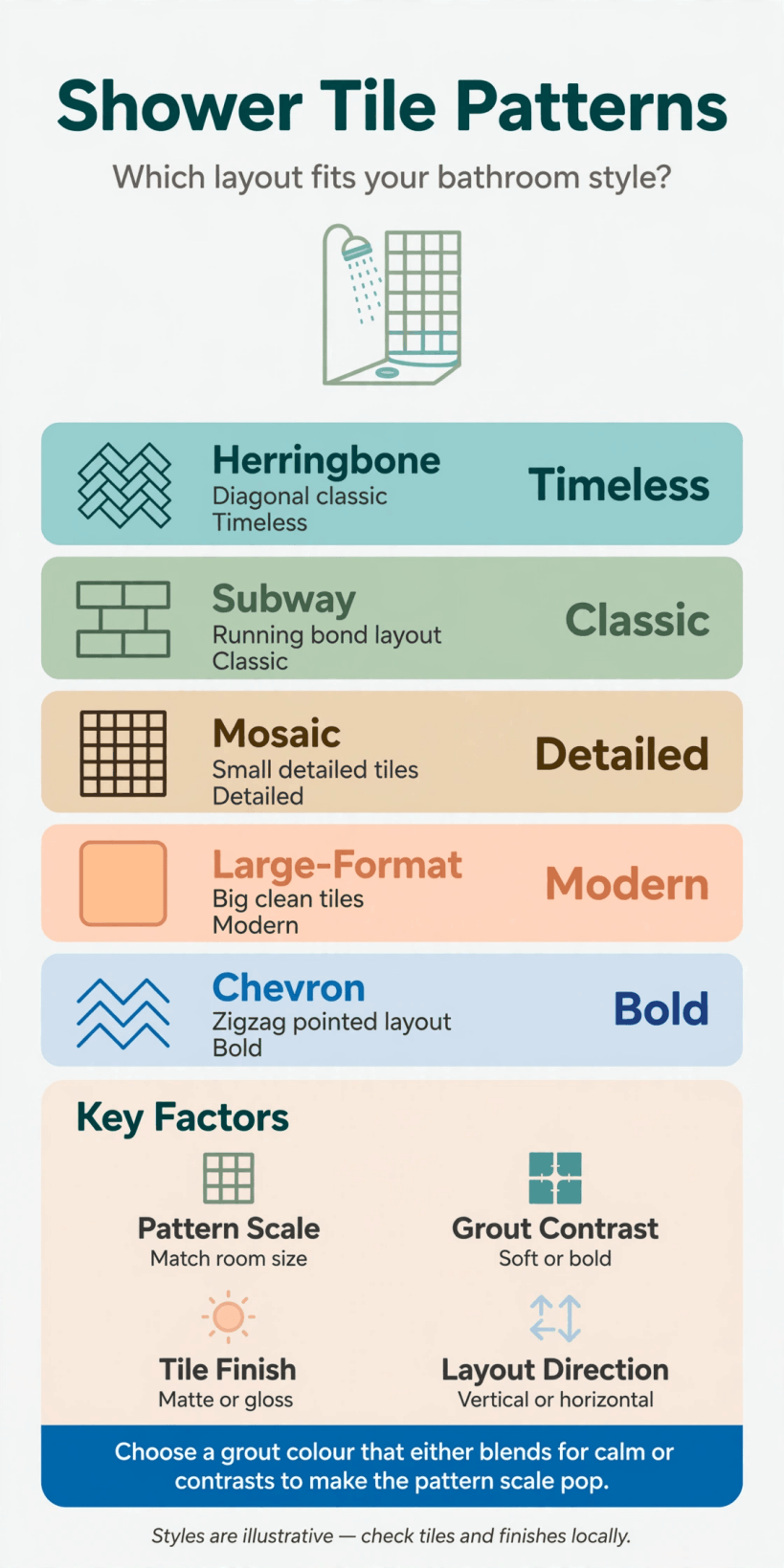
At a glance: compare the main layouts, grout choices and fitting demands before you order a single tile.
Use the table as a filter, not a rule book. A layout that looks wonderful in a wide enclosure can feel restless in a narrow one, and a pattern that seems plain on a sample board often becomes the calmest choice once water, light and glass are added. Tile size, joint width and finish change the same layout completely, so always judge a pattern at full scale: tape the layout on the wall, prop up a row of tiles, and look at it in morning and evening light before committing.
2. Straight Stack and Running Bond: The Reliable Classics
The straight stack lines joints up in neat columns and rows. It suits a grid-loving, modern bathroom, especially with a matte ceramic or porcelain tile and a grout colour matched closely to the tile. Because every joint is visible, the setting out matters: centre the layout on the main wall, plan where cuts land in the corners, and check that the first row is perfectly level. A stack can look stark in a glossy finish, so many people soften it with a warmer white, a stone-effect surface or a slightly wider joint that reads as a gentle shadow line.
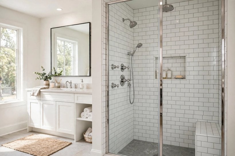
Running bond, the familiar brick offset, is kinder to uneven walls and to beginners. The staggered joints break up long walls, suit subway-style tiles beautifully and hide minor lippage better than a rigid grid. It is a natural fit for compact homes, where the same thinking behind this tiny house and small-space interior design guide applies: simple, hard-working choices that earn their keep. Try a one-third offset instead of a half offset with longer tiles, because a half offset on a slightly bowed tile can leave raised edges; check the tile maker’s guidance on offsets before fitting.
3. Herringbone and Chevron: Movement Without Busy Colour
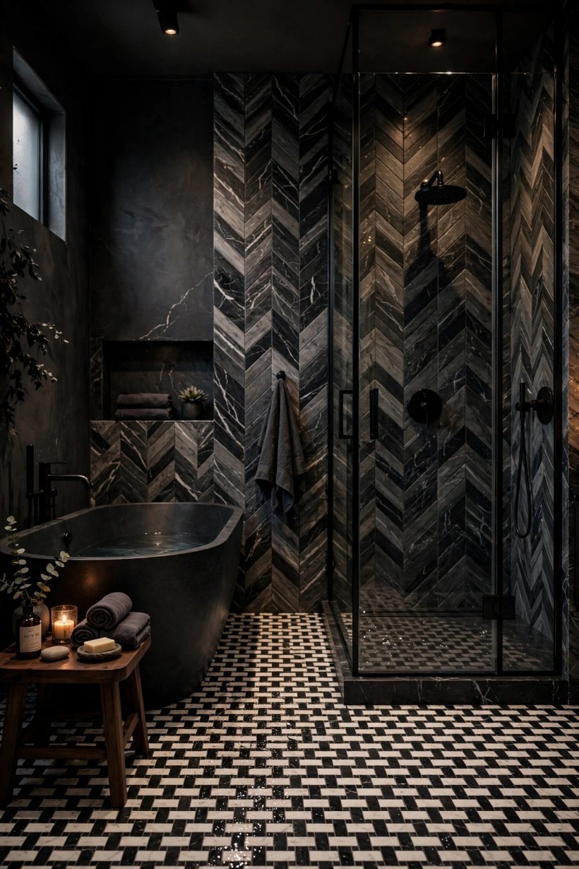
Herringbone lays rectangular tiles at right angles in a broken zigzag, and it brings energy to a plain palette. Keep the tile colour quiet — soft white, pale grey, muted sage — and let the geometry carry the room. On a floor, the many joints can be practical as well as pretty, but confirm the tile is suitable for a shower floor and comfortable underfoot. Herringbone needs a confident plan: find the centre line, dry-lay the first metre, and expect plenty of angled cuts along every edge.
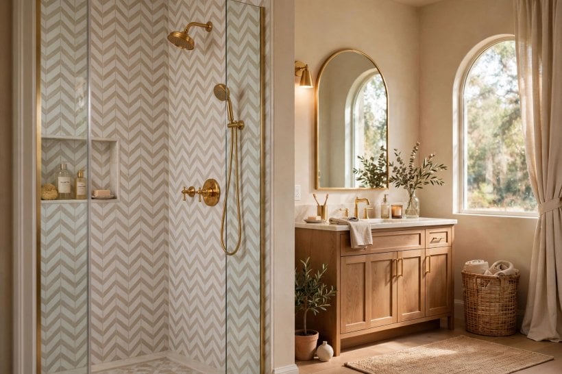
Chevron looks similar at a glance, but the pieces are cut to meet in clean points, giving a continuous arrow rather than a stepped zigzag. It reads sharper and more formal, and it can lengthen a short wall when the points run across it. Because chevron pieces are often sold ready-cut, spacing is easier, yet the points must meet exactly or the whole wall looks untidy. Both layouts reward a test panel on a board first; photograph it, live with it for a day, and only then fix tiles to the wall. If the room already has strong features elsewhere, balance the movement with plain tiles on the remaining walls.

4. Vertical Stacks and Brickwork That Stretch Height
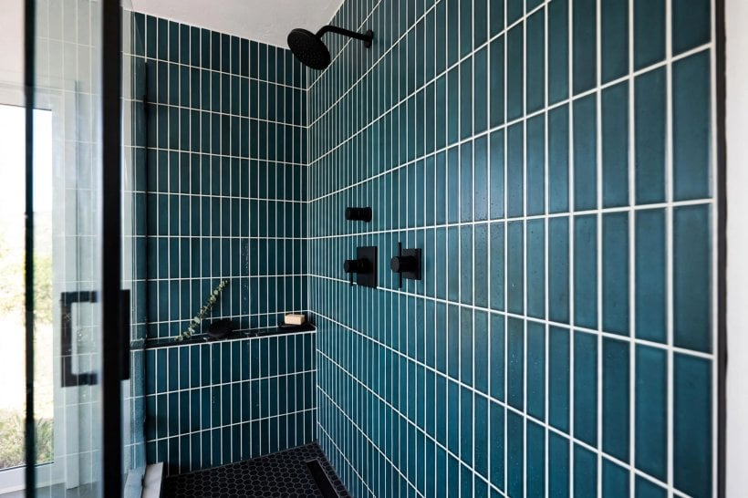
Turning a familiar tile upright is the simplest trick in this whole collection. A vertical stack draws the eye upward, which helps a low ceiling feel less close and gives a narrow enclosure a lift. Vertical running bond does the same with a softer rhythm. Long, slim tiles — sometimes called finger or kit-kat mosaics when they come on sheets — exaggerate the effect and add fine texture that catches light beautifully around a shower column or inside a niche.
Height tricks work best when the rest of the room stays calm. Keep the floor plain, choose one finish for the walls, and let the vertical lines run uninterrupted from tray or bath edge to ceiling where possible. Stopping the tiling at a picture-rail height cuts the lines short and loses the benefit. The same whole-room thinking appears in these home designing ideas for a tiny house, where every vertical surface has to work hard. Remember that vertical layouts show wavy walls honestly, so ask your tiler to check the surface and allow for making it flat; a skim or backer board is rarely wasted money in a wet area.

5. Hexagons, Fish Scales and Small Mosaics
Small pieces bring grip, texture and charm. Hexagon mosaics are the workhorse: classic in black and white, softer in marble-effect porcelain, and playful when a few coloured hexagons are scattered through a plain field as a gentle confetti. Fish-scale or fan tiles curve the geometry, suiting coastal and vintage schemes, and they look best given a whole wall to sweep across rather than being squeezed into a border. Penny rounds offer a friendly, retro feel and a surface full of joints.
All those joints are the trade-off. More grout means more cleaning, and in hard-water homes a mid-tone grout usually ages better than bright white. Sealing and care depend on the material, so check the manufacturer’s advice for natural stone and for grout in wet areas. Small mosaics are forgiving on curved or uneven surfaces and are a smart choice inside niches, where larger tiles would need fiddly cuts — the same small-scale problem solving you will find in these apartment interior design ideas for tiny houses. Order mosaics on sheets, check sheet alignment before fixing, and rotate any sheet that sits slightly off pattern.
6. Large-Format Tiles and Fewer Grout Lines
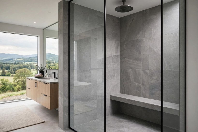
Oversized porcelain slabs and large rectangles calm a room down. With fewer joints, the surface reads almost like solid stone or polished plaster, cleaning is quicker, and a small enclosure can feel surprisingly generous because the eye is not stopped every few centimetres. Stone-effect, concrete-effect and soft mineral designs all work; a honed or matte finish keeps the look relaxed and is usually kinder about showing water marks than high gloss.
Large tiles are demanding in other ways. Walls must be flat, the tiles are heavy, cuts around valves and niches need care, and handling often takes two people. On floors, check slip resistance for wet use with the supplier, and plan the layout so slivers of tile do not land at the doorway or tray edge. Drainage also needs thought: a single large tile cannot follow falls to a central drain easily, which is why many large-format floors pair with a linear drain along one edge. If you love the calm of big surfaces elsewhere at home, the approach in this tiny house kitchen design article — fewer materials, repeated well — translates neatly to the shower.
7. Basketweave, Pinwheel and Woven Looks
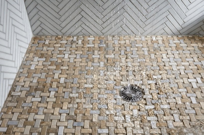
Woven layouts add craft and history. Basketweave alternates horizontal and vertical pairs so the surface looks plaited, and it is most often used on floors in traditional or cottage bathrooms, frequently in marble or marble-effect mosaic with a contrasting dot. Pinwheel, also called hopscotch, mixes one large square with one small square in a turning rhythm; it breaks up a plain floor without introducing a new colour. Windmill and Versailles-style arrangements extend the same idea for bigger rooms.
Because these patterns are busy at small scale, give them room and keep the walls simple. A woven floor with a plain wall tile and uncomplicated fittings looks considered; the same floor with patterned walls as well can feel restless. Contrast is the volume control: matching tones whisper, black-and-white speaks up. Dry-lay a square metre before fixing anything, because woven patterns reveal a drifting layout quickly, and small errors compound across a floor. If you are renovating in stages, photograph your dry lay and number the sheets — a tip borrowed from anyone who has styled layered rooms like those in these living room interior design ideas for a tiny house, where pattern discipline matters just as much.
8. Feature Walls, Niches and Border Details
Not every surface needs the pattern. One feature wall — usually the wall with the shower valve or the back wall you face on entry — can carry herringbone, fish scale or a bold colour, while the side walls stay plain and cheaper to fit. This one-hero approach is also the safest way to use a premium tile on a sensible budget, because a single wall uses far fewer boxes. Keep the junction tidy: a neat metal or matching trim where patterns meet looks deliberate, while a ragged edge looks like a change of mind.
Niches and shelves are the second place pattern earns its place. Lining a recessed niche with the feature tile ties the design together and turns shampoo storage into a detail, and a contrasting niche on a plain wall does the opposite job. Borders and pencil trims can frame a plain field, echo a floor pattern at dado height, or mark the top of a half-tiled wall. Whatever you choose, waterproofing behind the decoration is non-negotiable in a wet zone; confirm the system your installer uses and check product guidance rather than assuming any tile alone keeps water out, a caution that applies across kitchen ideas for tiny houses and small spaces too, wherever water and tight corners meet.
9. Mixing Patterns Safely: One Hero, Quiet Companions
Most successful showers use two patterns at most: one hero and one quiet companion. Pair herringbone walls with a plain floor in the same tile family, or a woven mosaic floor with simple stacked walls. Keep one element constant — colour, material or tile size — so the two patterns feel related rather than competitive. Repeating the hero tile inside a niche or as a narrow strip in the companion surface is a gentle way to link them without adding a third pattern.
Scale is the other safety rule. A large pattern beside a small pattern reads as intentional contrast; two medium patterns of similar size tend to fight. Grout can mediate: one grout colour across both patterns unifies them, while different grout colours push them apart. Sample boards help enormously here — build one with both tiles and the real grout, wet it, and view it from the doorway, because that is the view you will live with. The restraint in these tiny house living room ideas is the same discipline: choose the star, then let everything else support it quietly.
10. Grout, Finish and Maintenance Details That Decide the Result
Grout is not an afterthought; it is half the pattern. A contrasting grout draws the l
One last practical habit separates happy renovations from frustrating ones: order samples of your shortlisted tiles and live with them in the actual room for a few days. Wet them, angle them toward the window, and check them under the warm light you use in the evening as well as the cooler light of morning, because glaze, texture and grout all shift with light. Show the samples to your tiler early, too, and talk honestly about cuts, edges and trims before the first box is opened, since patterned layouts reward planning far more than improvisation. Keep a small reserve of spare tiles from the same batch stored safely afterwards, so a future repair never becomes a hunt for a discontinued design. With samples tested, falls and drainage thought through, and the fitting sequence agreed in advance, the pattern you loved on paper is the pattern you will enjoy, without surprises, for years.
ayout’s geometry in bold lines, which flatters simple stacks and brickwork but can make small mosaics look frantic. A matching grout melts joints away and lets texture and light do the work. Joint width matters too: narrow joints read modern and precise, wider joints feel rustic and are more forgiving during fitting. Ask to see grout samples dried against your tile, because wet grout always looks darker than the finished result.
Finish decides daily life. Gloss shows water spots and soap film quickly but bounces light into a dark enclosure; matte hides marks better and feels calmer, though textured matte surfaces need a brush rather than a cloth in the joints. For floors, always confirm wet-area suitability and slip guidance with the manufacturer or supplier, and be honest about cleaning: high-contrast grout in a busy family shower is a commitment. Sealers, ventilation and gentle cleaners protect the whole scheme, and a well-extracted room keeps grout brighter for longer — the indoor equivalent of the weather-aware planning in these tiny house landscaping ideas, where materials are chosen for the conditions they will actually face.
Final Considerations
Choose the pattern for the room you have, not the photograph you saved: measure the enclosure, respect its light, and let tile size follow the space. Spend your effort on setting out, flat surfaces and honest waterproofing, because those invisible decisions decide whether a beautiful layout still looks beautiful in five years. Pick one hero, support it quietly, sample everything wet and dry, and your shower will reward you every single morning.


0 Comments