
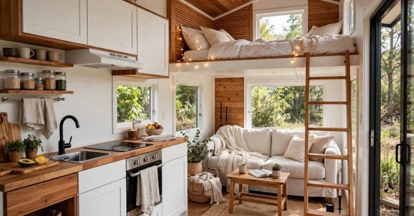
A small home lives or dies by its rooms. Get each one right and the whole place feels calm, capable and twice its size. This room-by-room tour of tiny house interiors shows how kitchens, living areas, bathrooms and sleeping zones each earn their footprint, and how light, storage and colour tie them together.
Work through the rooms in order, steal the ideas that fit your life, and remember the golden rule: design each room for its job, but let one palette and one logic run through the whole house.
1. Tiny House Interiors at a Glance
Before the detail, here is the whole philosophy on one screen. Every room in a small home has a proven default layout, and every successful interior, whatever its style, is built on the same four factors: light, storage, flow and colour. Kitchens work best in one of two layouts. Living areas work best when built-in furniture replaces freestanding pieces. Bathrooms come in two main styles. Sleeping splits into two zones. None of this limits your creativity; it frees it, because once the bones follow these patterns, your energy goes into the finishes, textiles and details that make the home yours instead of into rescuing a layout that fights you daily. The table below summarises the defaults, and the sections that follow take each room in turn, explaining why the default works, when to break it, and the small upgrades that make the biggest difference per inch spent.
| Room or Factor | Proven Approach | Why It Works |
|---|---|---|
| Kitchen | One-wall or galley layout | Two layouts that keep cooking compact and efficient |
| Living area | Built-ins instead of freestanding furniture | Saves space and adds hidden storage in the same footprint |
| Bathroom | Wet bath or split layout | Two styles that fit washing into a very small room |
| Sleeping | Loft or main-floor zone | Two zones with different comfort and access trade-offs |
| Light | Natural light plus layered lighting | The fastest way to make small rooms feel larger |
| Storage | Vertical and hidden | Uses the walls and the dead spaces furniture ignores |
| Flow | Clear walkways | Keeps daily movement effortless in tight quarters |
| Colour | One cohesive palette | Makes separate rooms read as one calm, larger home |
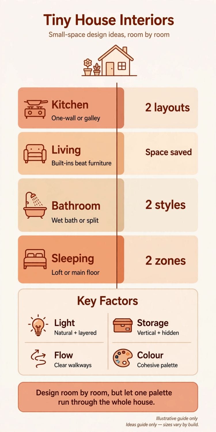
The room-by-room defaults at a glance: two kitchen layouts, built-in living space, two bathroom styles, two sleeping zones, and the four factors, light, storage, flow and colour, that hold it all together.
Keep one sentence in mind as you read: design room by room, but let one palette run through the whole house. It is the simplest advice in this guide and the one that separates homes that feel curated from homes that feel like a storage unit with a bed in it.
2. Start with Light: The Cheapest Space You Can Add
Light is the only upgrade that adds space without taking any. Natural light comes first: place windows where they wash walls rather than where they merely tick a box, use the tall wall above a loft for high glass that throws daylight deep into the plan, and treat skylights as serious tools in the middle of a deep, narrow home where side windows cannot reach. Mirrors opposite or beside windows double the effect for almost no cost, and glass in interior doors or above them lets borrowed light travel between rooms. Privacy and heat are the honest counterweights, so pair generous glass with blinds, curtains or films you actually like using.
Artificial light needs layering, because one ceiling light flattens everything it touches. Combine a soft general layer for the whole room, task light where work happens, under kitchen counters, beside the bed, at the desk, and a warm accent layer that makes evenings feel like a home rather than a corridor. Ceiling height shapes all of this, since taller spaces take taller windows and loftier light, a relationship explained in our guide to tiny house dimensions. Plan the circuits while you plan the rooms, because layered light needs switches in the right places; our tiny house electrical guide shows how lighting and power are planned safely from the start.
3. The Kitchen: One-Wall and Galley Layouts That Cook
Almost every small kitchen that works is one of two shapes. The one-wall kitchen runs everything along a single wall, sink, cooker, fridge and storage in one efficient line, leaving the opposite side free for a fold-down table, a slim island on wheels or simply breathing room. It suits open plans and solo cooks, and it keeps plumbing simple by concentrating it on one wall. The galley kitchen splits the run across two facing walls, creating a compact work corridor with everything a step apart. It suits keen cooks, hides the working mess from the living area more effectively, and makes a natural passage layout in longer homes. Both shapes beat any attempt at a miniature version of a big-kitchen island layout, which usually produces a room you cannot open the oven in.
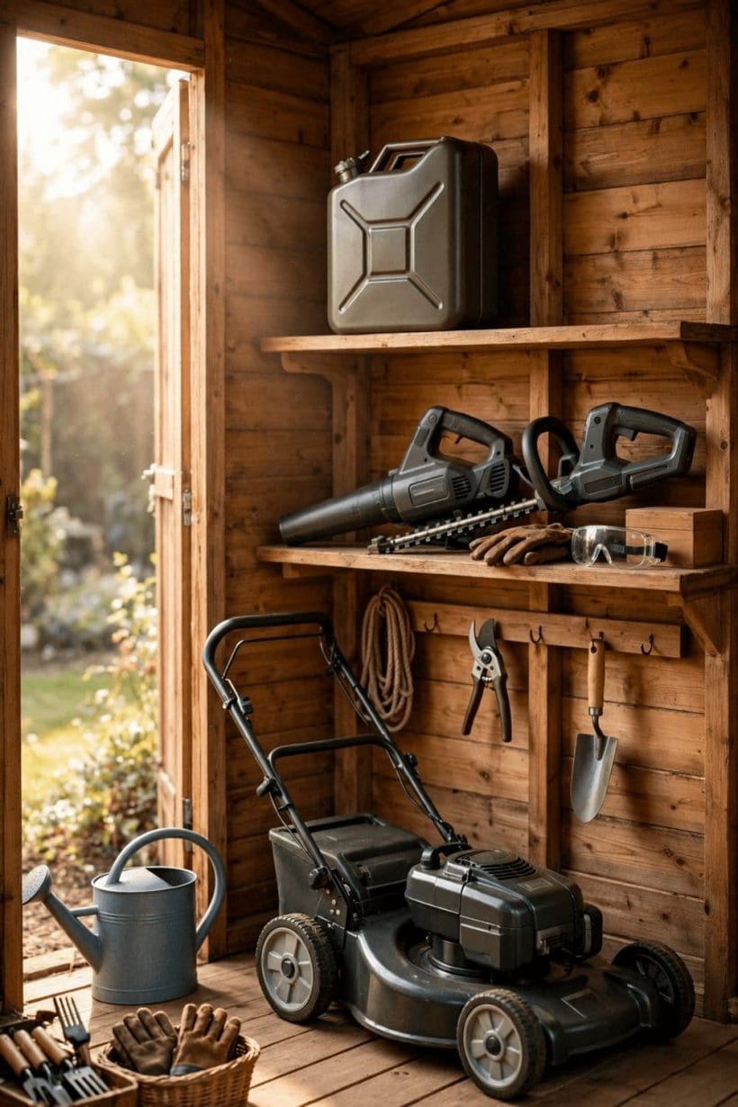
Within either shape, the details decide. Drawers beat cupboards for base storage because nothing gets lost at the back. A single deep sink swallows big pans better than a divided one. Induction cooking keeps heat and fuss down, and a combination oven or a good countertop alternative saves a whole appliance slot. Keep the worktop run honest: you need one clear landing space beside the cooker and one beside the sink, even if everything else folds, stacks or hangs. Vertical storage, rails, magnetic strips and the inside faces of doors, carries the overflow. Design the kitchen around the meals you actually cook, not the dinner party you host twice a year, and it will serve you every single day.
4. The Living Area: Built-Ins Beat Furniture
The living area is where small homes most often go wrong, usually by importing furniture scaled for a house three times the size. A standard sofa, two armchairs and a coffee table can consume the entire room and still seat people badly. Built-in seating solves the geometry: a bench made to the exact width of the wall, with storage inside, cushions on top and a back at the right angle, seats more people in less space and gives you a hidden cupboard the size of the seat itself. Pair it with a small movable table and one light chair, and the room can be lounge, dining space and guest overflow without a single wasted corner.
Built-ins also calm a room visually, because the eye reads one clean line instead of a jumble of legs and gaps. The same logic applies to media, shelving and desks: a wall-length low unit can hold the television, books, a fold-down work surface and closed storage in a single run. Keep the centre of the room genuinely empty; that void is what makes a compact living area feel like a room rather than a furniture showroom. If your home sits on a raised site, align the main seating with the best window or deck door, a trick borrowed from the elevated designs in our feature on the tiny house on stilts, where the living space is deliberately aimed at the view the stilts provide.
5. The Bathroom: Wet Bath or Split Layout
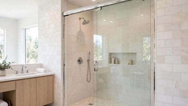
Small bathrooms come in two honest styles. The wet bath treats the whole room as the shower: the floor is one waterproofed, gently sloped surface, the shower has no separate tray or screen to squeeze past, and the toilet and basin live inside the same splash-friendly space. It is the most space-efficient arrangement there is, brilliant in very small homes, and it makes cleaning a five-minute job. Its compromises are real too, everything in the room gets damp, so storage must be closed or minimal, and the floor needs a moment to dry after a shower.
The split layout separates the shower into its own cubicle or end of the room, keeping the toilet and basin dry. It costs a little more floor and a door or screen, and returns everyday convenience: dry feet, a usable mirror, toiletries that stay put. Between the two, choose by household rhythm. Solo dwellers and minimalists thrive with a wet bath; couples, families and anyone who keeps more than a toothbrush in the bathroom usually prefer the split. Either way, spend on ventilation before decoration, because moisture is the one enemy a tiny bathroom cannot argue with, and choose fittings by their projection into the room, a few centimetres saved on a basin or a wall-hung toilet is space you feel every day. Local health and building rules may shape drainage and ventilation choices, so confirm the details with your building department before ordering fittings.
6. Sleeping Zones: Loft or Main Floor
Sleep divides into two zones, and the choice shapes the whole home. The loft is the classic: a sleeping platform above the living space, reached by ladder or stairs, leaving the entire ground floor for daytime life. Lofts feel private and cocoon-like, cost no floor area, and suit people who climb happily and sleep soundly in low headroom. Their honest costs are access at night, heat rising into the sleeping space in summer, and the daily discipline of a bed you cannot walk around, which makes changing sheets a small workout.
The main-floor bedroom answers all of that: a bed you can walk around, windows at pillow height, a door that closes. It suits couples, older owners, anyone with mobility limits, and homes large enough to spare the floor. Midway options deserve attention too: a raised platform bed with storage or a workspace beneath, a murphy bed that frees the room by day, or a small ground-floor nook under the loft for guests or children. Access design is half the battle in any loft home, and our guide to tiny house stairs compares ladders, storage stairs and alternating treads in detail. Whichever zone you choose, defend the sleep basics: blackout for the window, a reading light you can reach, ventilation you control, and a shelf for water, glasses and a phone that is not the floor.
7. Storage: Vertical, Hidden and Everywhere
Storage is the difference between a small home and a cramped one, and it follows two rules: go vertical, and hide it in plain sight. Vertical first. Walls are the largest unused surface in most small homes, so run shelving and cupboards high, use the full height above doors and windows, and treat the top of the wardrobe zone as prime real estate for the things you need seasonally rather than daily. Stairs, floors and furniture are the second frontier: drawers inside stair treads, hatches in raised floors, ottomans and benches that open, headboards with shelves, and the dead space behind a sofa all swallow the clutter that otherwise colonises every surface.
Hidden storage only works if it is organised, so zone it ruthlessly. Keep daily items at waist-to-eye height, weekly items high or low, and the once-a-year things in the hardest spots, and label the boxes you cannot see into. Be equally ruthless about volume: a small home rewards owners who store experiences rather than duplicates, and every household item should have to justify the cubic space it rents. Design storage into the build, not after it, because retrofitting cupboards into finished rooms always costs more and fits worse. Worked through in order, this is one of the steps in our building a tiny house checklist that repays the most thought per hour, since storage decisions touch every room, every wall and every day you live there.
8. Colour and Materials: One Palette, Whole House
Colour is where small homes either unify or fragment. When every room chooses its own strong colour and its own material story, the eye reads a series of small, clashing boxes. When one palette runs throughout, the same family of tones on walls, cabinetry and textiles, with materials repeated from room to room, the whole home reads as one calm, larger space. Light, warm neutrals are the classic base because they bounce light and forgive clutter, but the rule is cohesion, not paleness: a deep, moody home can feel just as spacious if the same tones flow unbroken from kitchen to loft, with contrast supplied by texture instead of by competing colours.
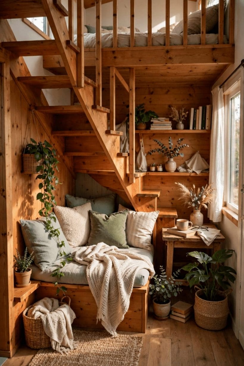
Materials deserve the same discipline. Pick a small family, two or three woods or wood tones, one metal finish, one tile language, and repeat them. Repetition is what makes a compact interior feel designed rather than accumulated, and it simplifies buying, repairs and replacements for years. Save the bold moves for things that can change: cushions, art, a rug, a painted door. Floors matter disproportionately in small spaces, so run one flooring material through as much of the home as you can, breaking it only where water demands it; the unbroken plane tricks the eye into reading one big room. Test colours in the actual light of the home, morning and evening, because small rooms amplify undertones that a showroom forgives.
9. Flow: Walkways, Doors and Daily Movement
Flow is the invisible quality you feel within a week of moving in. It is the path from door to kitchen with shopping bags, from bed to bathroom at night, from sofa to kettle and back, repeated hundreds of times until any friction becomes a daily irritation. Protect the main walkway first: keep it clear of furniture corners, opening doors that sweep across it, and storage that slowly migrates into it. In a narrow home the walkway is usually one straight run, which is a gift, because it doubles as the visual spine of the interior and the route that makes the home feel connected rather than compartmented.
Doors deserve a hard look. A swinging door in a small home claims a whole arc of floor; sliding doors, pocket doors, curtains in low-traffic spots, or no door at all where privacy allows, all hand that floor back to the room. Furniture placement should respect the choreography of a normal day: the chair you actually sit in facing the light and the view, the drop zone for keys, post and coats within two steps of the door, the laundry path that does not cross the food path. Lighting switches, sockets and heating controls belong on this map too, placed where the flow says hands will be. Walk your floor plan in your head at full speed, carrying things, tired, in the dark; wherever you flinch, redesign.
10. Small Rooms, Big Feel: Putting It All Together
Here is the synthesis. A small home feels big when each room follows its proven default, the kitchen in one of its two layouts, the living area built in, the bathroom honestly wet or split, sleeping in a chosen zone, and when light, storage, flow and colour are planned as one system over the top of all of them. The rooms stop competing and start cooperating: the palette carries the eye from end to end, the storage hides the machinery of life, the walkway runs clean, and the light does the quiet work of making every wall feel further away than it is.
Start any redesign or new build with the room that frustrates you most, apply its section here, and let the palette decisions ripple outward from it. If you are preparing a site or a shell before the interior begins, our guide to preparing land for a tiny house covers the groundwork that comes first, and if you are still choosing where the home will live, browsing where to buy tiny house lots will sharpen your sense of the plots and communities your interior plans need to suit. Small is not a limitation to decorate around; designed room by room, it is the whole point.
Final Considerations
Choose the defaults first, personalise second, and let one palette, one light plan and one storage logic unite the rooms. A tiny interior succeeds when nothing in it is accidental: every bench hides a cupboard, every window earns its wall, every colour shakes hands with the next room. Do that, and visitors will say the line every tiny owner loves to hear: it feels so much bigger than it is.

0 Comments