
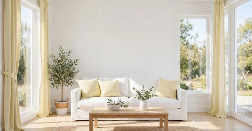
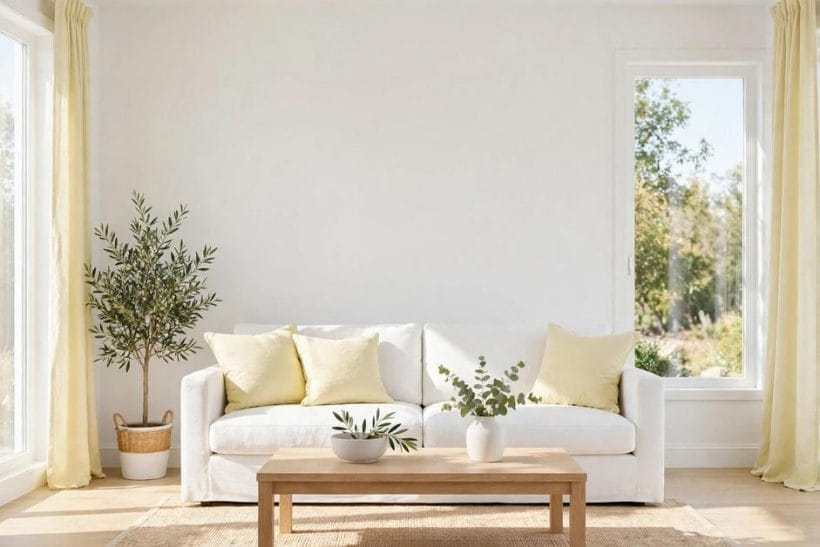
White and yellow is the freshest of the sunny pairings: white keeps the room light and clean, yellow supplies the warmth, and together they suit rooms that need brightness without busyness. Unlike gray-led schemes, where yellow accents a calm base, white-led pairings let yellow read more clearly — which means the shade of yellow matters more, and restraint matters even more. The nine pairings below each combine a white with a yellow in a different mood, from crisp to buttery, so you can choose the version that suits your room’s light.
A note on honesty before the pairings: paint colours vary by maker, light, and screen, and no name or code here is presented as a universal standard. The pairings describe colour relationships — a bright white with a clear yellow, a warm white with a soft butter — in general terms. Always test a sample on your own wall, in your own light, before painting. That single step matters more than any pairing on this list.
How to Test a White-and-Yellow Pairing
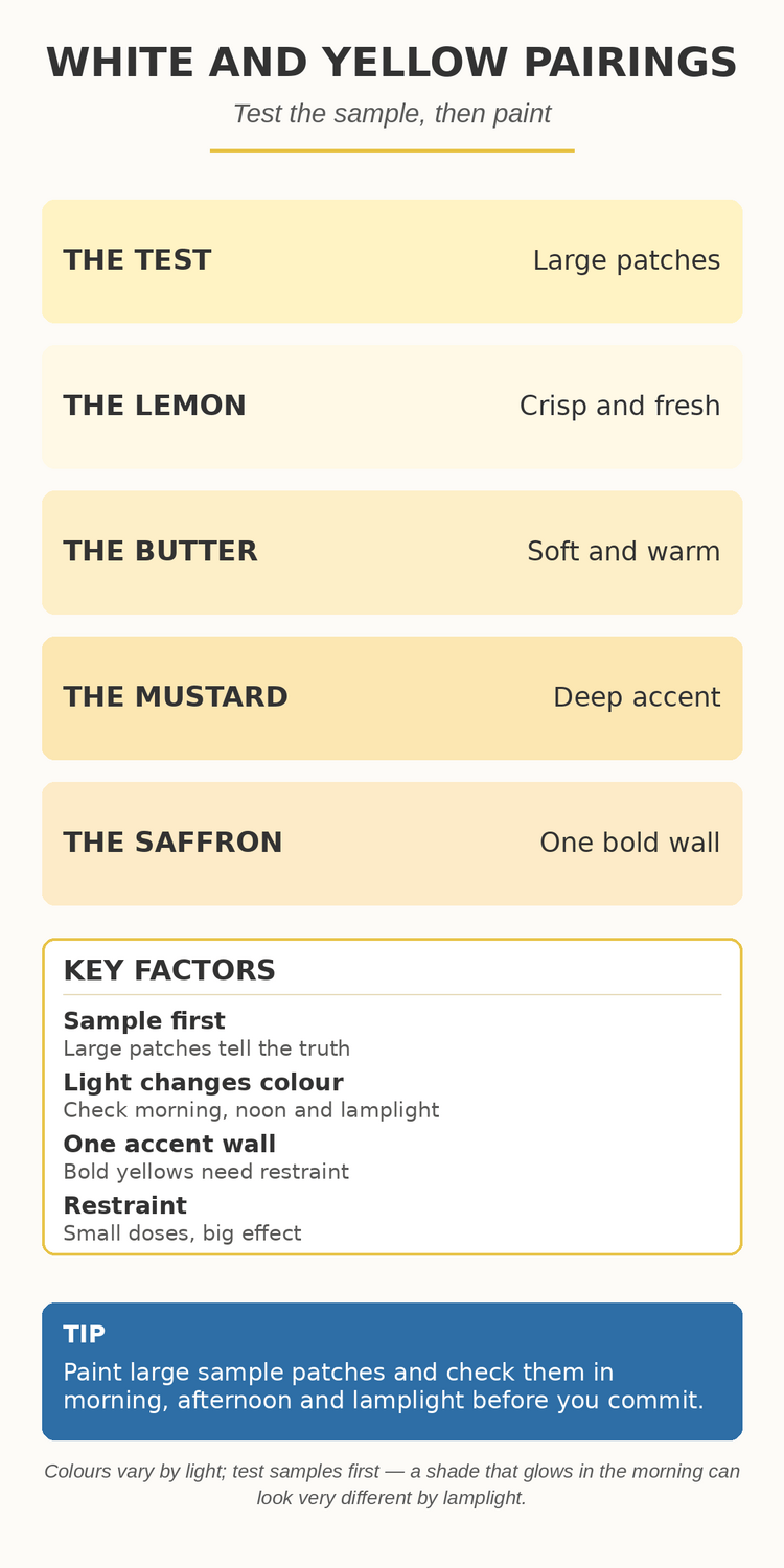
Before choosing any pairing, test it properly. Paint two large sample patches side by side on the wall that receives the most daylight, and live with them for several days, checking them in morning light, afternoon light, and lamplight. Small chips flatter every colour; large patches tell the truth, especially with yellow, which intensifies dramatically as its area grows.
Test the pairing against the room’s fixed elements too — flooring, worktops, and large furniture — since a yellow that glows beside white walls can clash with warm timber or cool stone. Keep the sample patches up until you have seen them in every light the room receives. A pairing chosen in one light and regretted in another is the most common paint disappointment, and the easiest to avoid.
Keep the test patches away from corners, where shadows darken every colour and mislead the eye. A flat stretch of wall at eye level, seen from the room’s usual seating position, gives the truest impression. If the room has two very different lights — a bright window wall and a dim opposite wall — test on both, since a pairing that works on one may fail on the other.
Pairing 1: Bright White and Clear Lemon
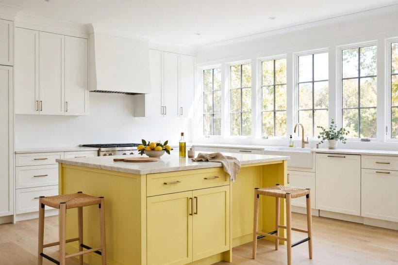
The crispest pairing on this list combines a bright, clean white with a clear lemon yellow. It suits kitchens, bathrooms, and sunrooms — rooms where freshness is the point and where strong daylight keeps the yellow lively rather than harsh. Use the white for walls and woodwork, and the lemon for a feature wall, a door, or cabinetry details.
Keep this pairing’s yellow to defined areas rather than whole rooms, since clear lemon across four walls can feel relentless. A lemon island, a yellow-tiled splashback, or a single sunny wall gives the freshness without the fatigue. White ceilings and trim keep the scheme crisp throughout.
Lemon yellow also suits rooms with white tile, since tile and paint in the same fresh family reinforce each other without competing. A white-tiled bathroom with a lemon wall, or a white kitchen with lemon cabinetry details, feels coherent because the materials share the same clean character. Avoid pairing lemon with creamy whites, which can make the lemon look harsh by comparison.
Pairing 2: Warm White and Soft Butter
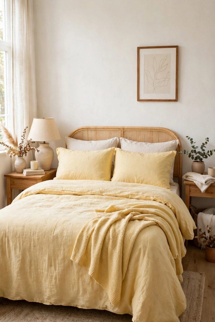
For bedrooms and living rooms, a warm white with a soft butter yellow is gentler than the lemon version. The warm white removes any clinical edge, and the butter yellow reads as sunlight rather than colour — present, but never loud. Together they make a room feel like a pleasant morning, even on a dull day.
Use butter on bedding, curtains, or a single wall behind the bed, and let the warm white carry the remaining walls and ceilings. Natural timber and cream textiles sit comfortably with this pairing, while cool metals can feel out of place. It is the most forgiving pairing on this list for rooms with mixed light.
Butter yellow is one of the few yellows that works on ceilings, since its softness does not press down on the room the way stronger yellows do. A butter ceiling in a white bedroom adds warmth overhead without darkening, especially in rooms with low ceilings where a strong colour above would feel oppressive. Keep the walls warm white so the ceiling reads as a gentle glow.
Pairing 3: Pure White and Golden Mustard
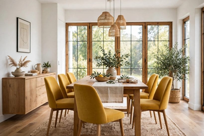
Mustard is yellow with depth, and against pure white it reads as a rich accent rather than a bright one. This pairing suits dining rooms and studies, where a deeper yellow adds appetite and focus without the energy of a clear lemon. A mustard accent wall behind a dining table, or mustard chairs around a white table, anchors the room beautifully.
Because mustard is strong, keep it to furniture and art rather than full walls in smaller rooms. A mustard sofa against white walls, or mustard dining chairs with a white table, gives the depth without darkening the space. Timber and brass tones complement this pairing naturally.
Mustard pairs naturally with dark timber, which is why it suits dining rooms with wooden tables and chairs. The timber grounds the mustard, and the white walls keep the combination from feeling heavy. In a room without timber, a mustard accent can feel isolated, so add a wooden tray, frame, or bowl to give it company.
Pairing 4: Off-White and Pale Straw
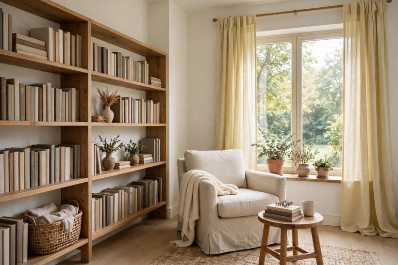
Off-white with pale straw is the quietest pairing here, suited to rooms where calm matters most — bedrooms, reading corners, and hallways. The straw yellow is barely more than a tint, warming the off-white without declaring itself as colour. Visitors may not even name the yellow, but they will feel the room’s warmth.
Use this pairing where the room already has texture to carry interest: linen, timber, woven rugs, and plants all prevent the pale scheme from feeling flat. The straw can appear on a single wall, on curtains, or on a large piece of art. Restraint is the point; this pairing rewards subtlety.
Straw yellow benefits from texture more than any other pairing on this list, because its colour is so subtle that flat surfaces can look unfinished. Linen curtains, a woven rug, or a textured throw give the pale scheme something for the eye to hold. Without texture, off-white and straw can read as a room that has not been decorated at all.
Pairing 5: White and Sunflower for a Cheerful Kitchen
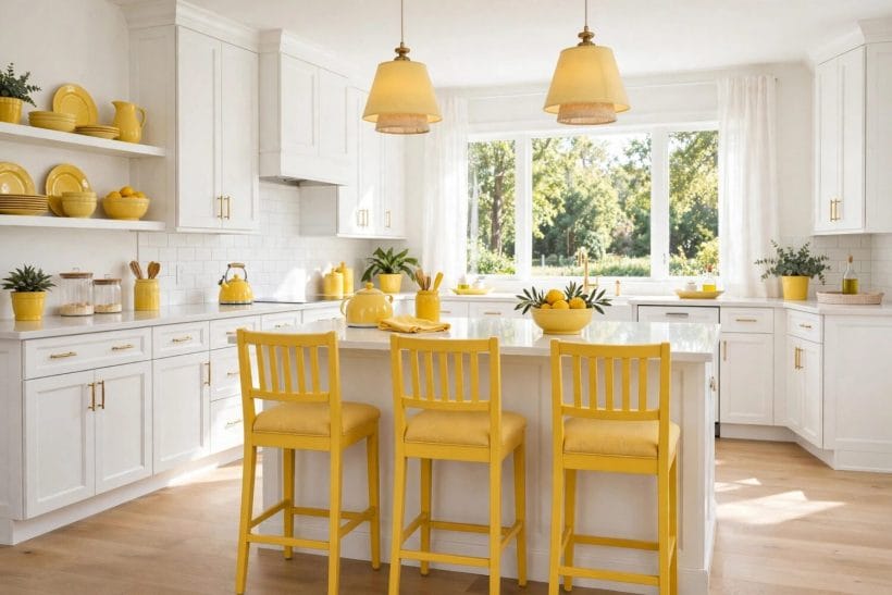
Sunflower yellow is the happiest shade on this list, and kitchens are where it earns its keep. White cabinetry with sunflower bar stools, a sunny blind, or a row of yellow canisters makes a working room feel cheerful at breakfast and welcoming at dinner. The white keeps the scheme clean; the sunflower keeps it from feeling sterile.
Confine sunflower to moveable items and small surfaces in the kitchen, so the cheer can be toned down without repainting. A sunflower kettle, towels, or a single open shelf of yellow crockery all deliver the effect. If the kitchen has white worktops, the pairing is already halfway complete.
Sunflower yellow fades faster than deeper yellows in strong sunlight, so items near a sunny window may lose their cheer over time. Choose sunflower for shaded walls and moveable items that can be rotated, and reserve sun-exposed spots for deeper yellows that hold their colour. Fading is gradual, but planning for it keeps the kitchen sunny for longer.
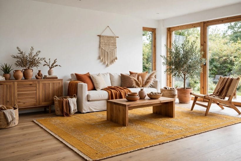
Pairing 6: White and Ochre for an Earthy Living Room
Ochre is yellow pulled toward earth — warmer than mustard, softer than gold — and it gives white rooms a grounded, collected feeling. This pairing suits living rooms with timber floors, leather seating, or natural textiles, where an earthy accent feels more at home than a bright one. An ochre rug, throw, or piece of art warms white walls without brightening them.
Layer ochre with other earth tones — terracotta, warm timber, cream — so it reads as part of a natural palette rather than a lone accent. Avoid pairing ochre with cool grays or stark metals, which can make it look muddy. In a room with warm materials, ochre and white feel timeless.
Ochre suits rooms that already hold warm metals, such as brass lamps or copper accessories, since the metal and the ochre share a golden undertone. A brass floor lamp beside an ochre chair, for example, ties the pairing together without any further decoration. Cool metals, by contrast, can make ochre look dull, so check the room’s existing finishes first.
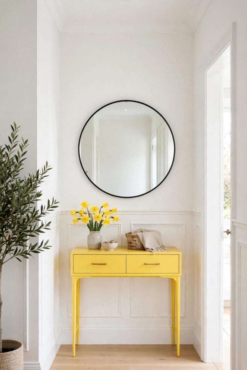
Pairing 7: White and Daffodil for a Fresh Hallway
Hallways and entryways, often the darkest rooms in a home, benefit most from a fresh yellow. Daffodil yellow — clear but soft — on a single hallway wall, a front door, or a console, lifts a white passage without demanding attention. It is the pairing equivalent of opening a curtain: the space feels brighter the moment it appears.
Use daffodil where the hallway needs a focal point, such as the wall facing the front door or the stair wall. Keep the remaining walls white and the flooring pale, so the yellow has light to work with. A mirror opposite the yellow wall doubles the lift, bouncing both light and colour down the passage.
Hallways often lack natural light, so a daffodil accent needs help from lighting to work. A warm wall light near the yellow wall, or a bright ceiling light that washes it evenly, keeps the daffodil fresh after dark. Without adequate light, even the freshest yellow looks tired in a passage, so plan the lighting with the colour, not after it.
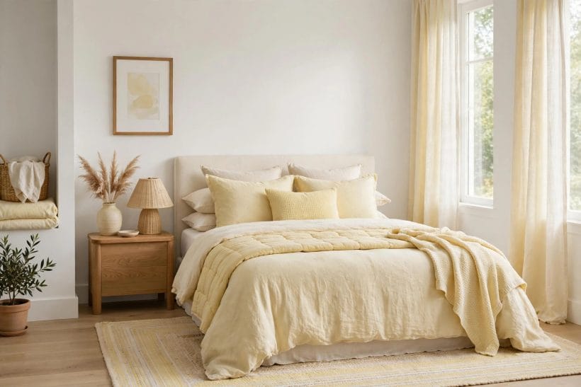
Pairing 8: White and Creamy Custard for a Nursery Feel
Creamy custard yellow is the softest strong yellow on this list — warm, milky, and gentle. With white it suits nurseries, guest rooms, and any room meant to feel sheltered. The custard can cover a full wall without overwhelming, which makes it one of the few yellows safe for larger areas in a white scheme.
Pair custard with white woodwork and soft white textiles, and add one natural material — timber, wicker, or cotton — to keep the scheme from feeling sugary. A custard feature wall behind a bed or a cot, with white elsewhere, gives the room its warmth while leaving it restful.
Custard yellow is forgiving of imperfect walls, since its softness does not highlight bumps and patches the way a bright white or a strong colour would. In older rooms where walls are less than perfect, a custard feature wall can look smoother than a pure white one. This practical advantage makes custard a good choice for rooms that will not be replastered.
Pairing 9: White and Saffron for a Bold Accent Wall
Saffron is the boldest yellow here — deep, golden, and confident — and it earns its place as a single accent wall in a white room. One saffron wall behind a sofa, a bed, or a dining table gives a white scheme drama and focus, while the remaining white walls keep the room light. This is the pairing for rooms that can carry one strong gesture.
Keep saffron to one wall only, and furnish against it in white, timber, or muted tones so the wall remains the room’s single statement. Art on a saffron wall needs simple frames and pale mounts to read clearly. Used once, saffron transforms a white room; used twice, it takes it over.
A saffron wall changes the room’s apparent temperature, making it feel warmer even before any heating is considered. In a cool, north-facing room this is a genuine benefit, but in an already warm, sun-drenched room it can feel too much. Match the boldness of the saffron to the room’s natural warmth: cooler rooms can carry it, warmer rooms should use it more sparingly.
Final Considerations
White and yellow pairings succeed when the yellow is chosen for the room’s light and kept to its proper share: lemon and sunflower for freshness, butter and custard for softness, mustard, ochre, and saffron for depth. Test every pairing as a large sample in your own light, and remember that paint colours are relationships, not codes — the wall, not the chart, has the final say.
Start with the pairing that matches your room’s light rather than the one that looks best in a photograph. A north-facing room needs the warmth of butter or custard, while a sun-drenched room can carry lemon or saffron without strain. Buy one sample pot, paint a large patch, and live with it for a week. The right pairing will still please you on the seventh day; the wrong one will already feel tiring.
For the gray-led version of this idea, see gray yellow combinations, and for related colour guides see dusty rose, blush pink bedroom, ranch exterior paint, Tuscan style bathroom, tiny house designs, and interior design ideas.


0 Comments