

Beige never really left. It waited out the grey decade in hallways and rental flats, and it has come back warmer, deeper and far better understood — less the colour of caution, more the colour of a room that intends to be lived in. Warm beige paint is the quiet engine behind most calm interiors.
These 75 beige paint ideas treat beige as a working colour with undertones, finishes and light behaviour to manage — not a default. The wider colour discipline sits inside the room surveys, starting with living room ideas; this post owns the warm neutral itself, wall by wall and room by room.
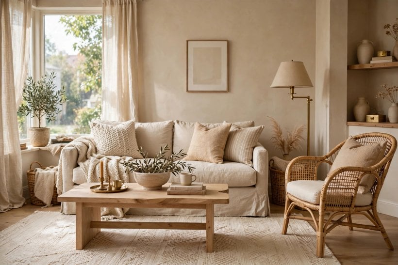
1. Beige Paint Ideas at a Glance
The central entity is beige paint: a warm neutral mixed from brown, white and a whisper of a third colour that decides its character. Its attributes are undertone, depth, finish, the light it sits in and the materials it sits beside. Master those five and beige stops being the safe choice and becomes the deliberate one — the wall colour that makes wood look richer, white look cleaner and colour look considered.
| What is beige, exactly? | A light warm neutral between white and brown. Its personality comes from the undertone — pink, yellow, grey or green — which shows itself only in real light, on a real wall. |
| Why does beige look wrong in some rooms? | Almost always an undertone clash: a pink-leaning beige against yellow-toned wood, or a grey-leaning one in cold north light. The colour is rarely wrong; the pairing is. |
| Where does beige work best? | Living rooms, bedrooms and halls — rooms that want calm without coldness. It also forgives in kitchens and bathrooms when the finish is chosen for steam and splashes. |
| Is beige a safe resale choice? | Among the safest: warm neutrals photograph honestly, offend nobody and let a buyer’s own furniture imagine itself in. Depth is the risk, not the hue. |
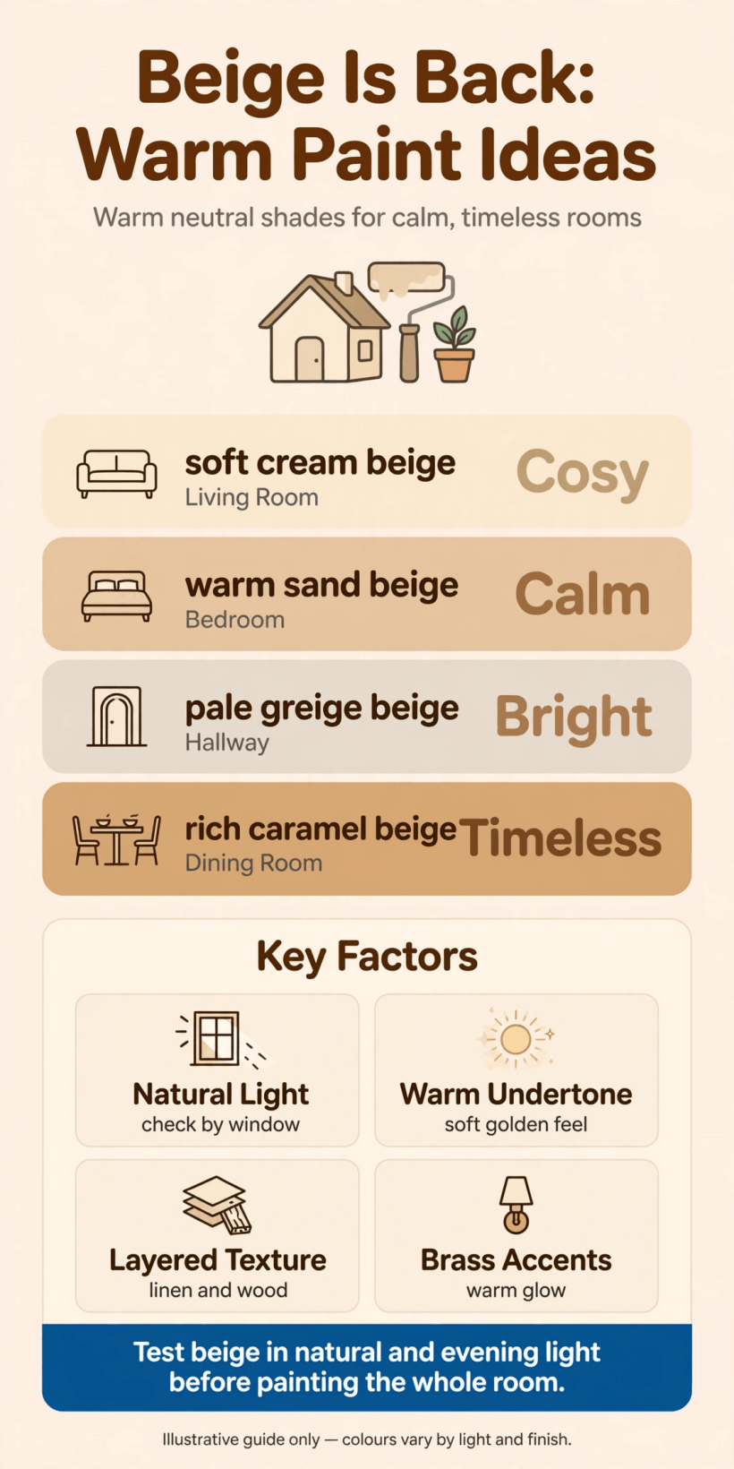
2. Undertones First: Reading Beige Before It Dries
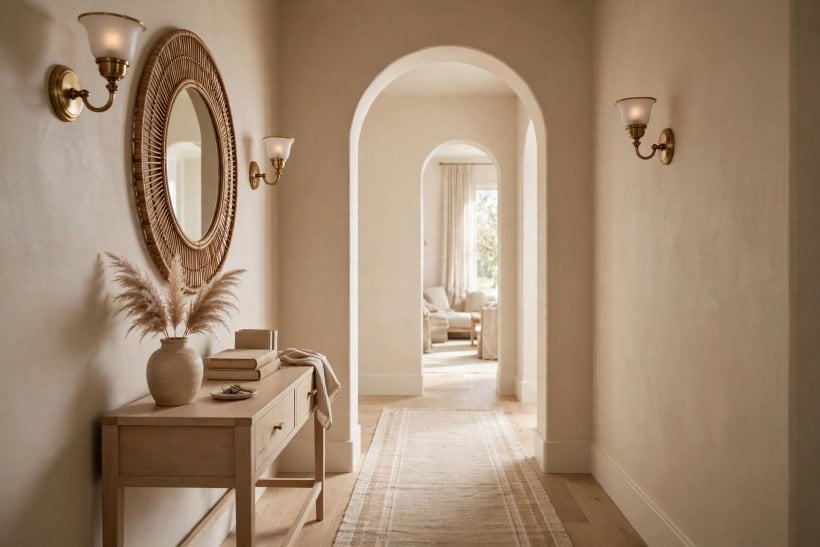
Every beige decision is an undertone decision. Paint companies print tidy rows of near-identical cards; the differences that look subtle in the shop become the whole room at home. This section teaches the reading of undertones before a single wall is committed — the cheapest skill in the whole post.
1. Name the Undertone Before You Name the Colour
Hold the swatch against pure white paper: the colour that leans out of the beige — blush, butter, stone or sage — is its undertone. Buy for that leaning, not for the poetic name on the card.
2. Treat Pink-Beige as a Warmth Specialist
Blush-undertone beiges flatter skin, lamplight and evening rooms. They suit bedrooms and north-facing living rooms, but curdle beside yellow oak and orange-toned pine. Pair them with cooler woods and crisp whites.
3. Use Yellow-Beige Where Sun Already Lives
Golden beiges glow in south and west light and suit kitchens and halls. In already-warm rooms they can tip toward mustard by evening, so test at the hour the room is actually used.
4. Let Grey-Beige Cool a Hot Room
Stone-undertone beige — the greige family — takes the heat out of sun-baked rooms and sits calmly beside concrete, steel and pale ash. It is the modern beige, and the easiest to live with long-term.
5. Respect Green-Beige Beside Gardens
A sage-leaning beige is the bridge colour for rooms that open onto planting: it carries the garden’s colour indoors without painting a single wall green. Beautiful beside oak and linen; muddy under warm bulbs.
6. Compare Swatches Vertically, Never Flat
Paint reads darker and warmer on a wall than on a card in the hand. Tape swatches vertically at eye height and judge them standing back — the geometry of the test is half its accuracy.
7. Read the Deepest Card in the Row
On a manufacturer’s strip, the darkest shade shares the undertone in concentrated form. If the deep card reads unmistakably pink, the pale one is pink too — it just whispers. This is the fastest undertone test in the shop.
8. Check Beige Against Your Fixed Colours First
Floors, worktops and tiles cannot be repainted on a whim; walls can. Choose the beige that flatters the room’s immovable colours — the floor’s undertone is the brief, not the starting suggestion.
9. Beware the Beige That Arrives by Default
Builder beige — the unspecified warm off-white of new houses — usually leans yellow and flattens everything. Replacing it with a chosen beige of the same depth transforms a room more than most furniture swaps.
10. Keep a True White Beside Every Test
Undertones hide until contrast arrives. A sheet of printer paper taped beside the swatch exposes the lean instantly and honestly. Remove it before judging depth — contrast also exaggerates darkness.
11. Decide the Undertone Family for the Whole House
Rooms read together through doorways. Pick one beige family — pink, stone or gold — and vary depth room to room. A whole-house undertone keeps sightlines calm even when colours differ.
3. Beige on Living Room Walls
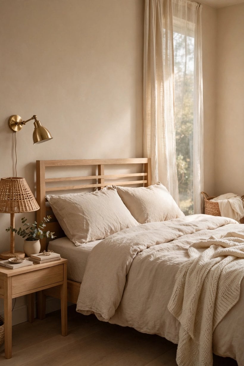
The living room is beige’s home ground: the room of sofas, wood, lamplight and long evenings, where a warm wall earns its keep hourly. The full survey of the room itself lives at small living room ideas; here the walls are the subject and everything else is supporting cast.
12. Paint All Four Walls and Stop Apologising
A full beige room, one depth on every wall, reads as architecture rather than decoration. The enclosure is the effect: furniture floats, art sharpens, and the room feels held rather than highlighted.
13. Go One Depth Darker Behind the Sofa
If a feature wall is wanted, keep it in the same family one step deeper. The sofa wall gains gravity without the jolt of an unrelated accent colour — a gradient, not a shout.
14. Let Beige Rescue a Dark Living Room
In low-light rooms, a mid beige with a warm undertone returns more light than grey at the same depth and never turns blue at dusk. It is the corrective colour for the north-facing sitting room.
15. Pair Beige Walls With a White Ceiling — or Don’t
A white ceiling lifts; a beige ceiling, carried over from the walls, coccons. Small living rooms often suit the cocoon: the boundary dissolves and the room reads bigger, not smaller.
16. Use Beige to Civilise a Multicoloured Sofa
Patterned upholstery, inherited rugs and clashing cushions settle instantly against warm beige. The wall absorbs the argument. Many “tired” living rooms are one neutral wall away from coherence.
17. Match Beige Depth to the Room’s Wood
Dark walnut wants a paler beige for contrast; pale pine wants a deeper one for definition. Match the wall to the wood’s depth and both look accidental. Contrast is the whole technique.
18. Run Beige Through an Open-Plan Space
One beige across a combined living-dining area unifies zones that furniture must then divide. Vary the textiles, not the walls: continuity is what open-plan rooms are chronically short of.
19. Frame Art With the Mid-Tone Rule
Artwork reads best on a wall midway between the art’s lightest and darkest tones. Beige’s mid-tone nature is precisely why galleries outside the white cube so often choose it.
20. Warm a Rental With Beige-Adjacent Textiles First
Where paint is forbidden, test the thesis in fabric: a beige throw and cushions against the existing wall previews the pairing. The full colour logic is worked through in living room paint for tiny houses.
21. Take Beige Up and Over Old Picture Rails
Painting wall, rail and cornice in one beige erases the visual chop of older rooms and adds apparent height. Period detail stays — the shadow keeps it — but the fuss dissolves.
22. Keep One Wall Ready for the Deep Version
Beige families extend downward into caramel and clay. A living room that may later want drama should start in the family whose deep end the household genuinely loves.
4. Beige in Bedrooms and Quiet Rooms
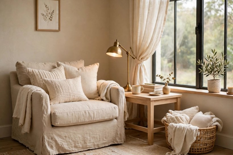
Bedrooms ask colour to do one job: lower the pulse. Beige does it without the chill of grey or the clinical edge of white, which is why the quiet rooms of the house are its second stronghold. The room-by-room survey continues at bedroom ideas; here the palette is the point.
23. Choose Pink-Beige for the Morning-Face Room
Bedrooms are seen at waking, in soft light, beside unmade faces in mirrors. Blush-undertone beige is the kindest backdrop a bedroom can offer — flattering without a word of pink on the label.
24. Layer Beige on Beige in the Bedding
Walls in mid beige, bedding in paler and deeper beiges: the tonal stack reads luxurious out of all proportion to cost. Texture — linen, wool, waffle cotton — does the decorating.
25. Deepen Beige Behind the Headboard
The wall the bed leans on can carry the family’s deep end — a caramel or mushroom tone — while the other walls stay pale. Sleep feels enclosed; the room keeps its light.
26. Use Greige in the Guest Room
Guests bring unknown tastes and their own colours in suitcases. Stone-beige walls are the true neutral host: nothing clashes, everything rests, and the room photographs like a small hotel.
27. Soften a Nursery With Yellow-Beige
Gentle golden beige warms a nursery without committing to a theme the child outgrows by three. It pairs with every toy colour ever manufactured and repaints over itself gracefully.
28. Paint the Study Beige to Lower Its Voice
Home offices benefit from a colour that recedes behind screens and paperwork. Mid beige with a grey undertone is concentration-friendly — present enough to feel furnished, quiet enough to ignore.
29. Carry Beige Into the Dressing Corner
Clothes are judged by the light and walls around them. A warm beige dressing area renders colours honestly — kinder than white’s glare, truer than grey’s dulling — so outfits chosen indoors behave outdoors.
30. Let Beige Calm a Patterned Bedroom
Floral quilts, striped curtains and a rug with opinions can share a room if the walls decline to compete. Beige is the great non-combatant of bedroom decorating.
31. Match Beige to Lamplight, Not Daylight
Bedrooms live by lamps. Test the colour at night under the actual bulbs: warm light doubles beige’s warmth, so a shade that seems perfect at noon may turn honeyed by ten.
32. Paint Ceiling and Walls One Beige for Sleep
The colour-drench is at its best overhead in a bedroom: no white slab glaring down at dawn. The enclosed warmth is the closest paint comes to a lullaby.
33. Reserve the Palest Beige for the Smallest Room
Box rooms and spare corners get the family’s palest member — nearly off-white, but with the warmth that stops it reading as a corridor. Small rooms need warmth more than they need white.
5. Beige in Kitchens and Bathrooms
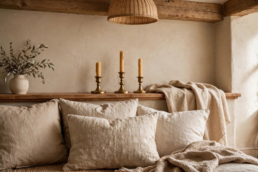
Wet rooms test beige hardest: steam, grease and hard surfaces expose every weakness of undertone and finish. Chosen well, beige is the colour that makes kitchens feel cooked-in rather than showroom-new, and bathrooms feel like bathing rooms rather than clinics. The bathroom survey itself is at bathroom ideas.
34. Paint Kitchen Cabinets Beige, Walls Whiter
Beige cabinetry with a clean off-white wall is the warm kitchen formula of the moment — and the forgiving one: cabinet colour hides the splash zone’s evidence better than any white.
35. Use Stone-Beige Beside Stainless Steel
Grey-undertone beige is the diplomat between warm wood floors and cold appliances. It speaks both languages and stops the kitchen splitting into warm and cold camps.
36. Take Beige Up the Splashback in Tile Form
Where paint fears water, beige continues in material: zellige-look tiles, travertine tones and limewash-effect finishes carry the palette through the wet zone without a colour break.
37. Choose Scrubbable Finishes in the Kitchen
Beige shows grease honestly, which is either a virtue or a chore. A washable kitchen finish in mid beige hides the week and survives the wipe; dead-flat paint does neither.
38. Warm a White Bathroom With Beige Above the Tile Line
White sanitaryware and chrome can read clinical. Beige on the upper walls and ceiling adds the missing body heat while the white below keeps the room’s hygiene legible.
39. Avoid Yellow-Beige Beside White Porcelain
The most common beige failure in bathrooms: a golden beige that makes every basin and bath look faintly cream-stained by comparison. Stone and pink undertones sit cleaner against porcelain.
40. Run Beige Through an En-Suite to Borrow Calm
Carrying the bedroom’s beige into its en-suite makes the pair read as one suite rather than two rooms. Vary only the finish — moisture-rated in the wet room — not the colour.
41. Let Beige Tile Grout Disappear
On beige tiles, match grout to the tile’s mid-tone rather than defaulting to white or grey. The wall becomes a surface instead of a grid — calmer, and more forgiving of age.
42. Paint the Kitchen Ceiling Beige to Lower It Kindly
Tall, echoing kitchens feel institutional. A beige ceiling — the walls’ colour at half depth — pulls the lid down visually and warms the light that bounces off it.
43. Use Beige as the Bridge in a Two-Tone Kitchen
Dark lower cabinets and pale uppers need a mediator on walls and island. Beige is the natural middle term, warming navy, softening black and flattering every wood between.
44. Keep a Beige Bathroom’s Metals Warm
Chrome is beige’s coldest neighbour. Brass, bronze and brushed nickel keep the temperature of the room consistent; if chrome is fixed, choose the stone-undertone beige that tolerates it.
6. Finishes, Light and the North-Facing Problem
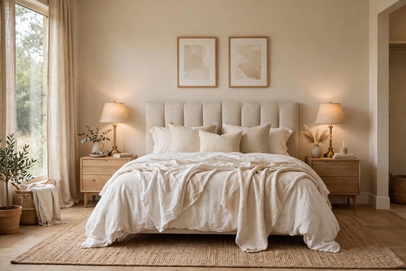
The same beige is four colours a day. Finish decides how much of that light-play shows; orientation decides its direction. The discipline of testing under real light is covered across the site, including tiny house interior paint colours — this section is the beige-specific drill.
45. Pick Eggshell for Living Walls, Satin for Wet Ones
Finish changes perceived depth: glossier reads darker and richer. Eggshell flatters beige in living rooms; satin or soft sheen survives kitchens and bathrooms. One colour, two finishes, no mismatch.
46. Test North-Facing Rooms With the Warmest Candidates
North light is blue and honest. It greys every beige it touches, so the swatch that looks almost too warm in the shop is usually the one that lands correctly on the wall.
47. Distrust Beige Under Shop Lighting
Retail light is engineered to flatter. Every beige decision made under it is provisional: the colour must be re-judged at home, morning and evening, before money follows the card.
48. Paint a Board, Not the Wall, for the First Test
A large primed board in the candidate beige can move from wall to wall and room to room — following the light like the nomad the test needs to be. Walls keep their innocence until the verdict.
49. Judge Beige at the Room’s Working Hour
A study used at dawn and a living room used at dusk are different briefs. The only test that counts is the colour seen when the room earns its living.
50. Expect Beige to Darken as It Scales
Colour intensifies with area: a wall always reads deeper than its card. The standing correction is to choose one step paler than the swatch the heart selects — and test at that step.
51. Use Flat Beige to Hide Tired Plaster
Dead-flat finishes swallow lumps, patches and old repairs that sheen would spotlight. On imperfect walls, a flat warm beige is the cheapest resurfacing a room can get.
52. Let Sun-Facing Rooms Take the Deeper Beiges
Strong light bleaches colour out. South and west rooms can carry the family’s deep members — mushroom, fawn, caramel — that would gloom a shaded room. Spend depth where light refunds it.
53. Coordinate Beige With Bulb Temperature
Warm bulbs amplify beige’s warmth; cool bulbs fight it. If the lighting is fixed and cool, step the beige warmer; if lamps are warm, a stone beige may be all the warmth required.
54. Watch Beige Beside North-Light Windows
The wall opposite a north window receives the bluest light in the house. Put the test board there, not on the window wall — it is the strictest examiner beige will face.
55. Keep Sheen Levels Consistent Across a Sightline
Two beiges of identical colour in different finishes read as a mistake through a doorway. Where rooms connect visually, hold the finish constant and let depth do the varying.
7. Pairing Beige: Wood, White, Black and Colour
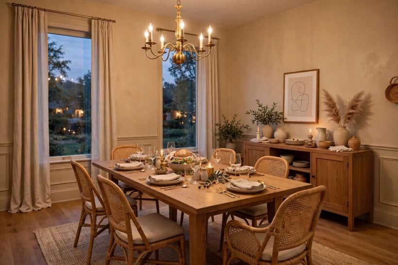
Beige is a team colour: its entire reputation rests on what it does to its neighbours. Get the pairings right and a beige room looks curated; get them wrong and the same paint reads as indecision.
56. Pair Beige With Oak for the Warm Standard
Mid oak and warm beige are the classic alliance — close enough in temperature to harmonise, different enough in depth to define each other. The pairing forgives almost any third colour.
57. Add Black in Small, Deliberate Doses
A black frame, lamp or door handle against beige is punctuation: it proves the neutrality is chosen, not defaulted. Without one dark note, beige rooms risk reading unfinished.
58. Choose Whites With the Same Undertone Family
Trim white must be beige’s relative, not its opponent. A pink-beige wall with a blue-white trim will fight at every skirting board. Manufacturers’ suggested pairings exist for this reason.
59. Let Beige Carry Strong Colour Furniture
The emerald sofa and the rust armchair both need a wall that will not argue. Beige’s service to saturated colour is why so many bold rooms are, on inspection, beige rooms.
60. Use Beige Between Two Strong Woods
Where walnut furniture meets pine floors, the wall is the peace treaty. A mid beige holds both woods in one room without either looking like the intruder.
61. Bring Beige to Linen, Wool and Stone
Natural materials share beige’s temperature. A room of beige walls, linen curtains, wool throws and a stone hearth achieves richness with almost no colour at all — texture becomes the palette.
62. Avoid Beige-on-Beige Without a Texture Change
The one true beige failure is monotony by sameness: same depth, same finish, same texture everywhere. Vary at least one of the three at every surface and the scheme breathes again.
63. Cool Beige Down With Green Plants
Houseplants are beige’s favourite accent — living green against warm neutral is a pairing older than paint. One plant per sightline is enough; the wall supplies the calm around it.
64. Let Brass and Beige Share the Warmth Load
Warm metals on beige can double a room’s temperature past comfort. If brass is the metal, step the beige toward stone; if the beige is golden, choose nickel or black.
65. Test Beige Against the Room’s Biggest Pattern
Every room has one dominant pattern — a rug, a curtain, a tiled floor. The beige must be chosen against it, under it and beside it, because that pattern is the colour’s true context.
8. Testing, Sampling and Beige in Small Rooms
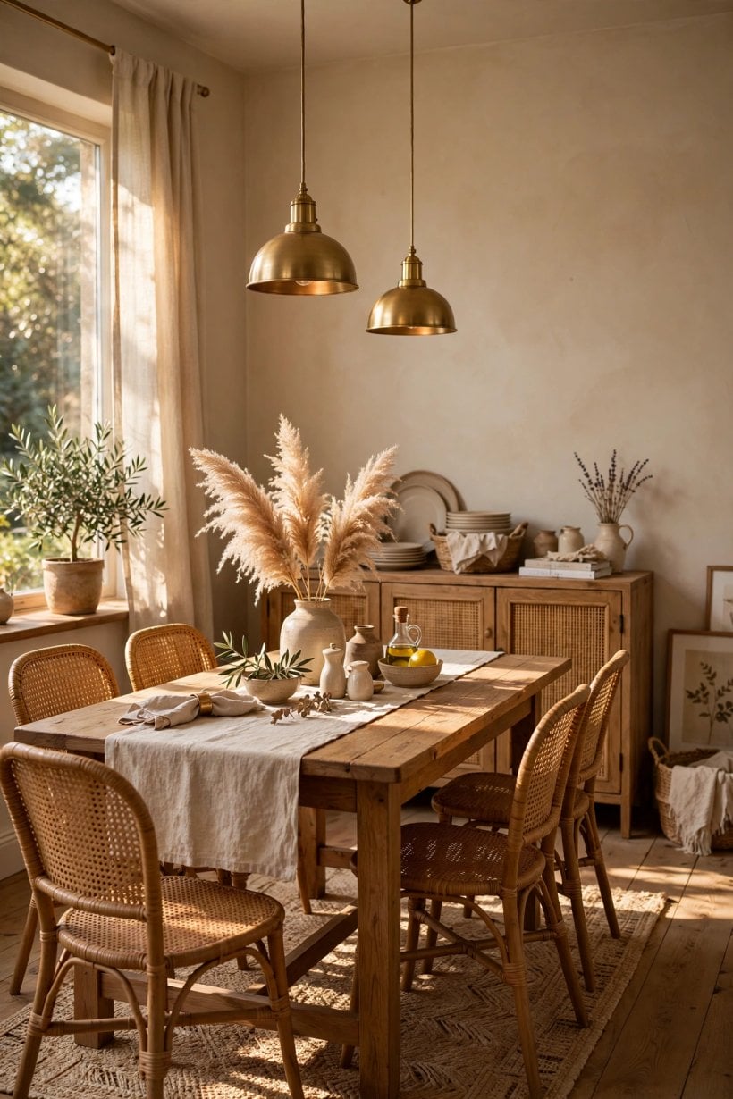
The final stretch is method: how beige is trialled, bought and used where rooms are small and mistakes are magnified. Small spaces are this site’s home territory, and beige — correctly handled — is one of their best colours.
66. Buy Sample Pots in Threes
Test the favourite, one step paler and one step warmer. Beige shifts more between adjacent cards than any vivid colour does; the trio brackets the answer in a single afternoon.
67. Paint Two Coats or Judge Nothing
One coat of beige over an old colour is a rumour, not a sample. Two coats, fully dry, in daylight and lamplight: only then has the colour actually been interviewed.
68. Give Small Rooms Beige, Not White, for Warmth
White in a tiny room reads as a corridor; pale warm beige reads as a room. The smallest spaces benefit most from beige’s embrace — the logic is proven across colourful tiny house interiors too, where warm neutrals anchor the bolder schemes.
69. Drench a Small Room in One Beige
Walls, trim and ceiling in a single beige erase the visual joints that chop small rooms into slices. The envelope feels tailored — bigger because it is simpler.
70. Keep Beige Pale in a Windowless Room
Without daylight, beige lives entirely by bulb light and deepens fast. Interior halls and cloakrooms take the family’s palest step and a warm bulb — the combination glows rather than glooms.
71. Use Beige to Unify a Patchwork of Doors
Old houses accumulate doors of different ages and woods. Painting doors, frames and walls in one beige family turns the patchwork into panelling — mismatch becomes rhythm.
72. Record the Recipe Once It Works
Brand, range, colour name and finish, written on the tin and in a note: beige is the colour households most often try to match years later, and the one hardest to match from memory.
73. Keep a Touch-Up Pot Decanted and Labelled
Beige walls in family houses take knocks at chair height and bag height. A small sealed jar of the exact paint, kept with the brushes, turns damage into a two-minute repair.
74. Re-Test Beige When the Floor Changes
A new floor re-lights every wall. Before repainting in disappointment, live with the old beige against the new boards for a week — often the pairing settles and the wall is innocent.
75. Let One Room Stay the Control Sample
When a house is beige throughout at different depths, the staircase or landing becomes the reference that keeps future decorating honest. Every new colour is judged against it first.
9. Checks and Mistakes: Before the First Tin Opens
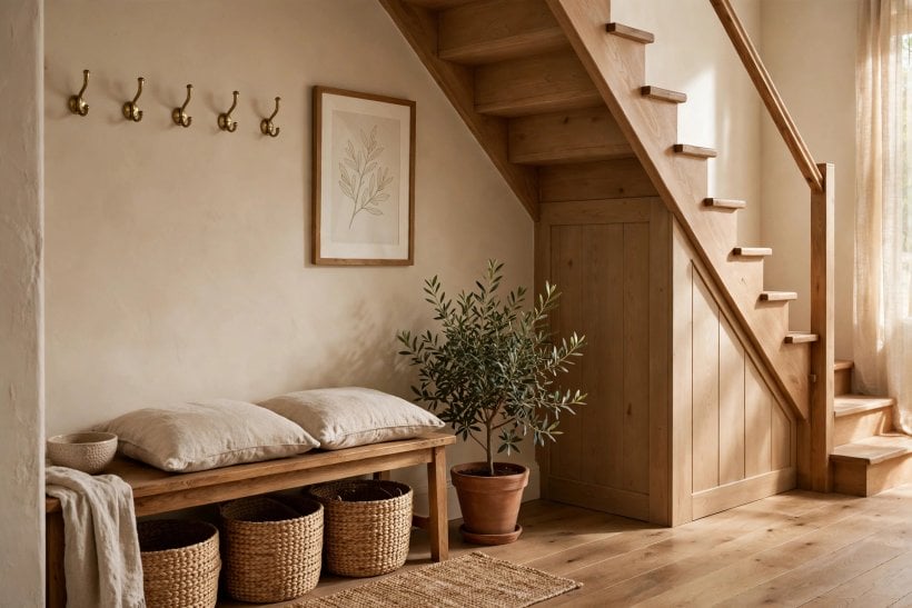
The recurring beige disasters are few and avoidable. The undertone chosen under shop light that turns the living room pink at dusk. The white trim from the wrong family, fighting the walls at every edge. The single coat judged too soon. And the deepest mistake: beige chosen as the absence of a decision, spread over a house that deserved a point of view. Run the checks instead — swatch against white paper, board on the strictest wall, two coats, morning and evening, floor and fabric in the room. Beige rewards exactly this much rigour and forgives everything else.
10. Costs and Pulling It Together
Beige is, mercifully, among the least expensive strong decisions in decorating: the cost drivers are coats and finish quality, not pigment rarity. Pale neutrals cover well; the money is better spent on the washable finish for working rooms and on sample pots — plural — than on premium tins of an untested shade. Pull the scheme together in the order this post has run: fix the undertone family for the house, set depths by light and room, hold finishes consistent across sightlines, then let wood, white and one dark accent finish the argument. The result is not a beige house. It is a warm house that happens to be painted beige — a difference every guest will feel and few will name.
Final Considerations
Beige’s return is not nostalgia; it is a correction. After a decade of cool greys, households have remembered that walls are backgrounds for lives, and that warmth is a function, not a fashion. Choose the undertone with care, test it like you mean it, and beige will repay the attention every single day — quietly, which was always its way of winning.

0 Comments