

Paint fashion moves fast, but painted rooms do not have to. Beneath every passing trend sits a small set of colour families that have carried homes gracefully for decades — whites, greiges, blues, greens and earthy tones — because they answer to light, wood, stone and fabric rather than to fashion.
This guide works through those enduring families one by one: what gives each its character, where it earns its keep, and how to test it honestly before a single wall is coated. The exact shade matters far less than the family you choose — get the family right and the room forgives almost any brushwork.
Nothing here is a ranking and nothing is dated. These families were carrying houses long before seasonal shade launches existed, and they will still be carrying them afterwards; that is precisely what makes them worth understanding properly.
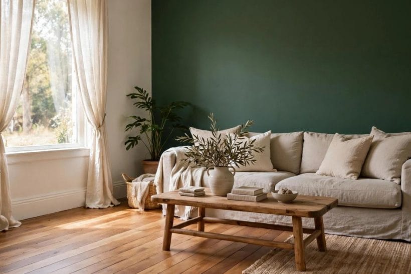
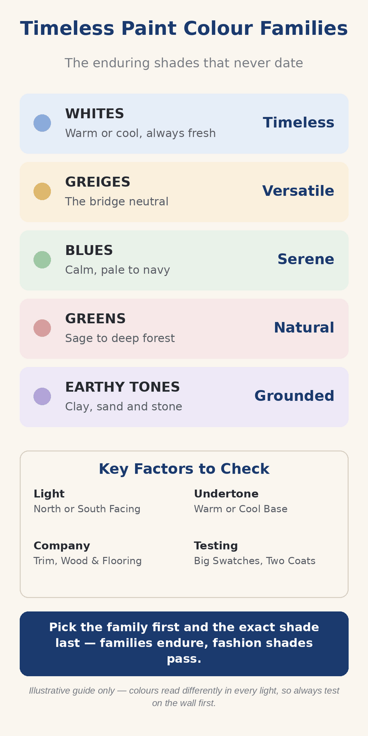
1. Paint Colour Families at a Glance
Scope first. This post owns the families themselves — the broad groups every paint shade belongs to. Its neighbours take the narrow questions: the Pure White vs Extra White guide settles the two most argued-over whites head to head, and the plum colour guide goes deep on one bold family member. Here, the whole palette is the subject — with the enduring paint colours guide as its companion survey of shades chosen to outlast fashion.
A family is a set of shades sharing an undertone and a mood. Colours inside a family almost always sit comfortably together, which is why whole homes are usually painted from two or three families rather than from a shelf of unrelated favourites.
| Family | Character | What it means |
|---|---|---|
| Whites | Always Fresh | Warm or cool whites that frame every other colour in the house |
| Greiges | The Bridge Neutral | Grey warmed with beige, at home beside both cool and warm finishes |
| Blues | Calm Colour | From palest mist to deep navy, the most forgiving strong family |
| Greens | Borrowed from Nature | Sage, leaf and forest shades that echo the garden outside |
| Earthy Tones | Grounded Warmth | Clay, sand and stone colours that make rooms feel settled |
2. Whites and Off-Whites: The Frame of the House
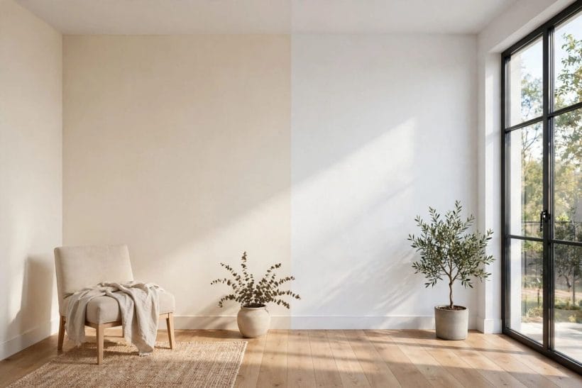
Whites are not the absence of colour but a family of their own, split by undertone. Choosing between a warm white and a cool white is the single most consequential paint decision in a house, because every other finish is judged against it.
Warm whites lean toward cream
Warm whites carry a hint of yellow, red or brown beneath the surface. They flatter timber, brass and warm fabrics, soften north-facing light, and are the traditional choice for older houses whose plaster and woodwork were never meant to look blue-white or clinical.
Cool whites lean toward blue and grey
Cool whites sit closer to a true, bright white with a whisper of blue or grey. They suit modern rooms, chrome and glass, white marble and south-facing glare, and they make small rooms feel crisp — but in dull light they can turn chilly and flat.
Let the room’s light cast the deciding vote
The same white reads warm at noon and grey at dusk. Paint large test patches on two walls, live with them through a full day, and judge at the hour the room is used most. Light, not the tin, has the final say.
3. Greiges, Taupes and the Warm Neutrals
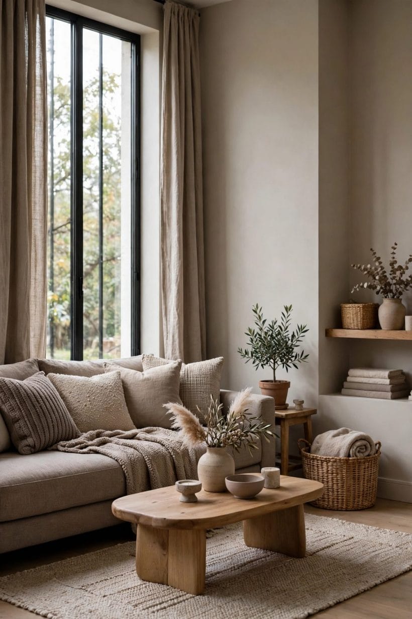
Between grey and beige sits the family modern houses run on. Greiges and taupes mediate: they cool a warm room down and warm a cool room up, which is why they appear in hallways and open-plan spaces that must agree with everything.
Greige: the bridge between grey and beige
A good greige changes sides politely — greyer beside warm wood, warmer beside cool stone. The greige undertones guide explains how to read that shift before you commit, because the undertone you miss on the swatch is the one that shouts from the wall.
Taupe: depth without darkness
Taupe runs deeper than greige, a mushroom-brown grey that gives rooms a tailored, grounded feel. The taupe colour guide shows where it works hardest: bedrooms, studies and anywhere upholstery and leather need a quiet, expensive-looking background.
Warm neutrals for whole-home flow
When one neutral must carry a whole floor, choose from this family and vary only the depth between rooms. The eye reads the change as light and shade rather than as a new colour, so the home feels composed instead of patched together.
4. Blues: The Calm Family
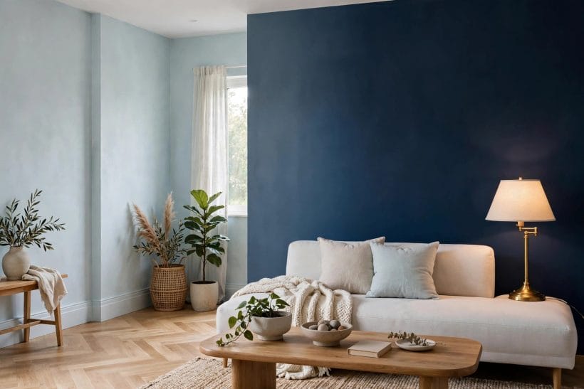
Blue is the strong colour beginners can trust. It recedes rather than advances, pairs with every timber and metal, and spans from a breath of mist on a ceiling to the full commitment of navy cabinetry. It is also the family most at home beside water, sky and garden green, which is why coastal and country houses reach for it so instinctively.
Pale blues for light and air
The palest blues behave almost like neutrals with better manners: they cool hot rooms, lift low ceilings and give bathrooms and bedrooms a washed, restful air. Keep them slightly greyed and they will never read as a child’s nursery unless you want them to.
Mid blues for living rooms and studies
Mid-tone blues hold furniture beautifully — pale sofas, dark wood and brass all sharpen against them. The blue living room ideas collection shows the family at work across seventy-five rooms, from washed denim shades to deep petrol.
Navy and ink as the family’s anchor
Deep blue is the neutral of the dark end: calmer than black, warmer than charcoal, and endlessly used on doors, islands and library walls. Treat it as a background colour, not an accent, and it will carry a room for years.
5. Greens: Borrowed from the Garden
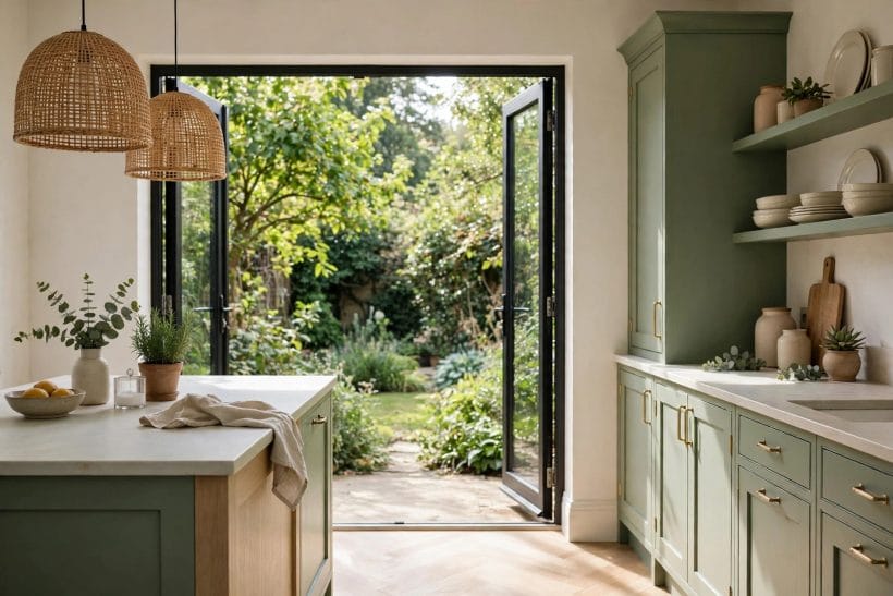
Green is the family that connects indoors to outdoors. Every green in a house is judged against the green through the window, so choosing shades that agree with your own landscape is the whole art.
Sage and soft grey-greens
Greyed greens are the peacemakers of the palette — gentle in bedrooms, kitchens and halls, and kind to both white and timber. Sage in particular behaves like a neutral with a personality, which is why it survives every trend cycle untouched.
Leaf and mid greens for energy
Clearer, leafier greens bring life to rooms that lack a view: a hallway, a downstairs cloakroom, a north-facing kitchen. Use them where a jolt of garden is welcome, and balance them with plenty of white and natural texture.
Forest and racing greens for depth
Deep greens make the cosiest studies, dining rooms and snug corners in the house. They ask for warm light and warm metals — brass, copper, aged gold — and repay the partnership with a richness few other families can match.
6. Earthy Tones: Clay, Sand and Stone
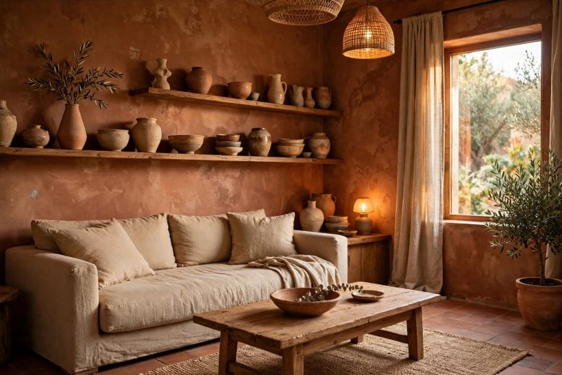
The earthy family — clay, ochre, sand, rust and stone — grounds a house. These are the colours of plaster, pottery and sun-baked walls, and they make modern rooms feel human and older rooms feel honest. They are also the great reconcilers of mixed architecture: a house with one modern extension and one old wing often finds its peace in an earthy scheme that belongs to neither era and flatters both.
Clay and terracotta warmth
Muted clay shades flatter skin, food and firelight, which is why dining rooms and sitting rooms wear them so well. Keep them dusty rather than bright and they read as architecture, not decoration.
Sand and stone for quiet backgrounds
Sandy, stony shades sit between the whites and the true earth tones: warmer than grey, calmer than cream. They are the natural choice for open-plan floors that must host timber, linen and pale stone without arguing with any of them.
Ochre and rust as the family’s spice
A little ochre goes a long way — a chimney breast, a door, the inside of a bookcase. Used as the accent inside an otherwise earthy scheme, it gives the warmth of a strong colour with none of the risk.
7. Charcoal, Ink and the Dark Accents
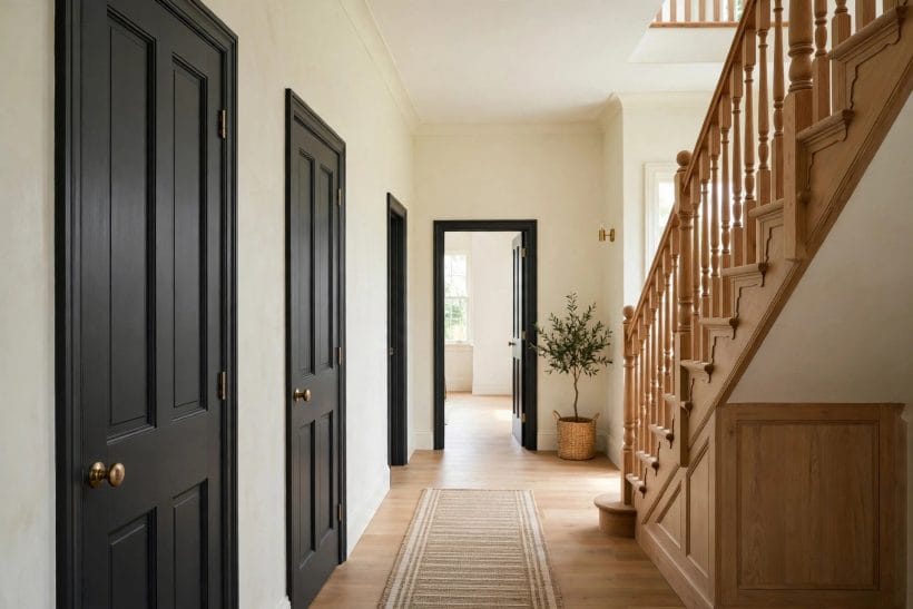
Every enduring palette needs a dark end. Charcoal, ink blue-black and deep brown-black give pale families their definition — on doors, staircases, cabinetry and the occasional whole small room that wants to feel like evening.
Charcoal instead of true black
Pure black paint is rare in enduring schemes because it flattens; charcoal keeps a breath of blue, green or brown that lets it talk to the rest of the palette. The charcoal colour guide works through the undertones and where each belongs.
Dark doors and woodwork
The cheapest transformation in the dark family is the woodwork: doors, skirting and stair rails in a deep shade make pale walls look deliberate and expensive. It is reversible, quick, and the classic test of whether a household likes living with dark accents.
One dark room, done wholeheartedly
A small room painted entirely dark — walls, woodwork and ceiling — stops apologising for its size and becomes a jewel box instead. Snug, study or cloakroom: commit fully or not at all, because a single dark wall in a pale room reads as indecision.
8. How the Families Work Together
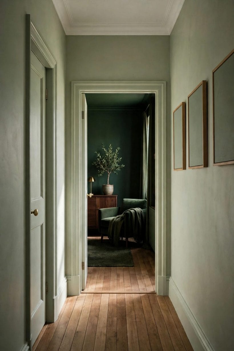
A house painted from two or three families feels designed; a house painted from seven feels restless. The families above combine in predictable ways, and the combinations below have carried whole homes for generations.
The quiet trio: white, greige and one colour
The safest whole-home recipe: warm white on ceilings and woodwork, a greige through the halls and main rooms, then one colour family — blue, green or plum — saved for the rooms that want character. Purple bedroom walls in the plum family show how a single bold room lifts the whole arrangement.
Warm house, cool house: pick a side
Families have temperatures. A warm house runs on cream whites, taupes and earthy tones; a cool house on bright whites, blues and charcoals. Either works beautifully — what fails is mixing the two temperatures at random from room to room.
Depth does the travelling, not hue
In a well-planned home, adjoining rooms differ more in depth than in colour: pale in the hall, deeper in the sitting room, deepest in the snug. Walking through feels like moving through light and shade in one landscape, not flicking between paint cards.
9. Testing Colour Honestly
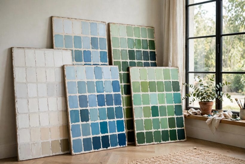
More paint regrets come from bad testing than from bad colours. A family chosen well still fails if the shade was judged from a thumbnail swatch under shop lighting, so test like the decision matters — because repainting is the expensive part. The rituals below take a weekend at most, and they are the difference between a colour you live with happily for a decade and one you apologise for every time a guest sits down.
Big swatches, two coats, on the wall
Paint a sheet of lining paper or a large board with two coats, and move it around the room. Small chips lie about depth: every colour looks gentler on a card than it will across four walls, so judge at the largest scale you can manage.
Judge at three times of day
Morning light is cool, midday is neutral, evening lamplight is warm — the same wall wears three faces daily. Live with test patches through all three, and choose the shade that behaves best at the hour the room is used most.
Test against the fixed finishes
Floors, stone, tiles and fitted furniture are not changing, so the paint must agree with them, not the other way round. Hold swatches against the flooring and worktops, in daylight, and let any clash disqualify the shade however lovely it looked alone.
10. Choosing Your Family: Questions to Ask First
Before the shade cards come out, four questions narrow the whole palette to the family your house actually wants. Answer them honestly and the right family usually chooses itself.
Which way does the room face?
North light is cool and grey, south light is warm and strong. North-facing rooms usually beg for warm families — cream whites, taupes, earthy tones — while south-facing rooms can take the cool blues and crisp whites that would chill a northern room.
What is staying in the room?
List the immovable colours first: floor, stone, tiles, the sofa you love. Your family must contain those colours’ undertones, or the new paint will make everything staying look slightly wrong. The room’s contents vote before you do.
How brave is this room allowed to be?
Every house has rooms for calm and rooms for character. Spend the bold families where evenings are spent and doors can close — dining rooms, studies, snugs — and keep the through-routes in the quiet families that tie the home together.
Final Considerations
Trends will keep arriving with named shades and confident claims, and most will leave just as quickly. The families in this guide — whites, greiges, blues, greens, earthy tones and their dark anchors — endure because they are built from light, landscape and materials rather than fashion. Choose your family with care, test the shade honestly, and the room will still look right long after the trend that named it is forgotten.
One last comfort: you are never locked in. Paint is the most reversible decision in a house, and a family chosen for the right reasons rarely needs reversing at all. Start with the room you use most, let it prove the family, and let the rest of the house follow at its own pace.

0 Comments