

Beadboard brings a bathroom its rhythm: fine vertical grooves, a clean capped edge, and walls that feel crafted rather than plain, whether the boards stop at chair-rail height or climb the whole wall in one calm, ordered sweep.
These beadboard bathroom ideas stay with beadboard itself — heights, colours, grooves, trim caps, and pairings with tile, vanities and fixtures — so you can choose a wall treatment that truly suits your room and the way it is used.
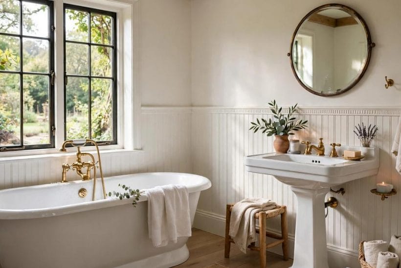
1. Bathroom Beadboard at a Glance
Scope first. This post owns the beadboard lane only: beadboard as a bathroom wall treatment, in its heights, colours and groove styles, and the tile, vanities and fixtures it pairs with. The wider pillar on bathroom ideas covers bathrooms in full; here, the boards lead.
The splits are simple. Cabinet colour lives in its own post, layouts live in theirs, and heating and the other fixture lanes each live in theirs too — this post never re-teaches bathrooms generally. Compact rooms get their own guide to small bathroom ideas, linked again where size shapes the boards.
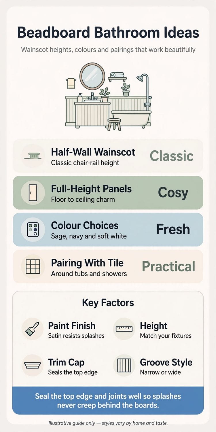
Read the height before the details. Where the beadboard stops decides how a bathroom feels, how tile and mirrors sit against it, and how the colour settles through the day. The table names the five beadboard families this post returns to, so later sections can speak of each by name.
| Family | Character | What it means |
|---|---|---|
| Half-Wall Wainscot | Classic | Beadboard to chair-rail height, capped with trim, painted wall above |
| Full-Height Panels | Cosy | Boards running floor to ceiling for an enclosed, crafted feel |
| Colour Choices | Fresh | Sage, navy, soft white and deeper tones changing the mood |
| Pairing With Tile | Practical | Tile taking the wettest zones around tubs and showers, boards beyond |
| Trim Cap | Finished | The ledge that seals the top edge and outlines the boards |
2. Half-Wall Wainscot: Heights, Caps and Trim
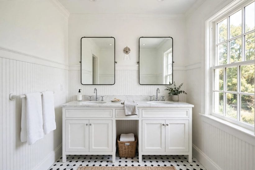
Half-wall wainscot is beadboard’s classic bathroom form: boards to chair-rail height, a cap on top, calm painted wall above. The white cabinet lane lives in the guide to white cabinets bathroom ideas; here, height and cap lead.
1. Classic half-wall wainscot in white
Soft white half-wall wainscot is where most bathrooms start, and for good reason: the boards bring texture without colour commitment, the cap draws a clean horizon, and the upper wall stays free for mirrors or a later change.
2. Chair-rail beadboard behind a double vanity
Behind a double vanity, chair-rail height beadboard gives two basins one composed backdrop. The grooves run evenly behind both mirrors, the cap aligns the wall, and splashes land on a painted surface that shrugs them off kindly.
3. Half-wall panels with a chunky cap
A chunky trim cap gives half-wall beadboard a shelf-like top edge where a small plant can rest. The deeper ledge throws a gentle shadow line, making the wainscot read deliberate and built rather than simply applied.
4. Half-wall beadboard wrapping a corner
Beadboard that turns a corner without breaking its rhythm makes a bathroom feel considered from every angle. The grooves continue, the cap mitres neatly, and the eye travels around the room instead of stopping mid-wall.
5. Low wainscot in a family bathroom
A lower wainscot suits a family bathroom where walls take knocks from baskets, stools and small hands. Painted boards forgive scuffs that plain plaster shows, a quick repaint restores them, and the upper wall stays light.
6. Beadboard below a painted upper wall
Beadboard below with a painted upper wall is the most flexible scheme here: repaint only the top half and the room changes mood entirely, while the boards keep their colour, their cap and their quiet order.
7. Wainscot height matched to the fixtures
Letting the wainscot height answer the fixtures keeps a bathroom composed: a cap meeting the vanity top or echoing the mirror line reads as design, not accident. Match the height to your fixtures first, as the infographic advises.
8. Half-wall beadboard with a ledge cap
A picture-ledge cap turns the wainscot’s top into a narrow display line for a framed print or small vase. It suits bathrooms short on shelf space, giving the treatment a second job while basin surfaces stay clear.
3. Beadboard in Small Bathrooms and Powder Rooms
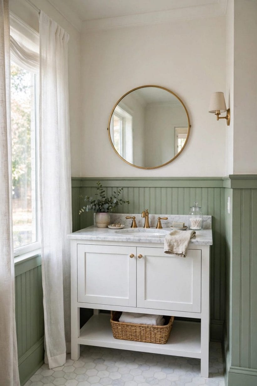
Small bathrooms gain most from beadboard, because the grooves add architecture a tiny room cannot get from furniture. Room planning itself lives in the compact bathroom layout guide; here, the boards do the work.
9. Vertical grooves lifting a compact bathroom
Vertical grooves lead the eye upward, and in a compact bathroom that quiet lift matters more than any single fixture. Run the boards on every wall in a pale colour, and the room feels taller without changing size.
10. Powder room beadboard in deep colour
A powder room rewards drama: deep-coloured beadboard below, a striking mirror above, and guests get a small room with real character. Because the space is used briefly, a bold colour delights instead of overwhelming anyone.
11. Pale beadboard in a small bathroom
In a small bathroom with modest daylight, pale beadboard keeps every wall working for the light. The grooves still give shadow and texture, the read stays airy, and mirrors complete a room that never feels boxed in.
12. Beadboard behind a pedestal basin
A pedestal basin leaves the wall behind it fully visible, and beadboard dresses that wall kindly. The boards frame the basin’s curves, the cap gives a line for a small mirror to answer, and the room gains focus.
13. Beadboard around every wall, continuously
In a narrow bathroom, stopping and starting treatments wall by wall makes the room feel fussier and smaller. One beadboard height carried right around unifies the space, and the continuous cap line stretches it end to end.
14. Beadboard as the vanity splash zone
Behind a small vanity, beadboard earns its keep as the splash zone: a satin finish sheds droplets, the grooves hide faint marks busy mornings leave, and the treatment looks decorative while doing a practical job daily.
15. Cloakroom beadboard with patterned walls above
A guest cloakroom can carry what a family bathroom cannot: beadboard below for order, a patterned upper wall for pleasure. The boards ground the pattern, the cap separates the two cleanly, and the smallest room becomes memorable.
16. Beadboard instead of bulky wall finishes
Where a tiny bathroom cannot spare depth for heavy wall finishes, beadboard sits close to the wall and asks for almost nothing. The room keeps its floor space, the walls gain texture, and nothing crowds the fixtures.
4. Pairing Beadboard with Vanities, Mirrors and Tubs
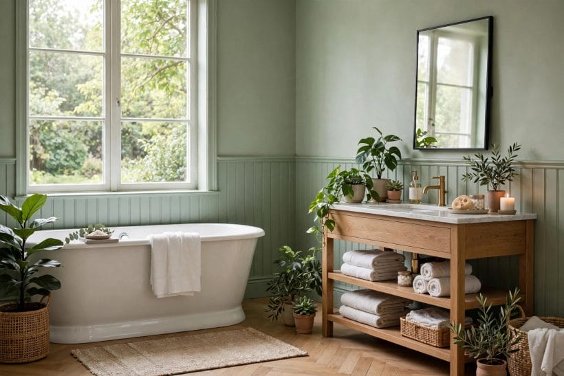
Beadboard rarely works alone: vanities stand against it, mirrors hang above it, tubs rest beside it. Choosing the furniture itself is covered by the bathroom vanity buying guide; here, the pairings lead.
17. Beadboard behind a wooden open vanity
Natural timber and painted beadboard are old friends: the wood brings warmth and grain, the boards bring rhythm and order. Behind an open vanity the pairing feels handmade and calm, and folded towels complete the look.
18. A round mirror softening vertical lines
A round mirror above the cap softens beadboard’s upright rhythm in the kindest way, its curve answering the straight grooves below. Centred on the basin, it settles the whole vanity wall without any stark contrast.
19. Beadboard backing twin vanity mirrors
Twin mirrors over a double vanity look best against an even, ordered wall, and beadboard supplies exactly that. The grooves run steadily behind both mirrors, small misalignments vanish into the rhythm, and the wall reads tailored.
20. Pedestal basin against white beadboard
White on white can still have texture: a pedestal basin against white beadboard layers smooth ceramic over fine grooves, and the difference in surface does all the decorating. Warm metal taps keep it from feeling clinical.
21. Beadboard behind a freestanding tub
A freestanding tub deserves a wall with presence, and beadboard behind it frames the tub’s silhouette beautifully. The vertical lines rise behind the curves, and the bathing corner feels deliberate rather than simply placed.
22. Mirrors on the plain wall above
Keeping mirrors on the plain upper wall, above the cap, gives beadboard rooms their classic balance: texture below, calm above. The cap becomes the horizon everything answers to, and sconces can join without crowding the boards.
23. Warm metal fixtures against painted beadboard
Warm-toned taps, rails and mirror frames glow gently against painted beadboard, especially in sage, cream or navy. The metal warms the painted surface, the boards give the fittings an ordered field, and the wall feels luxurious.
24. Beadboard and natural timber together
Beyond the vanity, timber stools, shelves and bath racks echo the boards’ own wooden nature. Kept in similar warm tones, the pieces feel gathered over time rather than matched from a set, and the bathroom settles calmly.
5. Full-Height Beadboard Panels
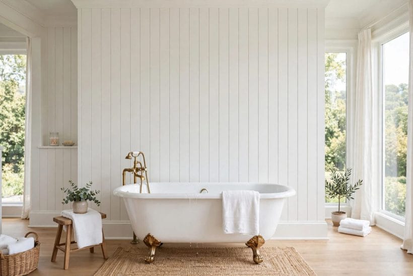
Full-height beadboard changes a bathroom’s whole character, wrapping it in crafted, enclosed calm. The dedicated guide to spa bathroom ideas explores the bathing mood in full; here, floor-to-ceiling boards lead.
25. Full-height white panels behind a tub
White panels rising the full wall behind a soaking tub make the bathing corner feel like a small retreat. The unbroken grooves draw the eye up, the tub’s curves rest against the order, and the scene stays serene.
26. Floor-to-ceiling beadboard, cosy and enclosed
Running beadboard floor to ceiling wraps a bathroom the way panelling wraps a snug sitting room: enclosed, warm and quietly old-fashioned. It suits rooms that feel cold or boxy, giving every wall one crafted surface.
27. Full-height beadboard in soft colour
A soft colour taken over full-height boards — pale sage, misty blue or warm cream — colours a bathroom without a single patterned surface. The grooves shade the colour gently as light moves, so walls feel deep.
28. Full-height panels on one feature wall
One full-height beadboard wall, usually behind the tub or vanity, gives a bathroom its focal point while other walls stay plain. The tall field of grooves reads as architecture, grander still against plainer walls.
29. Full-height beadboard meeting ceiling trim
Where full-height boards meet the ceiling, a simple trim closes the join and keeps the treatment looking built-in. The plain band lets the grooves stop cleanly, and wall and ceiling read as one considered composition.
30. Vertical lines on a tall wall
Tall walls can dwarf ordinary fixtures, but full-height grooves give them scale and rhythm. The lines break the height into a steady beat the eye can climb, and the room feels grand rather than empty.
31. Full-height beadboard wrapping whole rooms
Wrapping every wall in full-height beadboard is the boldest scheme here, and in a window-lit bathroom it feels like a cabin retreat. Keep the colour pale and fixtures simple, and the boards supply all the character.
32. Full-height panels with a quiet floor
Full-height boards carry enough texture for two surfaces, so the floor beneath them should stay plain and quiet. The grooves then become the room’s only pattern — which is exactly their charm, calm and complete.
6. Colour Choices: Navy, Sage, White and Deeper Tones
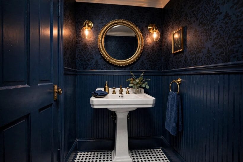
Colour is where beadboard stops being a texture and becomes a mood. The same grooves read classic in white, garden-fresh in sage and dramatic in navy, so choose the tone for the feeling the room should hold.
33. Navy beadboard with warm metal accents
Navy beadboard is the confident choice: deep, calm and flattering to white basins and warm metal fittings alike. In a powder room it feels jewel-like, and its grooves catch lamplight beautifully as evening settles in.
34. Sage green beadboard, garden fresh
Sage green beadboard brings the garden indoors without a single leaf print. The soft green flatters timber vanities, white tubs and houseplants alike, reading fresh in daylight and gentle grey-green under lamplight at night.
35. Soft white beadboard that never dates
Soft white remains the safest beadboard colour because it is really a texture choice, not a colour one. It suits every style here, brightens windowless rooms, and lets towels and plants supply the season’s colour.
36. Pale blue-grey beadboard for calm light
A pale blue-grey gives beadboard a cooler temperament, lovely in bright bathrooms where warmer tones might turn yellow. The grooves shade the colour softly, white fixtures stay crisp, and the room feels like morning.
37. Deep green beadboard, moody and restful
Deep green beadboard makes a bathroom feel tucked away and restful, especially under warm lamplight with timber and cream beside it. Use it at half height below paler walls, or full height for the full mood.
38. Warm cream beadboard in sunlight
Warm cream softens beadboard’s cottage crispness into something gentler, suiting sunlit bathrooms with timber floors and woven baskets. The colour glows in afternoon light and keeps white fixtures from ever feeling stark.
39. Charcoal beadboard as a bold base
Charcoal beadboard at half height, beneath a pale upper wall, gives a bathroom graphic confidence without darkness everywhere. White basins and mirrors stand out crisply, and the cap line becomes the room’s strongest detail.
40. Two-tone schemes split at the cap
The cap line is a natural place to split two tones: deeper colour on the boards, lighter above, or the reverse for a brighter room. The split follows the architecture, so it never looks arbitrary.
41. Colour-matched cap, boards and skirting
Painting the cap, boards and skirting in one colour makes the whole lower wall read as a single crafted piece. The monochrome field calms busy bathrooms, hides the joins, and lets the upper wall carry pattern.
7. Beadboard on Tall, Sloped and Awkward Walls
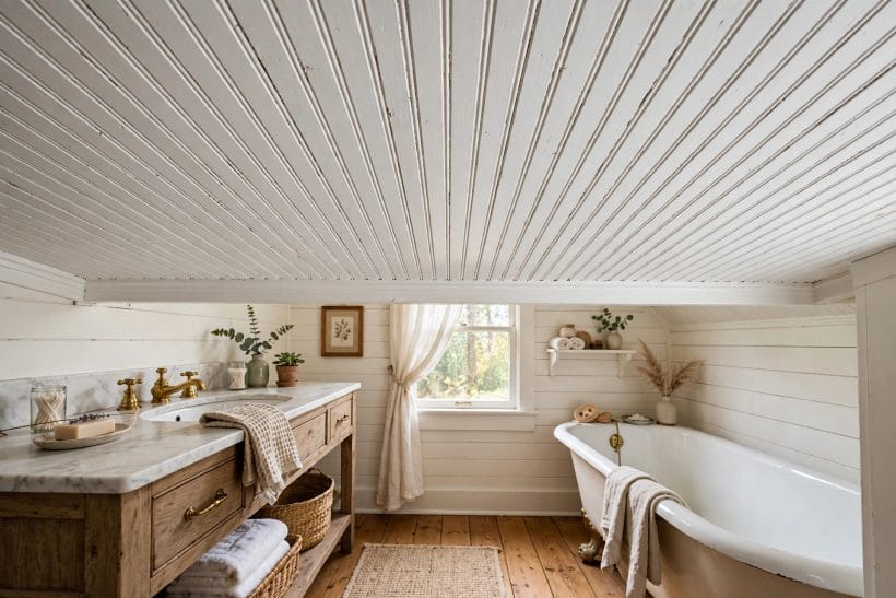
Awkward bathrooms — attic slopes, tall plain walls, windows in odd places — are where beadboard earns a second reputation, turning the room’s difficulties into its character. The boards follow the architecture instead of fighting it.
42. Beadboard following a sloped attic wall
In an attic bathroom, beadboard that follows the slope turns dead eaves space into the room’s charm. The grooves run with the roofline, the low wall gains a finished surface, and a tub beneath feels deliberately placed.
43. Beadboard beneath a low eaves ceiling
Where the ceiling drops low over a bathroom, beadboard on the walls below keeps the proportions friendly. Pale boards lift the low side, the cap line stays level where the ceiling cannot, and the room reads cosy.
44. Taller wainscot in high-ceilinged bathrooms
A high-ceilinged bathroom can feel echoing and unfinished, and taller wainscot answers it: boards rising well above the usual height give the wall a middle register, so mirrors, windows and ceiling finally relate to one another.
45. Beadboard carried around a window wall
A window wall need not break the treatment: beadboard carried beneath and beside the window keeps the room unified, and the cap can run into the sill line gracefully. Daylight then rakes across the grooves beautifully.
46. Beadboard turning awkward corners cleanly
Real bathrooms have boxing, alcoves and corners where pipes hide, and beadboard covers such awkwardness more gracefully than plain plaster. The grooves bend the eye around irregularities, and boxed sections read as more panelling.
47. Beadboard lining an alcove by the tub
A narrow alcove beside the tub often ends as wasted wall, but lining it with beadboard makes it a small feature: a shelf or stool inside gains a crafted backdrop, and the bathing corner feels planned.
48. Beadboard below a dormer window
The low wall below a dormer window is easy to neglect and hard to furniture, which makes it ideal beadboard territory. The boards give the awkward stretch purpose, the cap echoes the sill, and no building is needed.
49. Beadboard character for a plain box room
Some bathrooms are plain boxes with no period detail at all, and beadboard is their quickest route to character. One treatment supplies rhythm, shadow and craft, and fixtures that looked lost suddenly look chosen.
8. Beadboard with Wallpaper and Pattern Above
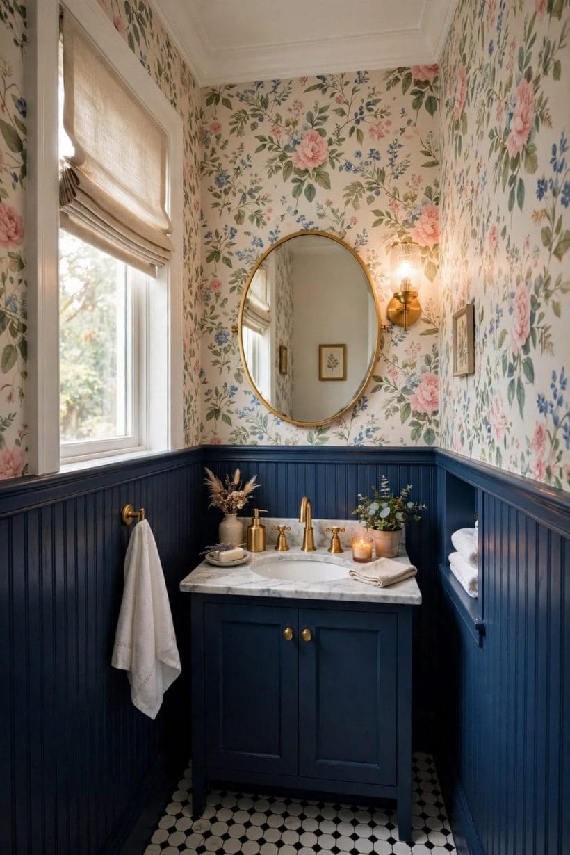
Beadboard below and pattern above is one of the oldest bathroom schemes, and still one of the happiest: the boards take the splashes, the upper wall takes the pattern, and the cap line keeps the peace.
50. Floral wallpaper above navy beadboard
Floral wallpaper above navy beadboard balances romance with backbone: the blooms drift across the upper wall while deep boards below keep the scheme grounded. A matching navy vanity and warm metal complete the pairing.
51. Patterned walls above white beadboard
Above white beadboard, almost any pattern behaves: the plain boards give the print a calm base, and the white echoes the basins and tub. It is the easiest way to enjoy bold wallpaper without pattern reaching splashes.
52. Beadboard as the calm half below print
A busy print needs a quiet partner, and beadboard’s fine, even rhythm is quieter than plain paint because it has its own order. The eye rests on the boards, and the room feels lively rather than loud.
53. Wallpaper and beadboard in one family
Choosing a wallpaper whose ground colour echoes the beadboard below makes the two halves feel like one scheme. Sage boards under a leafy print let the cap line separate textures rather than colours, very gently.
54. A bold print balanced by simple grooves
The bolder the upper print, the simpler the boards below should stay: plain grooves, one colour, a neat cap. That restraint lets a dramatic wallpaper succeed in a small bathroom, where the print is always close.
55. Botanical wallpaper in a powder room
Powder rooms and botanical prints belong together, and beadboard below protects the scheme’s lower half from bags, elbows and splashes. Guests get the full garden effect at mirror height; the boards keep the working half calm.
56. Wallpaper above beadboard for guests
A guest bathroom dressed with wallpaper above beadboard feels like a small hotel: considered, welcoming and a little indulgent. The boards keep it from feeling precious, the pattern makes it memorable, and upkeep stays easy.
57. Dark beadboard grounding a light print
A light print can float away in a bright bathroom unless something anchors it, and dark beadboard below does exactly that. The deep boards give the pale pattern weight, and white fixtures bridge the two tones.
9. Groove Styles, Trim Details and Paint Finishes
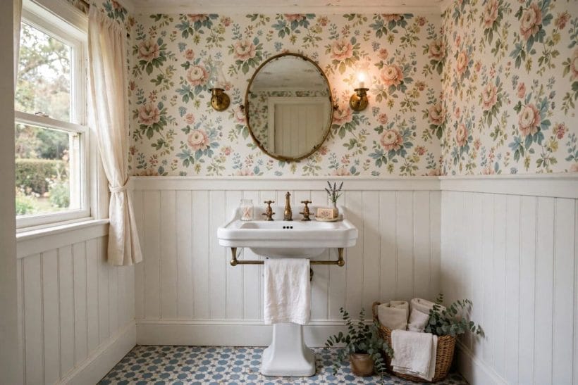
The details decide whether beadboard reads fine and traditional or broad and calm: groove spacing sets the rhythm, the cap sets the outline, and the paint finish decides how the surface handles splashes and steam.
58. Narrow grooves, a fine traditional rhythm
Narrow grooves give beadboard its classic, fine-grained rhythm, the one that suits period bathrooms and pedestal basins best. The close lines read as texture across the room and as craft up close, prettiest in pale colours.
59. Wider grooves for a calmer wall
Wider groove spacing calms the treatment down, suiting simpler, more modern bathrooms where fine lines might feel fussy. The broader boards catch broader shadows, and the wall blends with plain contemporary fixtures without losing character.
60. A smooth cap sealing the top edge
The trim cap is more than decoration: it seals the top edge of the boards, the very place splashes would otherwise creep behind them. A smooth, well-fitted cap keeps the line clean and the wall dry.
61. Satin finish that shrugs off splashes
A satin finish is beadboard’s natural partner in a bathroom, shedding splashes, wiping clean and holding a soft sheen that shows the grooves kindly. Flatter finishes mark sooner; glossier ones can glare under bathroom lighting.
62. A simple flat cap, modern and crisp
Modern bathrooms suit a flat, square cap rather than a moulded one: the boards keep their texture, but the outline stays crisp and architectural. With wider grooves and one colour, the treatment feels current yet unmistakably beadboard.
63. Deep shadow lines from defined grooves
Well-defined grooves throw real shadow lines, and those lines are the treatment’s decoration. Raking light from a side window shows them best, which is why beadboard bathrooms feel more textured in morning light than lamplight.
64. Trim painted to match the boards
Matching the trim’s paint to the boards makes cap, skirting and architrave disappear into one crafted surface. The eye reads a single panelled wall rather than parts, and small bathrooms gain a built-in, generous feel.
65. Skirting chosen to sit with beadboard
The skirting at the boards’ foot should feel like part of the same family: similar depth, same colour, a profile that does not fight the grooves. Considered bottom edges make wainscot read as joinery, not decoration.
66. Choosing sheen for steam and light
Sheen is a quiet decision with daily consequences: a soft satin or eggshell glow flatters grooves, tolerates steamy air and hides the faint unevenness old walls have. Sample one board and live with it a while.
10. Pairing with Tile, Sealing and Lasting Upkeep
Beadboard and tile divide a bathroom by temperament: tile takes direct water around tubs and showers, boards take the walls beyond, and their join should look planned. Heating has its own guide to bathroom heat lamp ideas and safety; here, pairings and upkeep close the post.
67. Beadboard meeting tile around a tub
Around a freestanding tub, let tile take the wall the splashes reach and beadboard continue beyond it, the two meeting at a corner or trim line. The tub gains a practical backdrop; the boards keep their dignity.
68. Tile inside the shower, beadboard outside
The clearest division of all: tile inside the shower enclosure, beadboard on the room’s walls outside it. Each material does what it does best, the shower stays washable, and the room keeps its crafted character.
69. Tiled splashback beside beadboard at the basin
Behind the basin, a short tiled splashback can take daily splashes while beadboard runs beneath and beside it. The tile echoes the floor or shower, the boards keep their rhythm, and the wall layers textures gracefully.
70. Sealed top edges where splashes gather
The top edge of the wainscot is where splashes settle, so it deserves the infographic’s care: seal the top edge and joints well, and water never creeps behind the boards. Sound sealing makes the treatment last quietly.
71. Sealed joints in the wettest corners
Corners near the tub and basin gather the most moisture, and sealed joints there protect the boards where they are most vulnerable. Checked occasionally and refreshed when tired, the sealing stays invisible while boards stay dry.
72. Repainting beadboard to refresh the room
Few refreshes give more for less than repainting the beadboard: tired white becomes sage, dated cream becomes navy, and the room feels remade while every fixture stays put. The grooves make any repaint look considered.
73. Gentle cleaning for fresh grooves
Grooves gather dust and soap mist slowly, and gentle, regular cleaning keeps them fresh: a soft cloth along the lines, nothing abrasive on the paint. Little and often is the whole secret, rewarded for years.
74. Beadboard on the calmer, drier walls
In a steamy family bathroom, beadboard fares best on the calmer walls — behind the vanity, beside the door, opposite the shower — while tile faces direct vapour. Placed honestly, the boards stay handsome instead of fighting moisture.
75. A beadboard wall that lasts for years
The final test of any beadboard scheme is time: fixture fashions come and go, but well-chosen boards in a loved colour simply become the bathroom’s character. Heights matched to fixtures, edges sealed, colour calm — it lasts.
Final Considerations
Choose the height for the room first and the colour second. Where the boards stop, how the cap seals their top edge, and how tile takes the wettest zones decide whether beadboard delights for years, far more than any first impression of a colour. Picture the boards’ rhythm at morning and at dusk, and the right scheme will make itself known.
Whether the result is a white wainscot behind twin mirrors or navy boards below a drift of floral wallpaper, the principle holds: let the beadboard suit the bathroom and its fixtures, pair it with restraint, and a beadboard wall repays the choice with texture and calm in every season.

0 Comments