

Clapboard is the siding that built the classic American house front: horizontal boards, each overlapping the one below, casting a ladder of fine shadow lines up the wall. Change the colour, board width or trim and the same wall becomes a white colonial, a blue seaside cottage or a charcoal modern box. Seventy-five clapboard exterior ideas follow, around the material itself, with maintenance and costs stated generally.
The angle throughout is the siding: colours and combinations first, then profiles, materials and finishes, and the practical checks at the end. Timber, fibre-cement and engineered clapboard are all covered in general terms — no product verdicts, and no figures beyond what the ideas need.
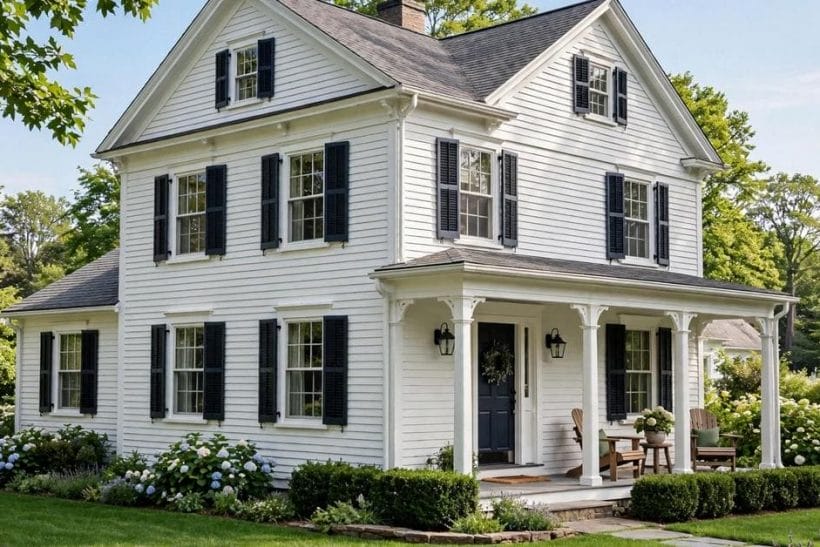
1. Clapboard Exteriors at a Glance
Scope first. This post owns one material: clapboard — horizontal lap siding — on house exteriors. The wider exterior reading lives elsewhere: mixed siding exterior ideas for clapboard combined with other sidings, exterior home ideas for the whole facade, white exterior home ideas for the colour at full stretch, black roof house ideas for roof-led pairings, Scandinavian exterior home ideas at its calmest, exterior trim materials for trim materials, and tiny house siding options for the small-scale view. Here, everything is the lap board.
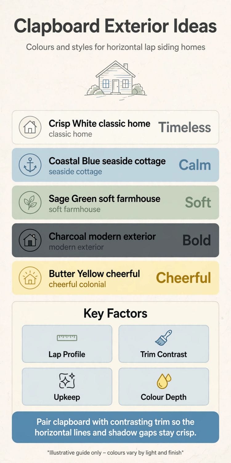
One rule governs the whole collection, and it is the infographic’s tip: pair clapboard with contrasting trim so the horizontal lines and shadow gaps stay crisp. Clapboard is a lined material — its whole beauty is rhythm — and every idea below serves that rhythm or deliberately breaks it.
| Colour family | Character | Trim that serves it |
|---|---|---|
| Crisp white | Timeless, classic | White on white, or a dark door and shutters |
| Coastal blue | Calm, seaside | Bright white trim |
| Sage green | Soft, farmhouse | Cream or white trim |
| Charcoal | Bold, modern | Black or natural timber accents |
| Butter yellow | Cheerful, colonial | White trim, dark shutters |
| Natural timber | Warm, weathered | Dark stained or black trim |
2. Crisp White and Classic Clapboard
1. The white colonial: clapboard’s home ground
The infographic’s “Timeless”: white clapboard on a symmetrical colonial, dark shutters, a columned porch at the centre. It is the arrangement the material was perfected for, and its discipline — everything lined, everything centred — is why it never dates.
2. White on white for a calm facade
White siding with white trim removes every contrast but the shadow lines, and the facade becomes a study in light: the laps’ rhythm visible at noon, the wall glowing at dusk. It suits simple forms best, where the architecture does the talking.
3. White clapboard with a black front door
One dark note concentrates a white facade: a black front door, black lanterns, the white clapboard reading crisper around them. Keep the shutters white or omit them, so the door owns the contrast alone — a single accent organises; three compete.
4. Farmhouse white with a wraparound porch
The farmhouse version relaxes the colonial’s symmetry: white clapboard, a deep porch across the front, informal planting against the walls. The lines run unbroken around the porch’s shade, and the house reads as cool and unhurried — clapboard’s country character at its best.
5. White clapboard and a dark roof
A dark grey or black roof over white clapboard gives the house its classic two-tone cap: the roof’s weight above, the lined walls below, the trim mediating. From the siding’s side, the point is simple — white clapboard flatters every dark roof material there is.
6. Cream and ivory: white’s warmer relations
A step off pure white into cream softens the facade for stone settings, older streets and northern light. Cream with white trim reads as white in sunshine and warmth in shade, and forgives the unevenness of age better than brilliant white.
7. White clapboard on a cottage
At cottage scale, white clapboard with a steep roof, small windows and a garden against the walls is the storybook arrangement. Narrow boards suit small walls, the white throws planting into relief, and a coloured door provides the single note of personality.
8. Keeping white clapboard bright
White shows the weather first: algae in damp shade, dust at the laps, rust at fixings. The upkeep is undramatic — a wash on a sensible cycle, prompt attention to stained laps, sound paint maintained before it fails — the rent on the crispest look here.
3. Coastal Blues and Seaside Cottages
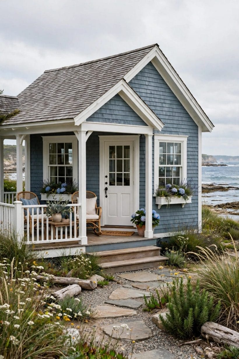
9. Classic coastal blue with white trim
The infographic’s “Calm”: a mid blue-grey clapboard, bright white trim at every corner and window, and the sea in the story whether or not it is in the view. Blue-grey flatters coastal light, hides salt haze, and makes white trim sparkle against it.
10. Weathered grey-blue, the shingle-country look
Along coasts where timber weathers bare, clapboard silvers to a grey that blues in certain lights — the colour of old boathouses and dune cottages. Achieved by weathering or an imitating stain, it asks this section’s least maintenance and suits houses that sit in weather.
11. Navy clapboard for a bold cottage
Deep navy on clapboard is the coastal colour with its sleeves rolled up: strong enough for a small house to hold its own in a landscape, set off by white trim and a pale door. It shows dust and salt sooner than mid blues, and repays the washing.
12. Pale aqua and sea-glass tones
At the pale end, aqua and sea-glass colours belong to beach cottages and warm coasts — colours like shallow water over sand. They need white trim to stay crisp and company to lean on: porches, shutters and planting, because pale colours alone can wash out.
13. Blue clapboard with natural timber accents
Swap the white trim for natural or stained timber — door, porch posts, a pergola — and coastal blue turns rustic: painted laps and warm wood, a combination belonging to lake houses as much as seaside ones. Keep the timber warm against the blue; the contrast is the scheme.
14. A blue upper storey over a white ground floor
Two-tone by storey — blue clapboard above, white below, divided at a trim board — lightens a tall house and gives each floor its character. It suits houses whose ground floor sits in shade while the upper walls take the sky.
15. Coastal colours inland
Nothing about a blue clapboard house requires a coast. Inland, the same colours read as freshness — a blue-grey house among green fields, white trim against summer planting — proof that “coastal” names a light quality, not a postcode.
16. Shutters and doors in the coastal palette
On a blue house, shutters in a deeper or paler tone of the siding’s own blue keep the scheme tonal, while a door in coral, yellow or weathered timber provides the single warm note. The discipline of section 2 applies at sea as on land: one accent owns the contrast.
4. Sage, Grey and Soft Farmhouse Tones
17. Sage green: the soft farmhouse colour
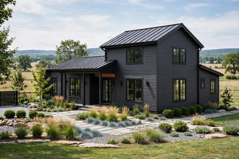
The infographic’s “Soft”: sage green clapboard with cream trim sits in a landscape like it grew there, which is why farmhouses and garden suburbs choose it. Sage mediates between house and planting in every season — near-green in summer, warm grey-green in winter — and flatters natural timber and stone.
18. Warm greys and greige clapboard
The warm grey family — grey with brown or green inside it — is clapboard’s most forgiving range: it hides dust, suits every roof colour, and reads modern or traditional by its company. On mixed streets, a warm grey house is the one everybody likes.
19. Weatherboard left to silver naturally
Unpainted clapboard in a durable timber weathers to silver-grey, the colour of old barns and coastal fences. It is the zero-paint option — not zero-care, since the timber still wants its inspections — and on rural houses its honesty is the aesthetic: the wall wears the fence’s finish.
20. Soft tones with white trim, kept quiet
Sage and grey clapboard with white trim is the combination to choose when the landscape is the loud element — a flower garden, autumn trees, a view. The house withdraws politely to a lined, light background. Restraint at the facade lets the garden be the colour scheme.
21. Dark green clapboard, the forest house
Deep green — nearly black in shade — melts a house into woodland: the laps’ lines visible only as texture, the windows lit like clearings. A brave colour that rewards its setting completely, pairing with natural timber, stone and bronze-toned metalwork rather than white trim’s sparkle.
22. Two soft tones: body and gable
Colour the gable a tone deeper or paler than the body — sage over grey-green, grey over paler grey — and a plain house gains composition without any architectural change. The change at the gable line follows the wall’s own geometry, which is why it looks designed rather than decorated.
23. Soft clapboard with brick company
A brick ground floor or chimney against soft-toned clapboard warms the whole scheme: brick’s reds answer sage and grey kindly, and the material change marks the house’s structure honestly. Section 8 treats combinations in full; here the note is colour — soft siding is brick’s best neighbour.
24. Dust, pollen and the practical soft colours
Practical owners choose mid soft tones for a reason beyond taste: they show the least of everything — dust, pollen, water marks, fading — between washes. On a house washed rarely and looked at daily, sage, warm grey and weathered tones keep their dignity longest.
5. Charcoal and Dark Modern Clapboard
25. Charcoal: the infographic’s “Bold”
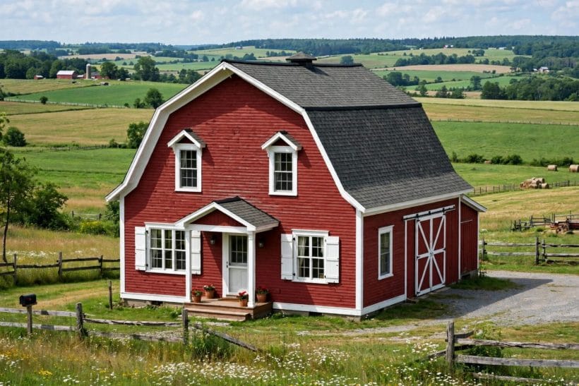
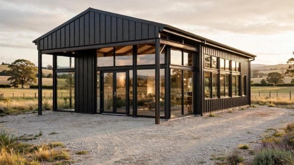
The infographic’s “Bold”: charcoal clapboard turns the oldest siding profile into a modern facade — the laps pure shadow-play, the trim lost in the same darkness, the windows lit rectangles. It suits simple, strong forms, and made a generation of traditionalists reconsider black houses.
26. Black on black: siding, trim and roof
The full monochrome — charcoal or black clapboard, black trim, dark roof — is a single-material statement relying entirely on texture: lap shadows by day, window light by night. It needs confident architecture and landscape softness against it; planting on a black house is half the design.
27. Charcoal with natural timber warmth
A natural timber door, porch ceiling or gable inset warms charcoal from stark to sophisticated — one warm material against the dark field. Keep the timber’s tone rich, since pale woods look lost against black, and let it appear in at most two places, so the warmth reads as intention.
28. Dark clapboard on modern forms
Contemporary houses use clapboard’s lines deliberately: dark laps on flat-roofed boxes and offset gables, horizontal rhythm against glass and metal. The traditional shadow lines keep modern forms from feeling clinical — a traditional texture doing contemporary work, at ease in both worlds.
29. Dark gables over a pale body
Invert idea 22: a charcoal gable over white or pale clapboard caps the house with weight and gives plain elevations a designed top line. The dark gable hides the roofline’s junctions and reads as part of the roof’s mass — a useful trick where the roof itself is undistinguished.
30. Heat, fading and dark colours honestly
Dark siding absorbs more sun and its coating works harder; deep colours also show fading and dust more readily than mid tones. None of this disqualifies charcoal — but choose quality coatings, expect a maintenance rhythm, and know the trade is deliberate.
31. Charcoal with white trim, the graphic look
White trim against charcoal clapboard is this collection’s boldest contrast: every corner board and window frame drawn in white on black. It suits crisp, symmetrical houses — a modernised colonial wears it beautifully — and leaves no room for untidiness, which is either its charm or its warning.
32. Dark clapboard in the landscape
A dark house recedes: into woodland shadow, against a hillside, behind planting. Where a new house should sit quietly in a valued landscape, charcoal and black clapboard disappear best — the lined texture keeping just enough presence that the house reads as crafted, not hidden.
6. Butter Yellow and Cheerful Colours
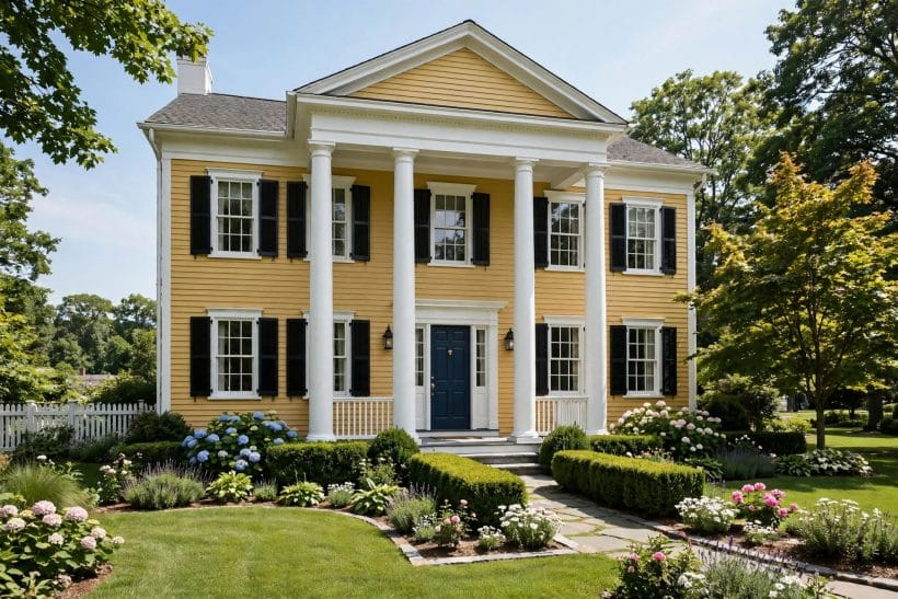
33. Butter yellow: the infographic’s “Cheerful”
The infographic’s “Cheerful”: butter yellow clapboard with white trim and dark shutters, a colour with sunlight inside it, friendly in every season and historically at home on clapboard for centuries. It flatters green lawns and grey days equally — more than can be said for most colours here.
34. Pale lemon and cream yellows
Step the yellow paler and it turns elegant: lemon-cream clapboard reads as warm off-white at distance and as colour up close. It suits houses wanting yellow’s friendliness with white’s restraint, pairing with white or deeper cream trim without the arguments louder colours start.
35. Mustard and ochre for depth
At the deep end, mustard and ochre clapboard carry an earthy, almost Mediterranean warmth — colours that hold their own against stone, terracotta and strong sun. They ask for quiet trim (cream, bronze, dark green) and confident planting, and reward bright, dry landscapes most.
36. Blush, clay and soft terracotta tones
The pink-clay family — blush, dusty rose, soft terracotta — gives clapboard a sun-baked softness suiting cottages, adobe-country houses and anywhere the light is warm. These tones sit happily with natural timber and cream trim, and fade gracefully in strong sun rather than chalking.
37. A coloured door on a cheerful house
On a yellow house, the door is the scheme’s exclamation: deep green, navy, black or barn red each write a different sentence — green the classic colonial answer, navy the coastal, black the formal. Choose once and repeat the colour nowhere else; the door is the single loudest note.
38. Cheerful colours on small houses
Colour does for a small clapboard house what a bright chair does for a small room: gives it presence beyond its size. A butter yellow or coral cottage holds its own on a street of larger, paler houses, and the fine lines keep the colour tailored rather than garish.
39. Historic colour palettes
Many regions keep documented historic palettes for clapboard houses — the ochres, creams and soft greens of particular eras and towns. Working within one is the easiest route to a cheerful colour that also looks inevitable, and local historical societies publish them for exactly these houses.
40. Testing colour on the inconspicuous wall
Every colour in this section should be tested the slow way: a board or patch on the house’s least-seen elevation, lived with through sun and cloud. Clapboard’s shadow lines deepen every colour by a shade — what the sample card promises, the lined wall delivers one tone richer.
7. Two-Tone Schemes and Trim Contrast
41. The trim-contrast principle
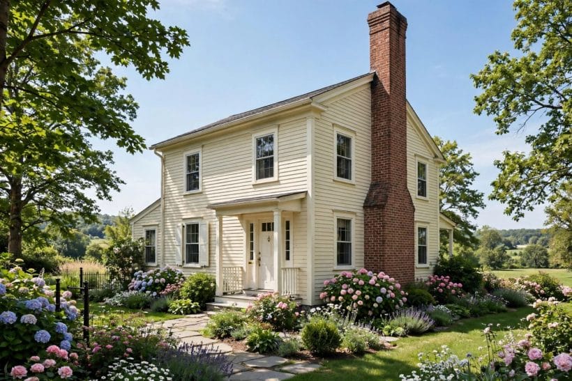
The infographic’s tip, as a section: clapboard’s lines stay crisp when the trim — corner boards, window and door surrounds, water table — contrasts with the field. The contrast can be tonal or textural, but a facade where trim and siding blur loses the architecture the boards worked to draw.
42. Corner boards as drawn lines
Corner boards — the vertical trim where walls meet — are clapboard’s punctuation: painted in the trim colour, they frame every elevation like a picture. On colour-sided houses they are formality at its cheapest; on white houses, a contrasting corner board is the boldest line you can add.
43. Two tones divided at a trim board
A horizontal trim board at a floor line divides two siding tones cleanly — colour below, paler above, or the reverse — giving the change an architectural reason. Two-tone schemes done this way look built rather than painted on.
44. Gable in a second material
Colour’s partner in two-tone work is texture: shingles, vertical boards or stucco in the gable over clapboard below. The gable is the natural place for the change — a different plane with its own decorative history — and section 8 takes the combinations up in full.
45. Shutters as the third colour
Body, trim and shutters: the classic three-colour scheme gives shutters the accent role, deeper or brighter than both. The discipline is hierarchy — one dominant (siding), one supporting (trim), one accent (shutters and door together) — and schemes respecting it look composed in any palette here.
46. Matching the trim to the roof
Where the siding colour is quiet, let the trim answer the roof instead: charcoal trim under a charcoal roof over sage siding, bronze trim with a metal roof. The facade then reads as two decisions — walls, and everything above and around them — suiting simple and modern houses alike.
47. Painting the porch to match
A porch in the trim colour, or in the siding colour with trim-coloured posts, stitches the porch into the facade’s scheme rather than leaving it an attached afterthought. The porch ceiling’s traditional pale blue or cream is the one sanctioned exception — a colour with its own folklore.
48. When to break the contrast rule
Monochrome facades — idea 2’s white on white, idea 26’s black on black — break the contrast rule on purpose and succeed by texture alone: the exception that proves the principle. Remove tonal contrast and the lap shadows, trim profiles and window depth must do all the drawing.
8. Clapboard With Brick, Stone and Shingles
49. Clapboard over a brick ground floor
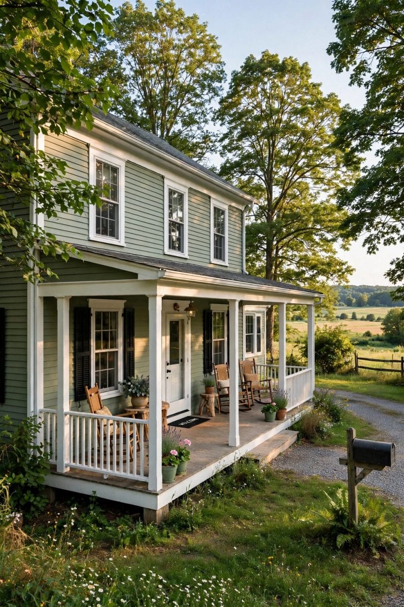
Brick below, clapboard above: the masonry grounds the house, the lined timber lightens its top, and the floor line gives the change its logic. It suits houses on slopes and streets of mixed masonry, and both materials maintain on their own cycles.
50. A stone base and water table
A stone foundation wall, expressed above ground and capped with a water table trim, gives clapboard a plinth to stand on: weight below, lightness above, and the siding’s vulnerable bottom edge clear of splashing rain. It is the oldest detail in this section and still the most useful.
51. Shingle gables over clapboard
Cedar shingles in the gable over clapboard walls is the shingle-style classic: two timber textures, one weathered family. The shingles can match the siding’s colour or weather their own way; either reads as craft. Keep the transition at a trim board and let any gable flare cast its shadow.
52. Board-and-batten accents
Vertical board-and-batten on a gable, dormer or single-storey wing contrasts its vertical rhythm against clapboard’s horizontal one — the mixed-siding conversation at its most graphic. Use it in one place only: the accent works because the clapboard field stays calm around it.
53. Brick chimneys and soft siding
Even a fully clapboard house usually keeps one masonry note: the brick or stone chimney rising through the roof. Its colour belongs in the palette conversation — soft siding answers brick kindly, as idea 23 noted — and a well-pointed chimney against lined siding portrays both crafts.
54. Stucco and clapboard
Smooth stucco against lined clapboard is texture contrast at maximum: one wall blank and calm, the next all rhythm. The pairing suits Mediterranean- and Tudor-inflected houses and modern ones alike, provided the junction is trimmed rather than left as a butt joint for the weather to argue with.
55. Metal roofing over clapboard
A standing-seam metal roof over clapboard pairs two lined materials — vertical seams above, horizontal laps below — suiting farmhouses and modern rural houses equally. The roof’s colour joins section 7’s trim conversation; bronze, charcoal and deep green are its classic answers.
56. Keeping combinations to two
The discipline of all combination work: two materials, occasionally a third as a small accent, never a fourth. Clapboard plus brick, shingle or stone each compose a whole house. A facade sampling every material in the yard composes nothing, however fine each sample is.
9. Profiles, Materials and Finishes
57. What clapboard is: the lap explained
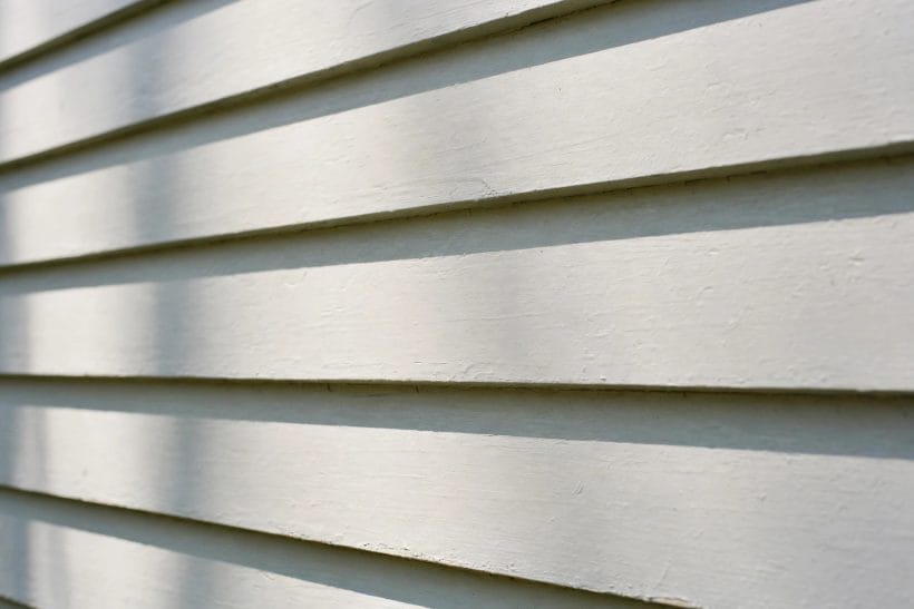
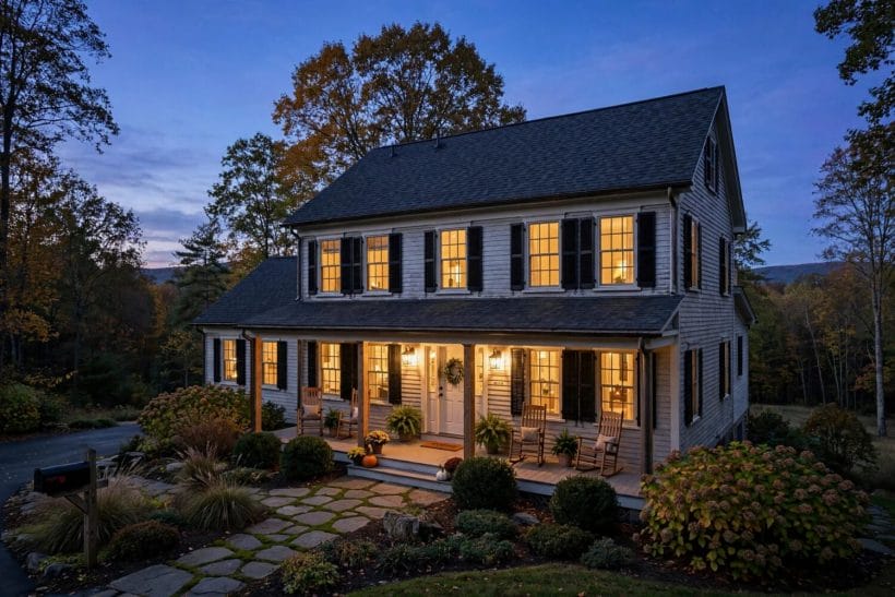
Clapboard — also called weatherboard or bevel siding — is a series of horizontal boards, each thicker at its lower edge, laid so every board overlaps the one beneath and sheds water down the wall. The visible strip of each board, its exposure, sets the wall’s rhythm.
58. Narrow exposures for fine, traditional lines
A narrow exposure — less of each board showing — draws the wall with many fine lines, the traditional finish for colonial and cottage walls and houses near the viewer’s eye. It uses more boards and labour to cover the same wall, and the refinement shows from the street.
59. Wide exposures for bold, modern rhythm
Wide exposures halve the line count and double their strength: the wall reads as bold horizontal banding, suiting larger walls, modern forms and houses seen from distance. The infographic’s “Lap Profile” factor is this choice — the facade’s whole graphic system, chosen once and seen forever.
60. Timber clapboard: cedar and pine traditions
Timber is the original material: cedar for natural durability and fine weathering, pine and other softwoods painted in the traditional manner. Timber boards repair singly, age honestly, and ask for their finish to be maintained — the wooden porch’s bargain, struck at the scale of the whole house.
61. Fibre-cement clapboard
Fibre-cement boards reproduce clapboard’s profile in a manufactured material resisting rot and insects and holding paint for long cycles. They are heavier to install and need their own fixings and cutting care, and in return give the lined look with a quieter maintenance diary.
62. Engineered wood and composite boards
Engineered boards — treated wood fibres formed into lap profiles — sit between timber and fibre cement in character: lighter, uniform, pre-primed or pre-finished, with makers’ warranties. The general advice for all of them: follow the maker’s fixing and finishing instructions exactly, because warranty and weathering live there.
63. Smooth versus wood-grained finishes
Manufactured clapboard offers smooth faces and embossed wood-grain faces. Smooth reads modern and makes shadow lines do all the textural work; grain reads traditional and forgives dust and minor marks better. Neither substitutes for idea 59’s profile choice — grain is a whisper where lap rhythm is the voice.
64. Pre-finished colour and its advantages
Factory-finished boards arrive with colour cured evenly on every face, edges included, in conditions no site can match. The advantages are consistency and a head start on the maintenance cycle; the cost is a fixed palette. For strong colours, factory finishes have made dark clapboard a calmer proposition.
65. Corners, butt joints and the details that show
Clapboard’s quality shows at its junctions: corner boards or mitred corners, butt joints staggered and sealed, laps kept level so lines meet at the corners. Check these installers’ details at quotation stage — they separate a crisp facade from a wavy one.
10. Costs and Practical Checks
66. Cost drivers, stated generally
Clapboard’s cost is driven by the material, the wall area and storeys, the exposure (narrow exposures cover slower), preparation of what lies beneath, the finish system, and scaffolding access. The honest comparison between materials is over the whole ownership, not the invoice.
67. Repainting cycles and the lined wall
Painted clapboard renews on a cycle set by climate, exposure and preparation quality — south and west walls weathering fastest. A sound finish maintained on schedule is always cheaper than a failed one stripped back. Ask local painters the cycle on your street.
68. Washing and algae care
Most of clapboard’s routine care is washing: a gentle clean on shaded elevations where algae films form, kept ahead of staining. Aggressive pressure washing damages boards and drives water behind laps — the general rule is soft methods, and prompt attention to the green film rather than an annual battle.
69. Repairing single boards
Like the porch’s boards, clapboard repairs by the unit: a damaged or rotted board can be cut out and replaced, its finish matched into the wall. Keep spare boards from an installation, labelled with the paint or stain used, and inevitable repairs stay small for the house’s whole life.
70. Moisture checks at the laps
The laps shed water by design, but the system’s weak points are its interruptions: window and door junctions, horizontal trim, the bottom board near the ground. An annual walk looking for peeling finish, soft board ends and blocked drainage there catches moisture while it is still maintenance, not repair.
71. Insects, birds and other tenants
Timber siding can attract wood-boring insects and the birds that hunt them; manufactured boards largely remove the menu. The general defences are sound finish, sealed joints and prompt repair of any hole before it becomes a home. Where a region has known pests, local professional advice outranks general guidance.
72. Fire and local rules
Some districts — wildfire-prone areas especially — regulate siding materials, and insurers have their own views. Check both before choosing a material, not after: the rules may steer the choice between timber and manufactured boards, and they outrank every aesthetic idea in this collection.
73. Professional installation and guarantees
Clapboard looks simple and installs exactingly — level laps around a whole house, correct fixings and overlaps, flashing at every interruption. It is professional work for most owners, and written guarantees on materials and labour, with makers’ instructions followed, protect the investment. Get idea 65’s junction details answered in writing.
74. Choosing your palette from the street
Make the final colour decision from the street, not the doorstep: the facade is read at distance, in the street’s company. Photograph the test wall morning and evening, beside the neighbours. The right scheme looks inevitable from across the road.
75. The lined wall that lasts
The last idea restates the first: clapboard is a rhythm before it is a colour. Choose the profile for the house’s scale, the colour for its light, the trim to keep the lines crisp, and maintain the finish on schedule.
Final Considerations
A clapboard facade succeeds on three decisions: a lap profile in scale with the house, a colour chosen for its light and landscape, and trim that keeps the lines crisp. Everything here serves one of the three.
Choose in that order and the material does the rest. Clapboard has been the classic house wall for centuries because it is legible: fine lines, honest laps, and a surface that takes every colour — and gives most back, in evening light, better than they looked on the card.

0 Comments