
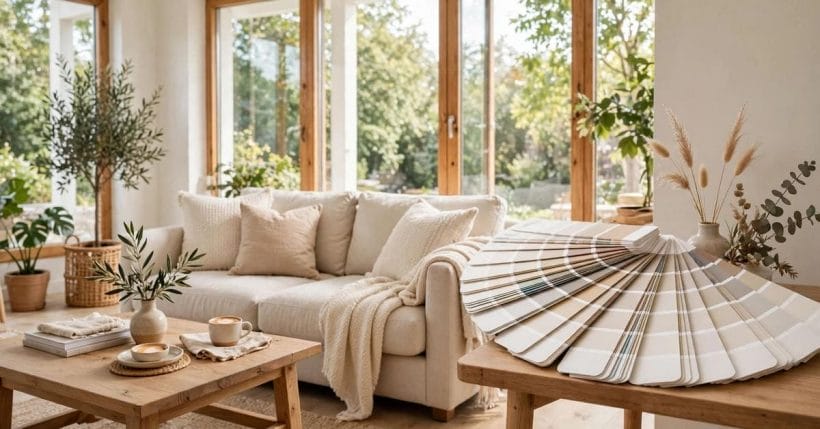
Two whites, one paint chart, and a difference that is invisible in the shop and obvious on your wall. Pure White and Extra White are both clean, modern whites from the same maker — yet one reads soft and warm in a room, and the other reads crisp and cool, and choosing wrong is a mistake you see every day.
This guide compares the two colours only — undertone, light and use, in general terms — so you can pick the right white first time: sw pure white vs extra white, settled by how each behaves in real rooms.
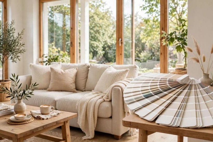
1. Pure White and Extra White at a Glance
Scope first. This post compares exactly two named whites — Pure White and Extra White, both Sherwin-Williams colours — as colours: their undertones, how each answers daylight, and where each belongs. It quotes no laboratory figures and makes no claims about the paints as products. The neighbouring reading lives elsewhere on the site: taupe and charcoal for the neutrals whites must live with, greige undertones and enduring paint colours for the wider neutral family, interior brick: paint it or leave it for the decision that often starts the white question, tiny house interior paint colours for small-space schemes, and white exterior home ideas for white at facade scale.
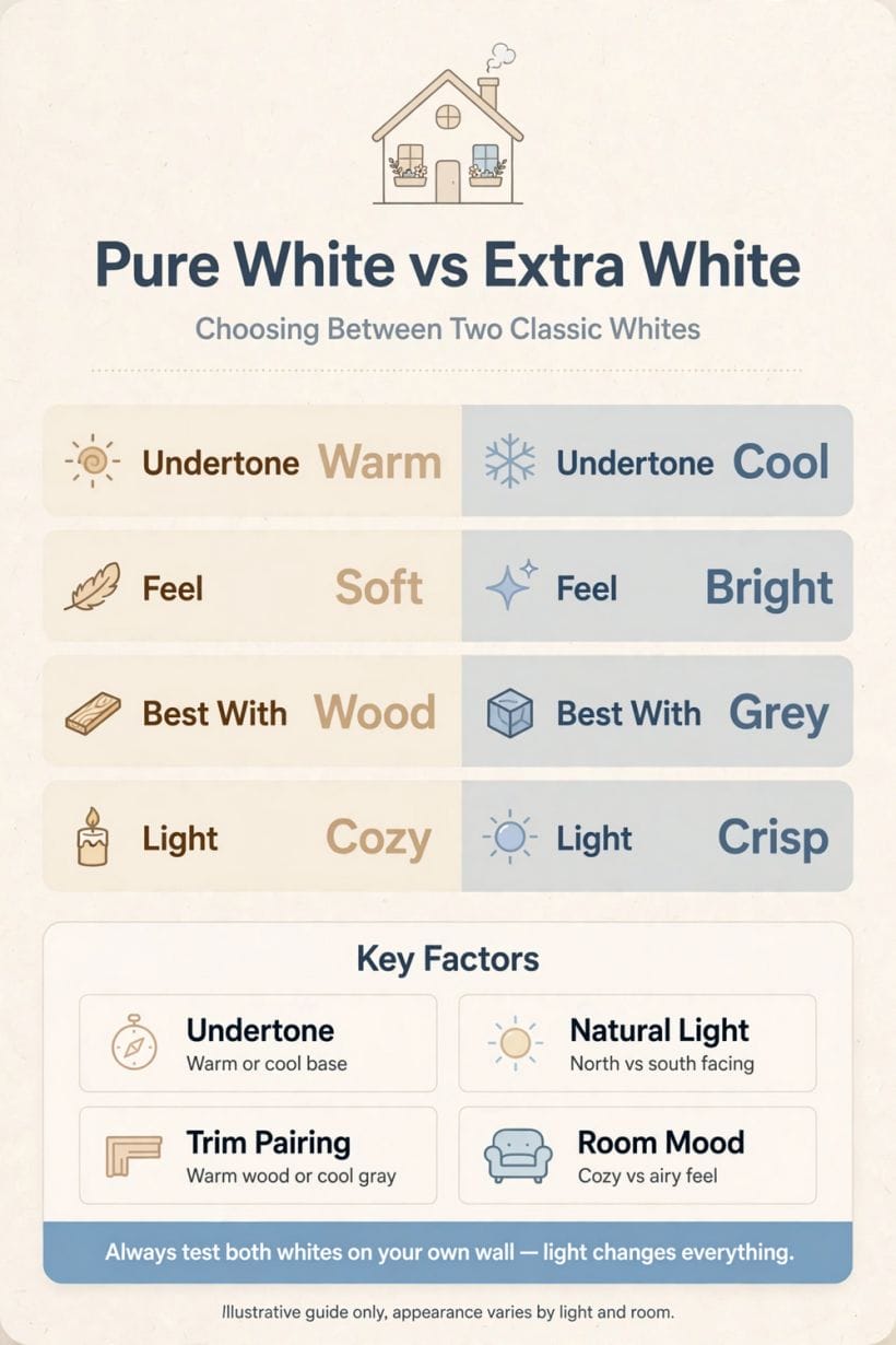
One rule governs the whole comparison: whites are not interchangeable. A white is a colour with an undertone, a mood and a response to light, and these two sit on opposite sides of the warm-cool line that divides the whole family.
| Attribute | Pure White | Extra White |
|---|---|---|
| Undertone | Softly warm, a whisper of warmth | Cleaner and cooler |
| Feel in a room | Gentle, mellow, forgiving | Bright, crisp, gallery-like |
| North-facing light | Stays kind, resists greying | Can turn cold or faintly blue |
| South-facing light | Warms further, can read creamy | Settles closer to a true white |
| Best known for | Walls and easy whole-room schemes | Trim, ceilings and sharp contrast |
2. What a White Paint Actually Is
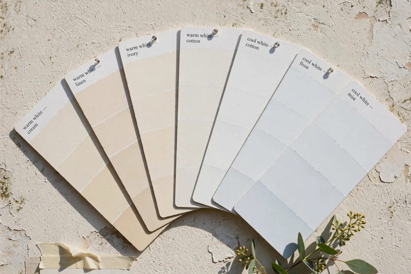
1. Every white carries an undertone
No architectural white is pigment-free neutrality. Each is tinted a breath towards yellow, pink, grey or blue, and that breath of colour — the undertone — is what a room amplifies. Pure White’s breath is warm; Extra White’s is cool. Everything else in this guide follows from that single fact.
2. Brightness is not the same as whiteness
A white can be dazzling and still read blue, or gentle and read warm. Judging whites by how “bright” the swatch looks in the shop confuses the two qualities. Judge them instead, side by side, in the room and the light where they will live.
3. The swatch lies by being small
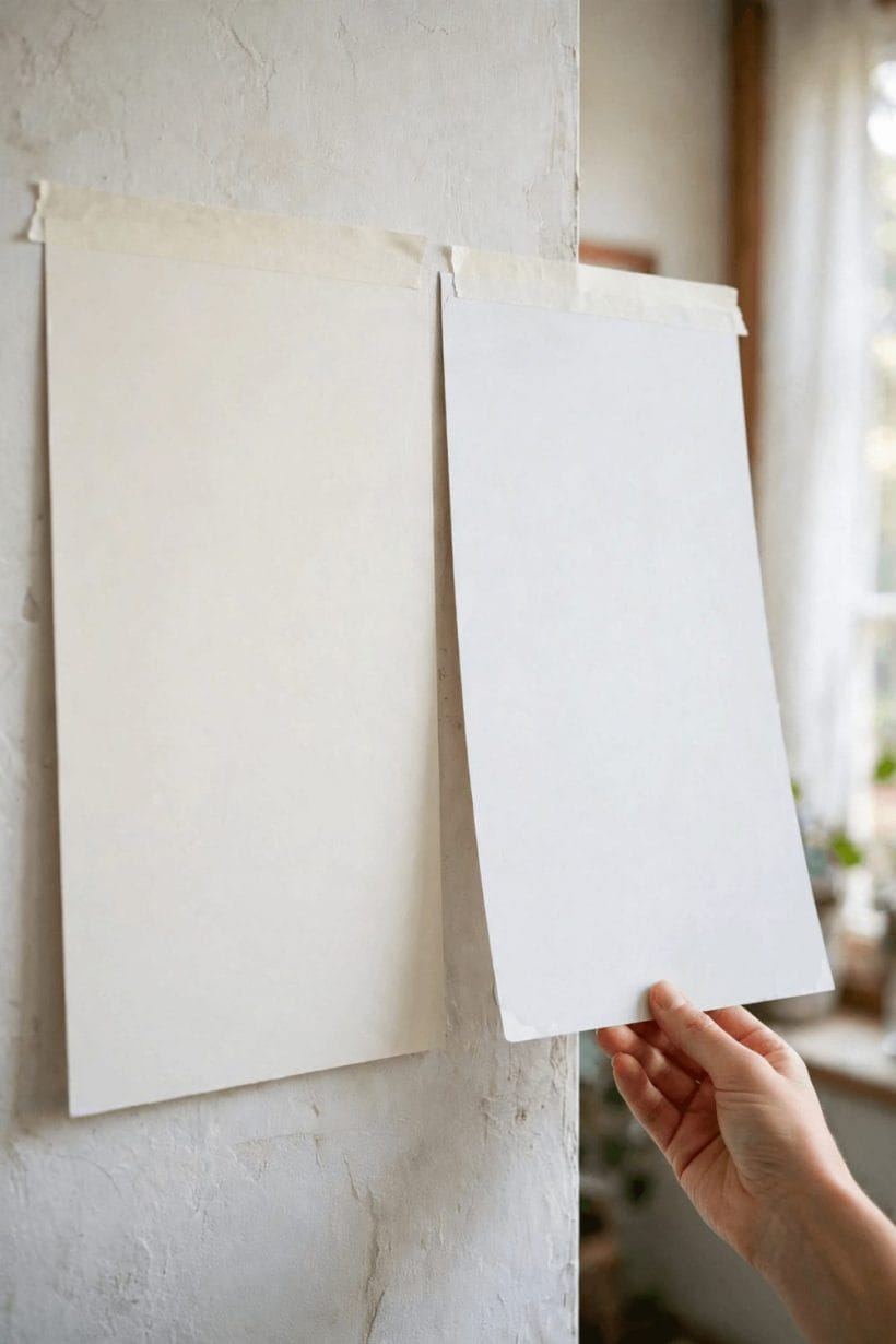
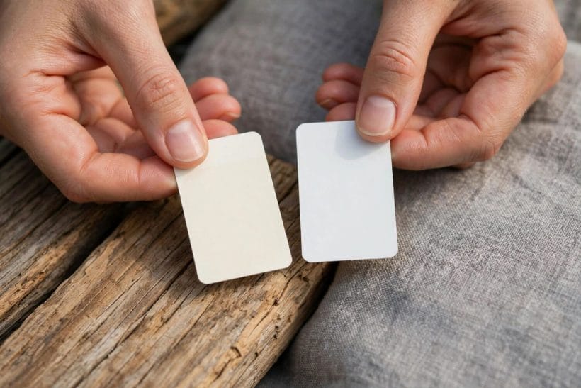
On a small card, the two whites look identical. On four walls they diverge, because a colour’s effect multiplies with area and with the light bouncing between surfaces. This is why the testing section below insists on big painted boards, never cards, before a decision.
3. Pure White: The Softer White
4. A warm-neutral character
Pure White sits close to the middle of the white family with a gentle warm lean — enough warmth to feel welcoming, not enough to read as cream. It is the white for people who find stark whites clinical and off-whites apologetic.
5. Where Pure White flatters
It is at its best on walls in living rooms and bedrooms, in north-facing rooms short on sun, and beside warm materials — oak floors, linen, leather, brass — whose tones it echoes. In those settings it disappears politely and lets the room be the picture.
6. Where Pure White can disappoint
Beside a very cool, blue-toned white elsewhere — a brilliant white appliance suite, a cold marble — Pure White can suddenly read creamier than intended. And in intense southern sun its warmth builds; a room that glows pleasantly at noon may feel yellow by evening.
4. Extra White: The Crisper White
7. A clean, cool character
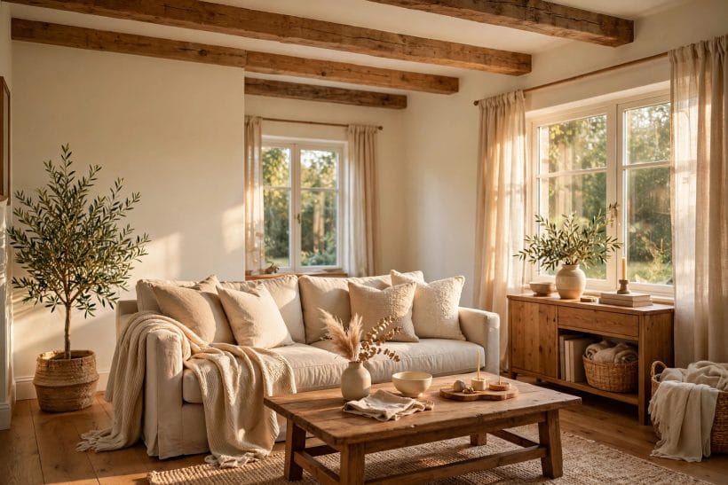
Extra White is the brighter, cooler of the two — one of the cleanest whites in its range, with a faint cool lean that the eye reads as freshness. It is the white of galleries, modern kitchens and anywhere a scheme wants edges.
8. Where Extra White flatters
It excels on trim, ceilings and cabinetry, where its crispness draws the architecture’s lines, and in sun-filled rooms whose warmth it balances. Against mid-tone and dark walls it gives the sharpest, most deliberate contrast of the two.
9. Where Extra White can disappoint
In a dim, north-facing room its cool lean can turn chilly or show a faint blue cast, and it is unforgiving of dingy neighbours — tired grout, yellowed varnish and grey-beige carpets all look worse beside it. It demands a room as clean as itself.
There is also a maintenance honesty to record: the brighter and cooler a white, the more plainly it shows scuffs, fingerprints and the grey film that busy hallways deposit. That is not a defect of the colour, only a property of it — but a household with toddlers and dogs may find the softer white’s forgiveness worth more than the crisper white’s edge.
5. North Light, South Light
10. North-facing rooms run cool
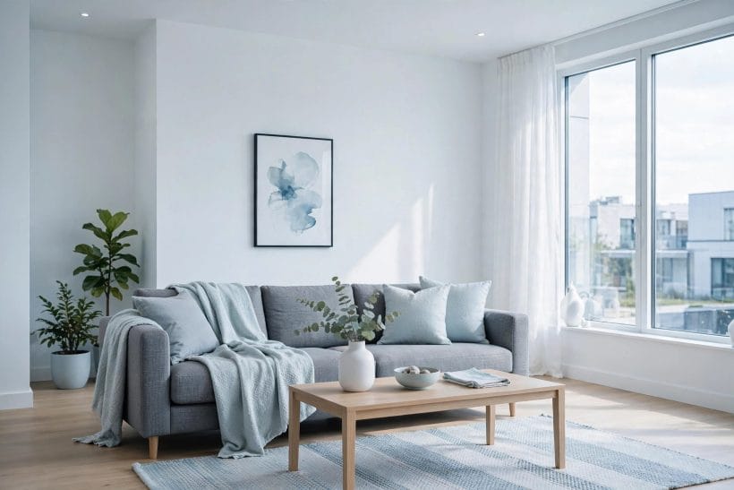
Light from the north is indirect and bluish all day, and it cools every colour it touches. Warm-leaning Pure White absorbs that coolness gracefully, which is why it is the safer of the two for north rooms; Extra White risks tipping from crisp to cold.
11. South-facing rooms run warm
Direct southern sun warms a room’s palette for hours. There the balance reverses: Pure White can drift towards cream by afternoon, while Extra White’s cool lean is exactly cancelled and it reads as a clean, true white.
12. East, west and the moving verdict
East rooms get cool morning light that warms; west rooms get the reverse, ending in a golden flood. A white in such a room is two colours a day. Test boards must be read at both ends of the day before either white is chosen — the evening verdict is the one you will live with most.
Artificial light has its own say in the evening. Warm bulbs push both whites towards the amber, and can make the two look closer than they do at noon; cooler bulbs exaggerate the gap between them. If a room is used mostly after dark — a dining room, a snug — the lamplight reading is not a footnote but the main text, and the boards should be judged there first.
6. Trim, Ceilings and Cabinets
13. Trim wants the crisper white
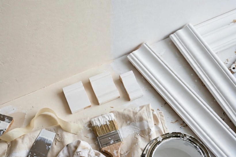
Architraves, skirting and doors read as the room’s drawing, and they reward definition. Extra White is the natural trim choice of the pair, especially against a softer wall colour; against Pure White walls it gives a gentle, tonal contrast rather than a shout.
14. Ceilings and the fifth wall
A ceiling reflects its colour down into the room, so the choice matters more than its distance suggests. Extra White keeps a ceiling feeling high and clean; Pure White lowers it slightly into warmth — sometimes exactly what a tall, echoing room needs.
15. Kitchen cabinets in the two whites
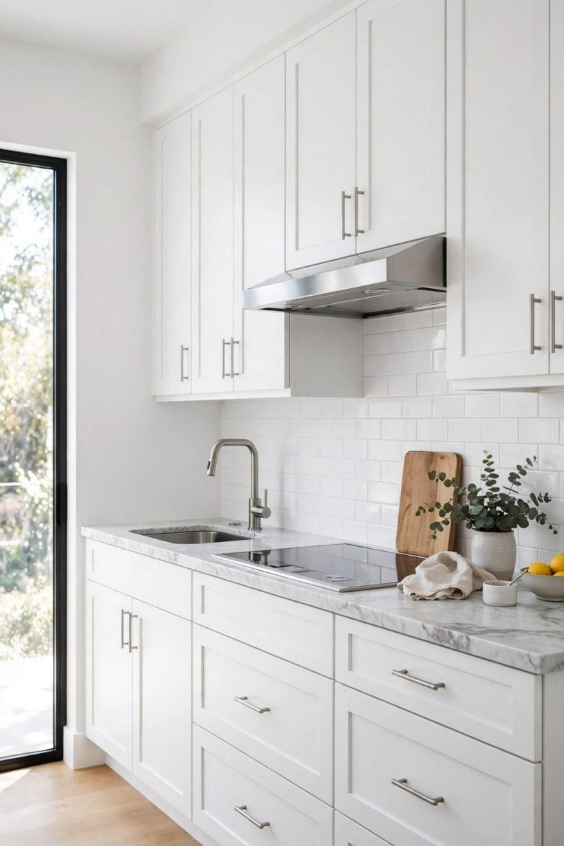
On cabinetry, Extra White reads modern and pairs with cool stones and steel; Pure White reads softer and pairs with timber counters and warm metals. Match the cabinet white to the room’s materials, not to the wall — the cabinets sit between the two.
Sheen deserves a word here, because it changes the comparison without changing the colour. The same white in a flat wall finish and a satin trim finish will read as two slightly different whites, the satin catching more light and looking cleaner. Many successful two-whites schemes are actually one white in two sheens — but between these two colours, the undertone difference is real, and sheen only sharpens or softens it.
7. Walls and Whole-Room Schemes
16. One white everywhere, the calm scheme
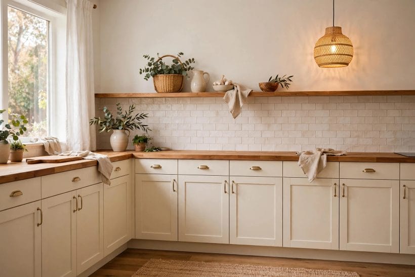
Using a single white on walls, trim and ceiling — the colour-drenched approach — removes every contrast decision and makes a room feel larger and quieter. Pure White is the usual choice for it, since an all-over cool white can feel institutional at whole-room scale.
17. The two-whites scheme, done deliberately
Pure White walls with Extra White trim is a legitimate, layered scheme: soft field, crisp lines. The reverse — Extra White walls with Pure White trim — rarely works, because the warmer trim can look merely dirty against the cooler wall. Direction matters.
18. White walls as a backdrop
Where walls exist to serve art, textiles and furniture, the softer white usually serves better: Pure White steps back, while Extra White’s brightness can compete with the collection it was meant to frame. Choose the backdrop by what it must carry.
8. Pairing with Floors, Wood and Colour
19. Warm floors ask for Pure White
Honey oak, warm walnut and terracotta all lean warm, and a warm white meets them halfway. Put Extra White over a warm floor and the floor can suddenly look orange by contrast — the commonest white-paint complaint there is.
20. Grey and cool schemes ask for Extra White
Concrete greys, blue-greys, chrome and cool stone form the opposite family, and there it is Pure White that risks looking off — faintly yellowed beside its cooler neighbours. Undertone loyalty, in either direction, is the whole rule.
21. White as the partner of strong colour
Beside a saturated wall colour, the white becomes part of the colour’s effect: a cool white sharpens blues and greens, a warm white softens reds and plums. Sample the white against the actual colour, never alone — whites are judged by their company.
9. Testing Before You Commit
22. Paint big boards, two coats
Brush each white onto a large board — a metre square is not too big — with the full number of coats you will use. Small strokes and single coats both mislead, because whites build their character with coverage and scale.
23. Move the boards, chase the light
Carry each board to every wall, beside the window and away from it, next to the floor and the largest furniture. Read them morning, noon and under evening lamps. A white that survives all three readings in all four positions has earned the room.
24. Live with the finalists for days
Whites are the colours people most often repaint within a year, almost always for a decision made in an afternoon. Leave the boards up through a bright day and a grey one; the right white is the one you stop noticing.
10. Choosing Between Them
The honest summary is short. Pure White is the warmer, softer, more forgiving colour — the wall white, the north-room white, the whole-scheme white. Extra White is the cooler, brighter, sharper colour — the trim white, the sun-room white, the contrast white. Neither is “better”; each is the answer to a different room.
25. Choose Pure White if…
Your rooms face north or east, your floors and furniture run warm, you want one white to do everything, or your taste runs to calm rather than crisp. It is the lower-risk choice in the majority of ordinary houses, which is why it is so often the recommended one.
26. Choose Extra White if…
Your rooms are sun-filled, your scheme runs cool and modern, you need trim and ceilings to read as drawn lines, or a softer white has already disappointed you by reading cream. In the right light it is the cleaner, more architectural colour of the two.
A practical footnote: whichever white you choose, it will be the background against which every future colour decision in the room is judged — sofas, curtains, art, even houseplants. Choosing the white is therefore not the last decision of a scheme but the first, and the one that quietly constrains all the others. That is the real reason this apparently tiny choice deserves its few days of testing boards and second looks.
27. The verdict you can trust
Ignore the chart, the screen and anyone else’s hallway: the undertone rule plus your own test boards settle this comparison completely. Warm room, warm white; cool room, cool white — and where the room is mixed, let Pure White’s forgiveness arbitrate. It is a small decision that you will see on every wall, every day, so it deserves its few days of testing.
One last reassurance for the undecided: the difference between these two whites, while real, is a difference of mood rather than of kind. Nobody walks into a room and names the undertone; they feel that the room is calm or fresh, mellow or bright. Choose the feeling, test it honestly in your own light, and either of these two classic whites will serve the room for years.
Final Considerations
Pure White and Extra White are separated by a breath of undertone, and that breath is the difference between a room that feels mellow and one that feels sharp. Both are fine colours; the failure mode is never the paint, only the match between the white and the light, floors and furnishings it must live with.
Test both, in boards, in your own rooms, at both ends of the day. The one that disappears into the room’s life is your white — and you will not need to think about it again for years.

0 Comments