
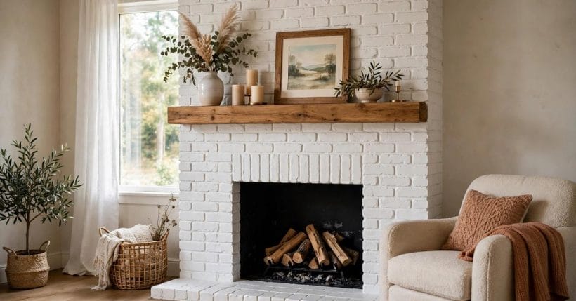
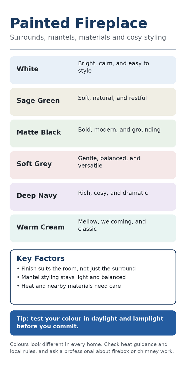
A painted fireplace can change the whole feeling of a room without changing its shape. A coat of paint softens rough brick, calms busy stone, and lets a plain surround sit quietly beside sofas, shelves, and art. The mantel becomes the calm centre of the room, a place for a vase, a picture, and a candle or two, while the colour underneath ties the wall to the rest of the furniture.
The appeal lies in restraint. A painted surround works best when the colour feels chosen rather than loud, when the finish sits evenly across brick or timber, and when the styling on the mantel leaves room for the eye to rest. From soft white to deep navy, the examples below show how painted surrounds and mantels can suit bright rooms, dark corners, small homes, and generous family spaces alike.
1. White Surrounds That Brighten a Room
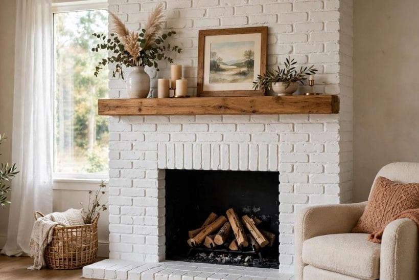
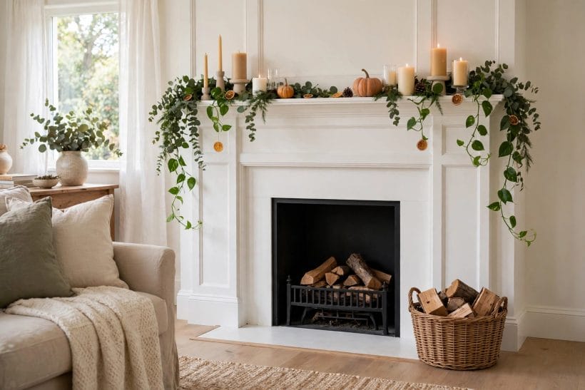
White is the most forgiving choice for a painted surround. It lifts a dark corner, makes a small room feel open, and gives brick texture a fresh, clean presence without hiding its character. Mortar lines and brick edges still show through softly, so the surround keeps its handmade feel while reading as light and calm. White also pairs easily with timber mantels, pale sofas, woven baskets, and plants, which is why it suits so many homes.
Styling a white surround is about warmth rather than clutter. A wooden mantel adds natural tone against the pale brick, while a framed picture, a tall vase, and a small group of candles give the shelf life without crowding it. Keep the arrangement low near the centre and taller at the edges, so the mantel feels balanced from the sofa and from the doorway. A soft throw and a chair nearby complete the scene, turning the surround into a welcoming corner rather than a formal display.
White works in both bright rooms and rooms with little daylight. In a sunny room it reflects light and keeps the wall feeling airy. In a darker room it stops the surround from looming over the furniture. Either way, the result feels calm, and the surround can stay the same while cushions, art, and seasonal touches change around it through the year.
2. Sage Green for a Soft Natural Look
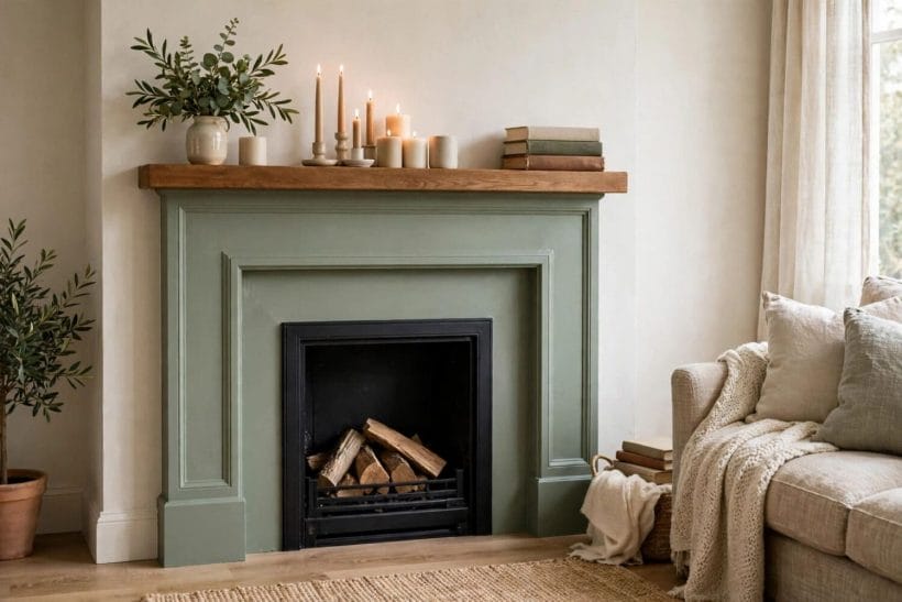
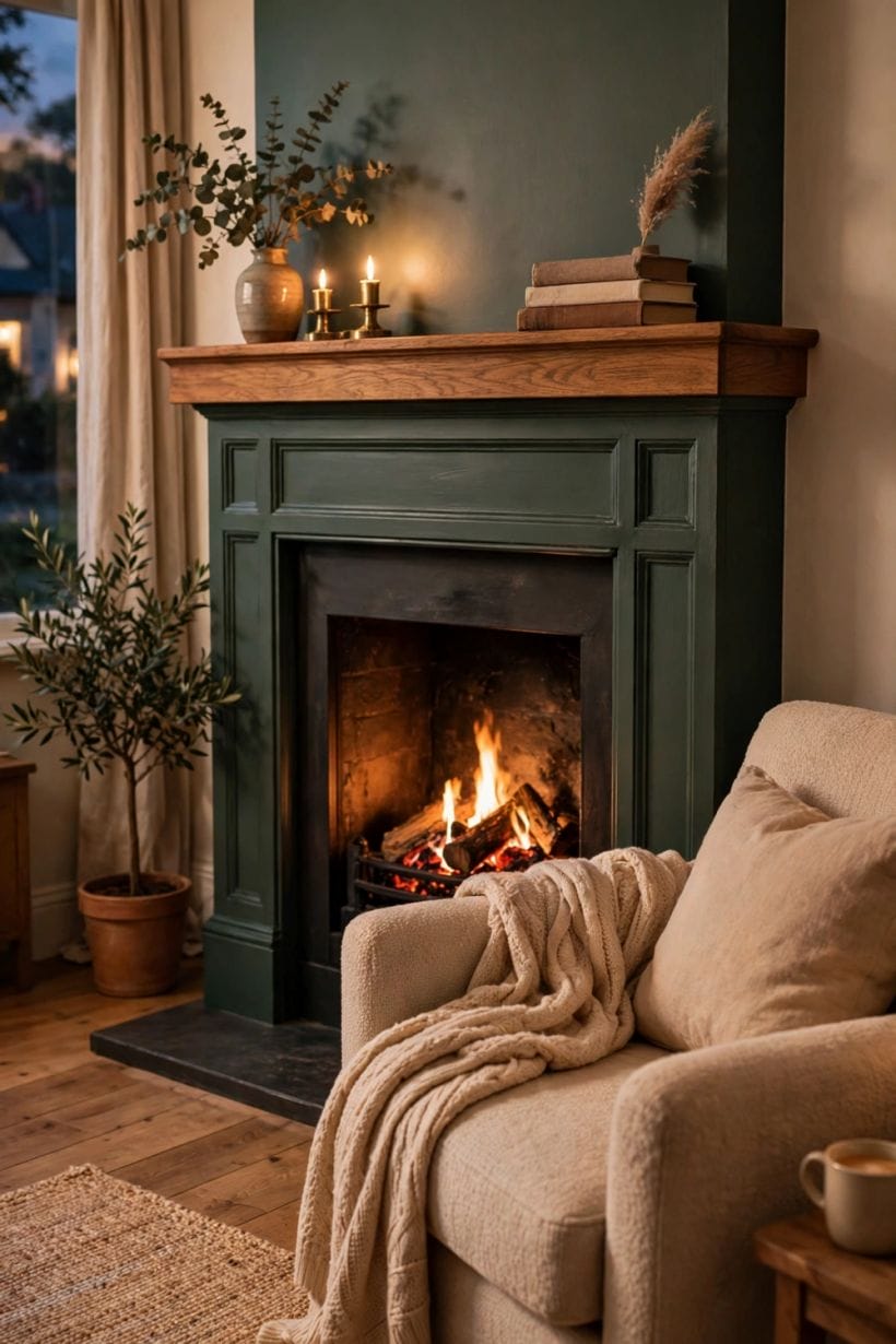
Sage green brings the outdoors in without shouting about it. The muted tone sits gently against timber floors, cream walls, and linen fabrics, and it suits rooms where plants, wood, and natural textures already set the mood. A sage surround feels restful rather than decorative, which makes it a good choice for reading corners and family rooms that are used every day.
On a sage mantel, keep styling simple and organic. A small vase of greenery, a stack of books, and a candle or two echo the colour without competing with it. Avoid bright or glossy objects that would fight the soft finish. Instead, let ceramics, wood, and dried stems carry the detail. The overall effect should feel gathered slowly, as though each piece earned its place over time.
Sage also works well beside built-in shelves and pale cabinetry. When the surround and the nearby joinery share a similar muted tone, the whole wall reads as one thoughtful composition. For more ideas on shelves that sit beside a fire, see these painted built-ins beside a surround and notice how a shared colour keeps the wall calm.
3. Matte Black for a Bold Modern Feel
Matte black turns a surround into a strong anchor. Where white recedes, black steps forward, giving a room a clear focal point and a modern edge. It suits rooms with pale walls, light floors, and simple furniture, because the dark surround provides contrast without needing bold patterns elsewhere. The matte finish matters here: it absorbs light softly and keeps the surround feeling calm rather than shiny or harsh.
Styling a black mantel calls for a light touch. A pale ceramic vase, a framed print with a light mount, and a single candle group can stand out beautifully against the dark ground. Leave generous space between objects so each one reads clearly. Too many small pieces will blur together against black, while a few well-chosen pieces will look deliberate and refined.
Black surrounds also pair well with warm timber and soft textiles. A wooden mantel shelf breaks the darkness with natural grain, while a wool throw and a leather chair soften the modern edge. The combination feels grown-up and cosy at once, a balance that suits both quiet evenings and lively gatherings.
4. Soft Grey and Stone Textures
Soft grey is a gentle middle ground between white and black. It suits stone surrounds especially well, because grey lets the texture of the stone show while giving the whole piece a unified, restful tone. A grey surround feels neither cold nor busy, and it sits happily beside timber, linen, and muted blues or greens. In rooms where the furniture already carries colour, grey keeps the surround supportive rather than competitive.
Above a grey mantel, a round mirror is a classic companion. It reflects light, opens the wall, and echoes the soft curves of stone. Below it, keep the mantel styling low and simple: a pair of candlesticks, a small plant, and a framed photograph are plenty. The mirror does the visual work, so the shelf itself can stay quiet.
Grey also ages gracefully. Marks and dust show less readily than on bright white, and the colour adapts as cushions and art change. For rooms that evolve slowly, with pieces added over years rather than in one sweep, a soft grey surround is a steady, dependable choice that rarely feels dated.
5. Deep Navy and Rich Dark Colours
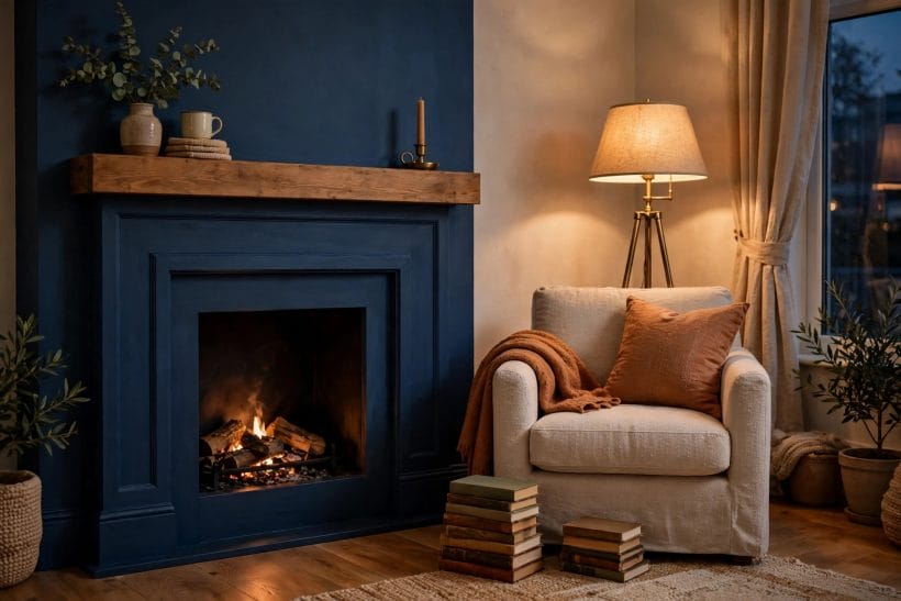
Deep navy gives a painted surround a sense of depth and drama. It suits reading corners, studies, and cosy living rooms where a darker mood feels inviting rather than heavy. Against navy, brass details glow, timber looks richer, and cream or ochre cushions stand out warmly. The colour asks for soft lighting, so lamps and candles become part of the design rather than an afterthought.
Keep the mantel styling warm and simple with navy. A wooden shelf, a small lamp, and a stack of books nearby turn the corner into a place for long evenings. Avoid pale, cool objects that might look stark against the dark paint. Instead, choose ceramics and textiles with warm undertones, so the whole corner feels like one welcoming composition.
Navy works best when the rest of the room stays calm. Pale walls, a light rug, and simple curtains keep the balance, letting the surround be the darkest note in the room rather than one dark element among many. Used this way, navy feels rich and cosy, never gloomy.
6. Cream and Warm Neutrals
Cream is the warm cousin of white. Where white feels crisp, cream feels mellow, and that softness suits rooms with timber beams, warm floors, and traditional furniture. A cream surround glows gently in lamplight and feels welcoming in winter, when the room is lit mostly by lamps and the fire itself. It also pairs beautifully with painted shelves and cabinetry in a similar warm tone.
On a cream mantel, natural materials shine. Wood, ceramic, linen, and dried stems all sit comfortably against the warm ground. A clock, a mirror, or a framed print above the mantel gives the wall a centre, while the shelf below holds a small, changing display. Seasonal touches, such as greenery in winter or fresh stems in spring, feel at home here because the warm base never fights them.
Cream surrounds suit family rooms that need to feel relaxed rather than formal. They hide everyday wear gracefully and welcome a mix of old and new pieces. For a broader look at how pale surrounds sit in everyday rooms, browse these tiny living room ideas and notice how warm neutrals keep small spaces feeling open and calm.
7. Brick, Stone, Timber and Mixed Materials
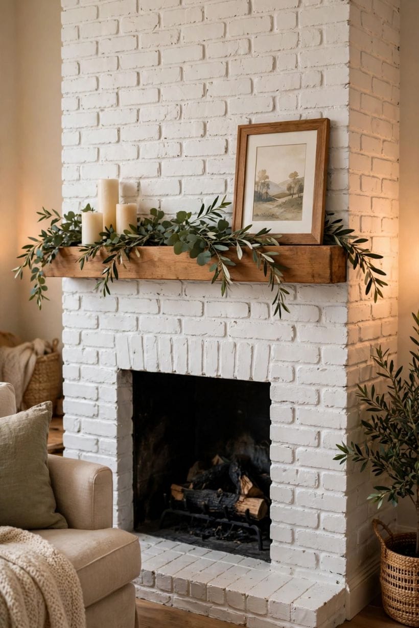
Brick is the most common material for a painted surround, and paint changes it in a particular way. Unpainted brick brings strong colour and texture, with each brick and mortar line demanding attention. Painted brick keeps the texture but quiets the colour, so the surround supports the room instead of leading it. The choice depends on whether the room needs a strong feature or a calm backdrop.
Before painting brick, consider the room as a whole. A painted brick surround suits rooms where the furniture and art already provide interest, because the wall steps back and lets those pieces shine. An unpainted brick surround suits rooms that need warmth and texture from the wall itself. Neither choice is better in every home, and the right answer depends on light, furniture, and the mood the room should carry.
Texture still matters after painting. Brush marks, brick edges, and mortar joints give a painted brick surround a handmade quality that flat plaster cannot match. That texture catches light softly and keeps the wall interesting at close range. If you are weighing the decision, this discussion of painting brick or leaving it bare sets out both sides and may help clarify which direction suits your room.
Stone and timber surrounds take paint differently from brick, and each material brings its own character. Painted stone keeps its rugged profile while gaining a unified colour, which suits rooms where the stone shape matters more than its natural tones. Painted timber, often used for mantels and panelling, takes a smooth, even finish that feels refined and classic. Mixed surrounds, with a painted stone body and a timber mantel, combine both qualities.
When materials are mixed, one colour usually works best across the whole surround. A single tone ties stone and timber together, so the eye reads the piece as one design rather than two competing parts. The mantel timber can stay natural while the stone is painted, or both can share the same colour for a quieter look. Either way, the join between materials should feel intentional, with clean edges and a consistent finish.
Consider how each material meets the wall and the hearth. Painted surfaces should sit neatly against plaster and flooring, with no rough edges or gaps drawing the eye. A tidy junction makes the whole surround look considered, even when the styling on the mantel is relaxed and informal.
8. Mantel Styling Through the Seasons
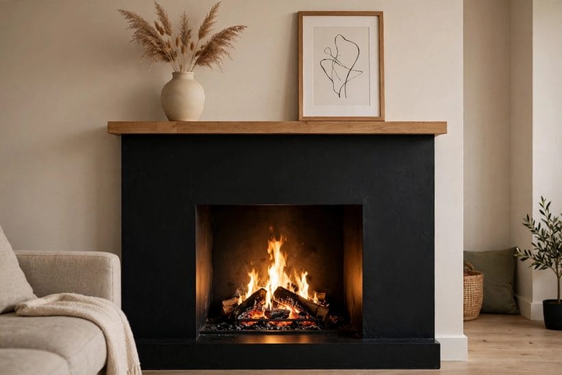
A mantel is at its best when it changes gently through the year. In spring, fresh stems and light ceramics suit the brighter days. In summer, a simple arrangement with space around each piece keeps the room feeling airy. In autumn, warm tones, dried stems, and candles bring cosiness. In winter, greenery and soft light make the mantel the heart of the room. Each season asks for a small change, not a complete redesign.
The secret is a steady base with a few moving parts. A mirror or a framed picture can stay in place all year, anchoring the wall, while vases, candles, and stems rotate with the seasons. This approach keeps the mantel feeling fresh without demanding constant effort. It also lets favourite pieces return each year, building a sense of tradition around the surround.
Balance matters more than quantity. A mantel crowded with objects feels restless, while a mantel with a few well-spaced pieces feels calm. Step back and look from the doorway: if the arrangement reads clearly from a distance, it will feel right up close too. A painted fireplace feels most welcoming when the mantel invites the eye to linger rather than darting from object to object, so leave breathing room between pieces.
9. Heat, Safety and Professional Advice
Paint near heat needs thoughtful choices. Finishes and materials behave differently when they sit close to warmth, so it is wise to follow the guidance of the product maker and to keep decorative objects away from hot surfaces. Heat, clearance, and local rules should be understood in general terms before any work begins, and anything that touches the opening, the inner chamber, or the flue belongs with a qualified professional rather than a weekend project.
This is not a place for improvisation. Chimney and firebox work calls for professional advice, and any doubt about heat or clearance is a reason to pause and ask an expert. A professional can advise on suitable finishes, safe distances in general terms, and whether a particular surround is appropriate for the type of fire in the home. Their guidance protects both the household and the surround itself.
Everyday care is simpler. Keep the mantel free of anything that could scorch, keep soft furnishings clear of hot surfaces, and check painted surfaces from time to time for signs of heat stress. If anything looks blistered, discoloured, or damaged near heat, stop using the fire and seek professional advice before continuing. A painted surround should be enjoyed with confidence, and that confidence comes from sound advice, not guesswork.
10. Mantels, Built-Ins, Small Rooms and Quiet Spaces
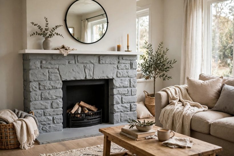
The mantel shelf is where a painted surround meets daily life. It holds photographs, art, candles, and small collections, and its height makes it visible from every seat in the room. A well-styled mantel feels personal without feeling cluttered, and it gives visitors something to notice without demanding attention. The best mantels tell a quiet story about the household, through objects chosen with care rather than bought all at once.
Height and grouping are the two tools that matter most. Taller pieces at the edges frame the wall, while lower pieces near the centre keep the view open. Group objects in small clusters rather than spacing them evenly like soldiers, and vary heights within each group so the eye moves naturally. A tall vase beside a short stack of books, or a framed print leaning above a candle group, creates a rhythm that feels natural.
Art above the mantel deserves the same care. A single large picture often works better than a cluster of small frames, because it gives the wall one clear centre. For inspiration on what hangs well above a fire, see these fireplace photos and notice how the strongest arrangements leave space around the art. The mantel below should echo that calm, not compete with it.
Surrounds rarely stand alone. Shelves, cupboards, and bookcases often flank the fire, and painting them in the same tone as the surround turns a single feature into a whole wall design. Painted built-ins give a room a fitted, intentional feel, hiding everyday storage behind calm, uniform doors while leaving open shelves for books and display. The shared colour is what makes the composition work.
Open shelves beside a painted surround need the same restraint as the mantel itself. Books grouped by size, a few ceramics, and some trailing plants create a lived-in look without chaos. Leave some shelves partly empty, so the wall can breathe. When every shelf is full, the wall feels heavy; when some space remains, the books and objects that are there stand out more clearly.
Bookcases that wrap around a surround deserve special thought, because they frame the fire on three sides. Keep their styling consistent with the mantel, using similar tones and materials, so the whole wall reads as one piece. These bookcases around a fireplace show how a shared painted finish can unify a busy wall. For the mantel itself, more mantel styling ideas can help refine the centre of the composition.
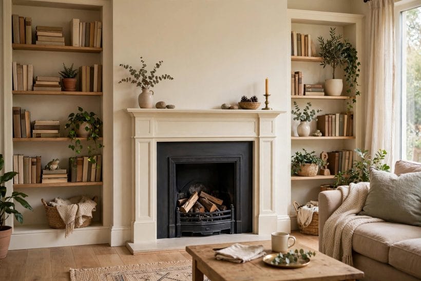
Painted surrounds are especially kind to small rooms. A pale painted surround keeps a compact living room feeling open, while a dark painted surround in a tiny corner can feel snug rather than cramped, provided the rest of the room stays light. The trick is proportion: the surround should suit the scale of the room, and the mantel styling should stay modest so the wall never overwhelms the seating.
In a small room, the mantel can carry more than decoration. A mirror above it doubles the sense of space, a small clock keeps the room grounded, and a candle group adds warmth without taking floor space. Wall-mounted shelves beside the surround add storage without bulk, and a light painted finish keeps all of it feeling airy. Every piece should earn its place, because there is little room for anything extra.
Cosy corners benefit from the same thinking. A chair drawn close to a painted surround, a soft throw, and a small side table create a retreat within a larger room. The surround anchors the corner, giving it purpose, while the pale or muted paint keeps it from dominating. It is a small change with an outsized effect on how the room feels.
A painted surround in a bedroom brings a different mood from one in a living room. Bedrooms ask for calm, and a soft painted finish delivers it, turning the fire into a gentle backdrop rather than a bold feature. Pale colours suit bedrooms best, because they blend with bedding and curtains, while the mantel holds only a few quiet objects: a candle, a small picture, and perhaps a vase of dried stems.
Keep bedroom mantel styling minimal. The room should invite rest, and a crowded mantel works against that. A single framed print above the surround, a pair of candlesticks, and nothing more can be enough. The painted finish itself provides the interest, through texture and soft colour, without needing elaborate display.
Bedroom surrounds also pair well with soft textiles. Linen bedding, wool throws, and sheer curtains all sit comfortably beside a painted surround, and their textures echo the soft finish of the paint. For ideas on fires in restful rooms, see these bedroom fireplace examples and notice how restraint keeps the room feeling peaceful.
Choosing a colour for a painted surround can feel daunting, because the surround is large and lasting in a way cushions are not. The best approach is slow and practical. Live with paint swatches on the wall for a while, watching them in morning light, evening lamplight, and on dull days. A colour that looks perfect in a shop may feel different beside your sofa, your rug, and your curtains, so testing in place matters more than any single impression.
Consider the fixed elements of the room first. Flooring, large furniture, and the wall colour around the surround all influence how a painted finish will read. A colour that harmonises with those fixed elements will feel settled from the start, while a colour that fights them will always feel slightly wrong. Photographs of the room can help, because a camera often reveals clashes the eye has learned to ignore.
Finally, trust the mood you want rather than the trend of the moment. A surround should suit the household that lives with it, not a passing fashion. Soft neutrals suit calm homes, deep colours suit cosy homes, and bold colours suit confident homes. When the colour matches the household, the surround will feel right for years, through changing cushions, art, and seasons.
Final Considerations
A painted surround rewards patience. Choose the colour slowly, prepare the surface with care, and style the mantel with restraint, and the result will feel both fresh and settled. Whether the finish is white, sage, black, grey, navy, or cream, the same principles hold: let the material show through, keep the mantel balanced, and let the room around the fire breathe.
Remember, too, that the surround is only part of the room. Furniture, lighting, textiles, and art all shape how the painted finish reads, so consider the whole space rather than the wall alone. When every element works together, the surround becomes a quiet centre that holds the room together without demanding attention.
Above all, enjoy the process. A painted surround is a chance to refresh a familiar room, to bring new colour to an old feature, and to create a corner that invites gathering. With thoughtful colour, simple styling, and professional advice wherever heat or structure is involved, the result is a room that feels warmer, calmer, and more like home.



0 Comments