
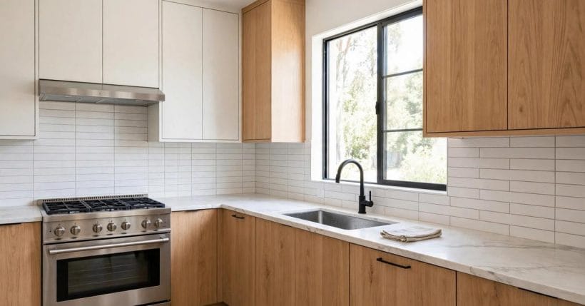
A kitchen backsplash looks simple until you stand in front of a bare wall and try to decide where it should begin and where it should end. Run it too short and the wall above the worktop looks unfinished, with splashes landing on paint that was never meant to take them. Run it too far and the tile starts to fight with door frames, window frames and the ends of cabinets, making the whole room feel busy. The good news is that most kitchens answer the question for you, because the cabinets, the cooker, the sink and the windows already draw the lines the tile should follow. This guide answers where to put backsplash in kitchen layouts in general terms, so you can walk into your own kitchen, spot those lines, and choose start and stop points that look deliberate rather than guessed.
One important note before we begin: this guide talks about placement only. It does not teach tiling, and it gives no fitting instructions. Tiling, plumbing and electrical work belong to qualified professionals, and anything involving a cooker connection, a socket or a water supply should be left to them. What follows is about looking at your kitchen, understanding the zones that need protection, and picking edges that already exist in the room, so the finished result looks like it was always meant to be there.
1. Start With the Worktop Line, Not the Tile
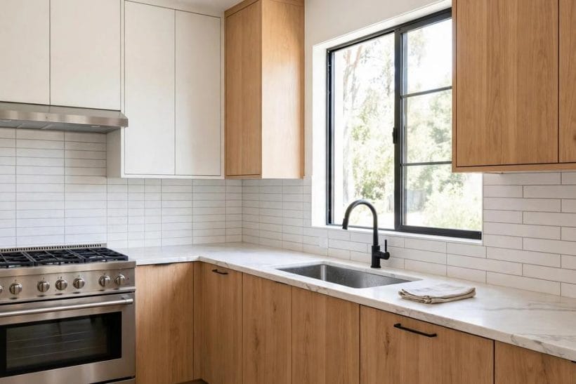
Every backsplash decision starts at the worktop, because that is where daily life happens. Water splashes at the sink, steam rises at the cooker, and everyday cooking leaves its mark on the wall just above the counter. The tile exists to protect that strip of wall, so the bottom edge of the backsplash is the easiest edge of all: it meets the worktop along its full length. A neat join there matters more than any other detail, because a gap or a wobble at the worktop line is the first thing the eye catches when you walk into the room.
From that starting line, look upward rather than outward. The wall above a worktop is a vertical space with its own landmarks, and the backsplash should relate to them. Wall cabinets give you a natural top edge. A window gives you a natural side edge. An open shelf gives you a line to run to or stop beneath. When the tile lines up with one of those landmarks, the result looks calm, because the eye reads the tile and the cabinet or shelf as parts of one arrangement rather than two competing ones.
It also helps to think of the kitchen in zones rather than as one long wall. The sink zone, the cooker zone and the preparation zones each have their own splash patterns and their own neighbours, so each zone can reasonably start and stop in a slightly different place. A single rigid rule applied to the whole room usually creates at least one awkward corner, while a zone-by-zone approach lets each stretch of tile end where its own neighbours suggest it should end.
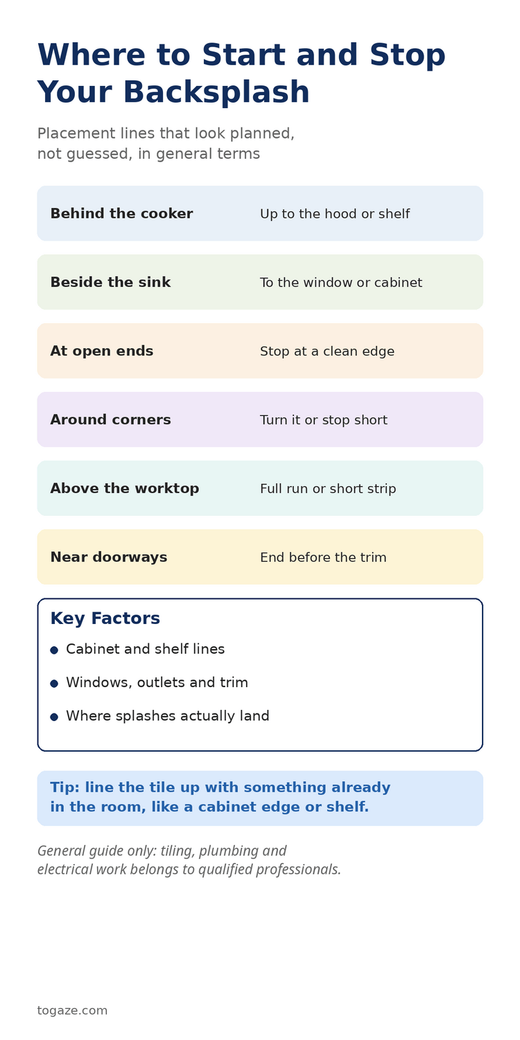
2. Behind the Cooker: The Tallest Decision
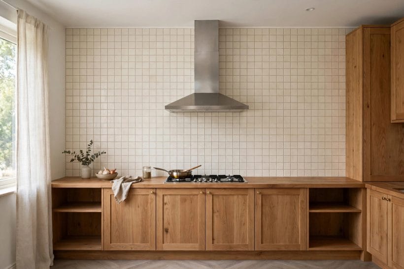
The wall behind the cooker is the one place where a backsplash almost always wants to go taller than anywhere else in the room. Cooking sends heat, steam and grease upward, and the wall behind a hob takes more of it than any other stretch. A short strip that stops well below the cooker hood can leave a band of marked wall above it, which defeats the purpose of the tile and looks unfinished into the bargain. For that reason, the cooker zone is usually treated as its own feature, rising higher than the everyday run on either side.
Where exactly it stops at the top depends on what sits above it. If a cooker hood hangs over the hob, the tile often runs up to the underside of the hood, which gives the whole arrangement a framed, intentional look. If open shelving sits above the cooker, the tile may run to the underside of the lowest shelf instead. If there is nothing above the hob at all, the tile may rise to the ceiling, turning the cooker wall into a deliberate focal point. Each of those endings works, because each one lines up with something real. What looks wrong is a tall panel that stops at no particular height, floating halfway up a blank wall.
The sides of the cooker panel deserve the same care. A panel that is exactly as wide as the cooker can look pinched, while one that runs a little wider on each side feels generous and protects the wall where pans are lifted and set down. Lining the sides up with the edges of the cooker hood above, or with the edges of the neighbouring cabinets, usually gives a width that feels right without any measuring or guesswork. And because cooker work involves heat and, often, gas or electrical connections, any changes in this zone are work for qualified professionals, not a weekend experiment.
3. Beside the Sink: Splashes, Windows and Taps
The sink is the wettest place in the kitchen, and the wall behind it earns its tile every single day. Washing up, rinsing vegetables and filling pots all send water toward the wall, and a tiled surface there is far easier to wipe clean than paint or bare plaster. The sink zone therefore deserves a full, generous stretch of tile, running at least as wide as the sink unit itself and usually a little beyond it on each side, so splashes that miss the bowl still land on tile.
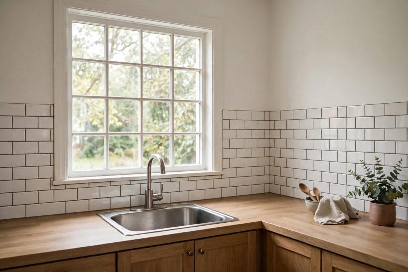
Windows change the picture in a pleasant way. Many sinks sit beneath a window, and in that case the window frame itself becomes the natural boundary for the tile. The backsplash can run up to the sill and stop there, or run up the sides of the window reveal, depending on the depth of the reveal and the look of the room. Either way, the window gives you a ready-made edge, and using it keeps the sink wall looking tidy instead of leaving a strip of tile that stops just short of the frame for no clear reason.
Taps and fittings add a smaller but real consideration. The tile needs to sit neatly around the tap and any wall-mounted fittings, and the top edge of the run should clear them comfortably rather than cutting across them. If a shelf or a cabinet sits above the sink, that gives you the top edge, just as it does elsewhere. If nothing sits above the sink, a run that matches the height of the neighbouring runs keeps the room consistent, and the eye moves along the wall without snagging on a sudden step up or down.
4. Under the Wall Cabinets: The Everyday Run
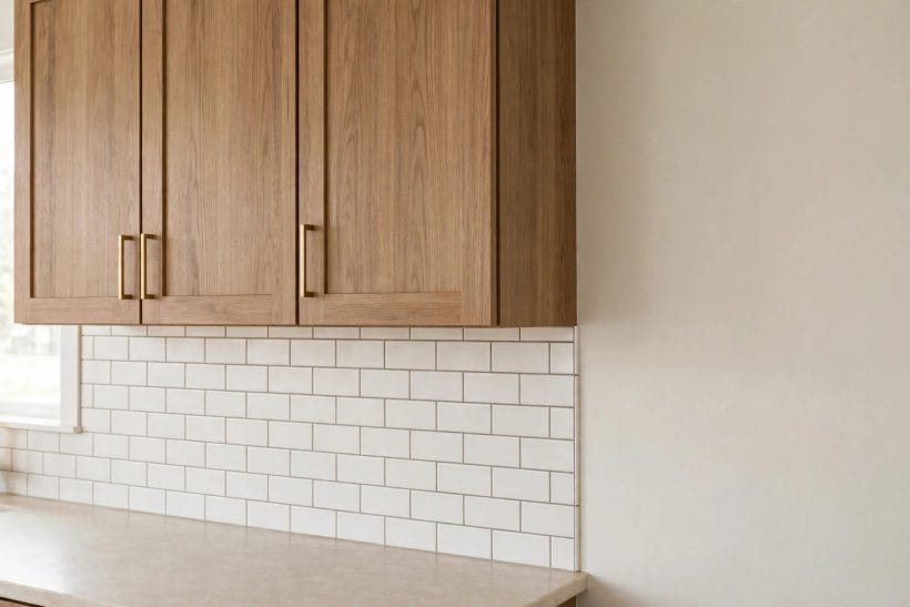
Between the worktop and the underside of the wall cabinets sits the classic backsplash: a horizontal band that runs the length of the counter. This is the workhorse of the kitchen, protecting the wall where food is prepared, small appliances stand and everyday splashes happen. Its top edge is already decided for you by the cabinets, which is why this run almost always looks right. The tile fills the space between two horizontal lines, the worktop below and the cabinet above, and the result is a calm, continuous band.
The ends of this run are where decisions creep back in. At the end of a run of cabinets, the tile usually stops in line with the cabinet edge, so the tile and the cabinet end together and the wall beyond stays plain. That shared edge reads as a deliberate finish, and it works whether the wall beyond is painted, papered or simply left clear. Stopping short of the cabinet edge, by contrast, leaves a sliver of bare wall that looks like an oversight, while running past the cabinet edge leaves tile hanging in open space with nothing to relate to.
Where cabinets are missing, the everyday run needs a different answer, which later sections cover in more detail. The principle stays the same, though: find a line in the room and end the tile there. A shelf, a window frame, a tall unit or the end of the worktop itself can all serve. The worst outcome is a run that simply fades out mid-wall, because the eye keeps returning to the place where the pattern stops without explanation.
5. At Open Ends: Where the Tile Should Stop
Open ends are the trickiest edges in backsplash placement, because there is no cabinet or frame to tell you where to stop. An open end happens wherever a run of worktop ends at a doorway, a passage into another room, or simply an open stretch of wall. Without a landmark, the tile can easily run too far and look as though it escaped from the kitchen, or stop too soon and leave the last stretch of counter unprotected.
The most reliable answer is to stop the tile at the end of the worktop, or just inside it, so the tiled area matches the working area it serves. If the worktop ends at a wall that turns into a doorway, stopping before the door frame keeps the tile inside the kitchen where it belongs. If the worktop ends at a tall unit or a fridge housing, the edge of that unit gives you a vertical line to stop against. In both cases, the tile ends where the kitchen’s working zone ends, which is a logic anyone walking into the room can feel even if they never put it into words.
A clean finished edge matters more at open ends than anywhere else, because there is no frame to hide behind. The edge should be straight, the tile pattern should resolve neatly rather than ending on a cut fragment, and the transition to the painted wall should be crisp. When the edge is clean, even a short run looks finished. When it is ragged, even a long run looks like a job interrupted halfway through.
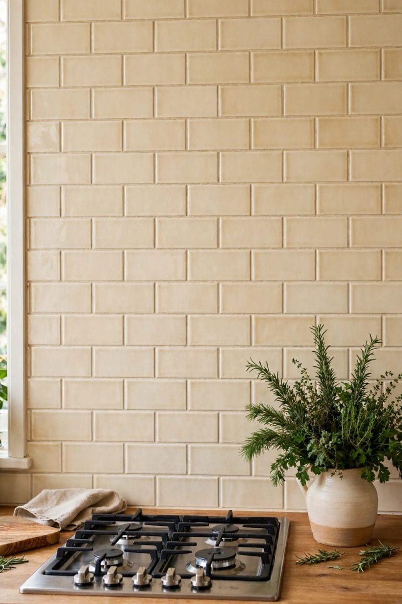
6. Around Corners: Turn It or Stop Short
Corners divide opinion, because both answers can look right and the wrong choice for a particular kitchen is usually obvious once you see it. Turning the tile around a corner keeps the protection continuous and suits kitchens where the worktop itself turns the corner, as in an L-shaped layout. The tile follows the counter around the bend, and the corner becomes part of one flowing run rather than a break in it. This works best when both walls of the corner are working walls, with counter space and splash risk on each side.
Stopping short of the corner is the better answer when only one wall is a working wall. If the adjoining wall holds a doorway, a tall unit or simply open space, running tile around the corner puts protection where no splashes will ever land, and it drags the kitchen’s busiest surface into a quiet part of the room. Stopping the tile on the working wall, in line with the end of the counter or the cabinet above, keeps the tile where it earns its place and lets the other wall stay calm.
Whichever route you choose, the corner itself needs a tidy finish. A turned corner should carry the pattern cleanly around the bend, without a jarring change of direction in the middle of a tile. A stopped corner should end on a straight, finished edge, just like an open end. For help with the trickier corner details, see these ideas for subway tile inside corners, which cover how corner layouts are planned in general terms.
7. Full Height or a Short Strip: Choosing the Look
Once the start and stop points are settled, the remaining question is height: should the tile fill the whole wall between worktop and ceiling, or sit as a shorter band above the counter? A full-height backsplash makes a strong statement. It suits feature walls, cooker walls and kitchens where the wall above the counter is otherwise bare, because it turns a practical surface into the room’s main visual event. It also removes the question of where the top edge goes, since the ceiling itself is the edge.
A short strip is quieter and often kinder to a small or busy kitchen. It protects the splash zone without dominating the room, and it leaves the upper wall free for paint, shelving or artwork. Short strips work especially well where wall cabinets already break up the wall, because the tile band between worktop and cabinet is all the height the room needs. They also suit rented homes and gentler budgets, since they cover less wall while still protecting the area that takes the most wear.
There is no rule that says a whole kitchen must pick one height. Many of the most successful kitchens mix the two, with a full-height panel behind the cooker and a shorter band everywhere else. The contrast actually helps the eye, because the tall panel reads as a feature and the shorter runs read as background. What matters is that each height has a reason: the tall panel protects the cooker wall, the short band protects the preparation zones, and neither one is tall or short by accident.
8. Windows, Shelves and Open Runs
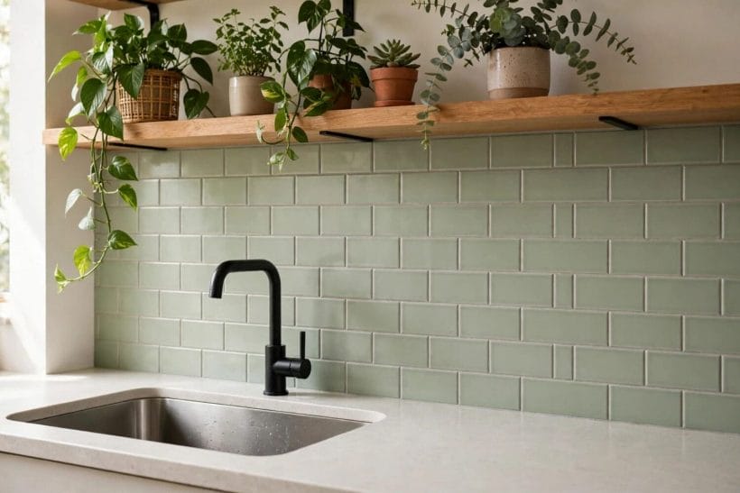
Kitchens without wall cabinets, or with only a few of them, need a different kind of thinking. Open shelving has become a popular alternative to upper cabinets, and it changes the backsplash question because the shelf is a lighter, more open landmark than a cabinet. Tile can run to the underside of the lowest shelf, which frames the shelf nicely and protects the wall behind it, or it can run full height behind the shelves, which makes the shelving read as decoration against a tiled background. Both look good, and the choice comes down to whether you want the shelves or the tile to be the star.
Windows are the other great landmark in an open kitchen. A window above the sink or above a run of counter gives the tile a natural place to stop, and the light from the window makes the tile itself look better, catching its surface and colour through the day. Where a window sits in the middle of a run, the tile can step around it, running up to the sill on each side. The key is consistency: if the tile meets the sill on one side of the window, it should meet it in the same way on the other side, or the asymmetry will nag at the eye.
Open runs with no cabinets, shelves or windows at all are the hardest case, and they are also the case where restraint pays off most. A short, even band above the worktop, ending in line with the counter at each end, usually looks better than a tall panel with nowhere to stop at the top. The band protects the wall, keeps the room feeling open, and leaves the upper wall free for whatever comes later, whether that is art, a rail or simply a calm painted surface.
9. Outlets, Switches and Trim: The Fiddly Edges
No kitchen wall is a blank canvas. Outlets, switches, trim and pipework all interrupt the surface, and the backsplash has to live with them gracefully. The general principle is simple: the tile should work around these features rather than cutting across them. An outlet that sits half on tile and half on paint looks like a planning failure, while one that sits cleanly within the tiled area, or cleanly above it, looks like part of the design. Where an outlet falls near the top edge of a planned run, it is usually worth adjusting the run so the outlet sits comfortably inside it or clearly outside it.
Trim and architraves deserve the same respect. Door frames, window frames and skirting boards all give you edges to stop against, and stopping just short of a frame usually looks tidier than running tile into it. The small gap between tile and frame can be finished neatly, and the frame itself stays crisp and readable. Running tile hard into a frame, by contrast, can make the frame look swallowed, especially with a busy tile pattern.
Anything involving wiring is also a safety matter, not just a visual one. Outlets and switches should only ever be moved or altered by a qualified electrician, and the same goes for any work near a cooker connection or a water supply. Placement planning is a visual exercise you can do from your kitchen chair. Moving the services behind the wall is not, and it should never be treated as part of a decorating decision.
10. Small Kitchens, Galley Runs and Islands
Small kitchens reward restraint more than any other kind. In a compact room, a backsplash that runs everywhere can make the walls feel closer, while a well-chosen run in the right places makes the room feel considered rather than crowded. The priority order stays the same: cooker wall first, sink wall second, preparation runs third. If the room is genuinely tiny, protecting those zones well matters more than covering every inch of wall, and a shorter run that ends cleanly will always beat a longer run that ends awkwardly.
Galley kitchens, with two parallel runs facing each other, have their own rhythm. Because both walls are working walls, both usually deserve tile, and keeping the two runs at the same height makes the narrow room feel balanced rather than lopsided. If one side has cabinets and the other has a window, the tile heights will naturally differ, and that is fine as long as each side ends at its own landmark. Symmetry is pleasing, but forcing it by ignoring a window or a cabinet would look worse than a thoughtful difference.
Islands and peninsulas add a final twist, because the tiled wall may sit behind a hob on a peninsula, or the island may face a tiled wall across a walkway. Where a hob sits on a peninsula, the tiled panel behind it follows the same rules as any cooker wall, ending at a hood, a shelf or the ceiling. Where an island faces a wall, the wall’s tile should relate to the island’s working side, protecting the splash zone without competing with the island itself. For the surfaces that meet the tile, it helps to think about the whole pairing, from trending kitchen countertops to quartz countertops explained, so the worktop and the wall read as one arrangement.
Final Considerations
If there is one habit that separates a backsplash that looks planned from one that looks improvised, it is this: end the tile on a line that already exists. A cabinet edge, a shelf, a window sill, a door frame, the end of a worktop or the ceiling are all lines the room has already drawn for you. Use them, and the tile will look like part of the kitchen’s architecture. Ignore them, and the tile will look like an afterthought, however beautiful the tile itself may be.
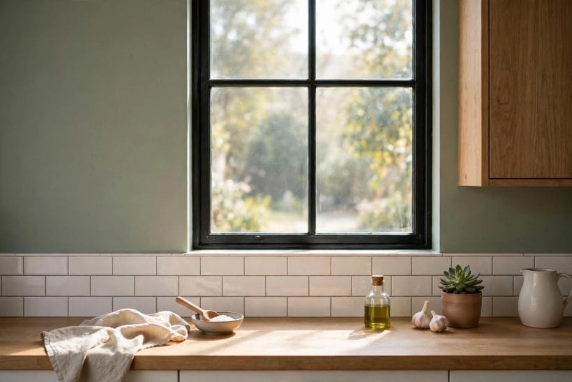
Before you commit, it is worth living with the lines for a little while. Stand at the sink and the cooker, look at the walls as you actually use them, and notice where splashes land and where your eye naturally stops. Tape, cardboard or even a row of paper sheets can stand in for tile while you test a start point or an end point, and that simple rehearsal often reveals an awkward edge that a drawing would have missed. It also gives you time to notice the neighbours you might have forgotten: a light switch, a shelf bracket, a window latch.
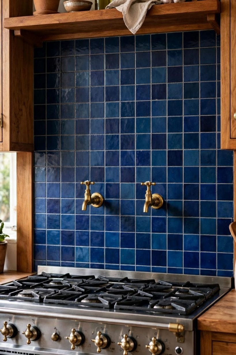
Material choice plays its part too, though it is a separate question from placement. A quartz surface carried up the wall, for example, changes the feel of a run entirely, and the ideas in these quartz backsplash pictures and ideas show how a single material can run from worktop to wall. White cabinets pair with tile in their own way, as these white cabinets with tile backsplash ideas demonstrate, and the cabinets themselves deserve attention, from kitchen cabinet quality checks to the practical question of matching a discontinued tile if an older tile ever needs a partner. Placement comes first, though: a well-placed modest tile beats a poorly placed luxurious one every time.
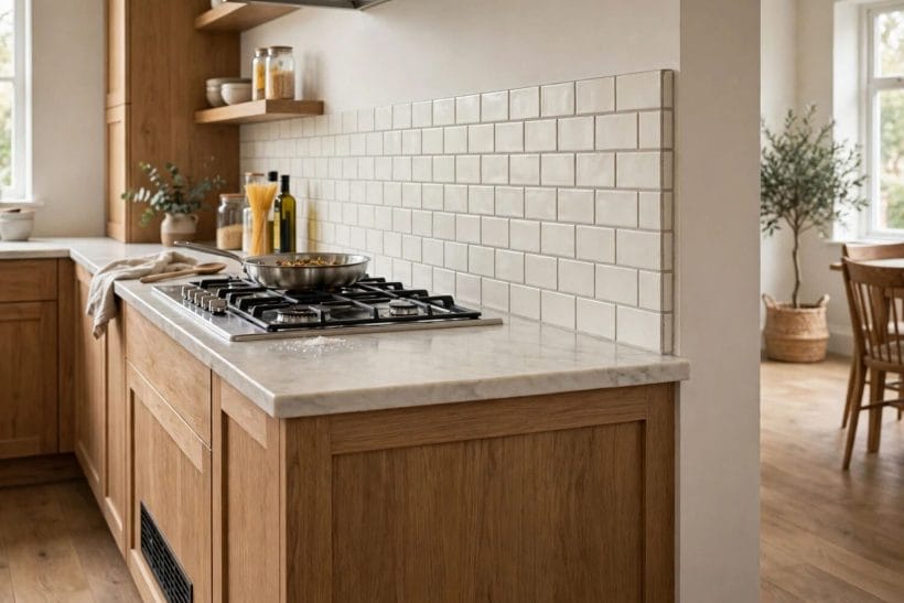
Finally, remember the scope of this guide. It answers where to put backsplash in kitchen plans in general terms, and it deliberately stops short of fitting advice. The lines you choose are yours to decide from your kitchen chair. The work of fixing tile to the wall, moving a socket or touching a water supply belongs to qualified professionals, and a good tradesperson will also spot the practical details, like an uneven wall or an awkward corner, that no guide can see from afar. Choose your lines with care, hand the fitting to someone qualified, and the result should be a backsplash that protects the wall, flatters the room and looks as though it was always meant to be exactly where it is.



0 Comments